Complimentary Scale

Process
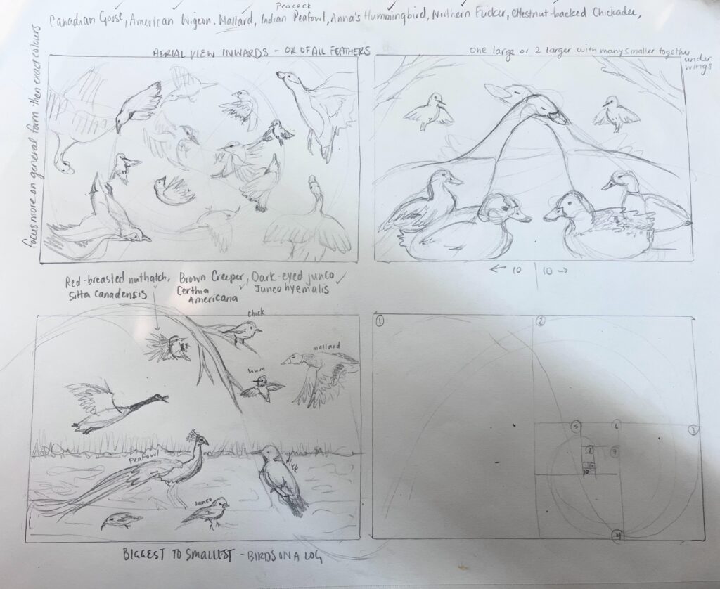


This painting was a process! My friend reached out to ask me to make a commission as a gift for her partner on their one year anniversary. Given he is a birder, and their first date they identified 10 birds in MEEGAN (aka Beacon Hill Park), she thought that would be the subject matter. After haggling the price (up to $200 from $100) I decided that I liked birds, my friend, and the challenge enough to accept. I started with making some thumbnail sketches of different compositions. I immediately realized that since it is a gift for her partner there must be 2 of each of the birds. So, I upped my goal from 10 to 20 birds. After desiging the thumnails and sending her a photo, we both agreed we liked the radial composition best.
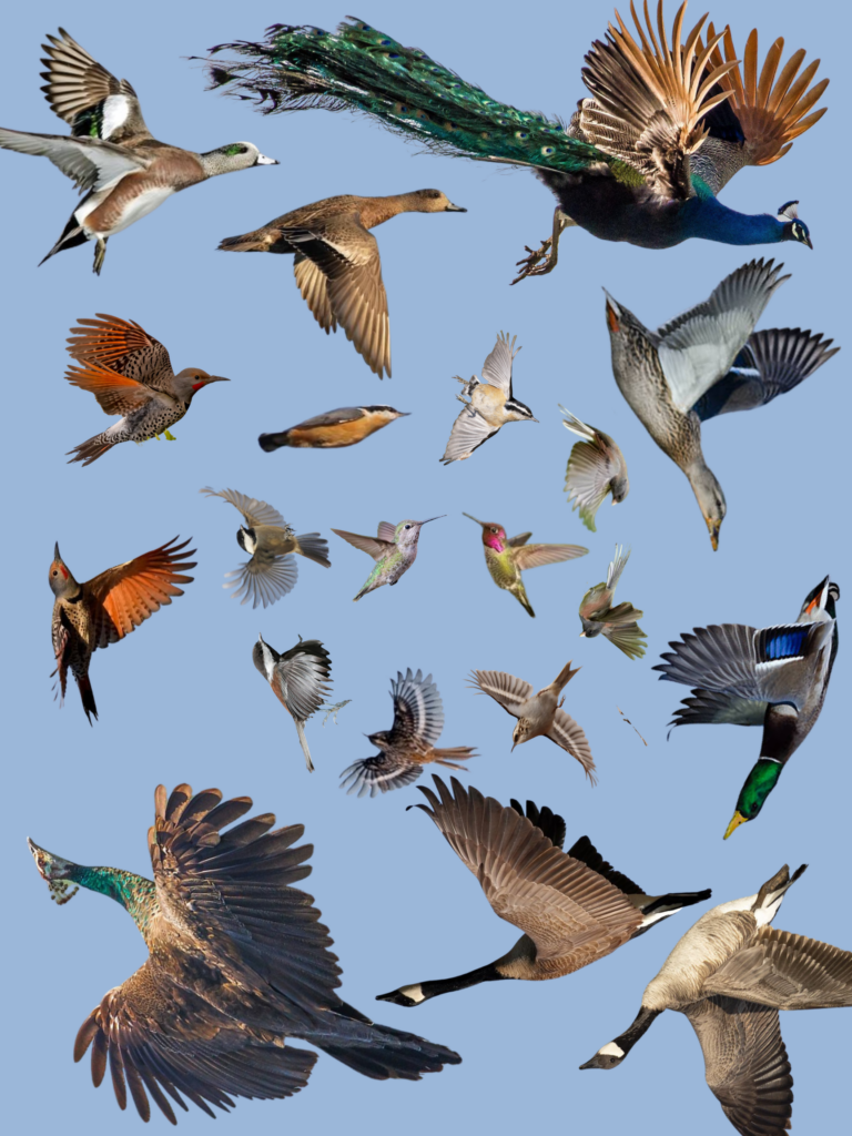
Then I moved onto finding images for each of the birds. I scowered the web for photo references and ultimate found the images I thought would be fitting for the design. I wanted all the birds to be in flight so I looked at A LOT of different bird images and searched for male/female counterparts to ensure I was capturing both genders. After making the design and playing with the composition I moved onto decided on a background imagery.
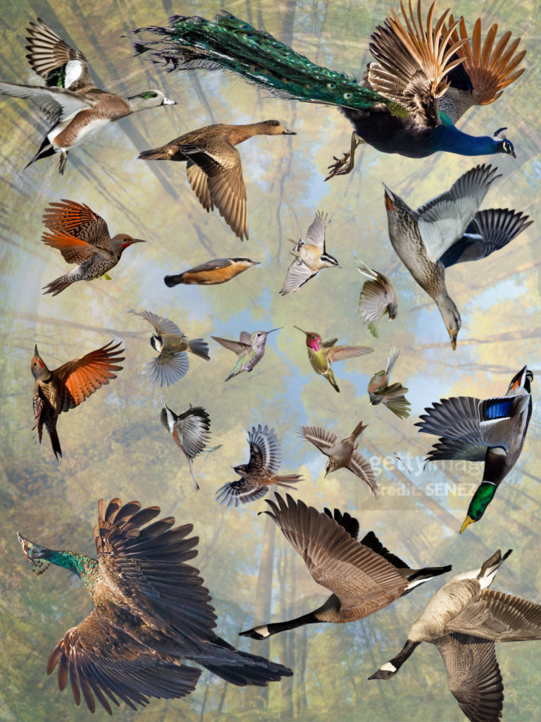
I played with a lot of different background options. Many of which I can not find saved on my computer. There were some different colour brown triangles, some super zoomed up images that looked abstract, some grassland images, but ultimated I decided on the imagery of looking up at a canopy of trees. After speaking with Scott, who recommended that I reduce any contrast in the background to ensure the imagery didn’t fight with the foreground, I decided to overlay a white faded screen over the background, then added the birds and voila! Composition made. I want to note… this sounds like a simple retelling. But honesty this probably took an entire 4 hour class to do. At least.
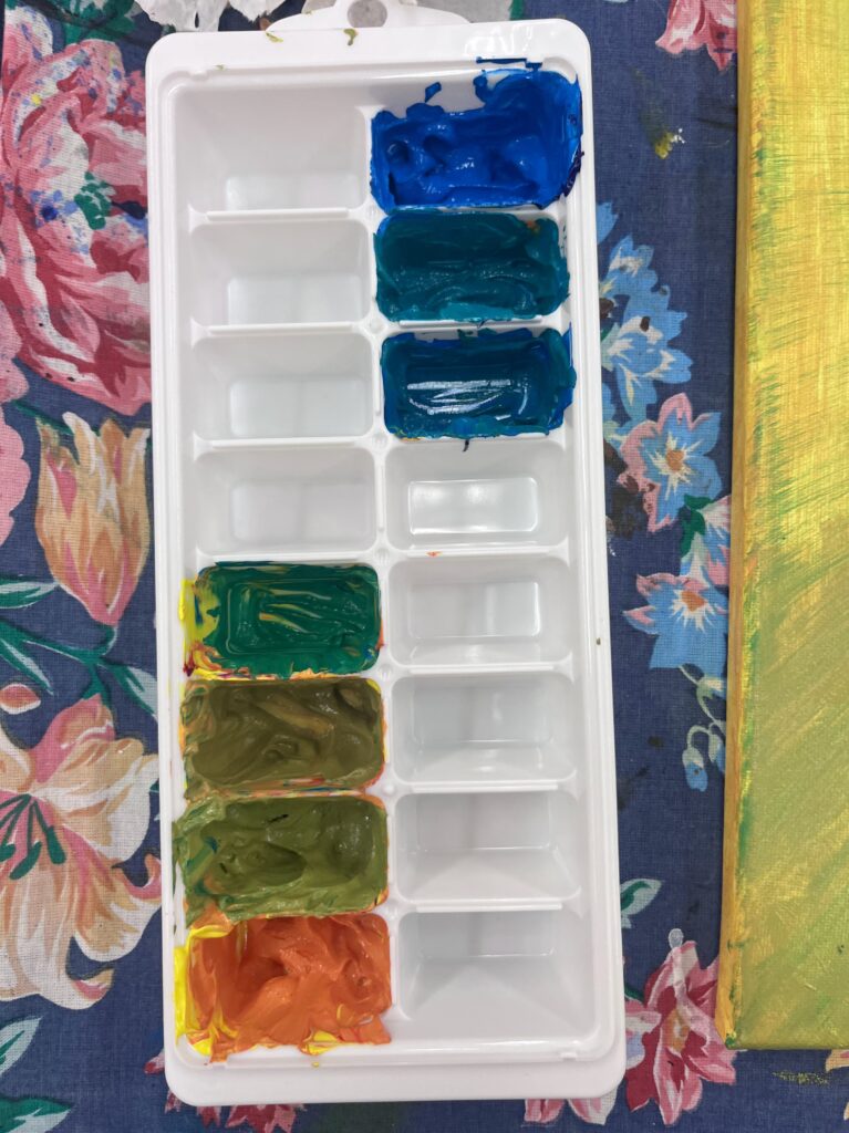
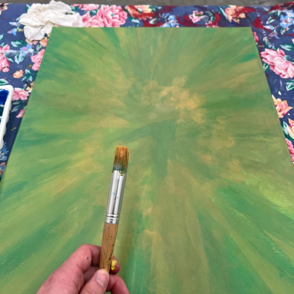
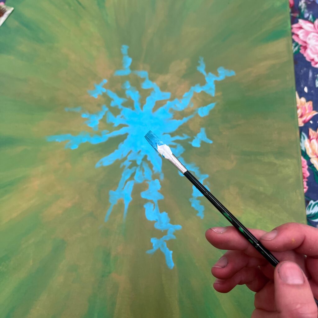
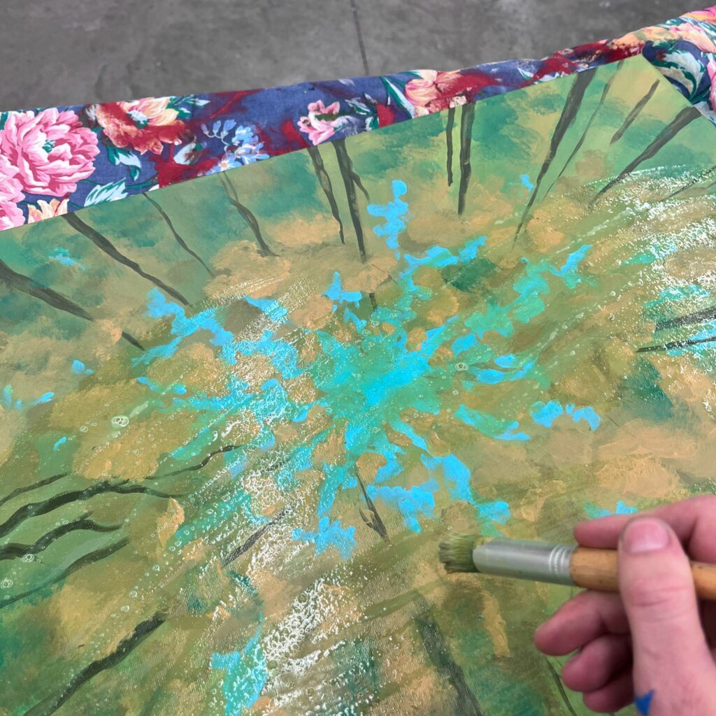
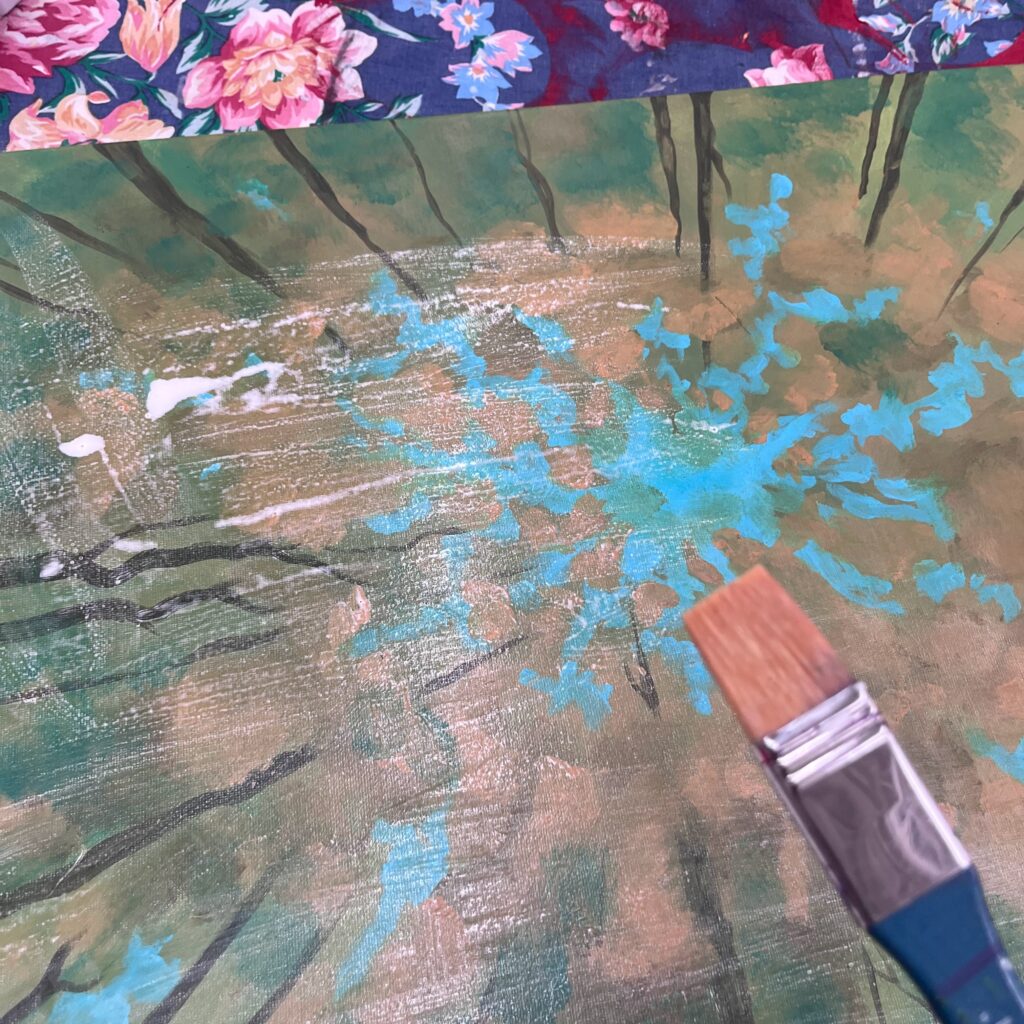
Then I went to print the photo for my physical reference piece for the painting. Mixed my colour scale, and starting on the background. As you can see from the reference images above, this was many layers. A colour wash, then the texture of the foliage, then the sky, the branches, more foliage, then the green wash… which I decided didn’t make the cut, then the white wash. This took probably 5 hours.
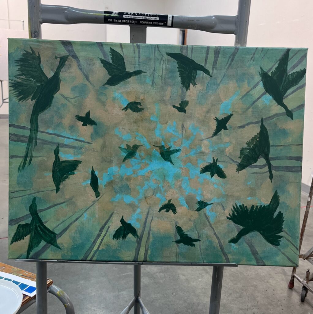
Then I moved onto the forms. I wanted to make sure I got the sizing and positioning correct before I starting laying down the colours. Here I used a dark green to set the forms. Leaving the hummingbirds for last and then checked with my friend to see what orientation she wanted the painting. Throughout the entire process I was maintaining ongoing communication with the client to ensure she was liking where the project was headed.
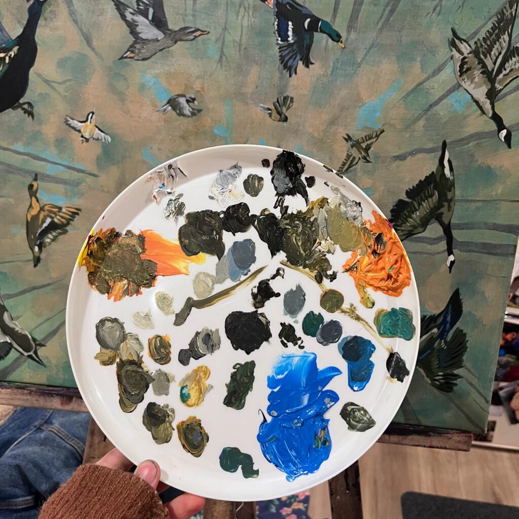
Finally I started to fill in the birds colouring. At first, I tried to identify the similar colours throughout the composition, mix the paint, and then continue to rotate the painting to use the same colours throughout. But eventually I noticed that this ended up in lots of areas that I was missing spots on. So I decided to focus in on each form individually, mixing small amounts of paint as I went. As a result, I had to mix the paint often as it tried quickly. I have a lot of confidence mixing this complimentary colour scheme as a result. I learned that orange and black make brown. And mixing the gray scale in with the different complimentary colours scales providing a range of different colours. It was incredible how much variety I could get adding the black and white. I feel like I could do an entirely other colour scale with the blacks and whites, but there would be endless combinations, so I can understand why this wasn’t a part of the assignment.
There was a big moment for me during the the tuesday class. While the other class was going on, I heard scott compliment another artist on her ablility to keep the painting look “painterly”. That made something click. That was my problem. I was trying to make the birds look too realistic, so much so that it wasn’t communicating well into the painting medium. After that, I started exploring making more shapes, and less trying to get into the finer details of each feather and colour. This is when the painting seemed to really take off for me. Now I just needed to repeat that process for each bird… 20 times.
Painting
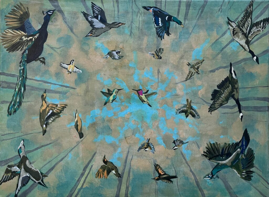
Birds of a Feather
Ash Houghton
18 x 24
2024
Reflection
This painting was a real challenge for me. The process was long and there were a lot of finer details in the birds. There were many moments during the creation of the background where I said “to hell with it! Trust the process!” not ever really knowing what the effect might be. Fortunately for me, I trusted my intuition and the background came together well.
There were many moments where that came up during the process… laying the initial green forms of the birds, deciding how big to make the hummerbirds, questioning whether or not to add the pink at the centre and “break the rules” of the assignment so to speak. There were even many moments where I completed “hated’ the artwork. Every night I’d take the painting and place it close to my bed and as I unwound from the day, talked to a friend on the phone or read my book, I would look up at the painting with a more calm mind and think about what was working well, and what wasn’t.
As a result, I believe I really learned a lot about mixing the complimentary colour scale. As I mentioned above, because I was mixing such small amounts of paint for each small bird, I had to continually mix the paint and replicate similar colours. So, I got really good at mixing the various browns, and greens, oranges and blues and grays and ever other colour between. I think this is the first time in my life I stucked with a specific 2 (technically 3 if you include the green, and 5 if you include the black and white) colour scale and I have to stay it created a lot of unison in the pallet and really makes the birds of a feather look like they are flocking together!
While I did get to play with the placement of the birds and the background of imaging and the different cuttouts of photographic images, the placement of each bird included a lot of detail. I wanted to created a radial or spiral partner which lead the eye to the centre of the painting. Placing the hummingbirds in the centre was an intentional decision since to me, they represent love and joy. Having all the other birds spiraling around them reminded me of the way that a whole community makes an individual. And by extention, especially in this case in this case, a whole community makes a couple.
