LAB 01: Object Analysis WORKSHEET
Complete 1 worksheet for each object (all worksheets are in this document). You may respond to the questions below with text and/or images.
Object #1
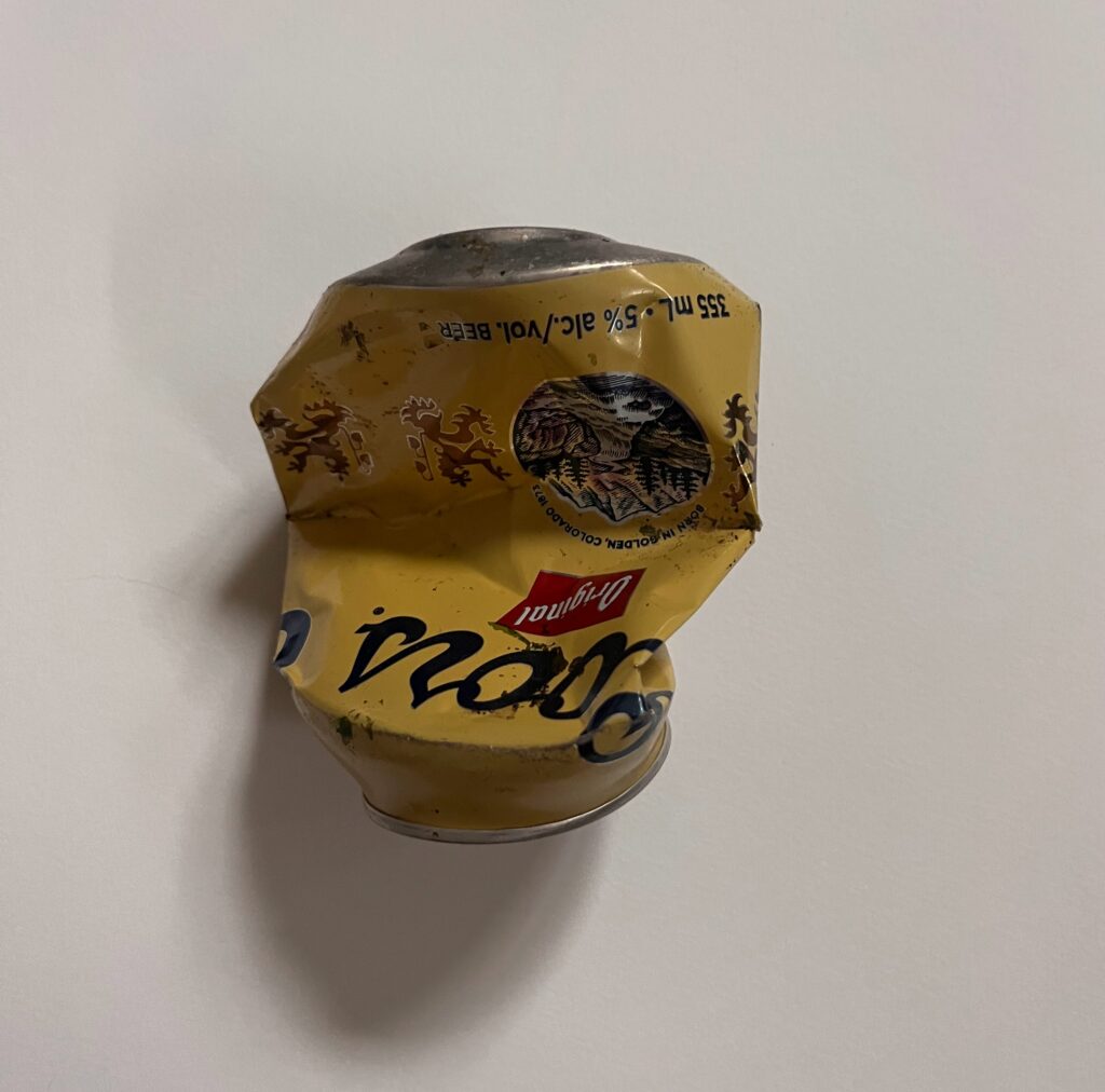
- Name the object:
Beer Can
- Describe the object (size, colour, material, handmade, manufactured, etc.):
Made of aluminum, discoloured mostly yellow Coors beer can, about 5 inches long in it’s crumpled shape. Mass manufactured.
- What is the intended function(s) of the object:
To carry bear. To be a social lubricant. To be one of many cans of beer or other forms of alcohol which signify an ability to consume large amounts of liquid poison.
- What is the cultural context of the object?
(What era was it made? Is there a geographical connection? Is there a connection to gender, class, or a culture? Is the object taboo, a banal everyday item, or sacred, etc?)
Its a contemporary era beverage attached to North American culture. It can be found as a common and cheap “Canadian” or “American” alcoholic beverage. I would say it’s associated with middle aged men, lower class, and more rural culture. To those who are higher class or live in cities where there is a strong culture of smaller batch niche beers of arguably greater quality, this would be considered more taboo to drink.
- Do you have a personal connection to the object?
(Does the object conjure a memory, symbol, or reaction for you on a personal level?)
I used to drink a lot when I was a teenager and in my 20s. Almost two years ago I stoped drinking for health reasons. Coors was something I would commonly see my dad drinking. I found this empty crumpled can on the beach while I was enjoying the pristine beauty of the place I was in.
- Name the ways the object can be manipulated? (Broken, wrapped, filled, burned, stitched, etc.)
It can be crumbled, torn into smaller strips of aluminum, charred, and wrapped, or painted.
- Mental Associations 1: Name three (3) things/elements that have a commonality or similarity to this object.
Pubs, dads, trucks.
- Mental Associations 2: Name three (3) things/elements that are opposite or in contrast to this object.
Craft breweries, ballets, authentic connection.
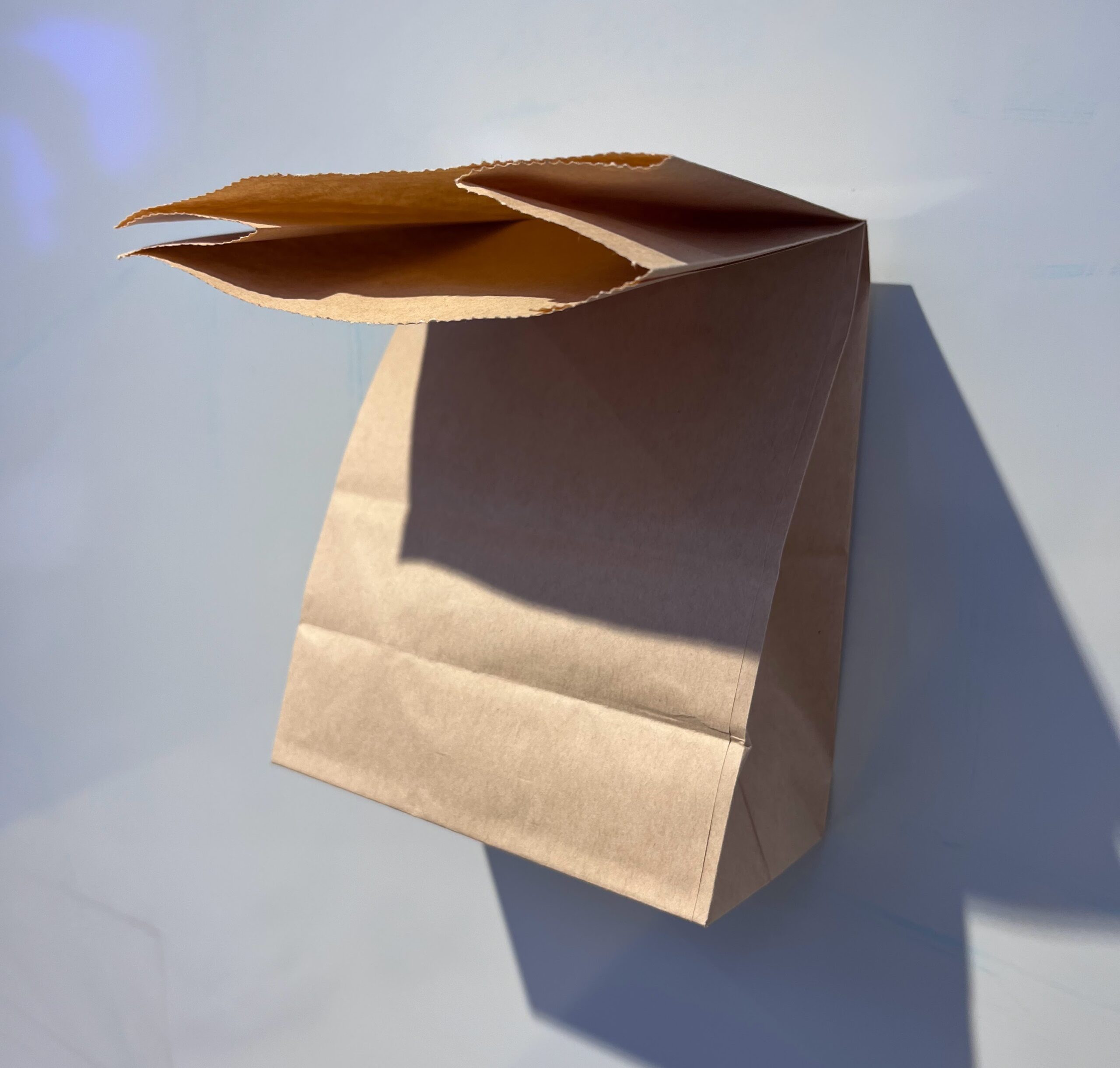
Object #2
- Name the object:
Tim Hortons cup
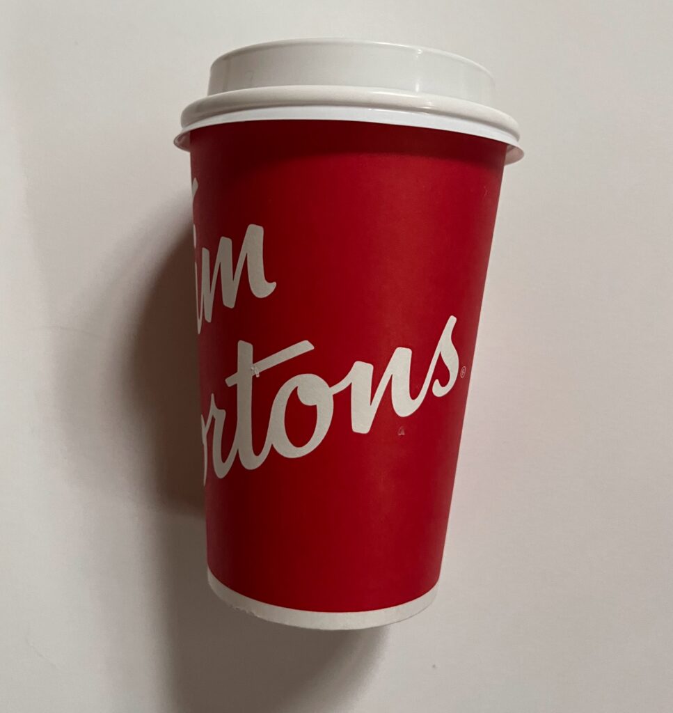
- Describe the object (size, colour, material, handmade, manufactured, etc.):
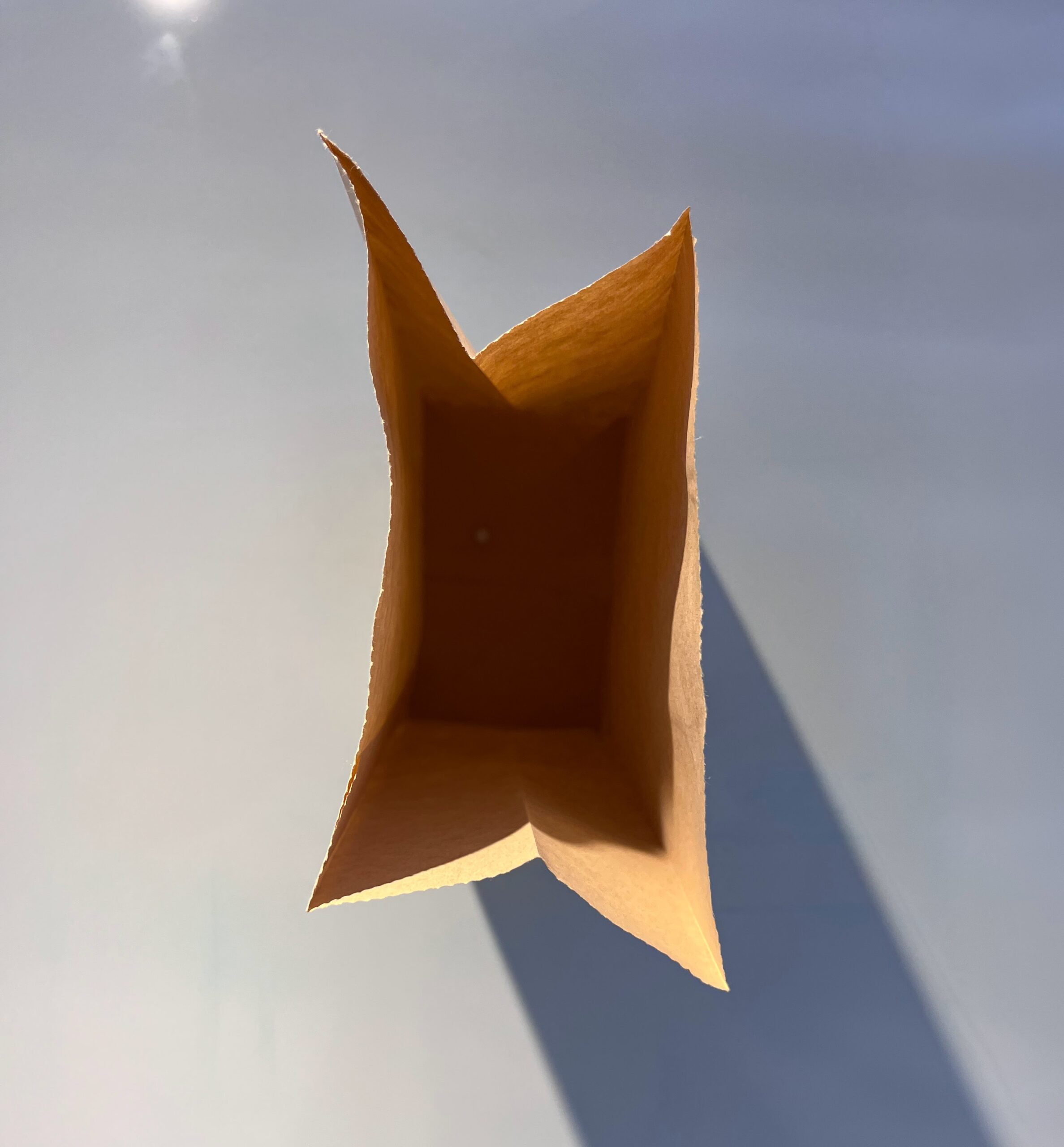
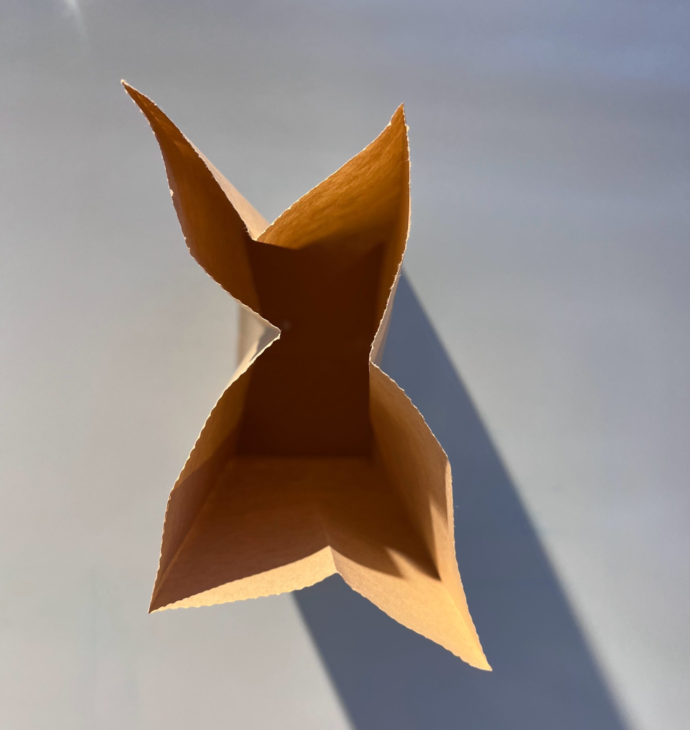
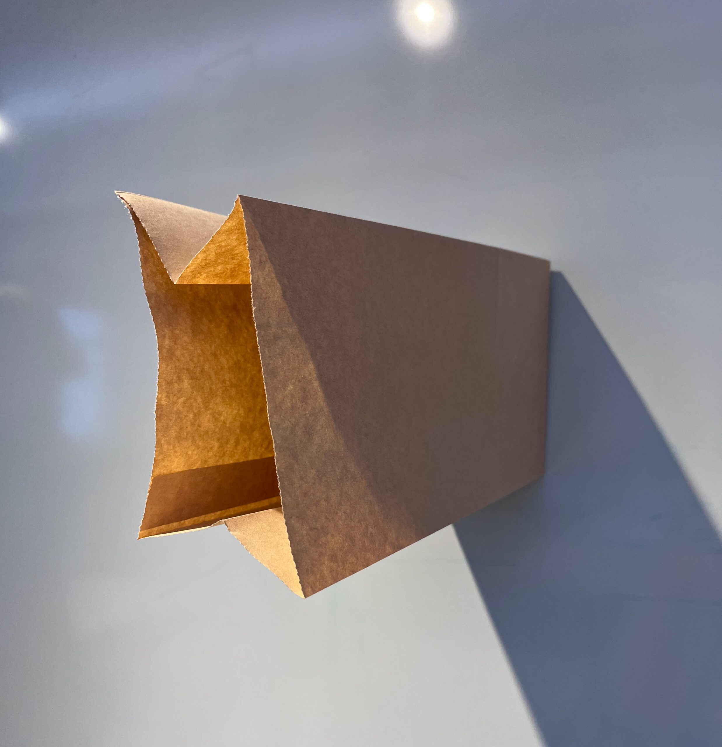
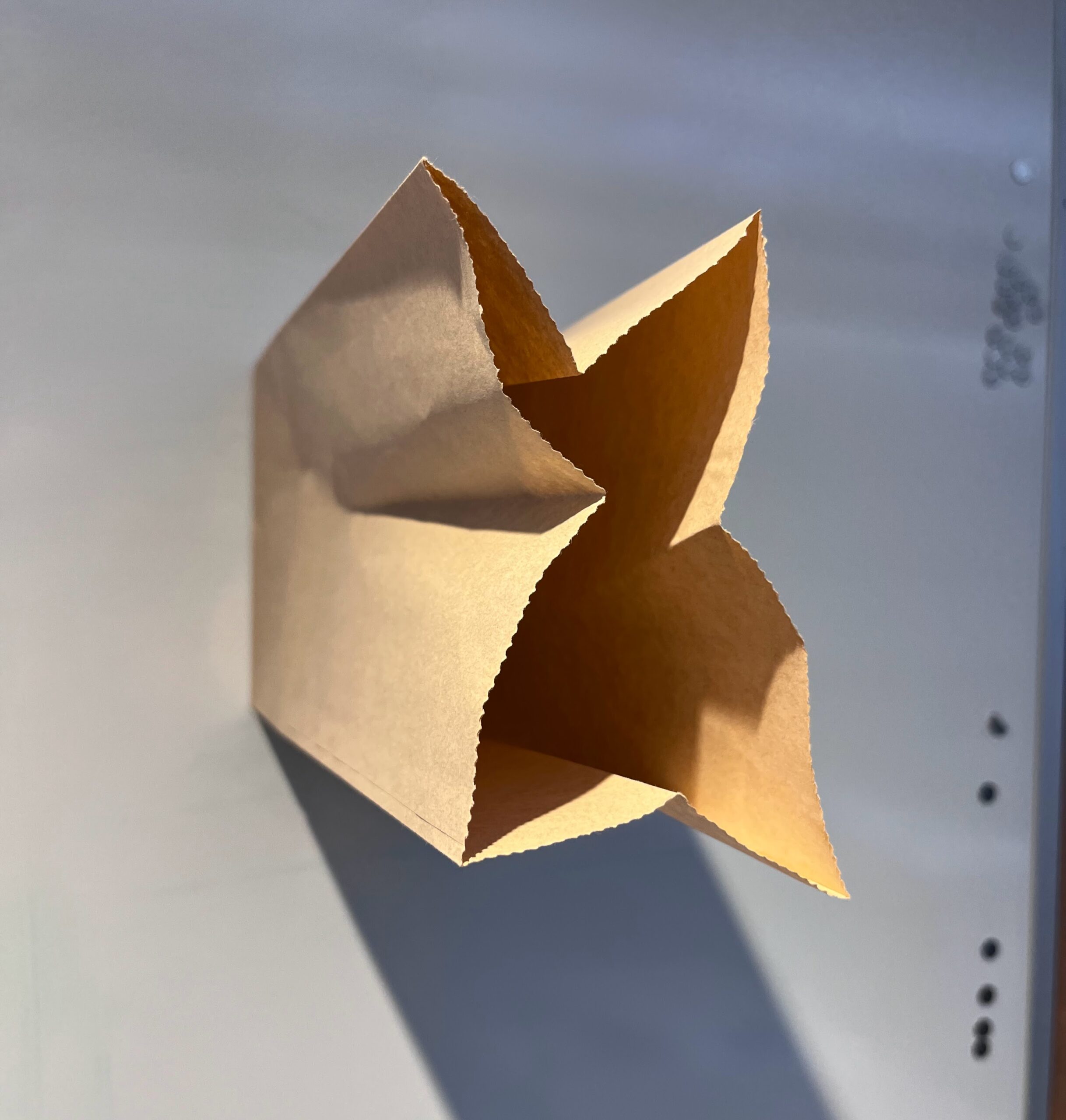
Manufactured, red and white, paper with plastic lining for waterproofing, approx 9 inches tall and 4 inches in diameter at top.
- What is the intended function(s) of the object:
To carry hot beverages, to be a symbol of Canadian identity, and when full, to be a comfort on a cold day.
- What is the cultural context of the object?
(What era was it made? Is there a geographical connection? Is there a connection to gender, class, or a culture? Is the object taboo, a banal everyday item, or sacred, etc?)
Contemporary era (within last 100 years) Tim Hortons as a business has been a symbol of Canadian identity, despite the fact that it is no longer a Canadian company. It’s considered a lower class, coffee company as it produces fast, convenient food and beverages, in an unpersonalised way.
- Do you have a personal connection to the object?
(Does the object conjure a memory, symbol, or reaction for you on a personal level?)
I used to love drinking Tim Hortons drinks as a teenager/in my 20s. When the company sold out and lost their patent on the coffee beans they used and made them famous, the quality/taste was greatly reduced. Recently the UN published a report that stated Tim Hortons was a company among a rising trend of Canadian businesses (or companies located in Canada) that were considered to be enacting contemporary slavery by the means in which they pay, treat, and blackmail their staff into working for them. Often threatening deportation if staff go public with the poor wages and conditions.
- Name the ways the object can be manipulated? (Broken, wrapped, filled, burned, stitched, etc.)
Ripped, crumpled, painted, burned, stitched, filled, wrapped.
- Mental Associations 1: Name three (3) things/elements that have a commonality or similarity to this object.
Coffee, tea, hockey
- Mental Associations 2: Name three (3) things/elements that are opposite or in contrast to this object.
Paris, old growth forests, saunas
Object #3
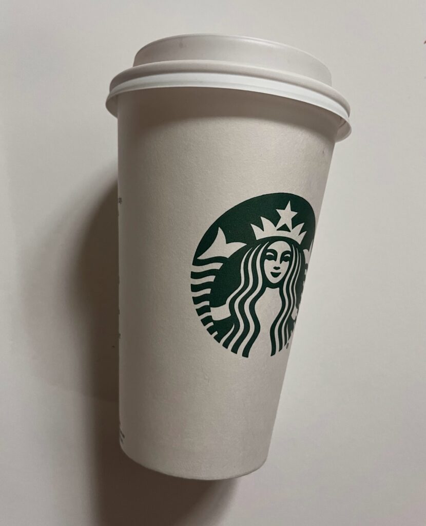
- Name the object:
Starbucks cup
- Describe the object (size, colour, material, handmade, manufactured, etc.):
White with green logo, image of a woman/mermaid with two tails as the logo and a star overhead, about 10 inches tall and 4 inches in diameter. Manufactured.
- What is the intended function(s) of the object:
To hold hot beverages, to be a symbol of relative esteem. To be a comfort when filled with a hot beverage on a cold day.
- What is the cultural context of the object?
(What era was it made? Is there a geographical connection? Is there a connection to gender, class, or a culture? Is the object taboo, a banal everyday item, or sacred, etc?)
Starbucks is considered local to Seattle but became a massive company that is now well known and can be found around the world. It’s known to be a higher class coffee shop with often expensive drinks. It’s beverages change with the seasons and with other popular trends. It is slightly more personalized as often staff will write the name of the customer on the cups. I imagine its more associated with women. Its common place and can often be found at meetings or in corporate settings due to its mass production and association with higher quality “fast food” style coffee.
- Do you have a personal connection to the object?
(Does the object conjure a memory, symbol, or reaction for you on a personal level?)
When I was a teenager I justed to spend ever lunch hour walking down a busy street in victoria, about a 10-15 min walk, to spend most of my allowance on a fancy drink. The look and esteem of holding a starbucks cup, and more so often holding the cup, was associated with higher status and capital given the drinks were often $5-$10. As I grew older I disassociated with the brand and its mass production and dominance of the market. Now, I prefer more locally owned boutique coffee shops where I can source the quality of coffee and the know my barista.
- Name the ways the object can be manipulated? (Broken, wrapped, filled, burned, stitched, etc.)
Ripped, crumpled, painted, burned, stitched, filled, wrapped.
- Mental Associations 1: Name three (3) things/elements that have a commonality or similarity to this object.
Pumpkins, Halloween, vanilla
- Mental Associations 2: Name three (3) things/elements that are opposite or in contrast to this object.
Trailer parks, Local businesses, activism
Object #4
- Name the object:
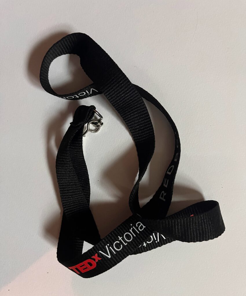
Laniard (TedX Victoria)
- Describe the object (size, colour, material, handmade, manufactured, etc.):
Black fabric, long, with writing that is red and white stating “TedX Victoria”. Metal connection point/ clasp at the end to attached to a name tag or key chain.
- What is the intended function(s) of the object:
To attached a name tag or key around the neck.
- What is the cultural context of the object?
(What era was it made? Is there a geographical connection? Is there a connection to gender, class, or a culture? Is the object taboo, a banal everyday item, or sacred, etc?)
Contemporary, globally used at corporate functions and events, No gender association, often branded with event name and sponsors.
- Do you have a personal connection to the object?
(Does the object conjure a memory, symbol, or reaction for you on a personal level?)
I got this laniard at a Ted Talk, my first in person ted talk, I’ve ever attended. It was a one year anniversary event I went to with my boyfriend at the time. I use it to keep track of my keys.
- Name the ways the object can be manipulated? (Broken, wrapped, filled, burned, stitched, etc.)
Cut, wrapped, burned, sticked, painted.
- Mental Associations 1: Name three (3) things/elements that have a commonality or similarity to this object.
Corporate events, speakers, intellectual persuits
- Mental Associations 2: Name three (3) things/elements that are opposite or in contrast to this object.
Trailer parks, Macdonalds, rivers
Object #5
- Name the object:
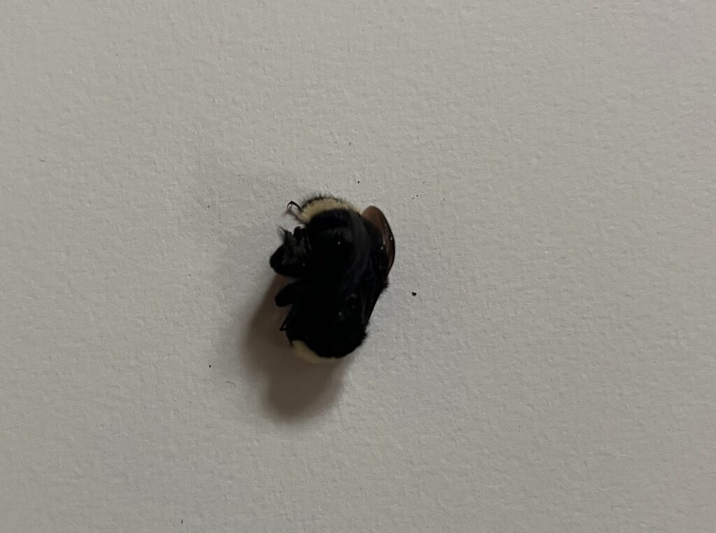
Dead bumble bee
- Describe the object (size, colour, material, handmade, manufactured, etc.):
1 cm x 2 cm x 1 cm, fuzzy black and yellow, organic, small, delicate/fragile, legs are a bit sticky
- What is the intended function(s) of the object:
To be a living creature with inherent value. To live in a colony as part of a society. To pollinate plants among many other incredible ecosystem functions unknown to me!
- What is the cultural context of the object?
(What era was it made? Is there a geographical connection? Is there a connection to gender, class, or a culture? Is the object taboo, a banal everyday item, or sacred, etc?)
Short lifespan but has been around since the era of flowering plants (assumption) in the Jurassic period. Often a symbol of healthy fertile farmlands. No gender association. Becoming more rare. Could also be associated with naturalistic or more environmentally inclined or food inclined communities.
- Do you have a personal connection to the object?
(Does the object conjure a memory, symbol, or reaction for you on a personal level?)
About a year and a half ago I attended a meadow making course, designed to help local people create and restore native meadow ecosystems. Learning about bees and pollinators, especially native bees, was an important part of the course.
- Name the ways the object can be manipulated? (Broken, wrapped, filled, burned, stitched, etc.)
Crushed, wrapped, burned
- Mental Associations 1: Name three (3) things/elements that have a commonality or similarity to this object.
Honey, honeycombes, flowers
- Mental Associations 2: Name three (3) things/elements that are opposite or in contrast to this object.
Industrial revolution, Pesticides, outer space
Mash Up Brainstorm


Mash Up Objects
Mash Up Narrative Stories
The itsy bitsy spider went up the spout again
As she climbed up to the light, she lost her sight of friends
Entangled in the web of community threads
The web became the trap, false stories in the end.
Growing up I always felt a sense of separation from the world around me. Never seemed to truly fit in. Friends didn’t feel genuine. Most of life seemed like wearing a masque – just trying to fit in. Then, in grade 11, I took the class “Comparative Civilizations” where I was exposed to the works of Plato and Aristotle. For some reason, their questions around the meaning of life and suffering made me feel like I wasn’t alone. It gave me a sense of relief. For the first time I felt a sense of closeness with others through s questioning ideas. I began to associate the sharing of ideas with a sense of belonging, and community.
The best laid plans fail. Better to embrace the messiness of it all. Breath deep and smile at the wisdom imparted.
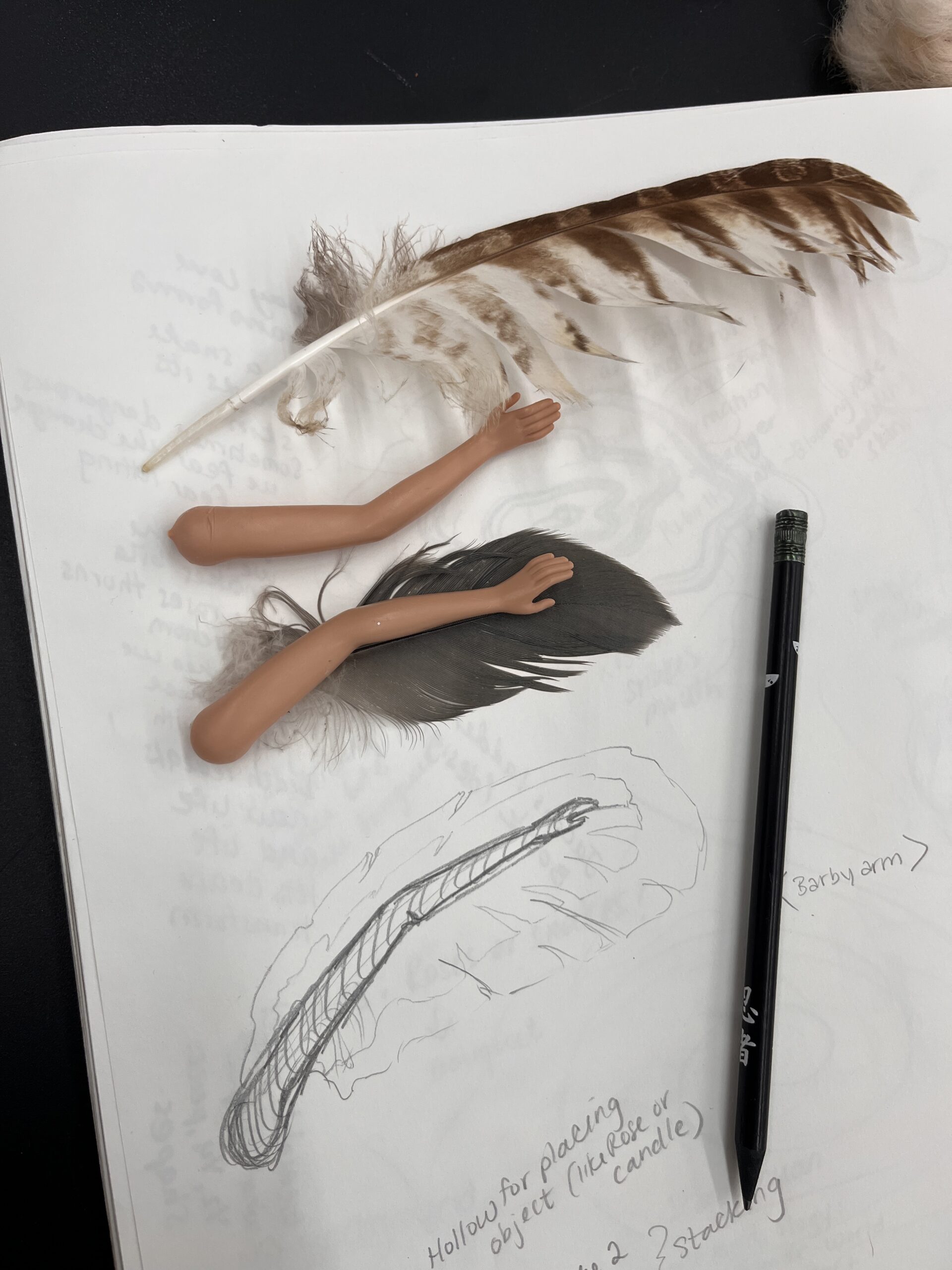
Assemblage Project Brainstorm
Idea 1: Crushed can connection
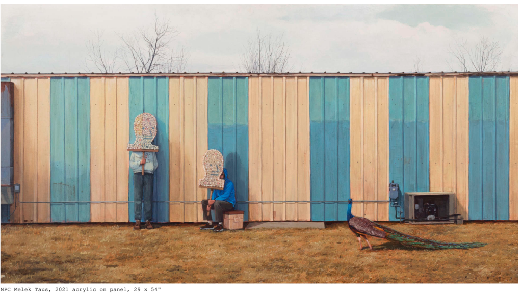
Concept idea: drawing on the work of Pat Perry for inspiration where in his painting he has an image of two humans looking at a peacock covering their faces with large cutout signs of human faces. Drawing on this theme of representing humans with objects, I would create two humans in conversation, perhaps sitting at a table, but their shapes would be made of crushed cans. Leaving space to see through the forms to create a sense of hollowness in the imagery. This would show the way that this society way of building connection is hollow and doesn’t truly represent the humans engaging one another, but rather an image of the person. To incorporate another object of “assemblage” they could be holding an object?
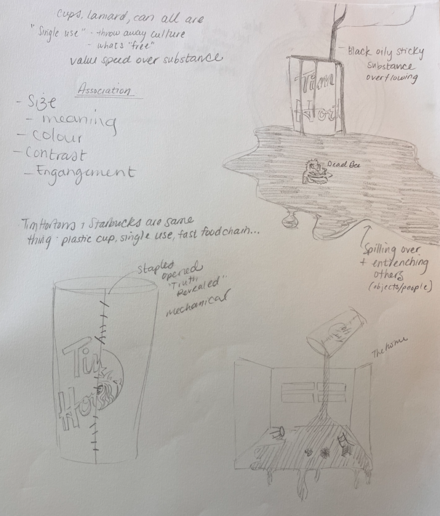
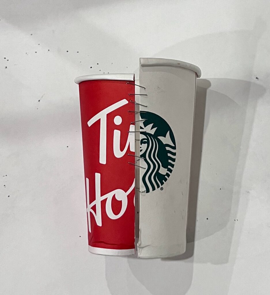
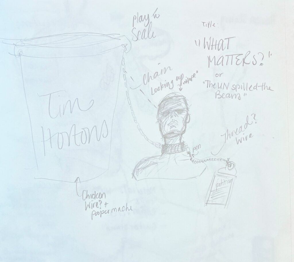
Idea 2: Tim Hortons cup – disposable people
- Inspiration: UN Report on modern slavery
- Engagement idea: place art outside Tim Hortons with petition
- Concept:
- Idea 1: Create Tim Hortons disposable cup overflowing with molasses, with objects of value becoming stuck in the overflowing sticky dark substance. representations/symbols of humans/humanity, human rights, inclusivity etc.
- Idea 2: Create a large human form (at least twice the size of an actual human) out of paper cups. Drawing inspiration from Tara Donavan, use every day object to create larger than life representation of another image. In this case, the red and white cup of the Tim Hortons in the shape of a human being shackled/in bondage. Communicating the ways we are creating slavery through late stage capitalistic approaches and disposing of the humans, like the disposable cup
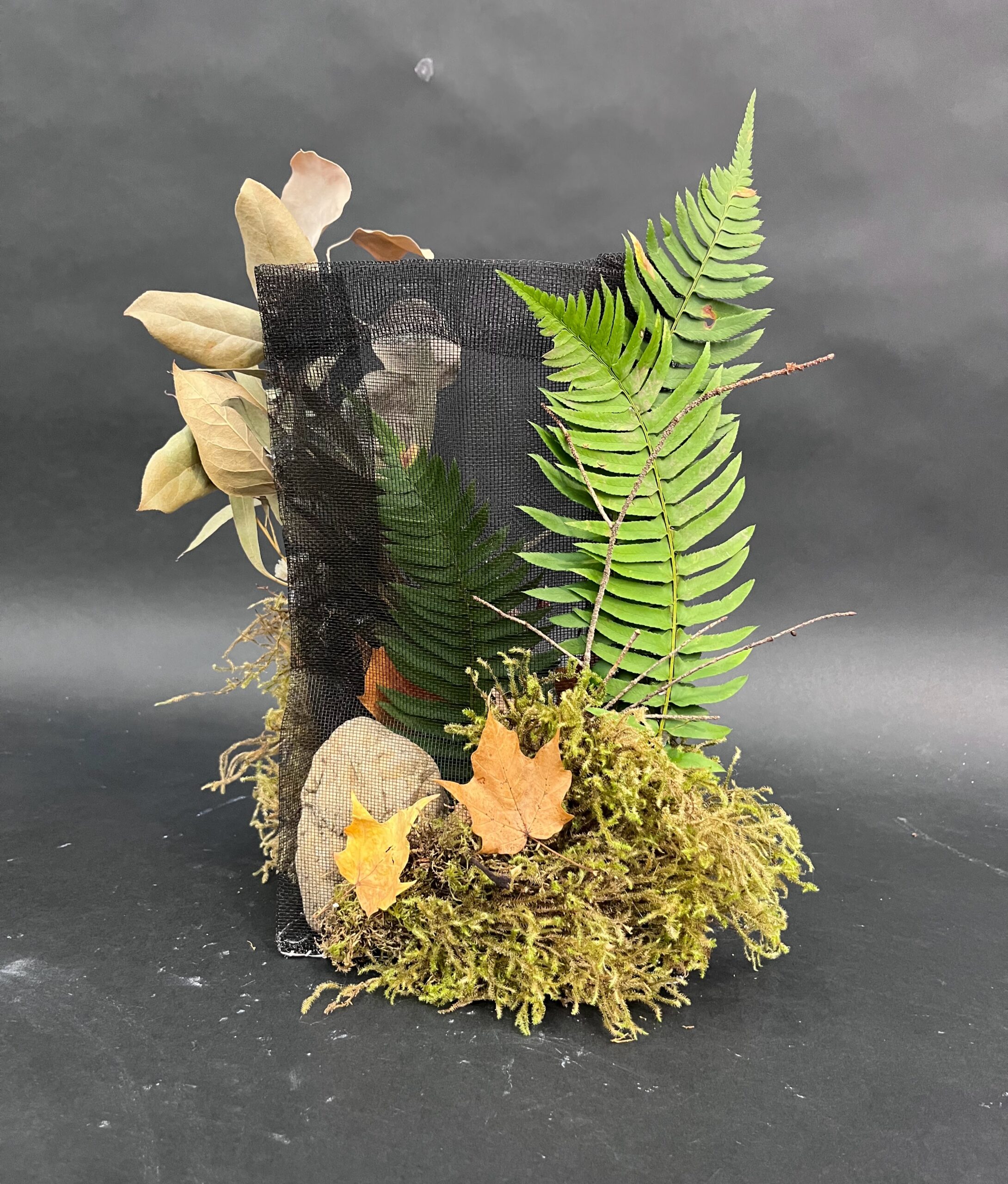
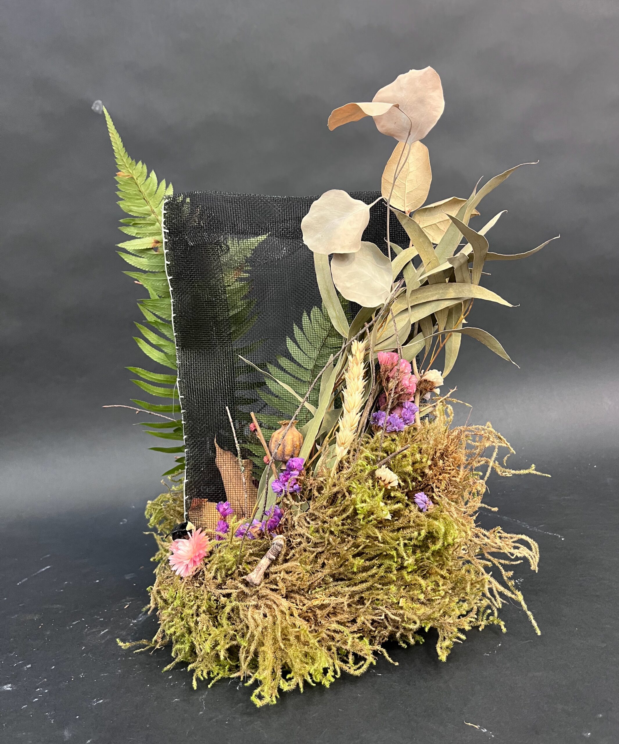
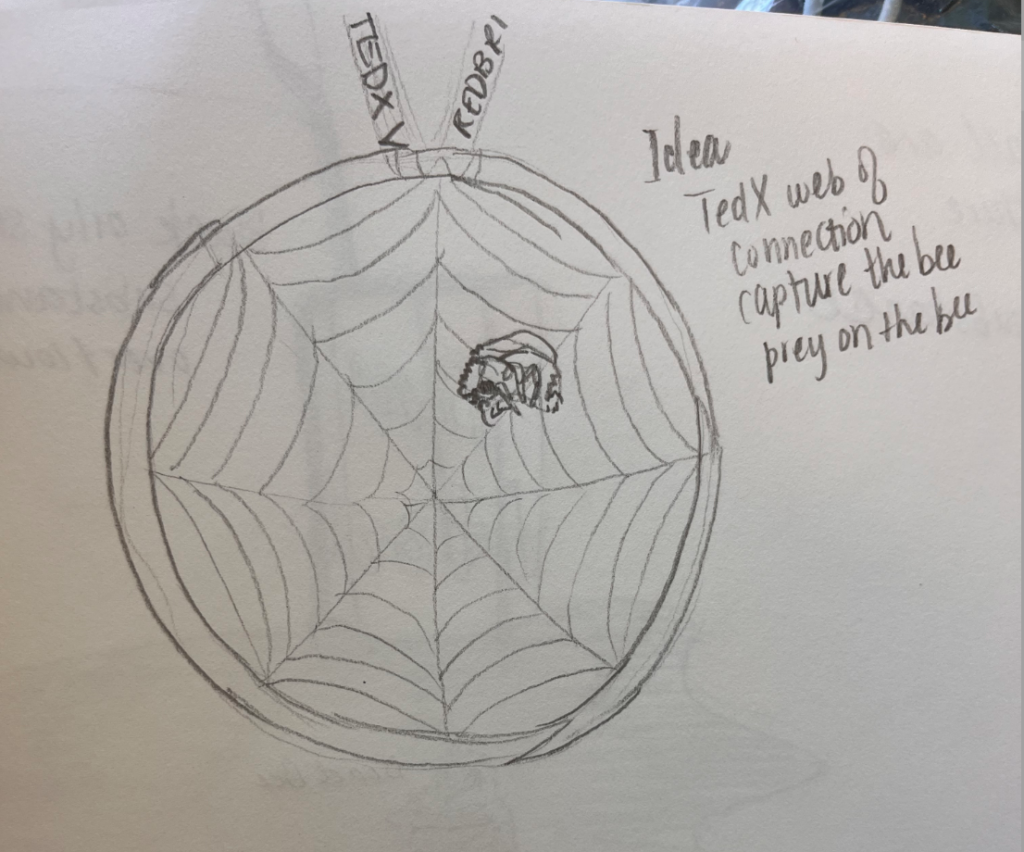
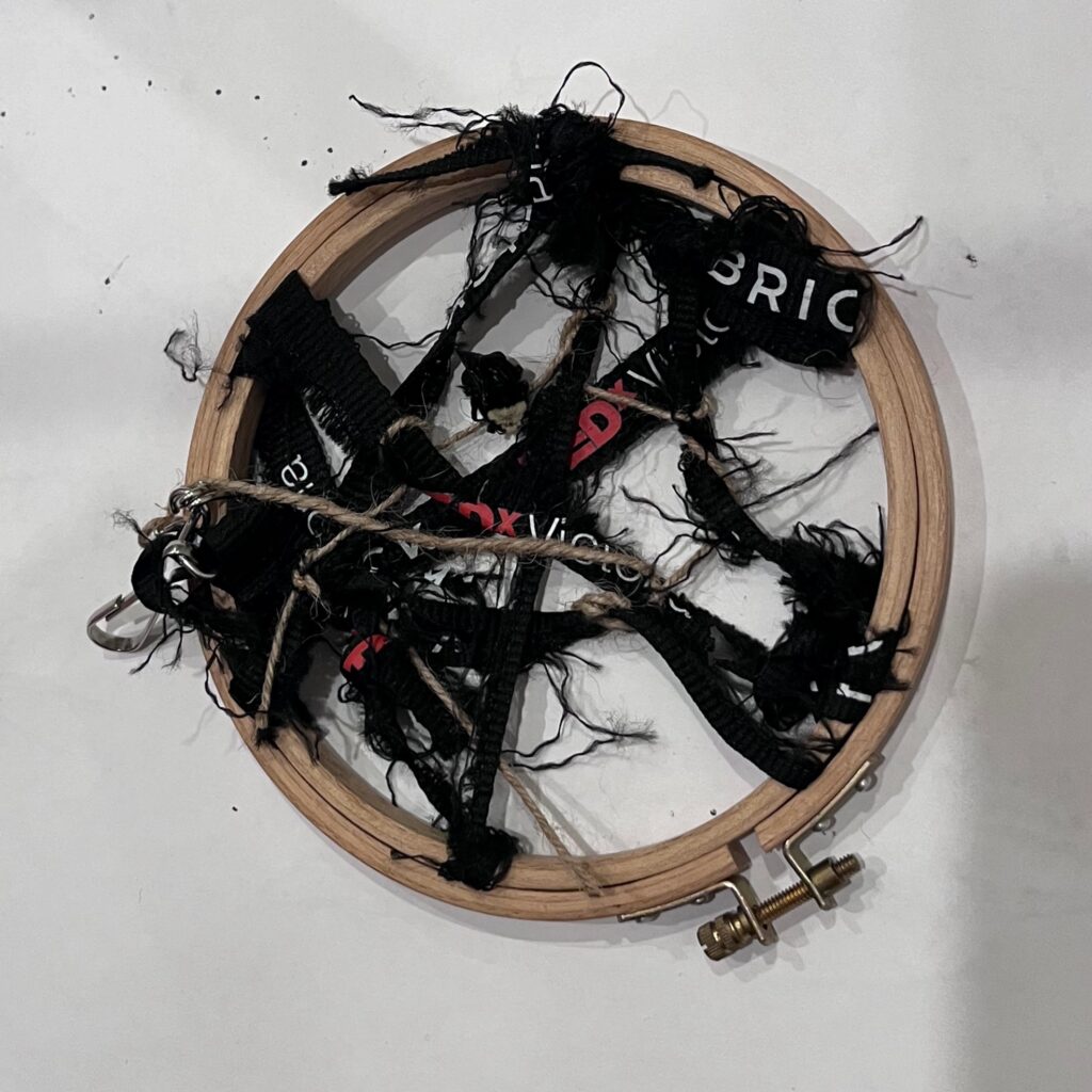
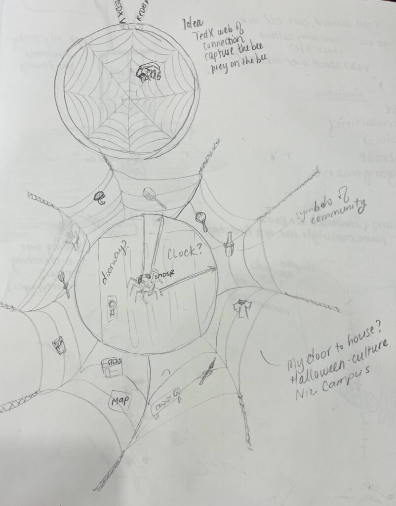
Idea 3: Web of connection: exploring context for community
- Concept:
- Exploring what community means in our modern society. How do we build authentic connection in artificial environments. How do build trust and connection and a sense of shared identity in a way that is authentic, in a world that is wrought with inauthenticity.
- Starting with the frame of a embroidery hoop, start to create a spiders web that then extends beyond the frame of the hoop and grows into the surrounding space. Using fabrics woven from symbols that represent connection like brand name clothing, lanyards from conference events like TedX, shoe laces, and other woven materials that can be deconstructed to make an entanglement of webbing. Within this webbing, objects representing self, personhood and authetic relating are entangled within the web, caught up and separated in space through the context of the web in which is it is held
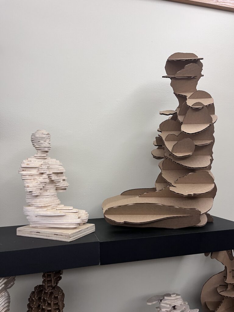
Artist Research – Tara Donavan
Research Project: Tara Donavan
- Where were they born? Where did they grow up? Where do they live now? Where did they study art? Or are they self-taught?
- Born in 1969 in Queens, NY, Donovan received her BFA from the Corcoran College of Art and Design in Washington D.C. and her MFA from Virginia Commonwealth University. (source: https://www.artnet.com/artists/tara-donovan/)
- What kind of art do they make?
- a contemporary American artist best known for her site-specific installations. Employing disposable materials such as Scotch tape, toothpicks, drinking straws, and Styrofoam cups, she creates forms resembling biological masses. “It is not like I’m trying to simulate nature. It’s more of a mimicking of the way of nature, the way things actually grow,” the artist’s said. (source: https://www.artnet.com/artists/tara-donovan/)

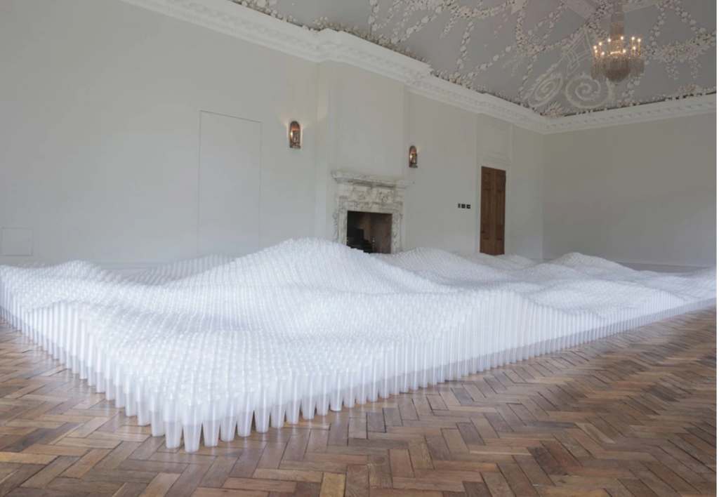
‘Untitled (Plastic Cups)’ is photographed at Jupiter Artland, a sculptural garden and art gallery close to Edinburgh.
- What are the formal aspects of their work (size, colour, materials, texture, value, composition, genre, style, etc)?
- Composed of 500,000 plastic cups
- Stacking cups in varying heights to create geographical landscape taking up a large portion of the gallery space
- Plastic cups are white and translucent and neatly arranged into a rectangular border shape drawing the eye to the top of the cups where the varying depths of stacked cups mimc mountains and valleys, flowing water, or cloud cover.
- The repetition of the simple one-type of cup emphasized the shape and scale
- Taking up a large portion of the room, the structure creates a sense of mass, from an object that is nearly massless until holding a liquid. In this way she’s taken an object that holds liquid and has turned it into a representation of liquid, perhaps in the shape of a cloud (vapour) or the waves of a body of water.
- How do these formal aspects affect how you “read” the artwork?
- I see a juxtaposition of a disposable or “throw away” cup into an object of value and significants (weather patterns, water, land)
- I see the juxtaposition of something transparent and hollow into something that is massive and substantial
- These juxtapositions make the viewer (myself) consider how the repetition of an object, and the careful consideration of that object can transforms its meaning and significance. I’m also struck thought of so many cups being discarded and through the knowledge that many throw-away objects find their ways into bodies of water as pollutants, I imagine the artist is drawing attention to the impact that has on our environment.
- What materials and methods might they be using to make these works?
- She’s stacking the cups at various heights to create a realistic geographical form.
- I imagine she mights be using a software program to measure the heights of a desired subject mater and then taking the measurements of the cups she might be able to mathematically equate the number of cups.
- I image she might also set down a grid to match the digital image and calculation into the physical space of the room to help with the construction of the body of the work.
- What emotions does the work elicit for you?
- I feel a sense of awe and wonder
- A sense of airy, lightness
- What ideas does the work cultivate, or questions does the work ask you to consider?
- How can I flip the meaning of an object i.e. from empty to full, from something that holds to something that is held, from something that is disposable to something that is essential
- Is there anything about this artist’s work that interests you? What and why? If not, can you articulate why that is? What is missing for you?
- I am interested in the impact of utilizing common objects and creating new meaning through repetition.
- I’m also impressed by the sense of scale and beauty that she can elicit from otherwise mundane and smaller objects
- Normally I’m attracted to works that utilizing colour and have a range of diversity in the works, but Tara Donavan is found another way to entice the eye through her choice of subject matter and assemblage.
- Is there anything about this artist’s work that you can carry over into your own art practice? What in particular?
- I’d like to incorporate the repetition and play with scale
https://www.artnet.com/artists/tara-donovan/)
Oblique Strategies – by Ash
- Change the scale
- Repeat an element of the work. Do it again.
- Stop and write a poem about the work (so far)
Appropriation Video
- Appropriation: artists using pre-existing objects.
- Borrowing, copying and altering images and/or objects that already exist
- “visual sampling”
- Existed throughout art history and in music, fashion, tv, film, advertising
- art is “mimesis” – Mimesis is the process of imitation or mimicry
- plato defined art as an imitation of the visible world
- Copying is a useful way of training. Students are often encouraged to do so.
- Mimicry can also be used as a tool to encourage the ready to notice the differences
Recontextualization:
- To appropriate is to take possession of something
- Appropriate artists what the view to recognize the images they copy
- They hope the viewer will bring all of their associations with the image/object
- The deliberate “borrowing” of an image for a new context is called “recontextualisation.
Appropriate: to make or make use without authority or right: about originality/stealing, ownership, and originality
Surrealism: shocking or challenging peoples existing ideas of an object
Dadaism: uses satire to open social dialogue on politics of the time
Cultural Appropriation:
- taking over of creative or artistic forms, themes, or practices by one cultural group from another
- Does not include sharing of culture
- often reflects. a racialised power imbalance between two cultures and connotes cultural exploitation and dominance
- Disregards the sacred meanings and stories associated with those practices or items that are taken. It separates people, their history, lived experience and cultural symbols.
Cultural jamming: is a tactic to disrupt media culture and mainstream cultural institutions, including corporate advertising. Also referred to as “subvertising” satirizing media and branding. Eg. Coke Salish by Sonny Assu okay because it is a marginalized group utilizing imagery from a big corporation? and satirical? could coca cola not sue for that?
Mash Up : an end product that integrates elements from two or more sources
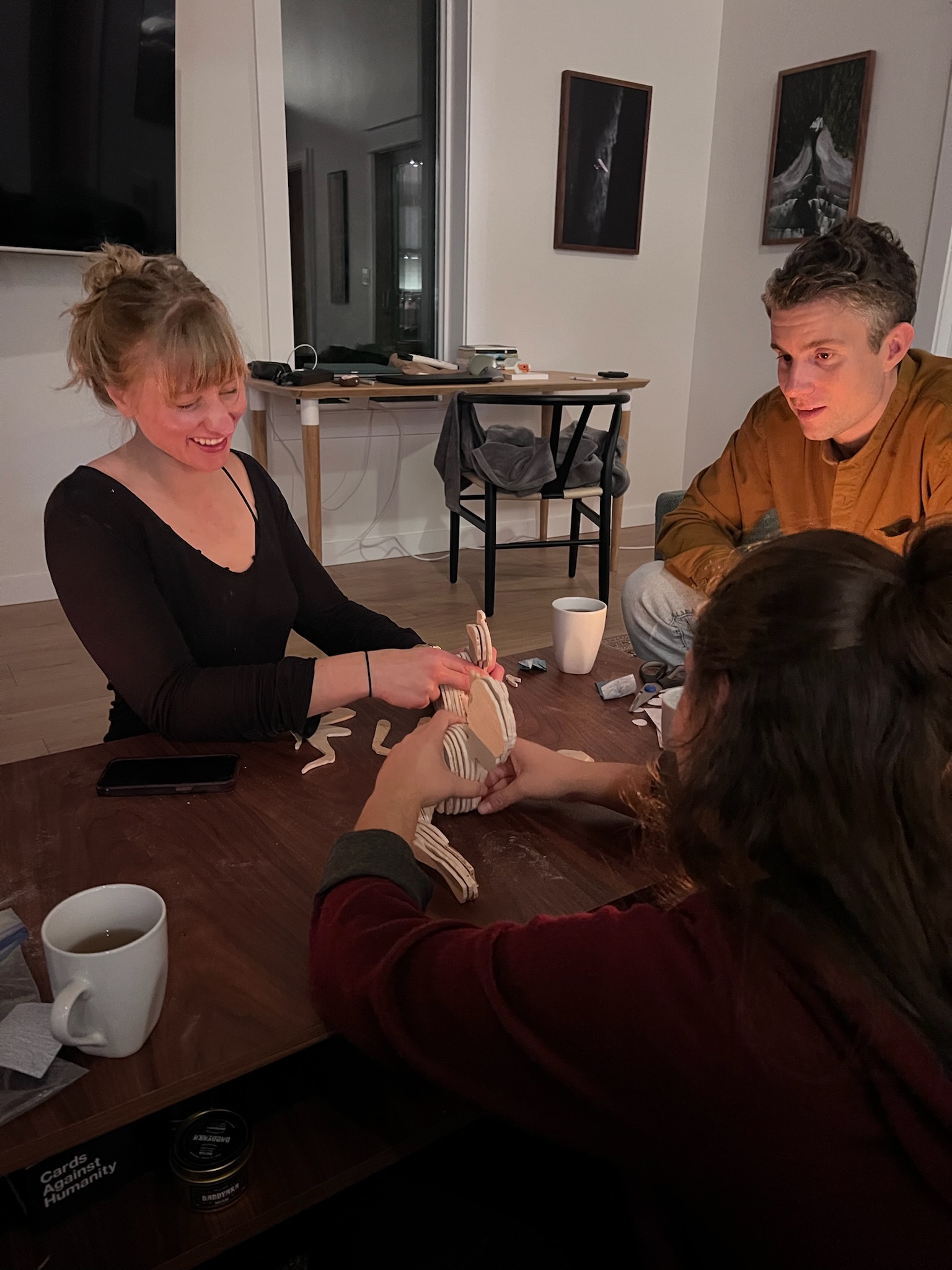
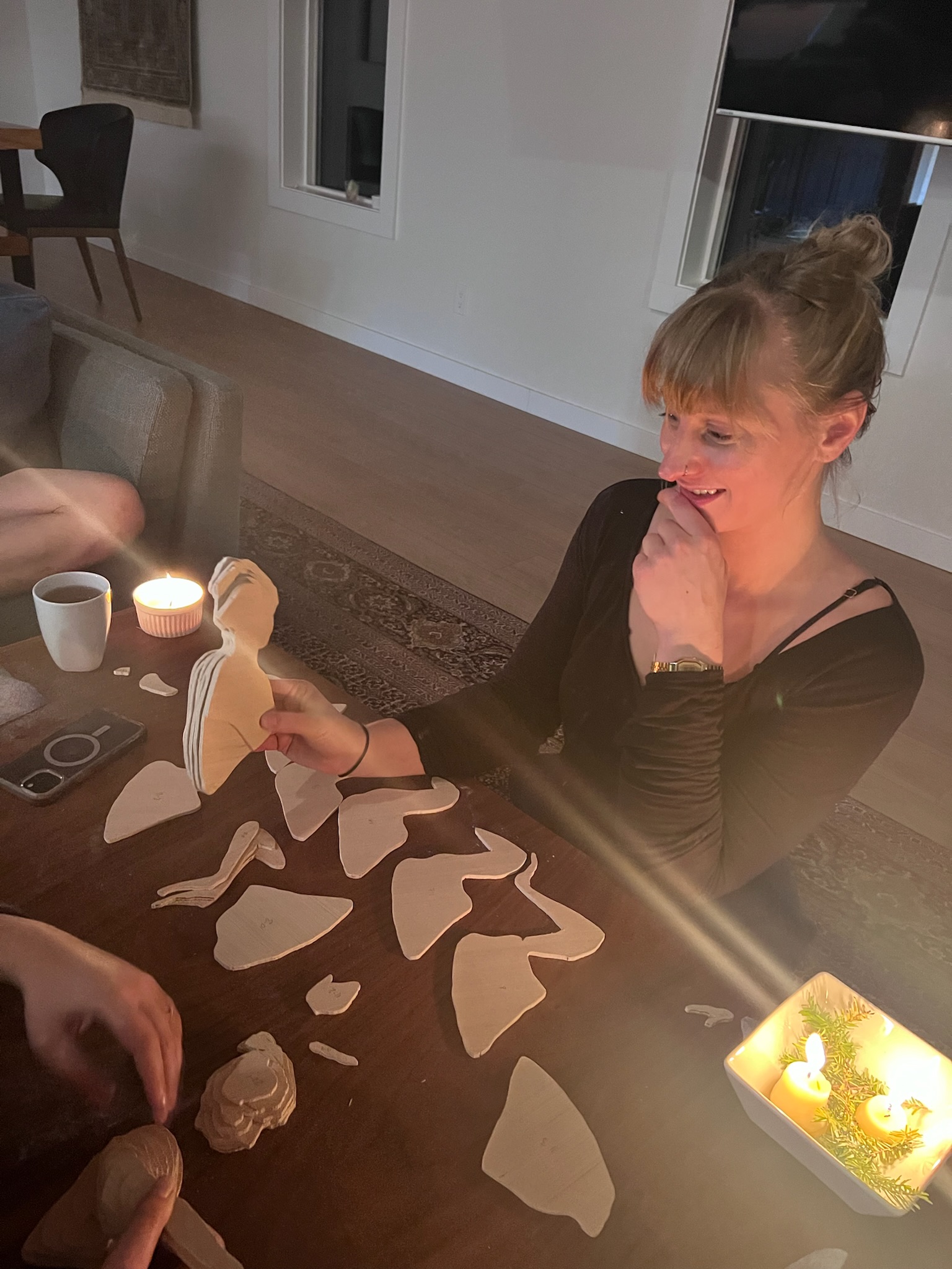
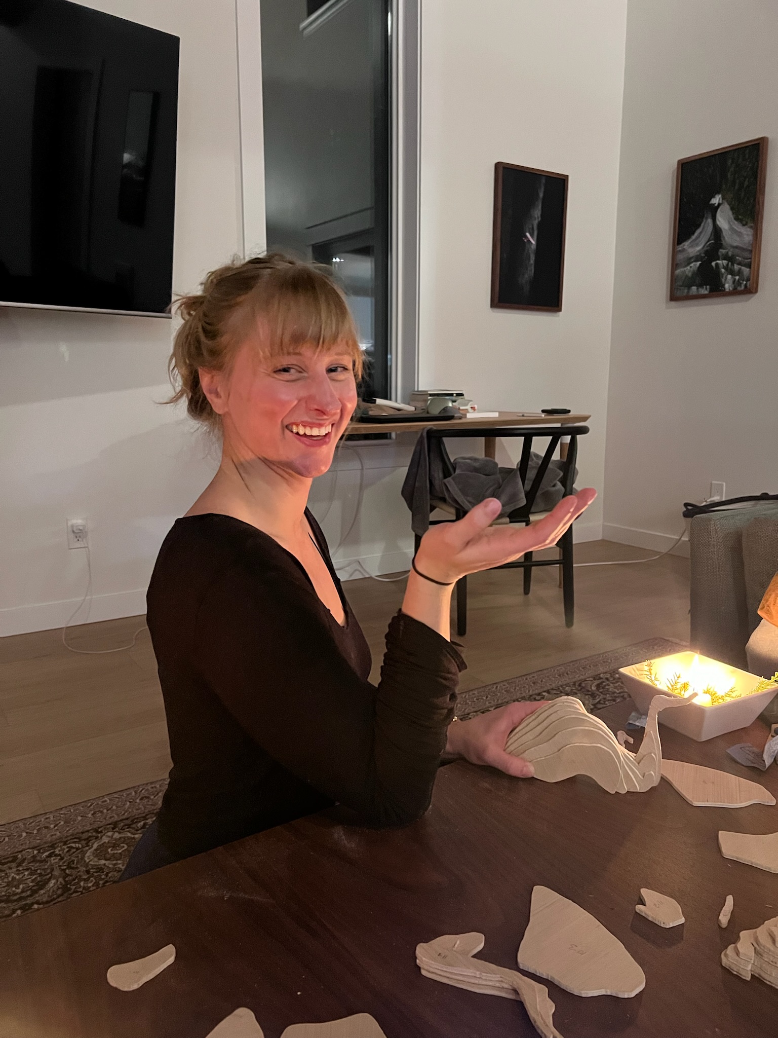
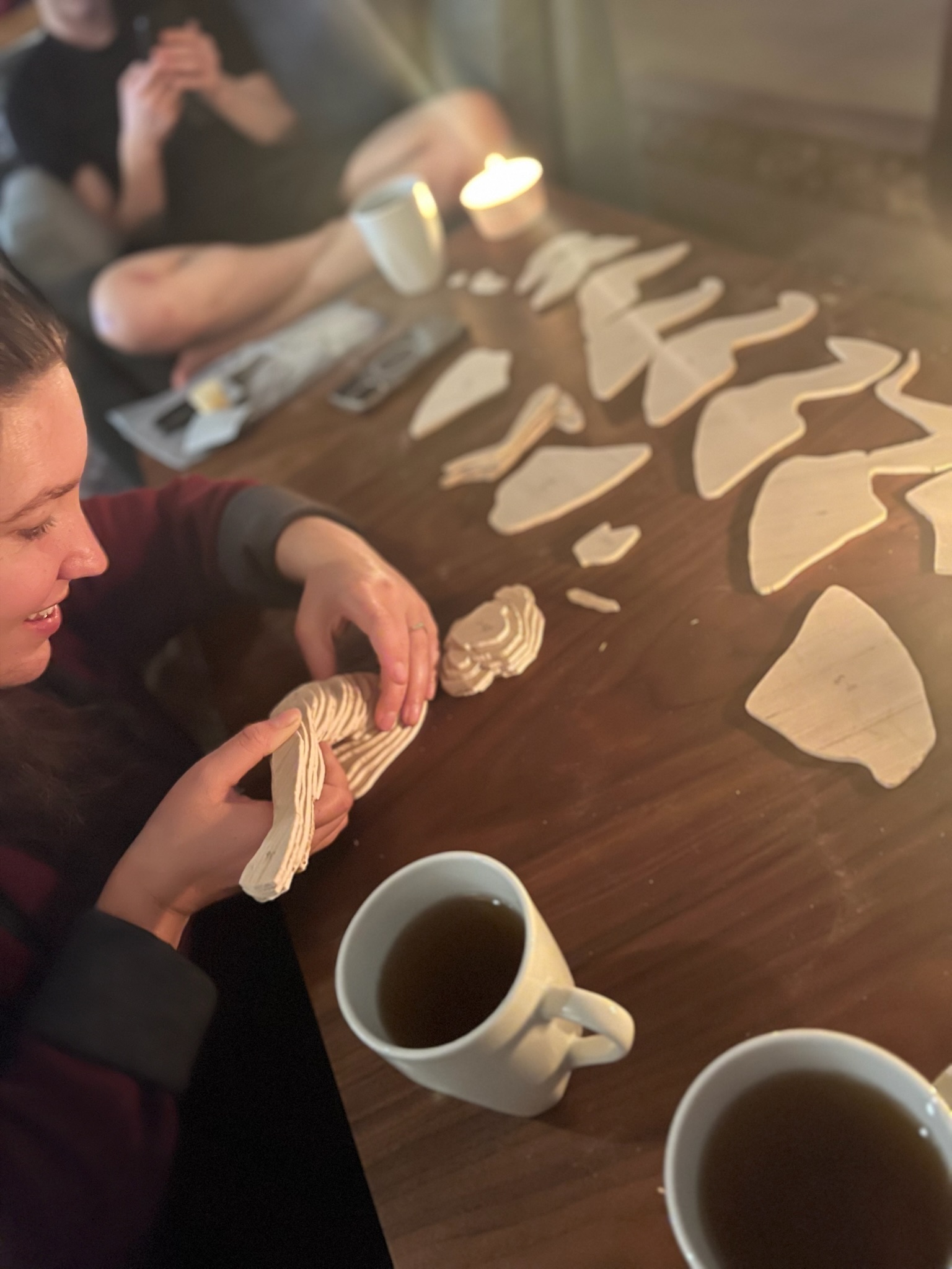
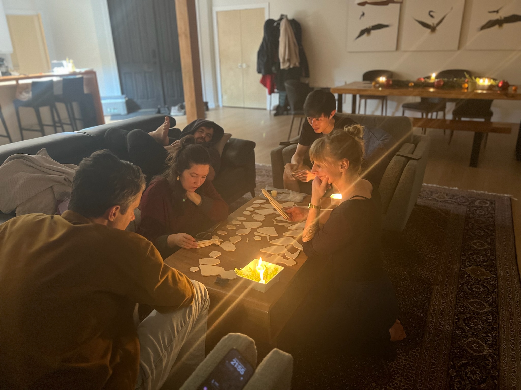
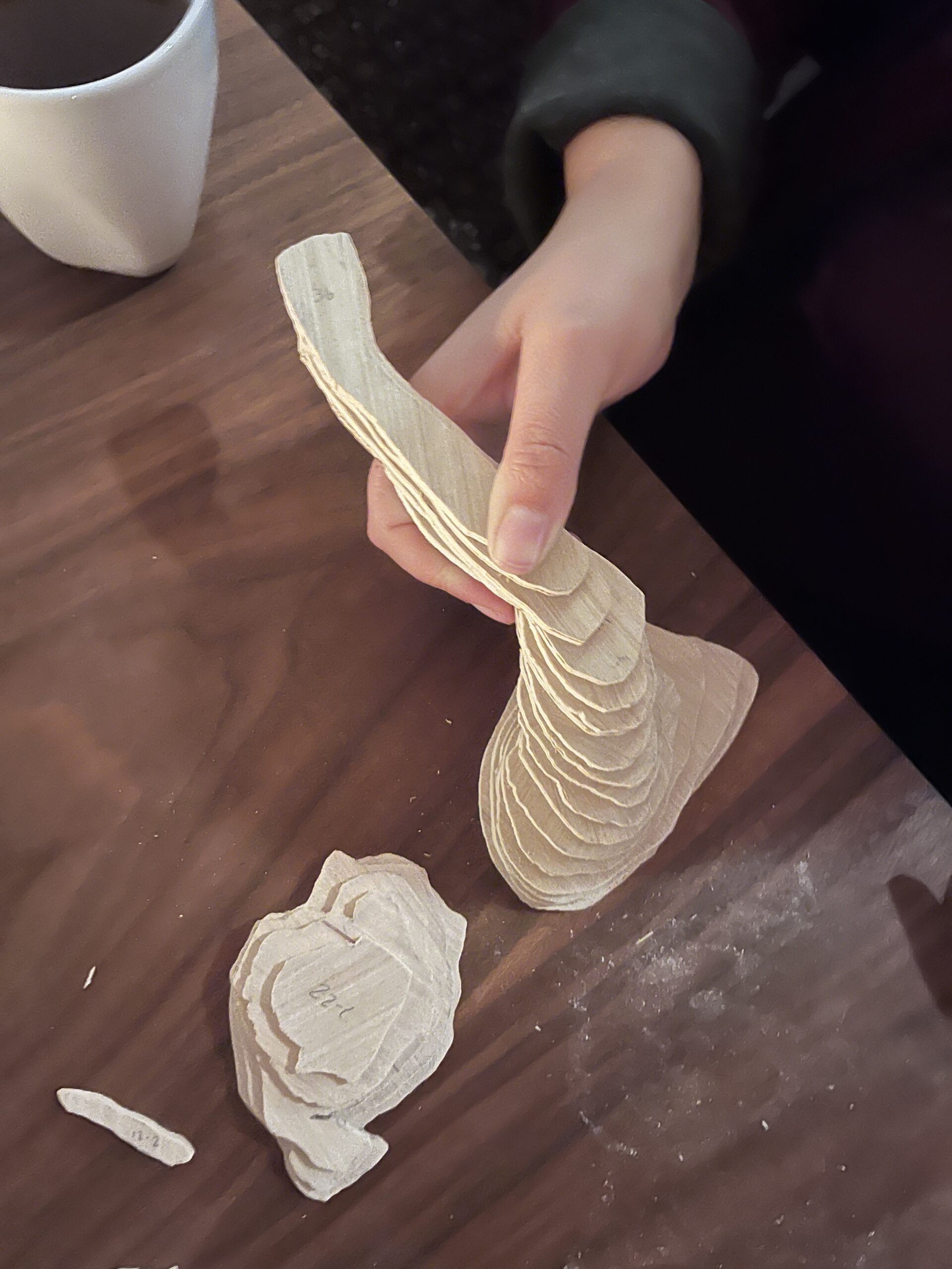
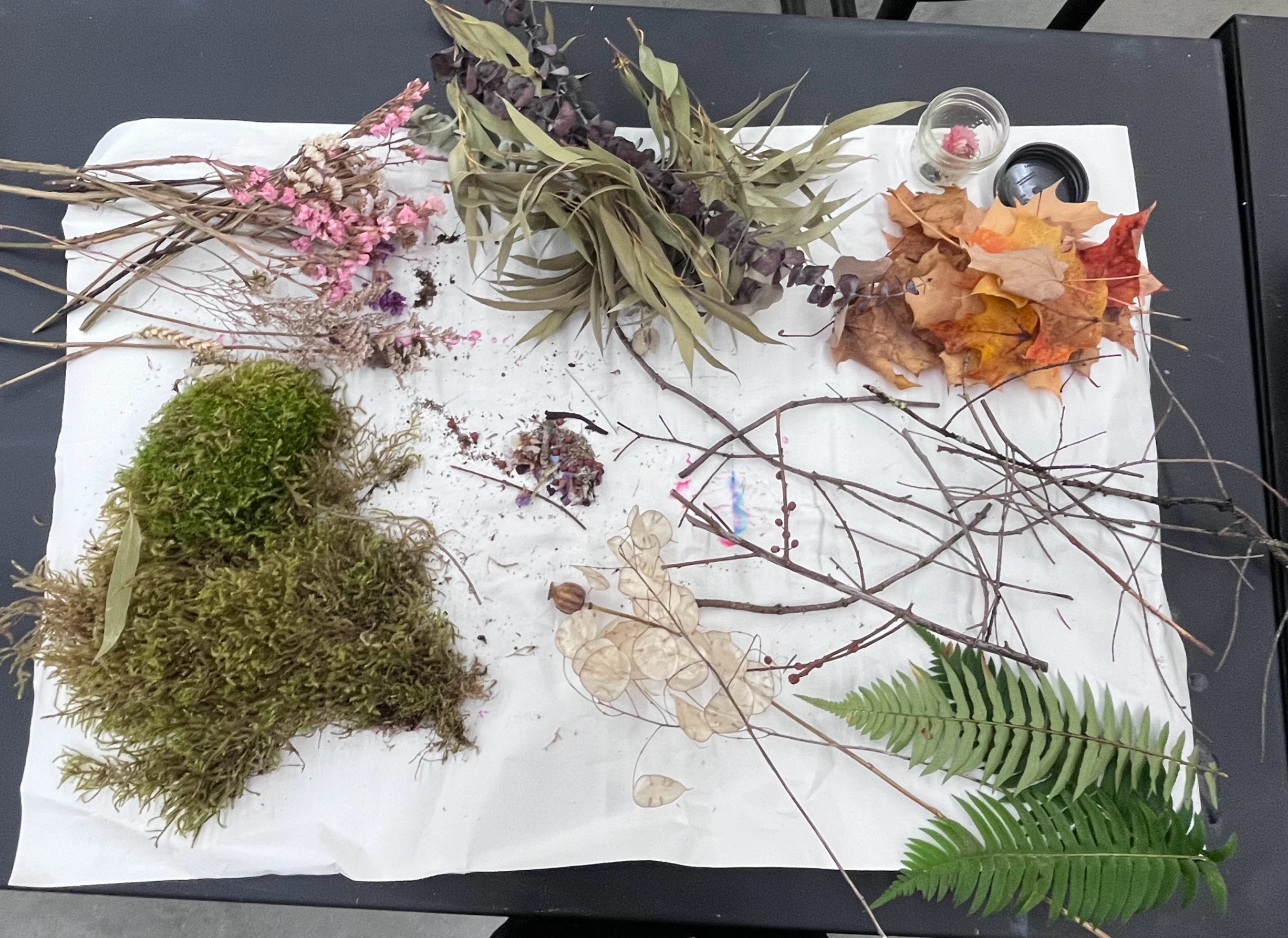
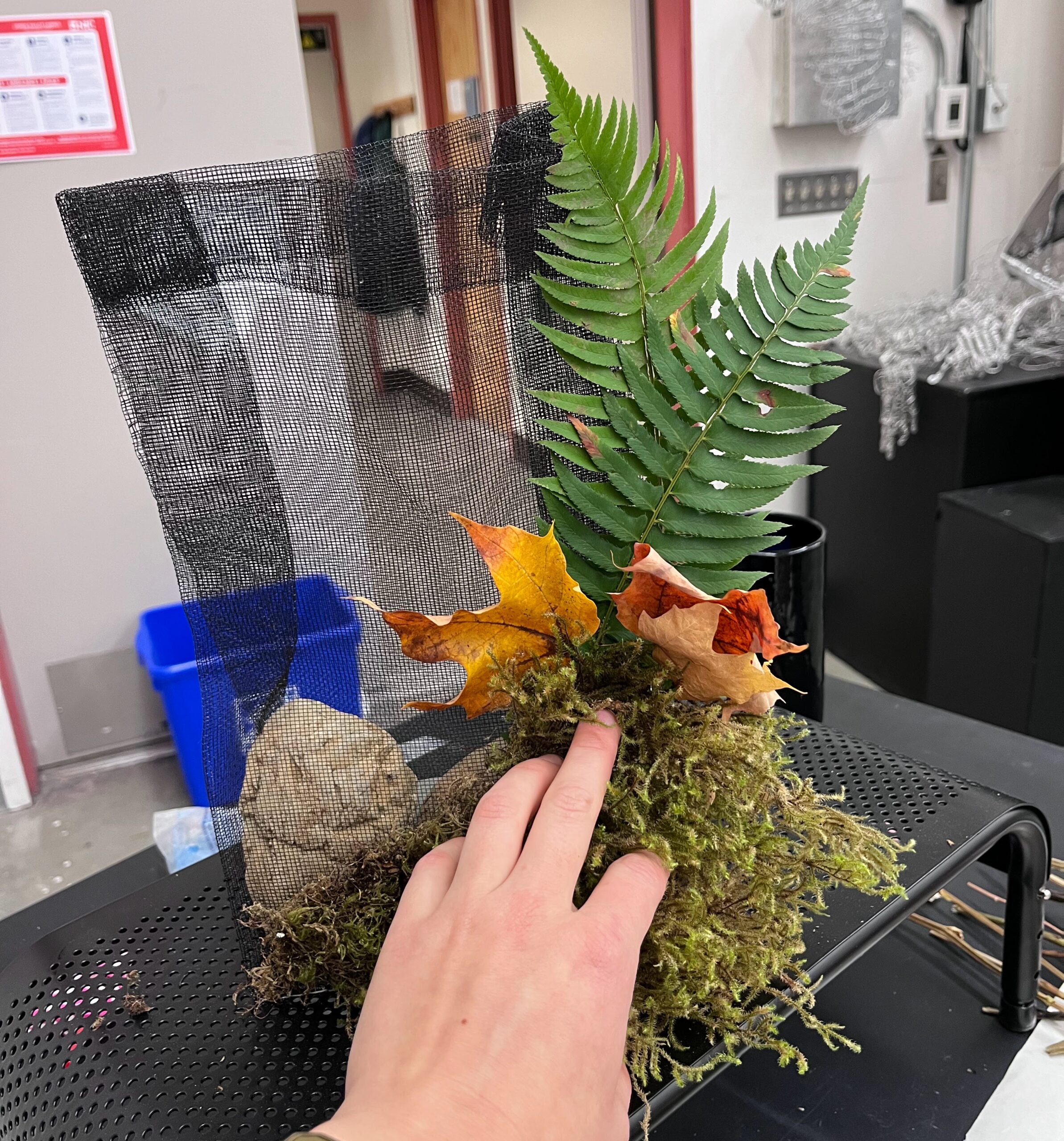
Assemblage Project Work in Process
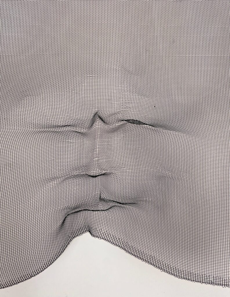
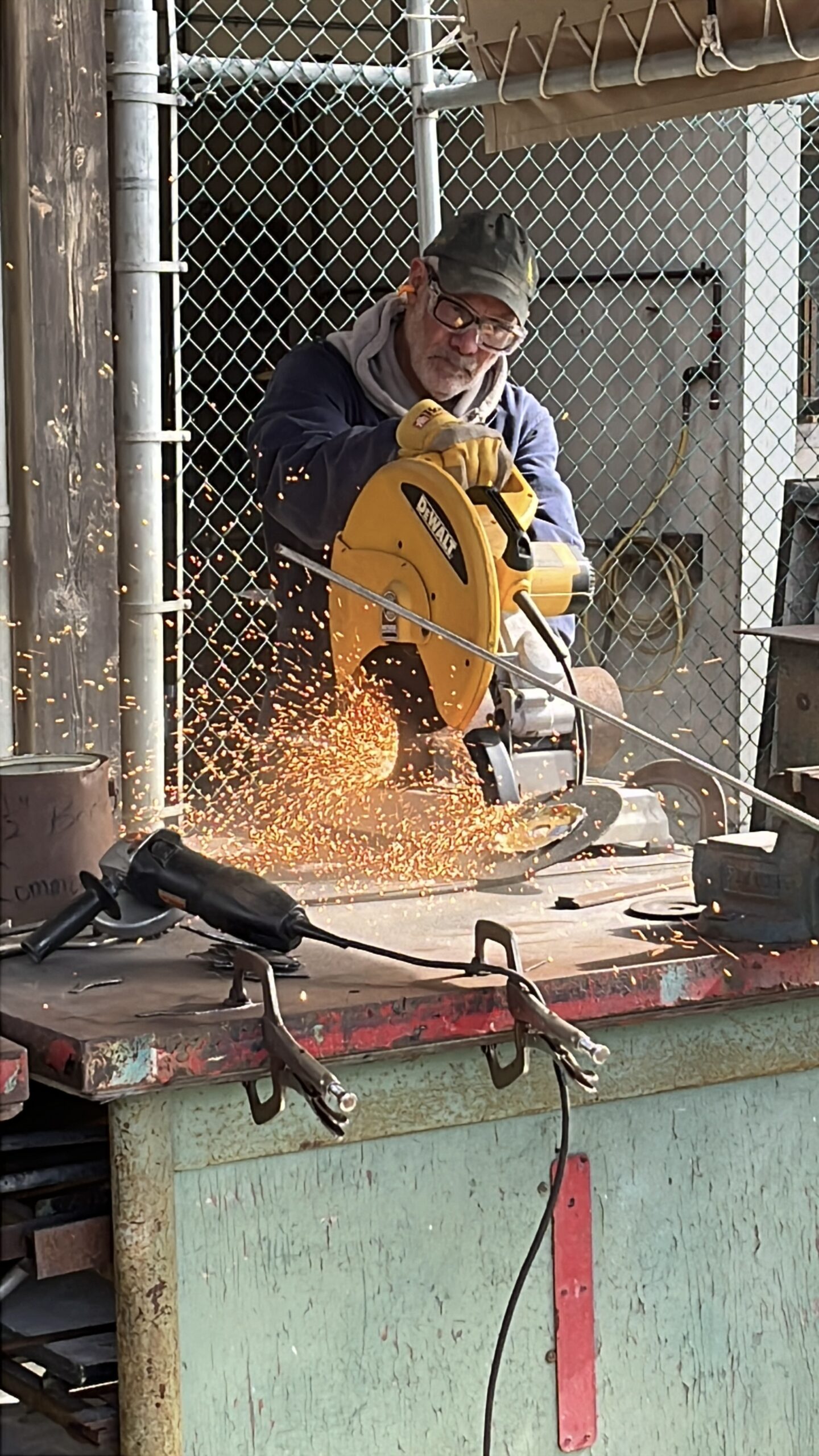
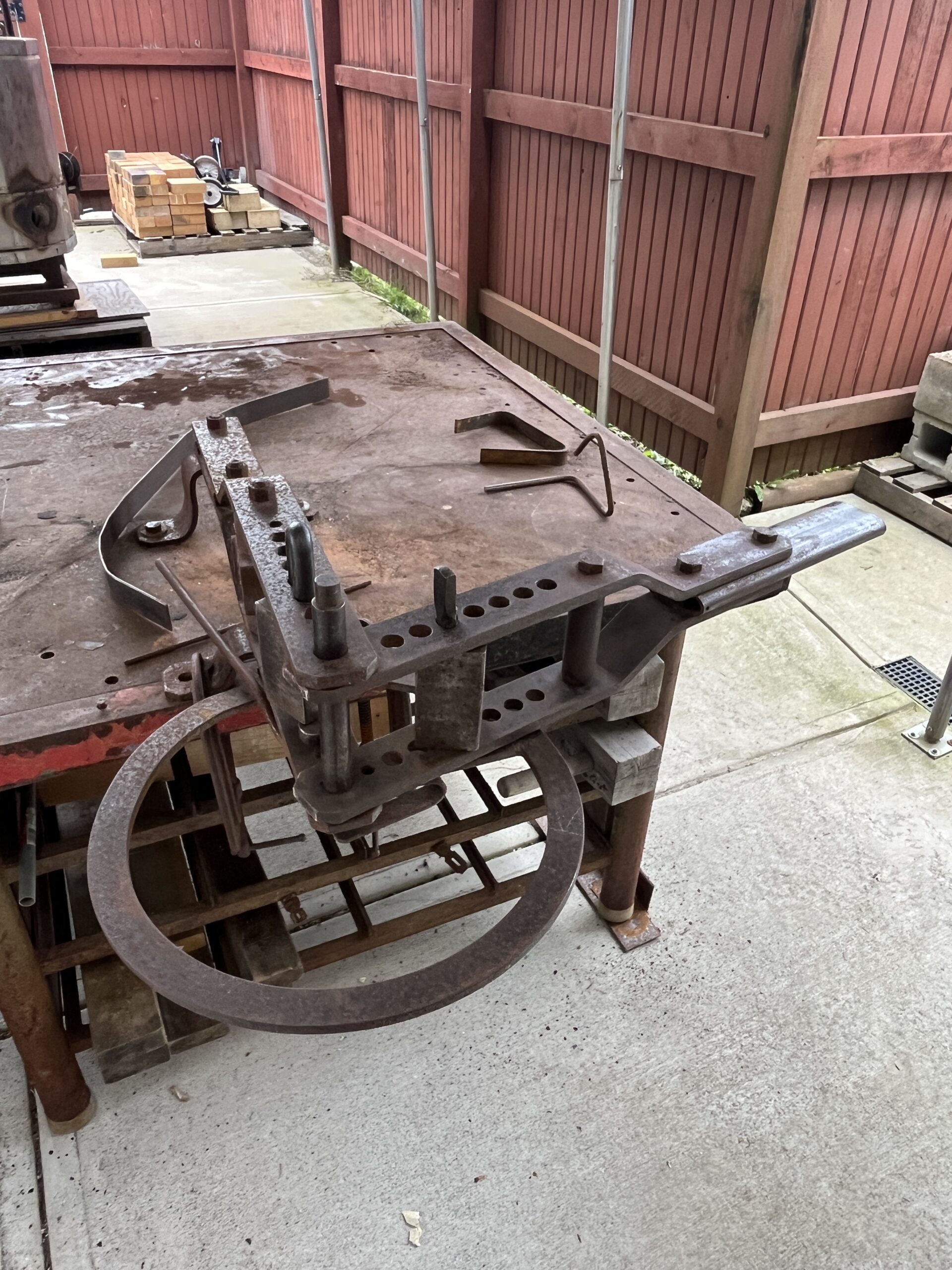
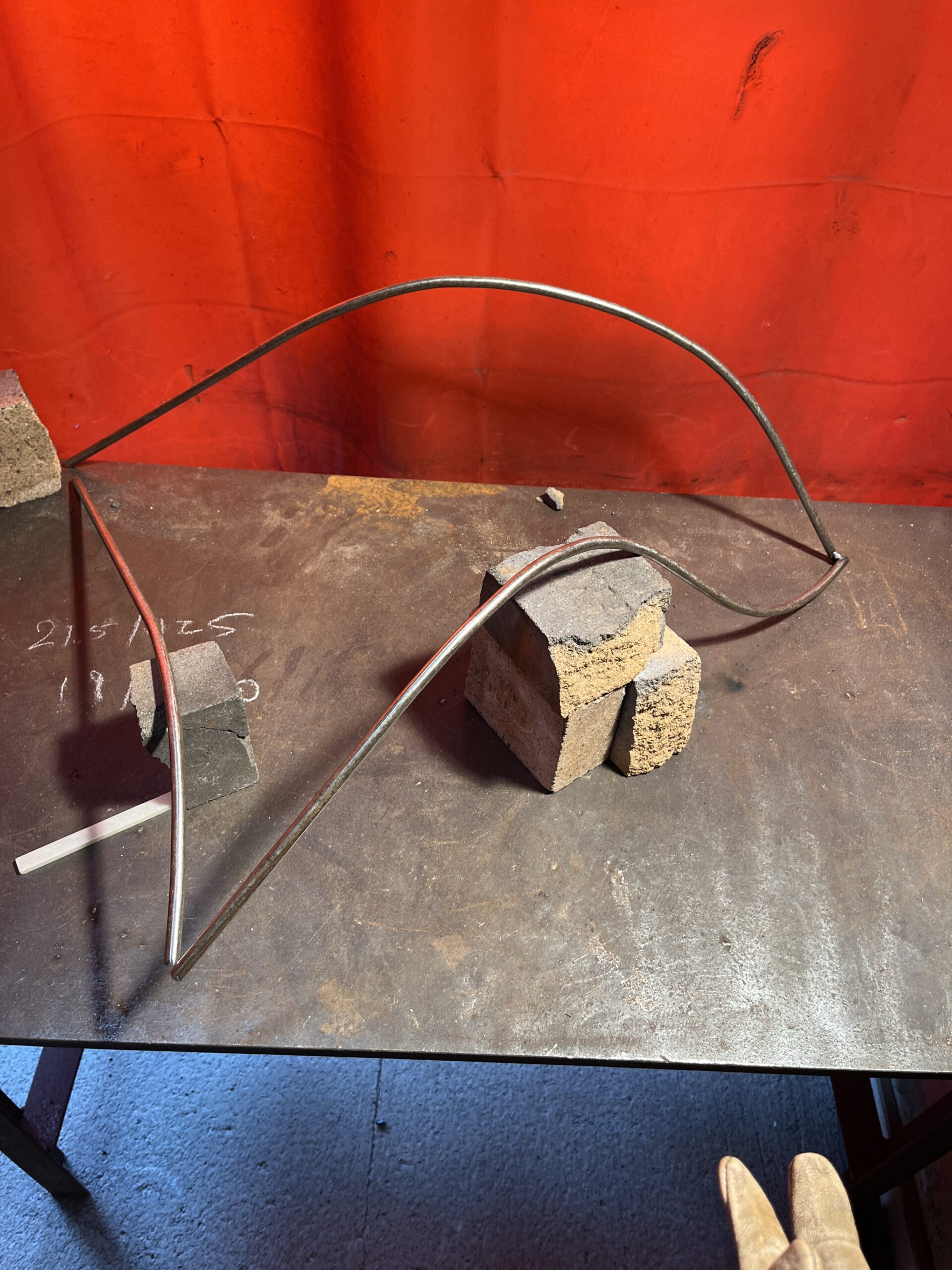
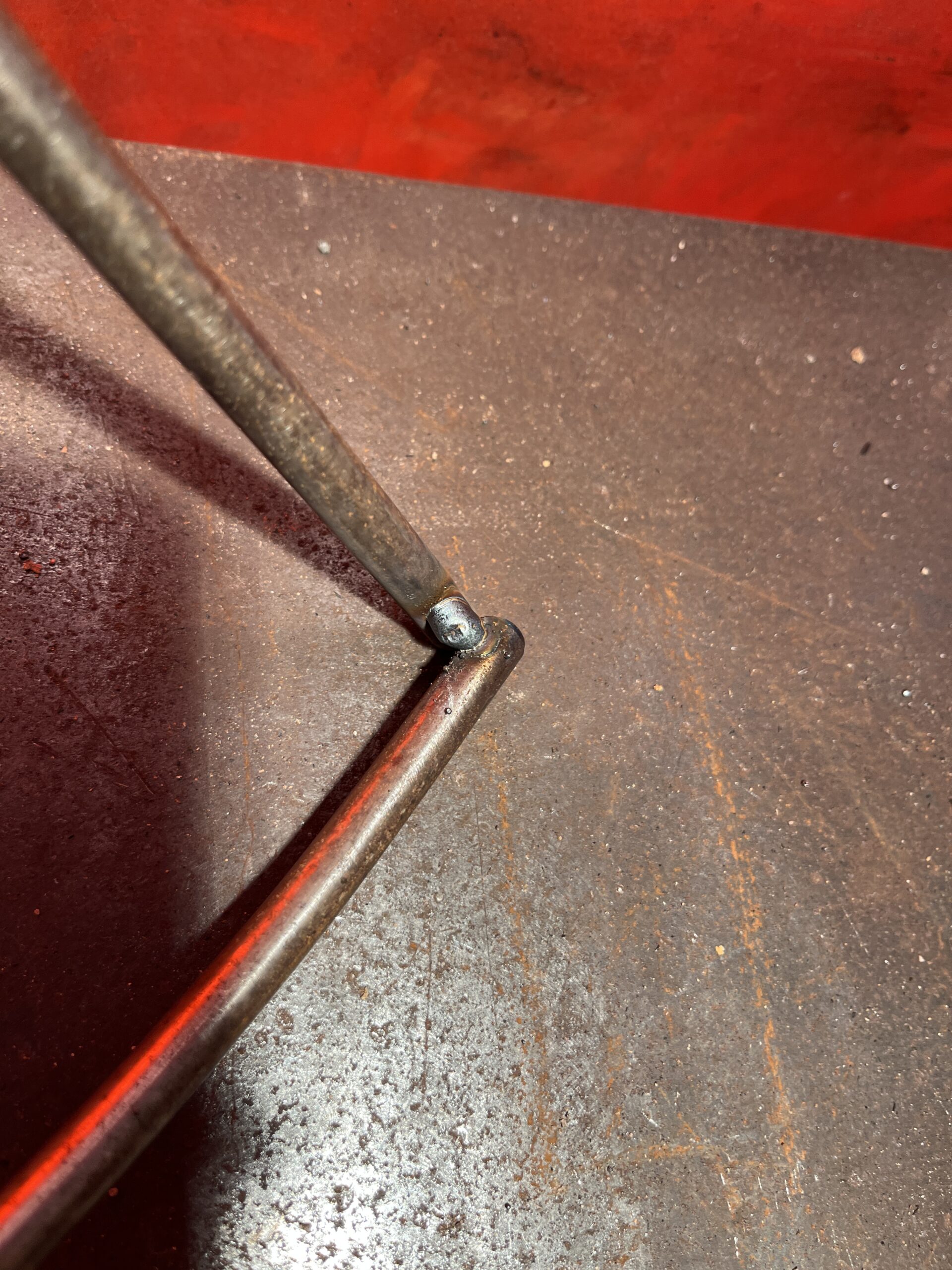
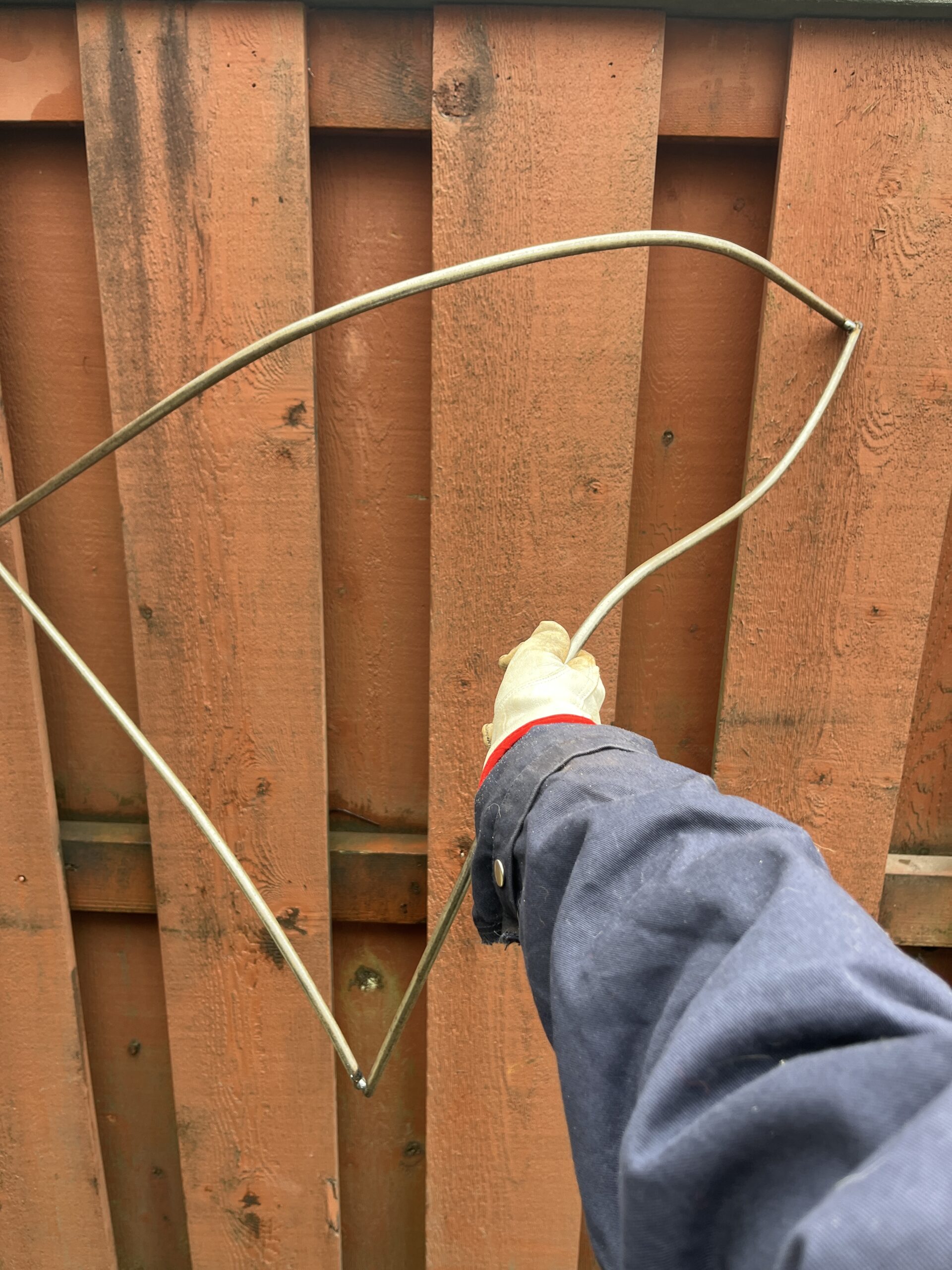
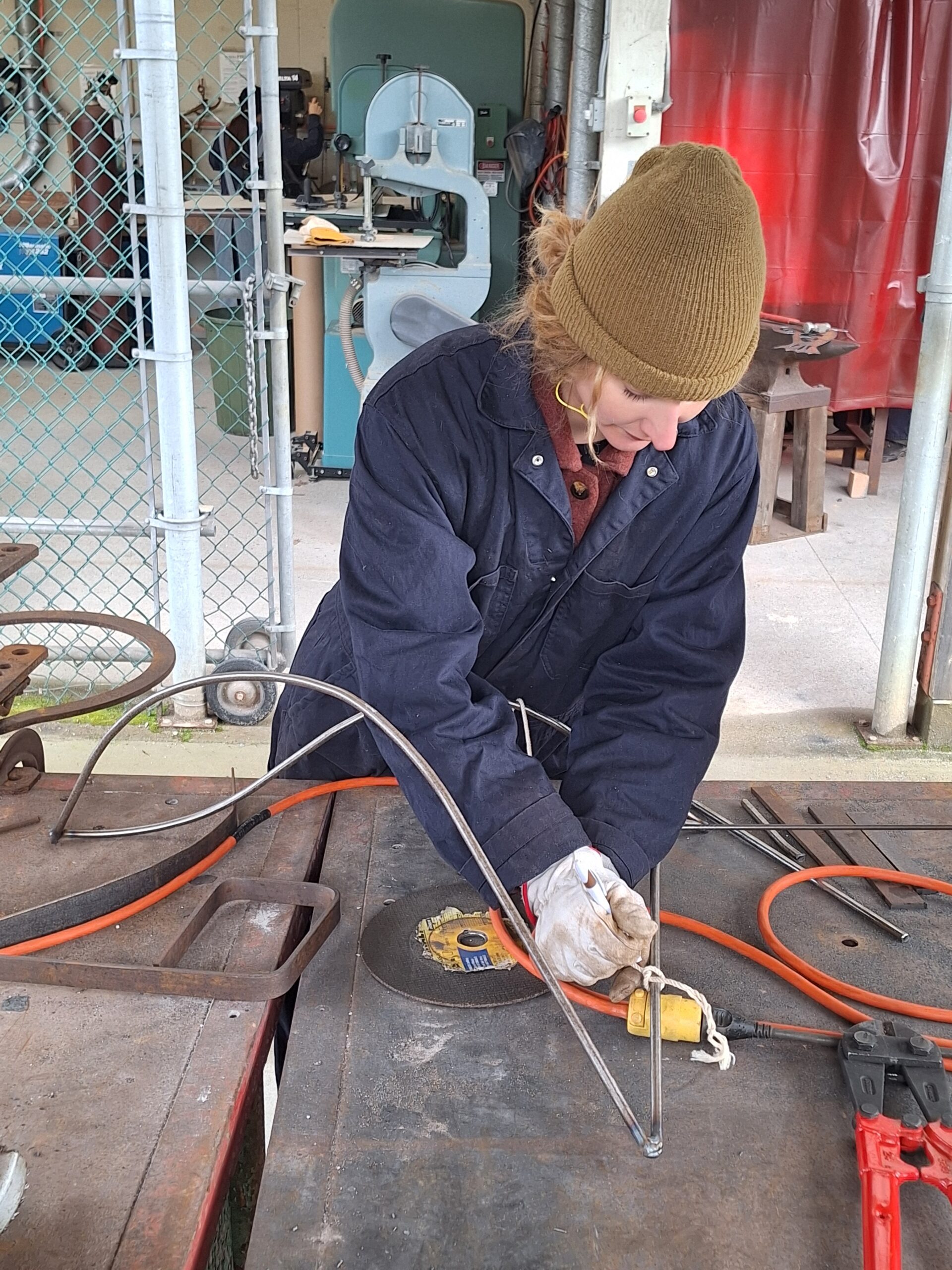
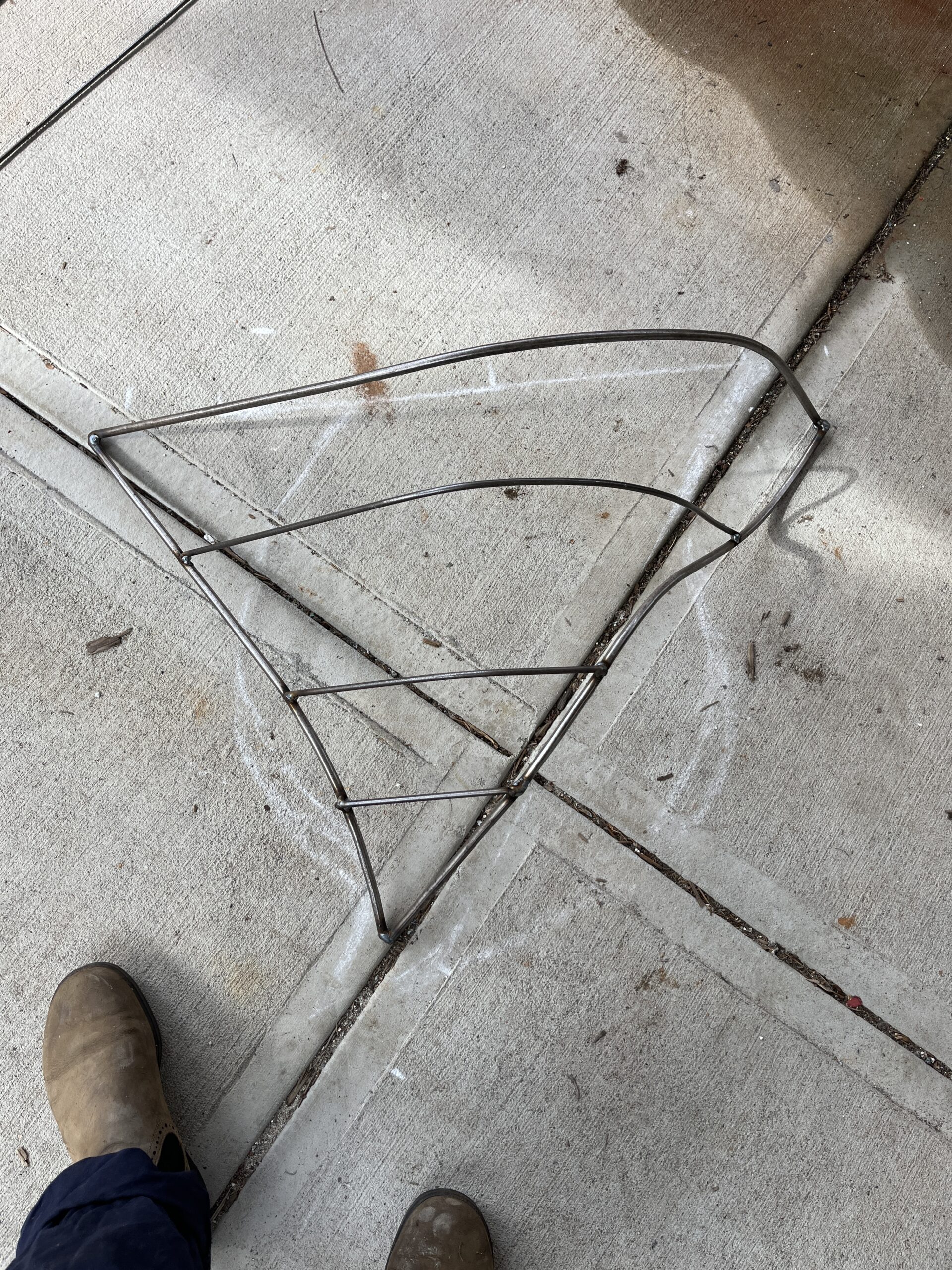
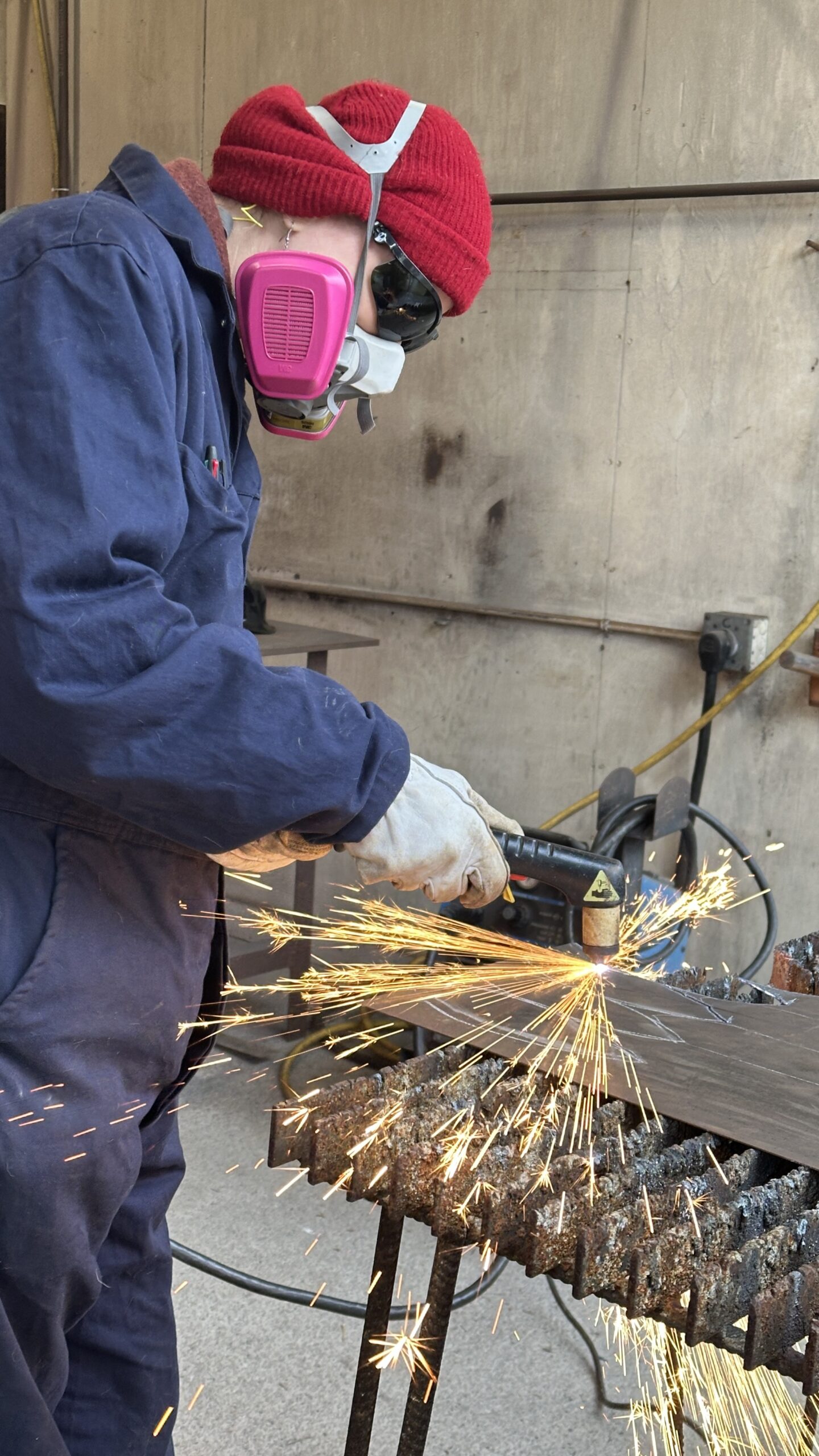
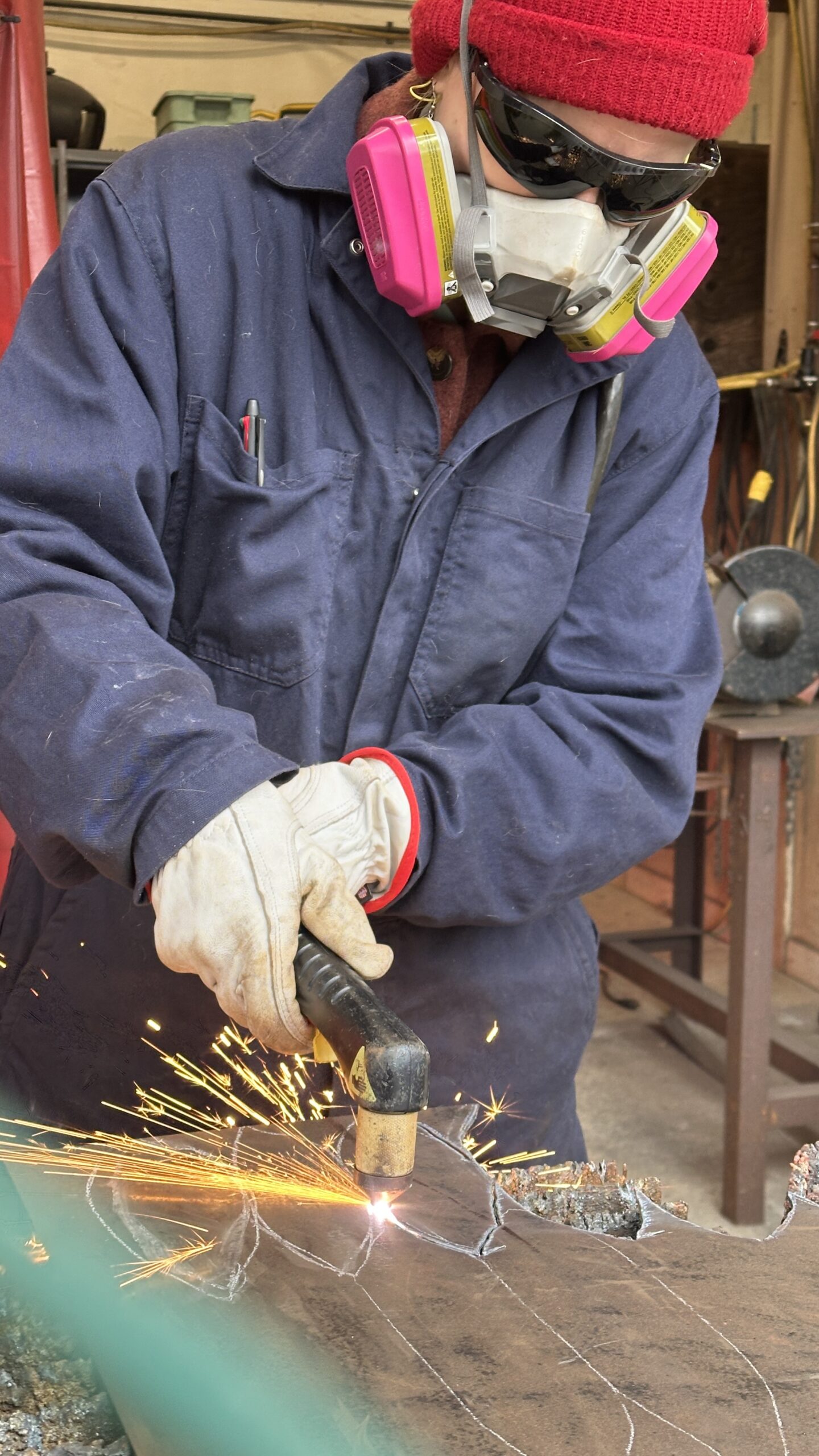
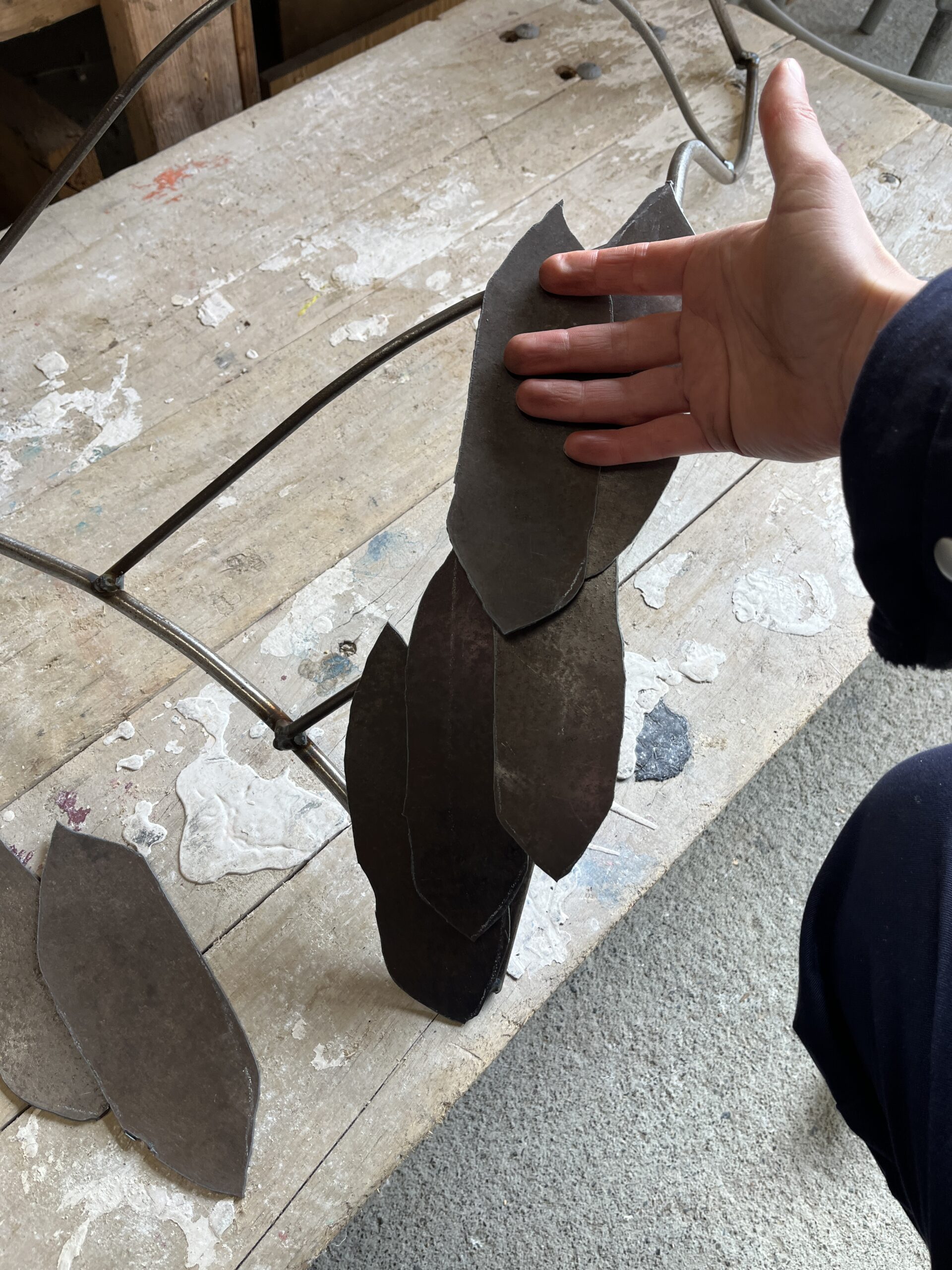
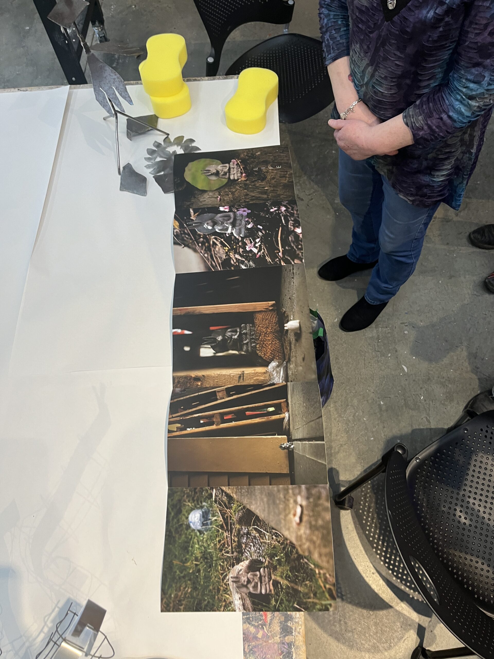
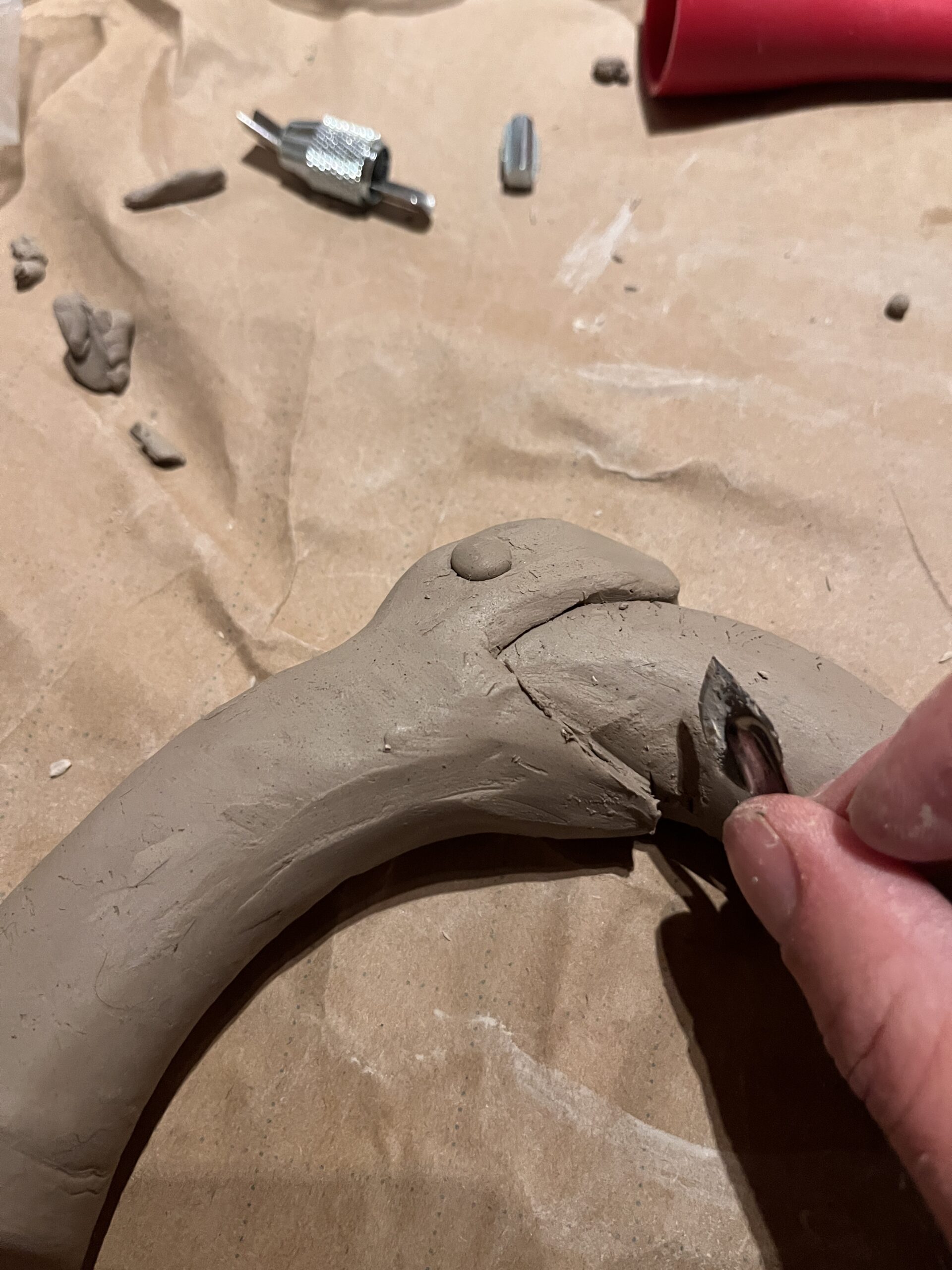
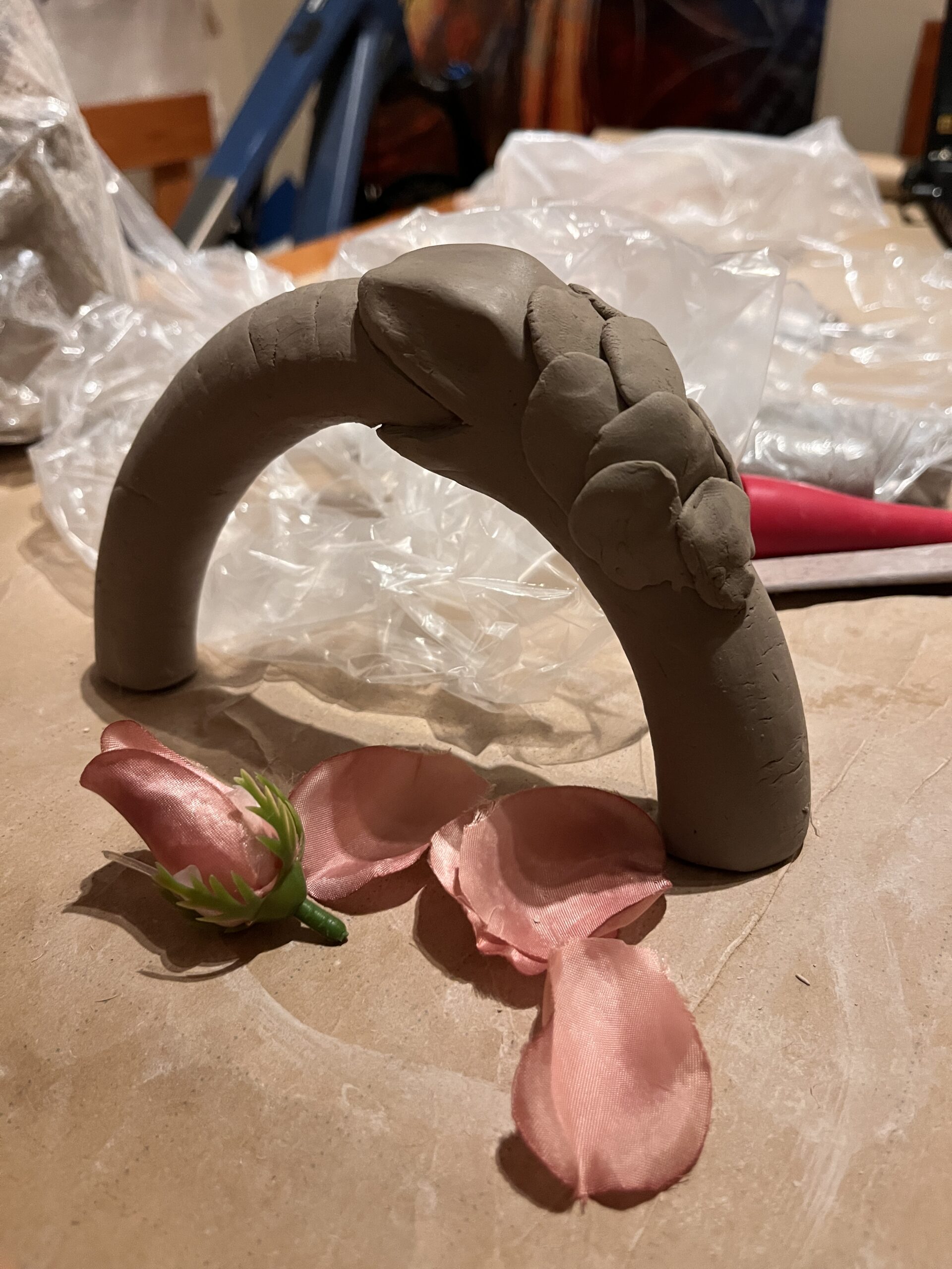
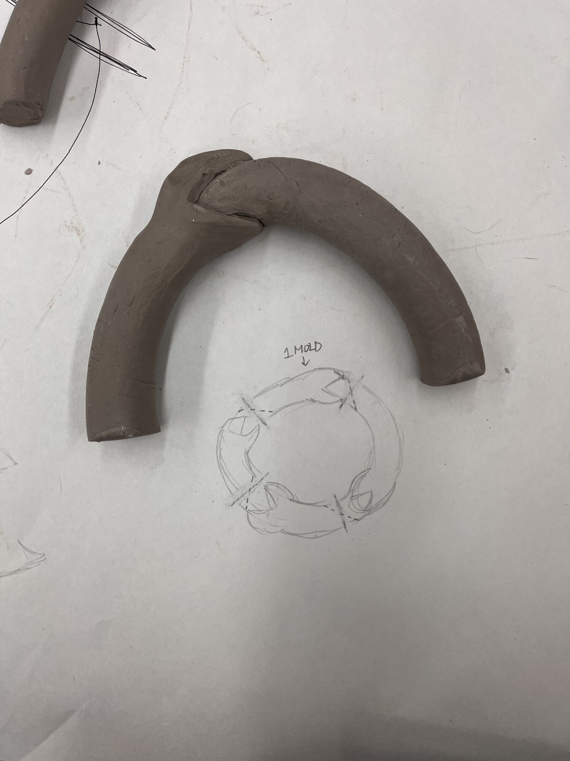
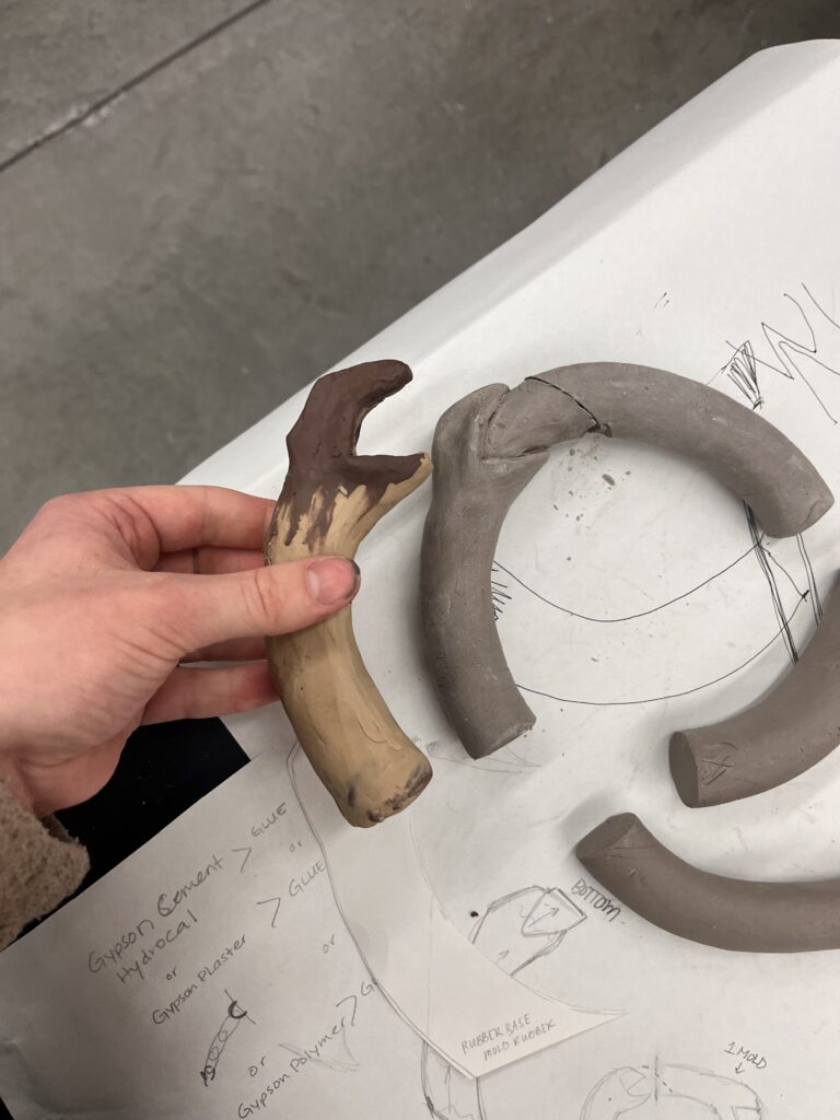
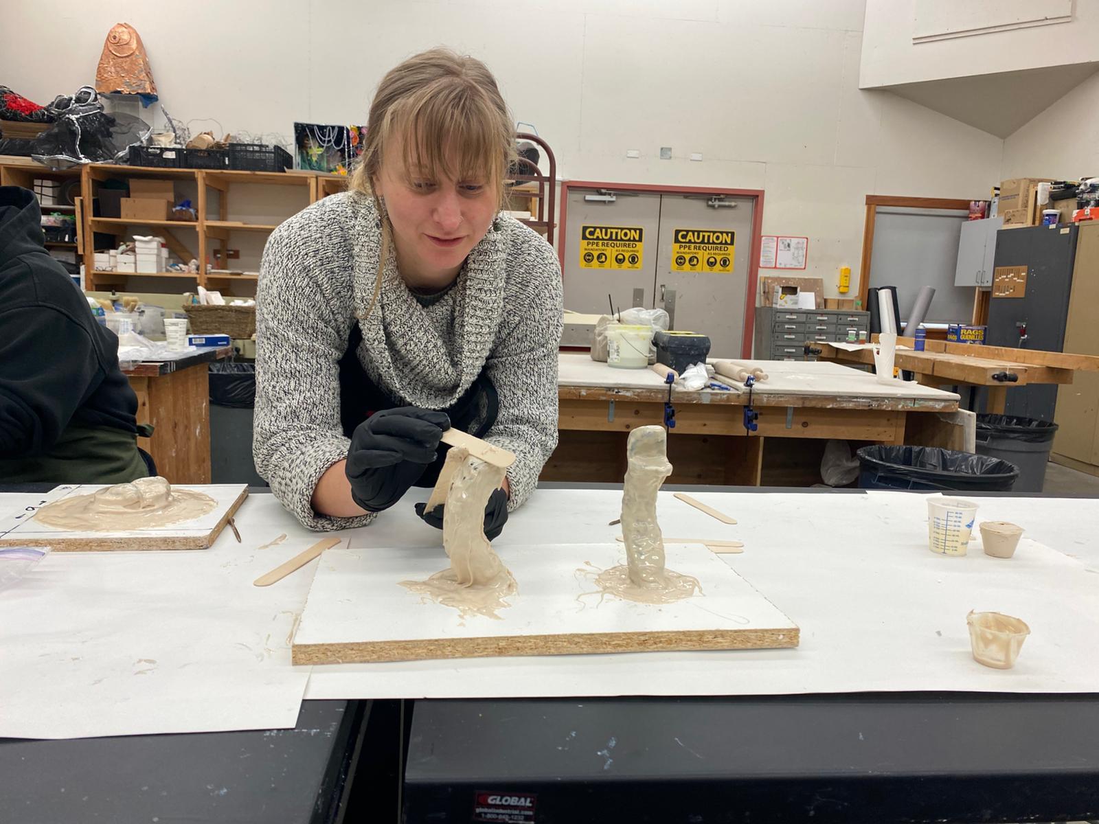
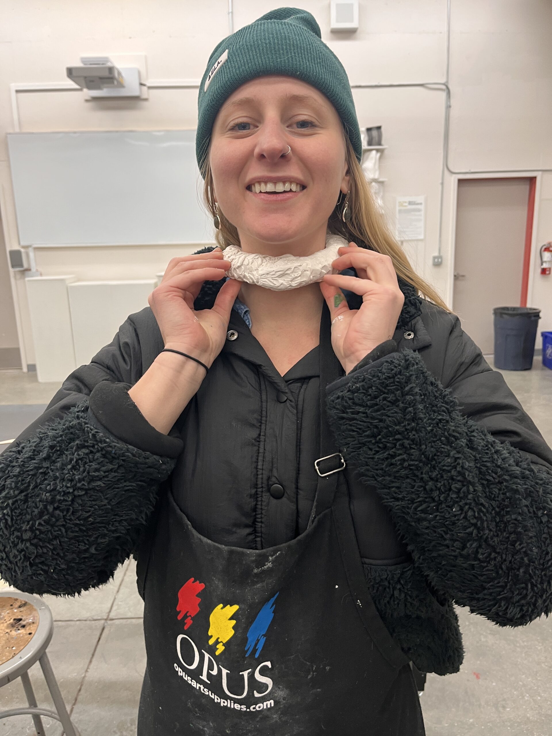
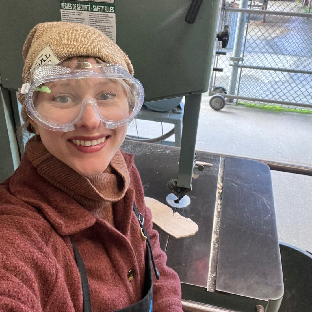
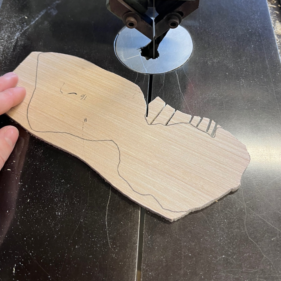
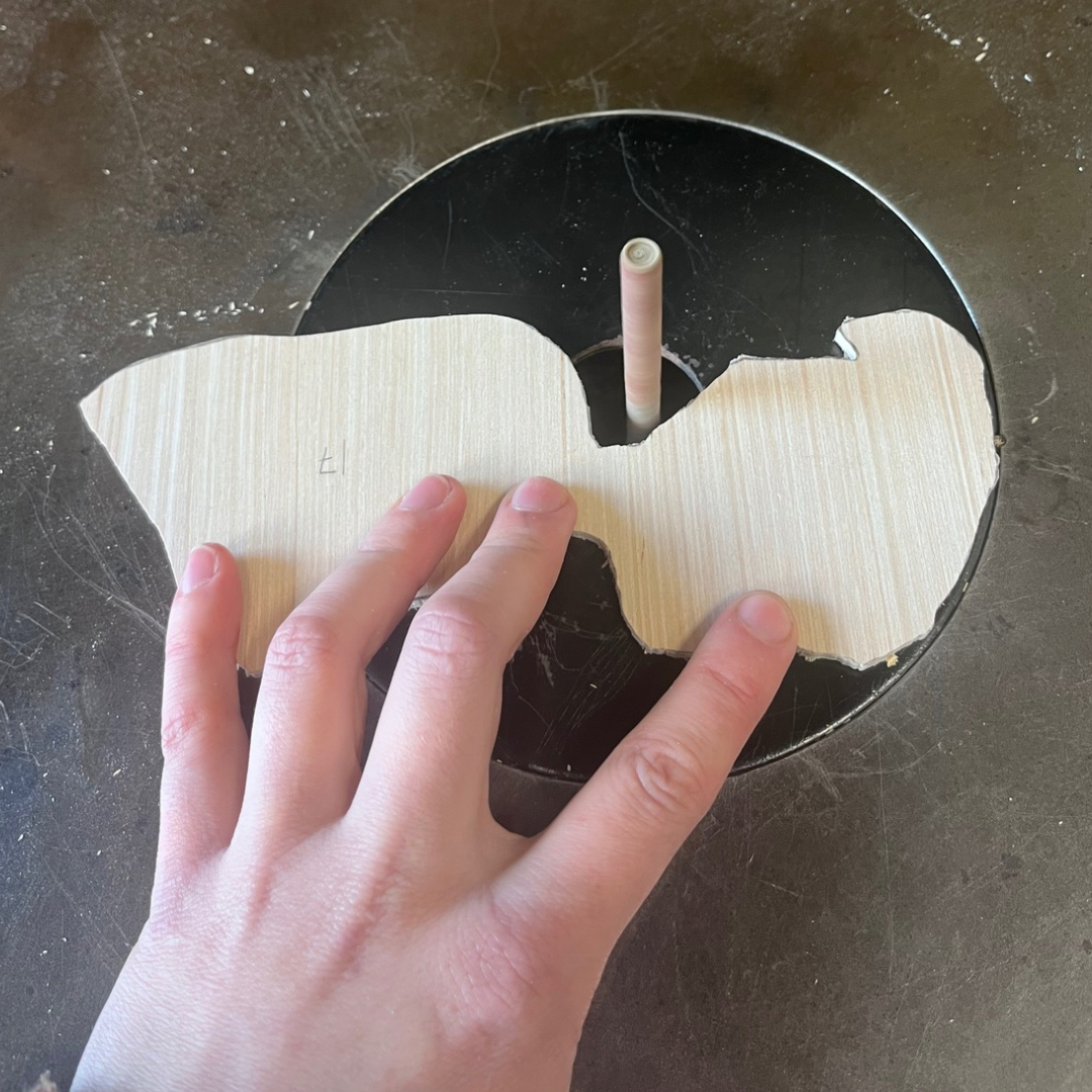
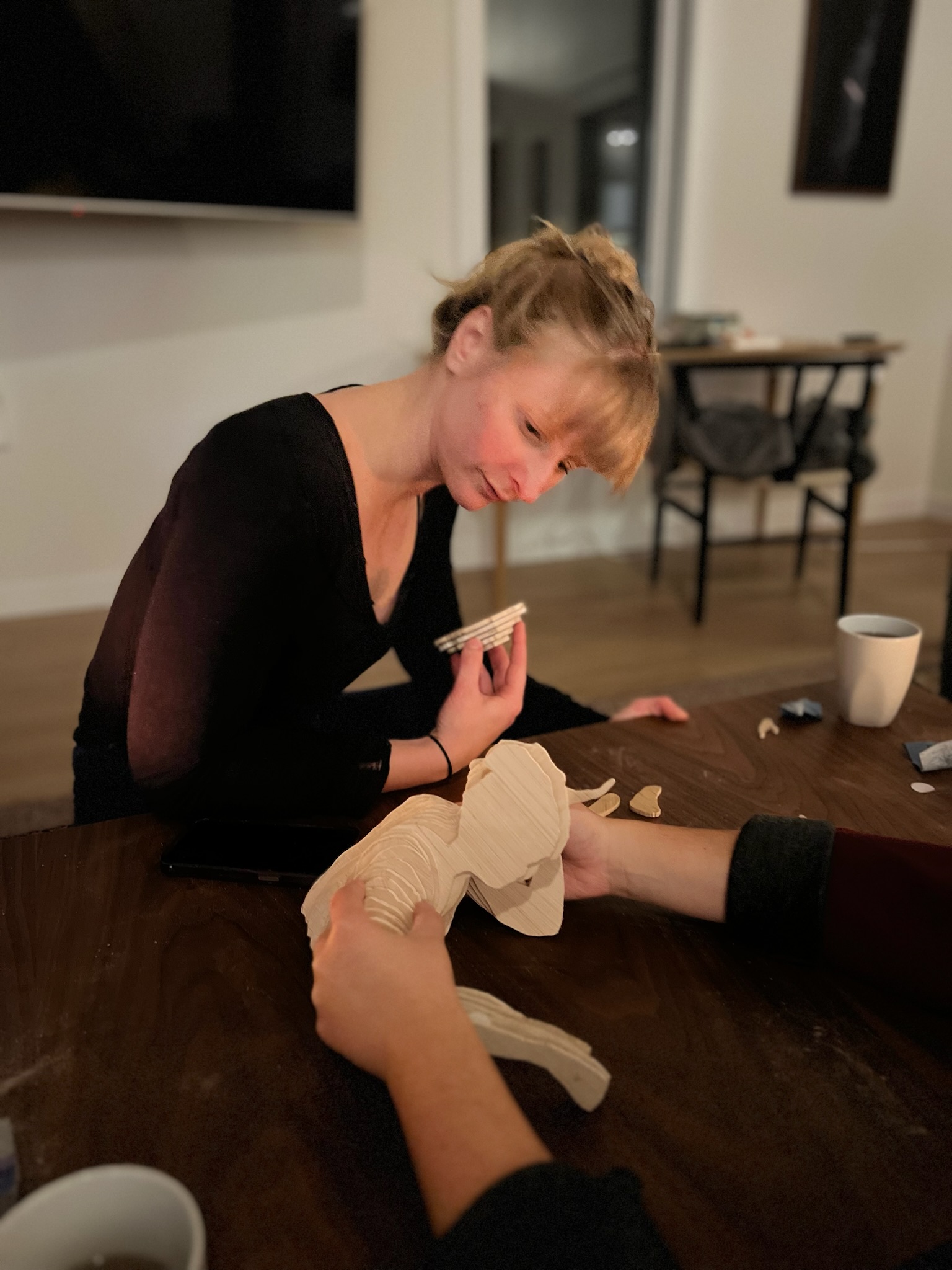
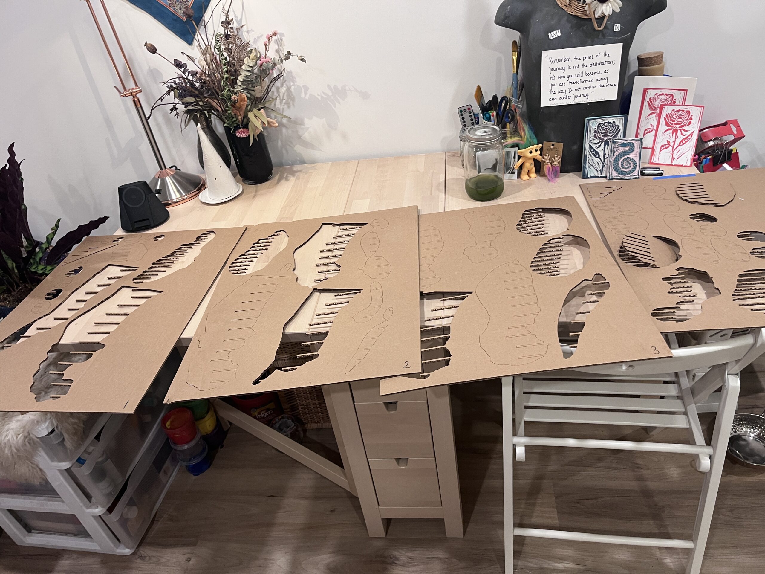
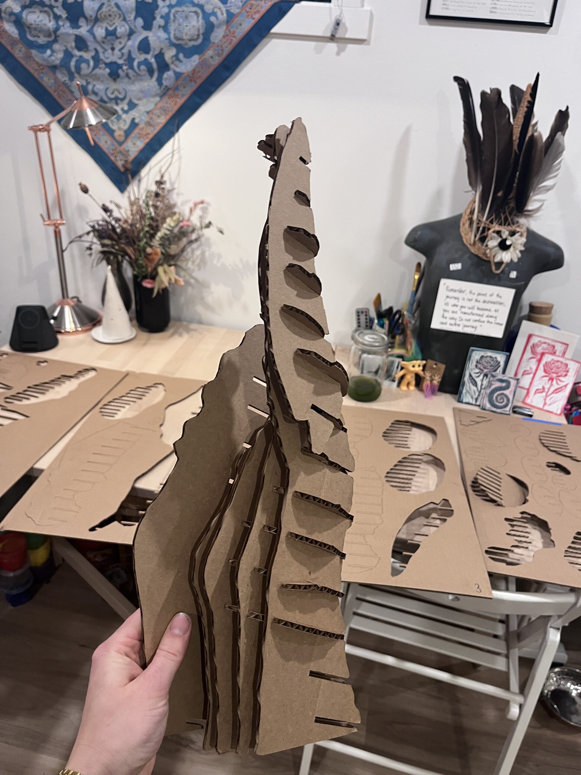
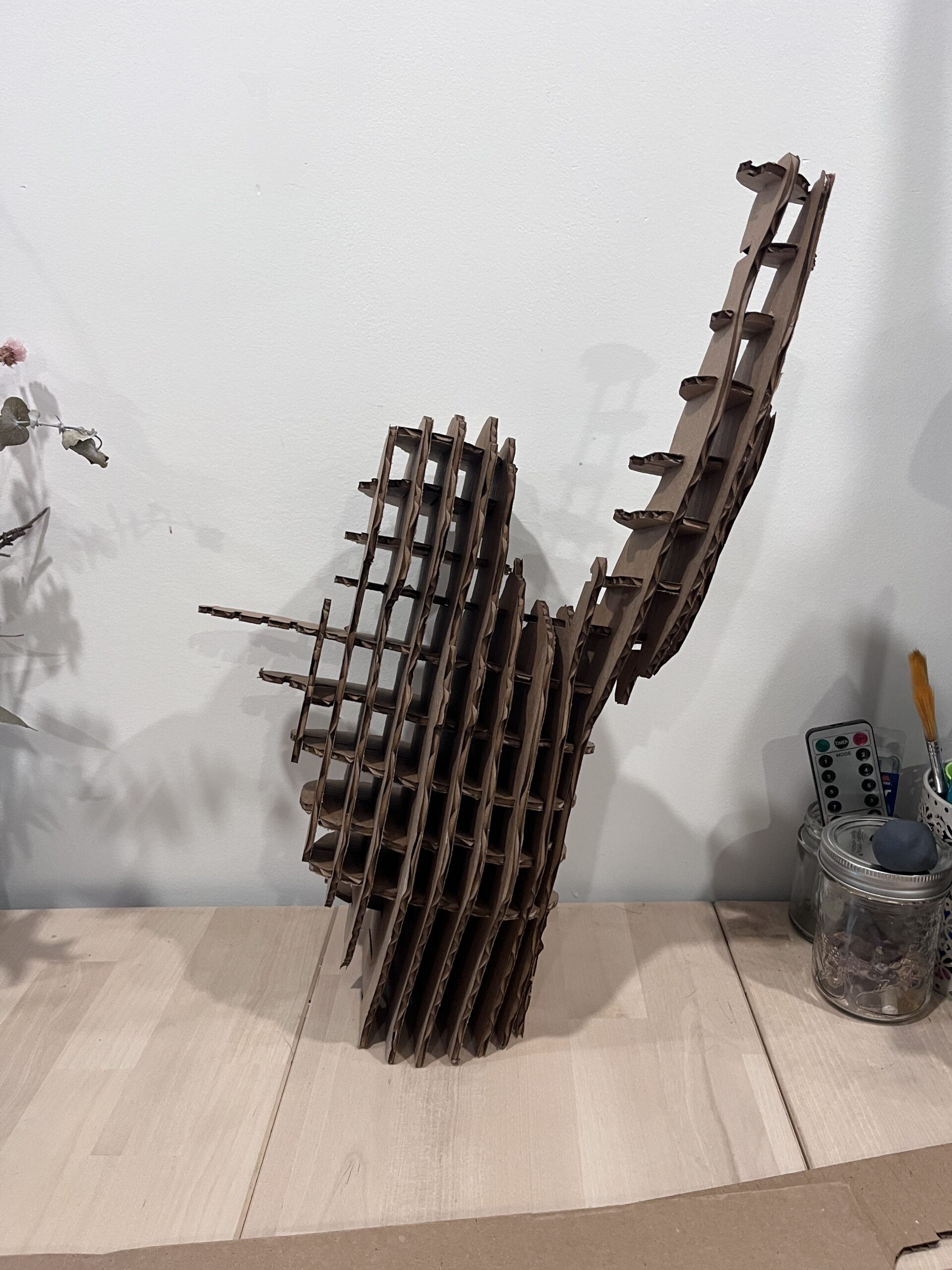
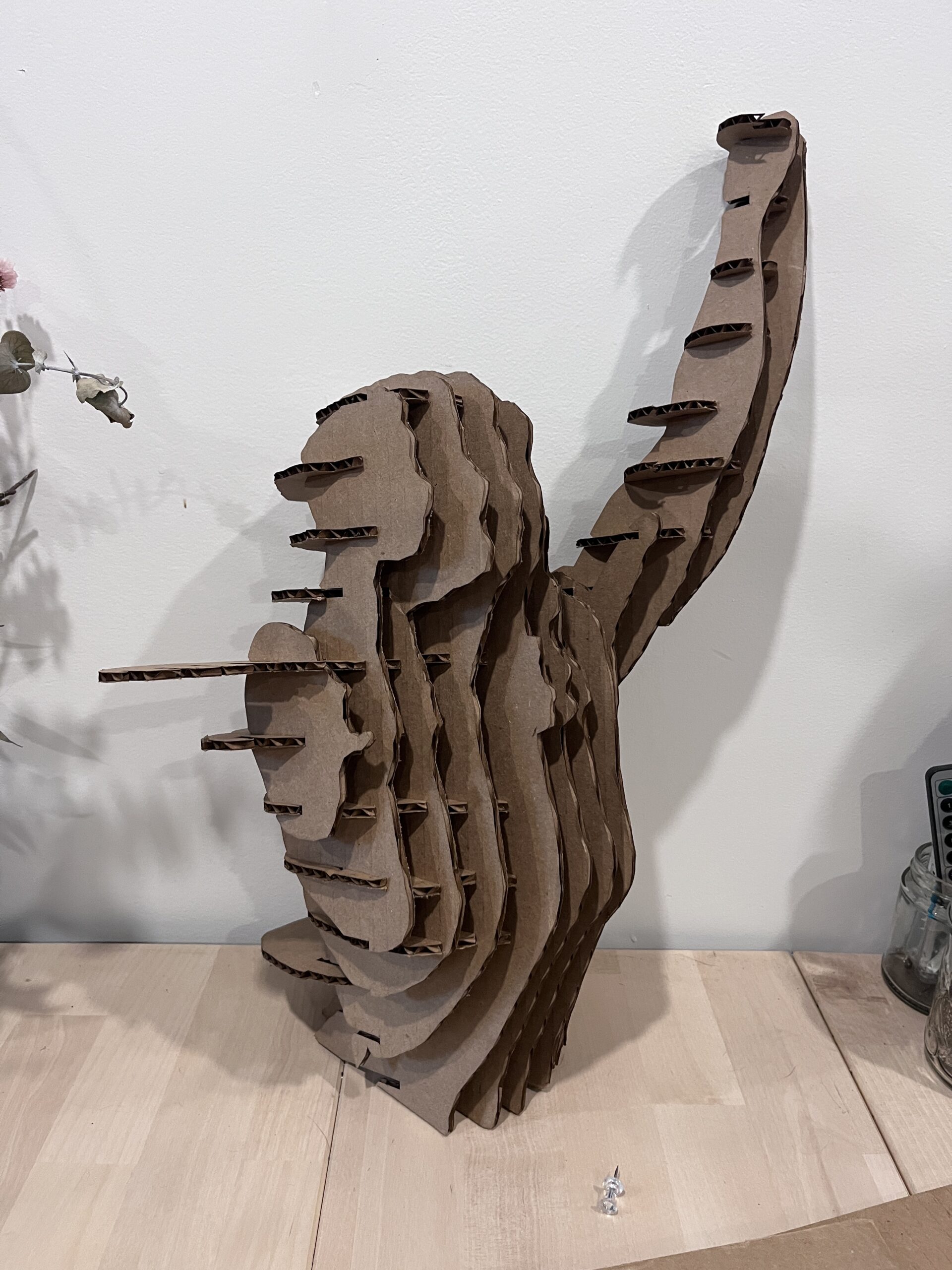
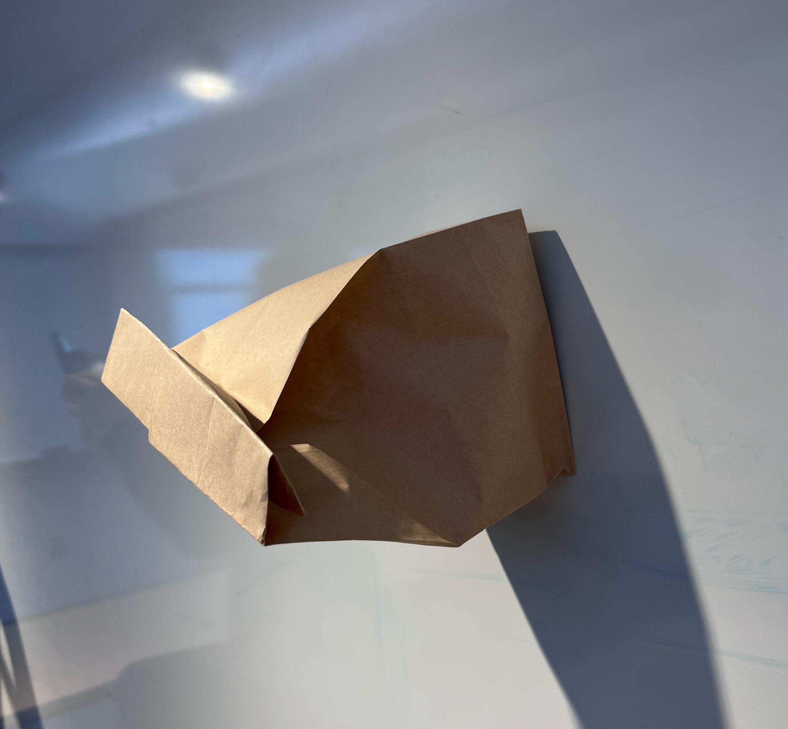
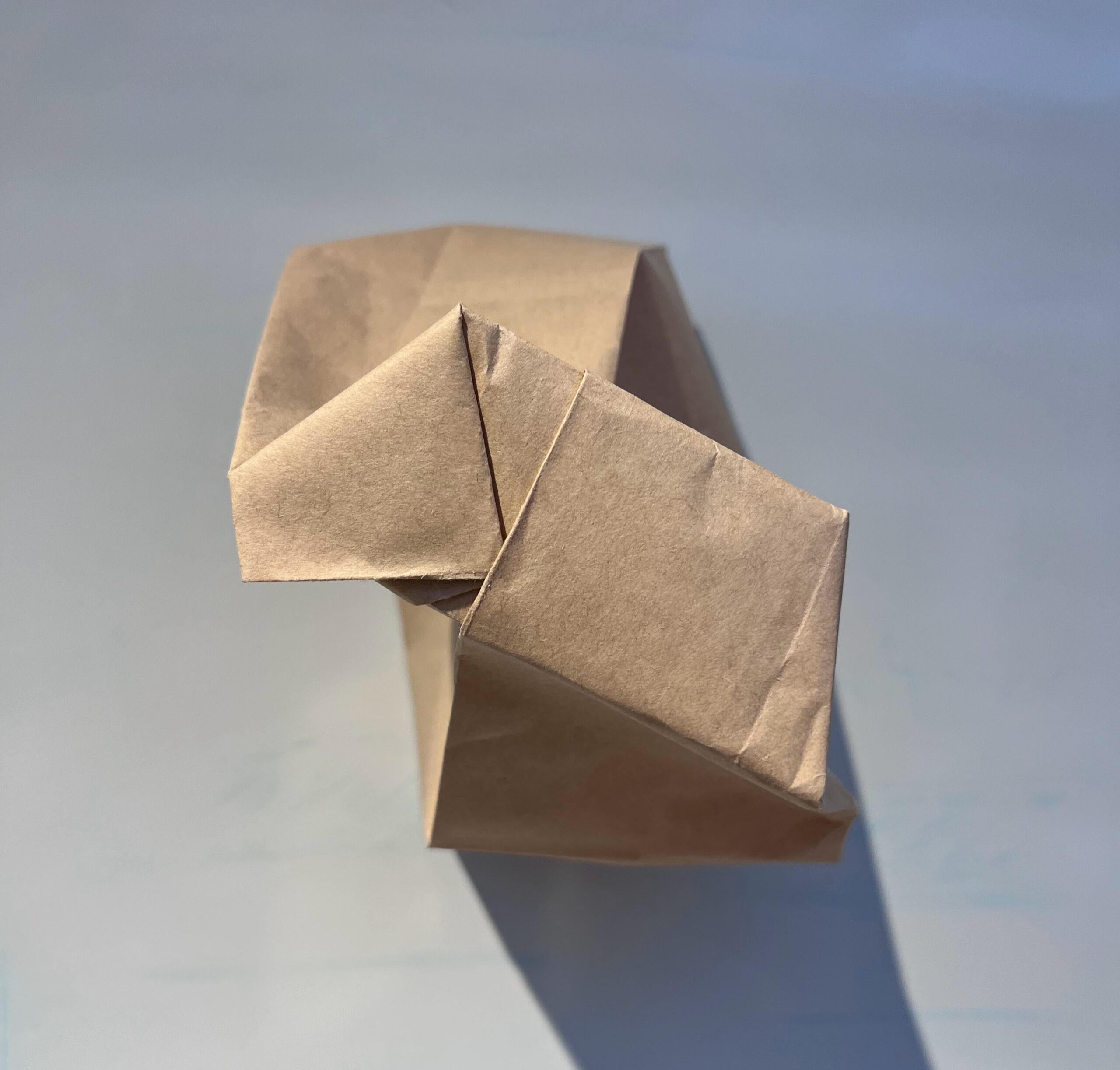
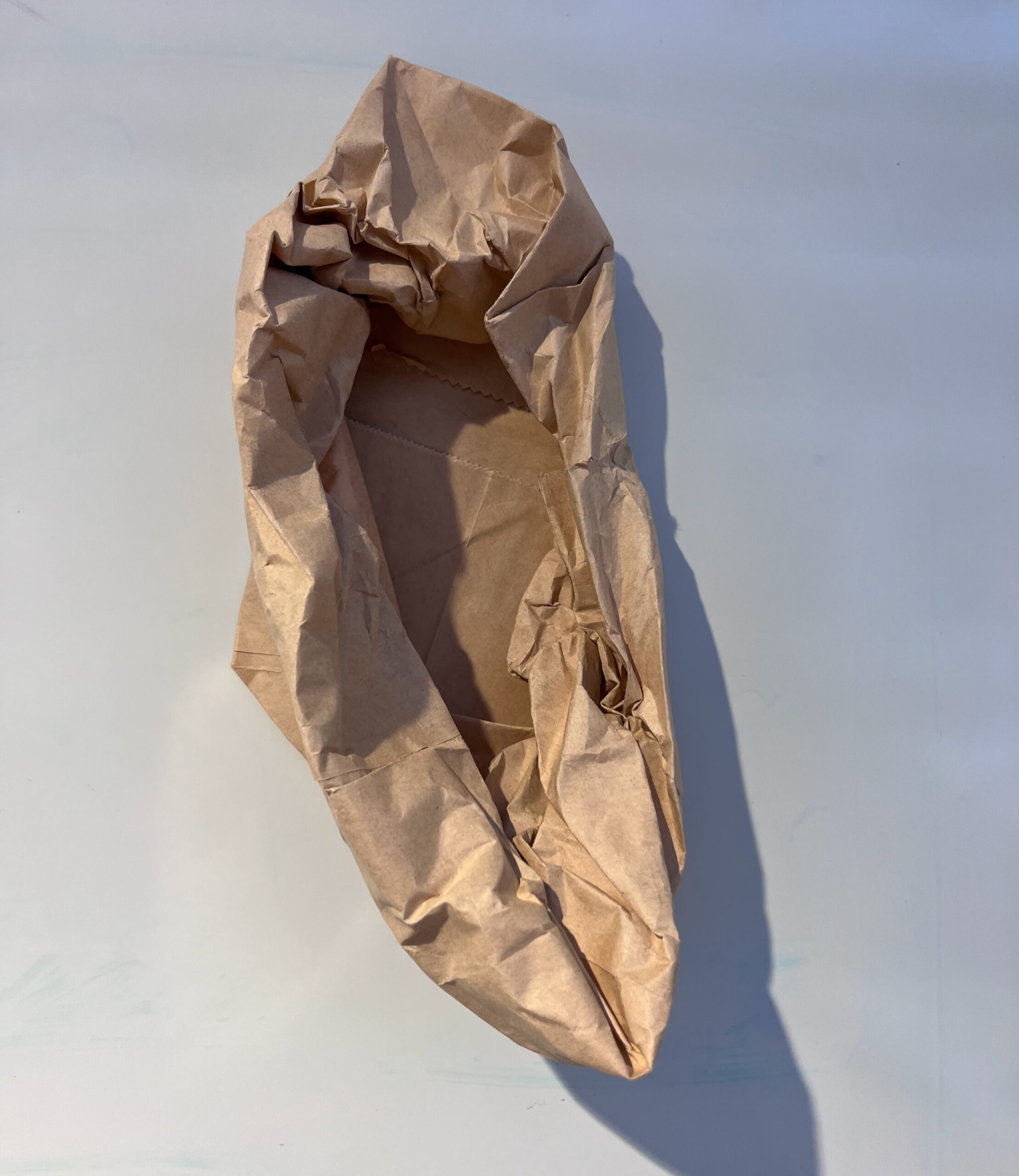
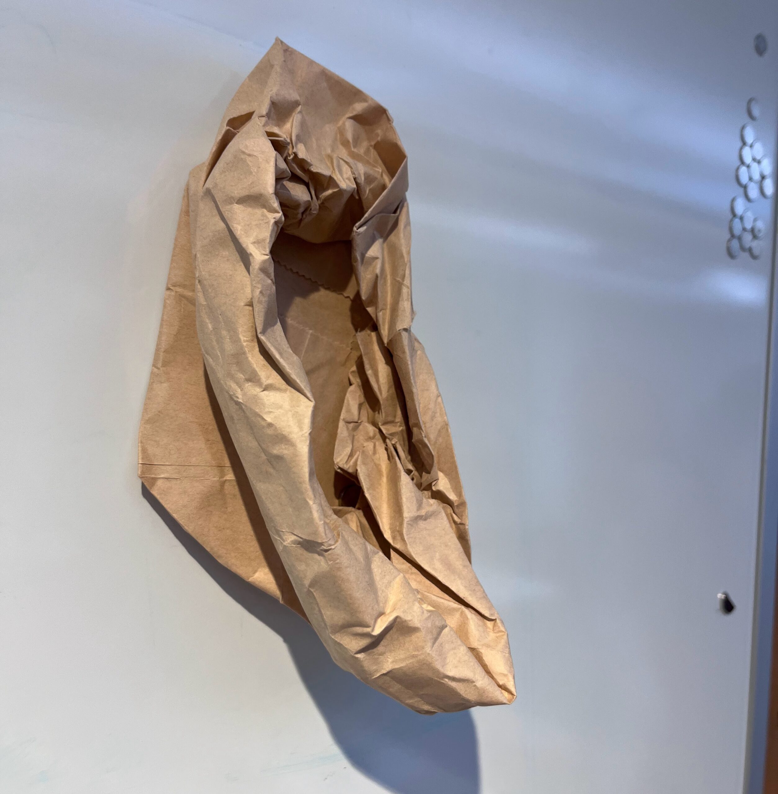
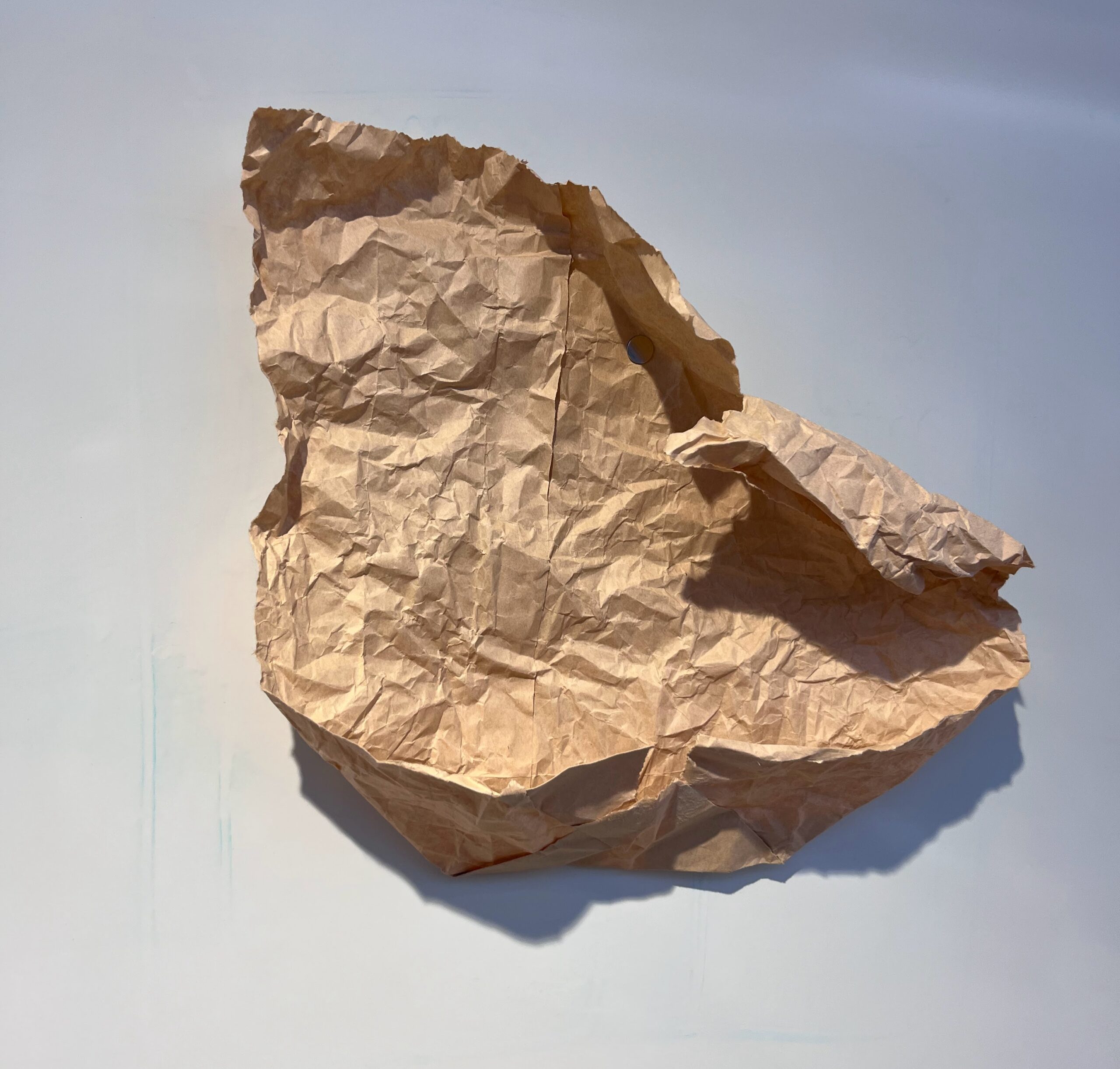
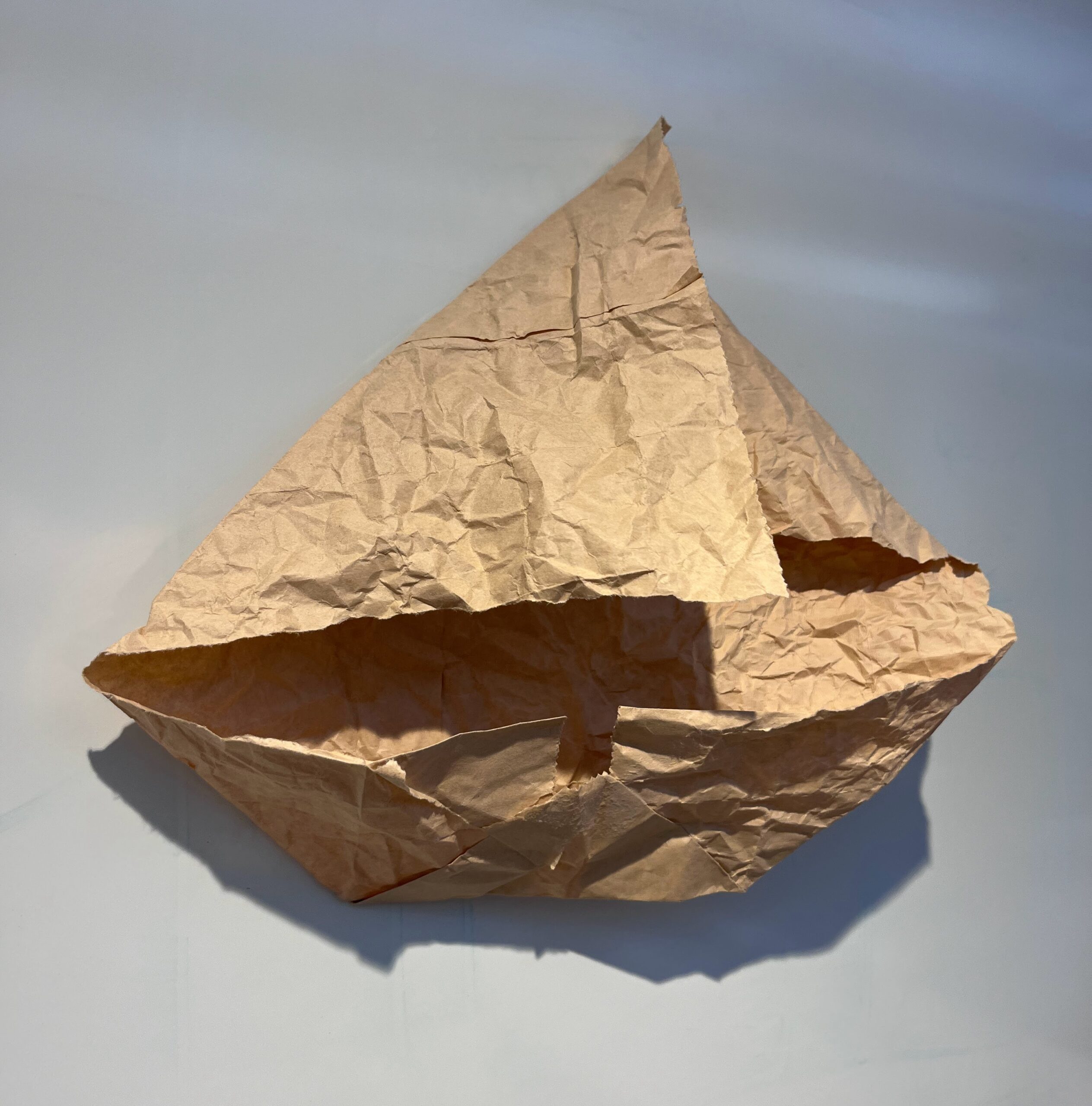
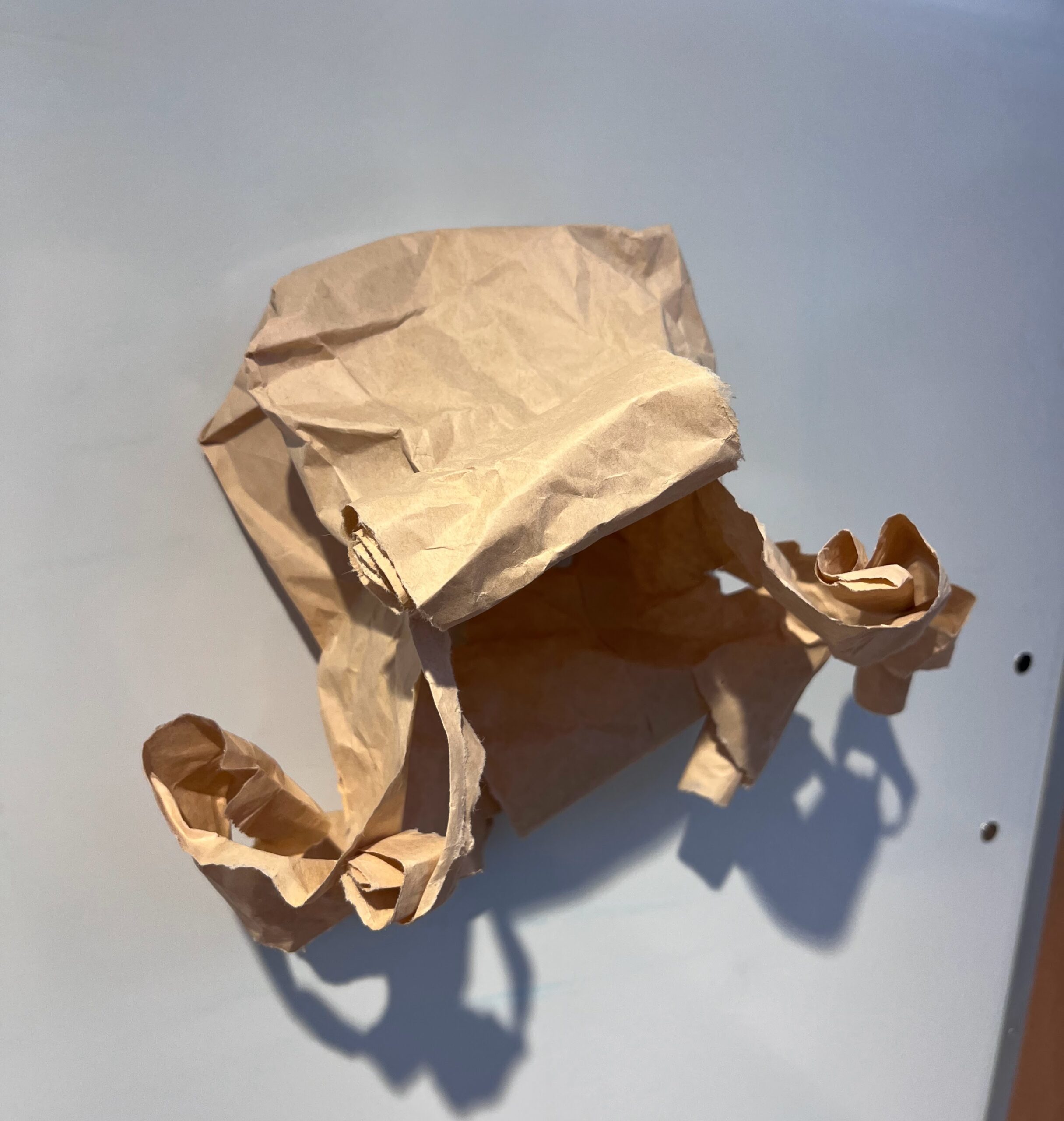
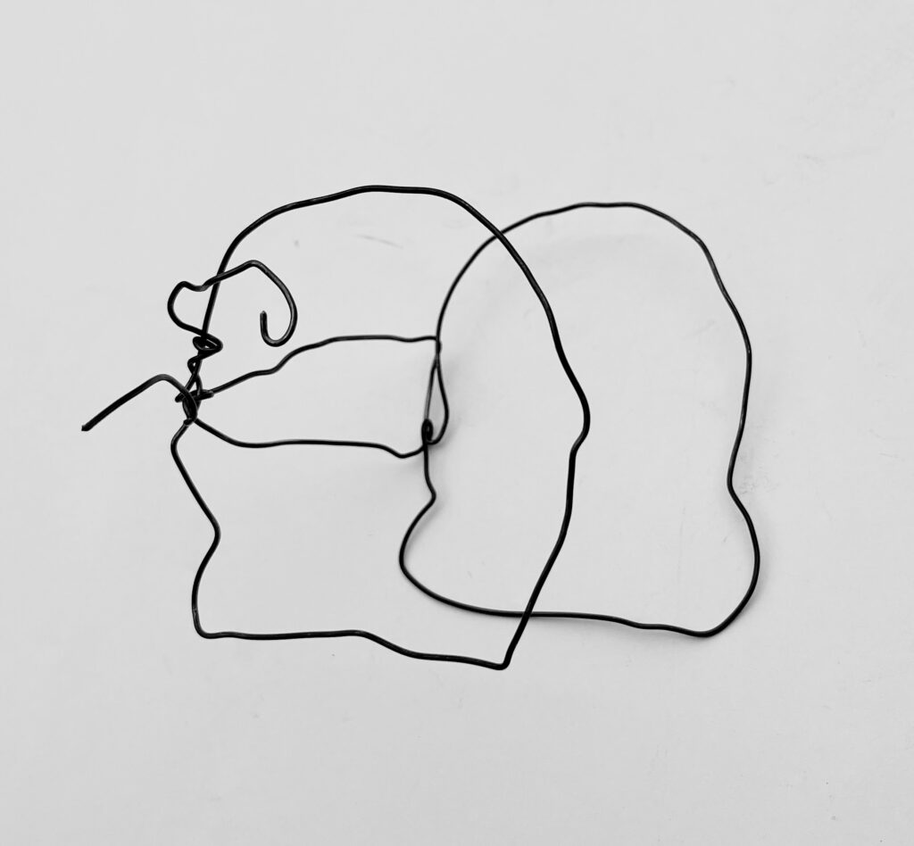
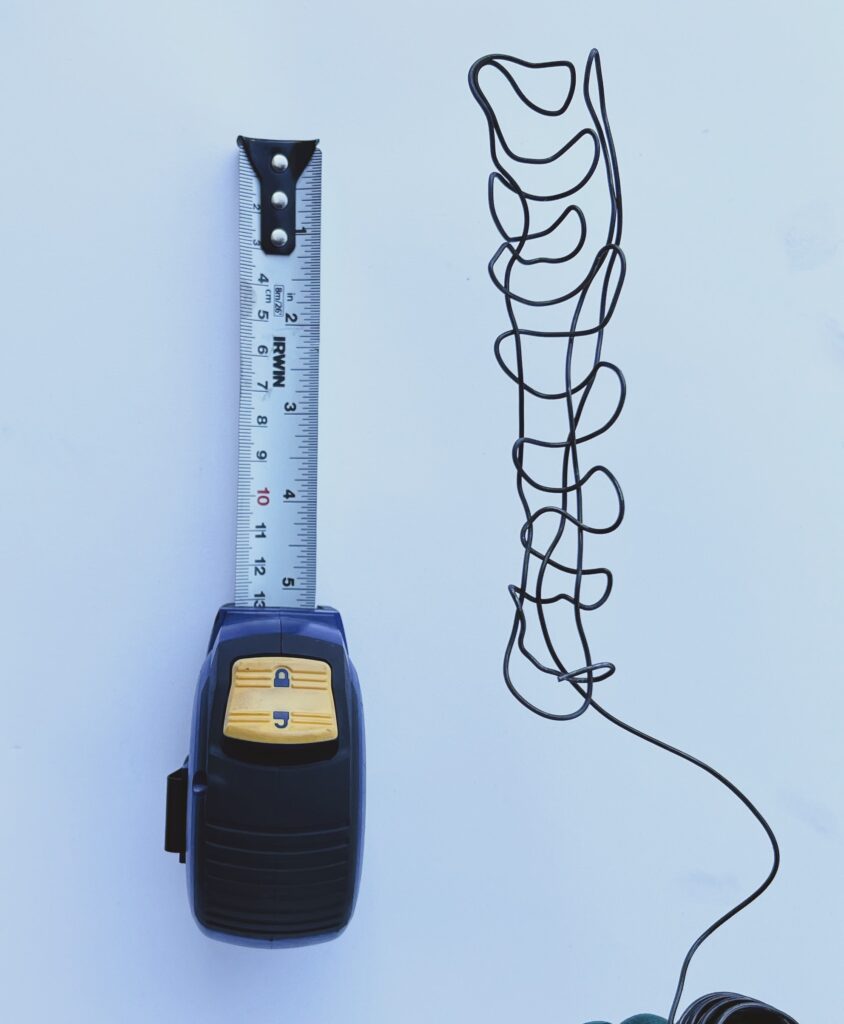
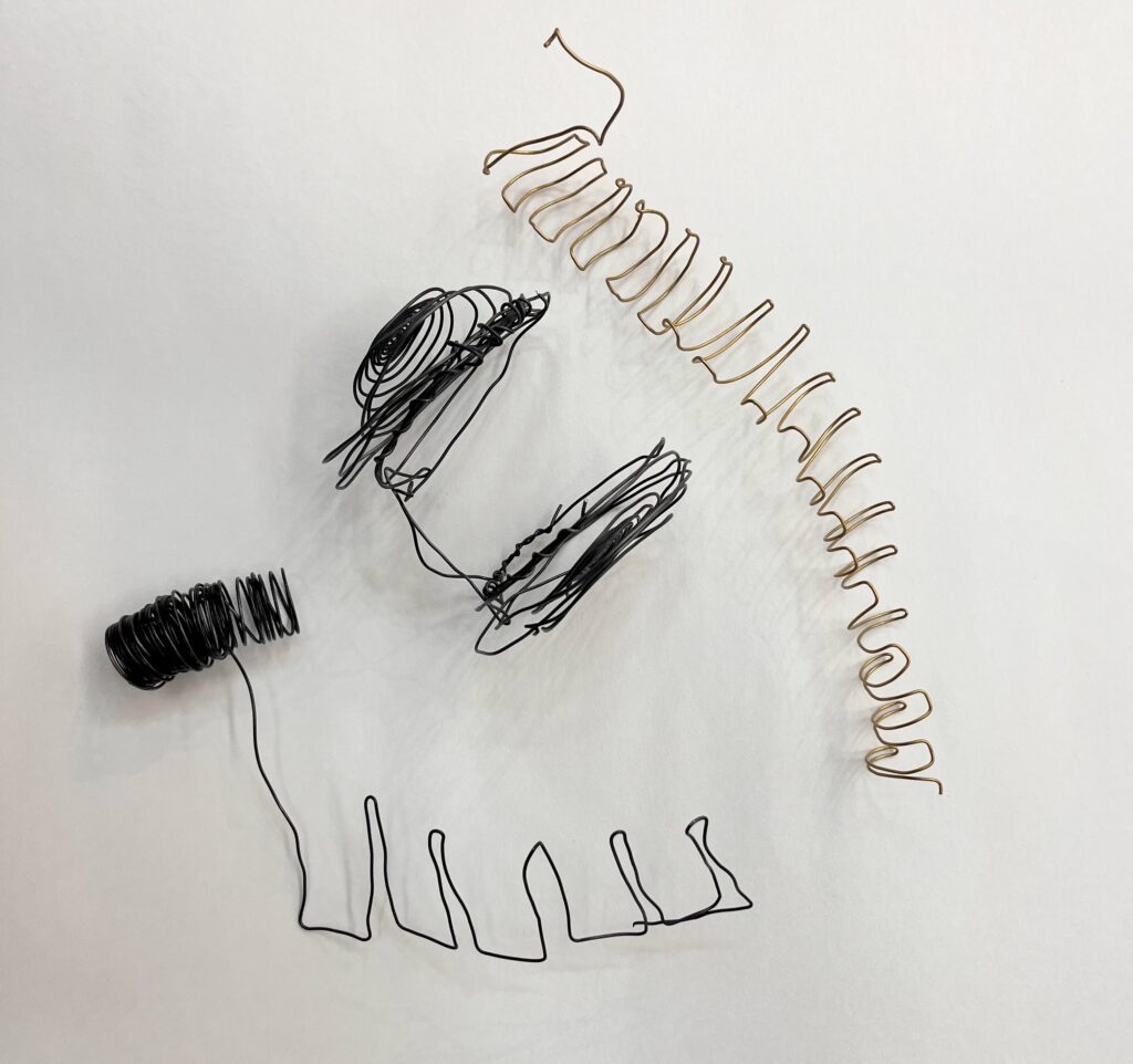
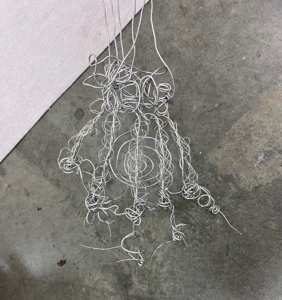
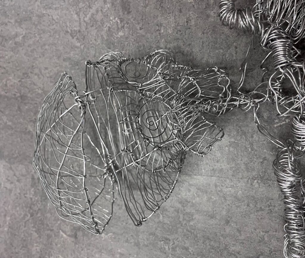
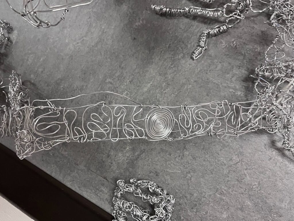
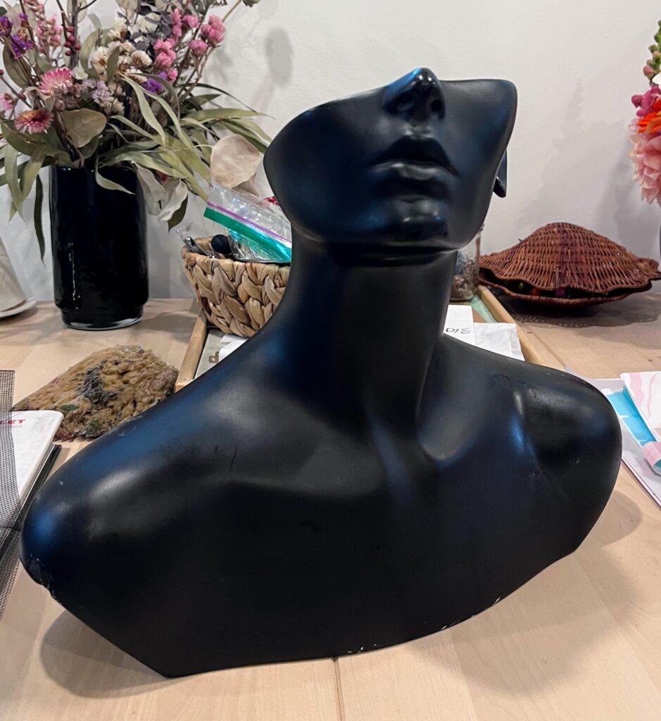
Adjusting scale and expectations: as I worked to gather my materials to start construction of my project, I realized that building a human-scale figure fully equip with tim hortons cups is perhaps a bit overzealous. Plus, the idea of having it ready to stage outside, potentially in the rain, added another layer to my concerns. How would it be weather proof? How could I ensure the structural integrity. After several meetings with Jeff as we explored different materials I could use (tie rods, chicken wire, aluminum mesh) I came to the conclusion that going small would perhaps result in a better project. I wondered if instead of building a form from scratch, I could use a mannequin. I searched marketplace and found this half faced form for $10.
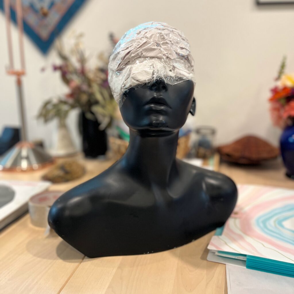
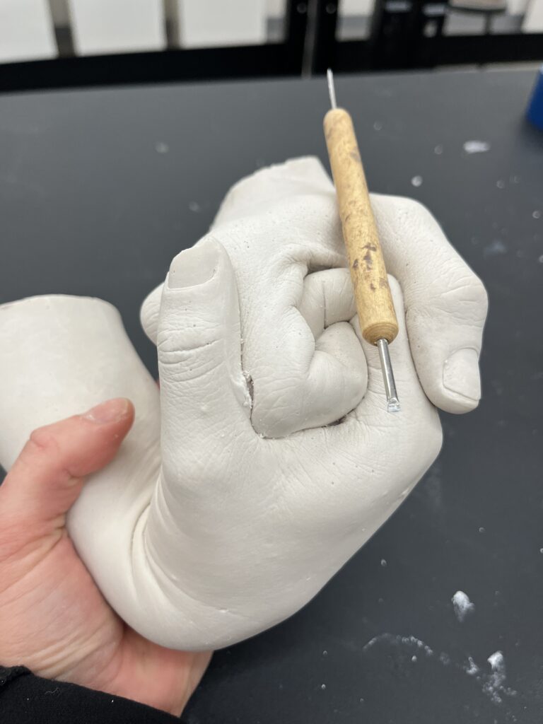
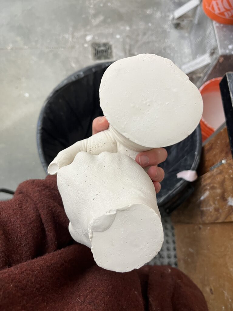
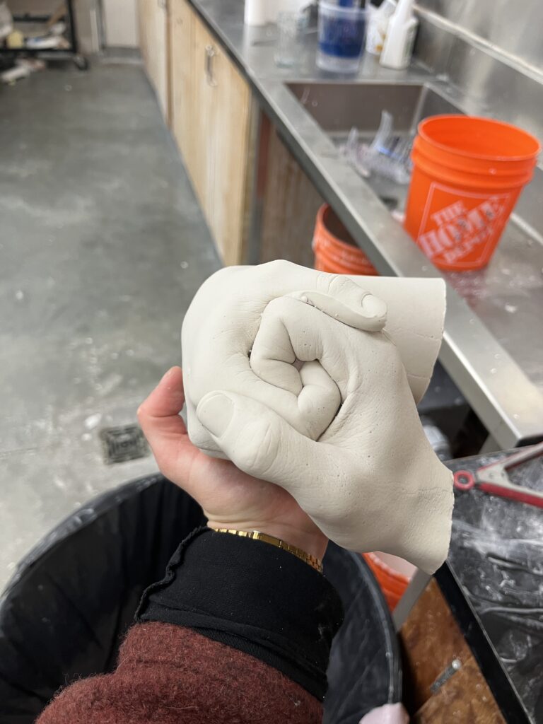
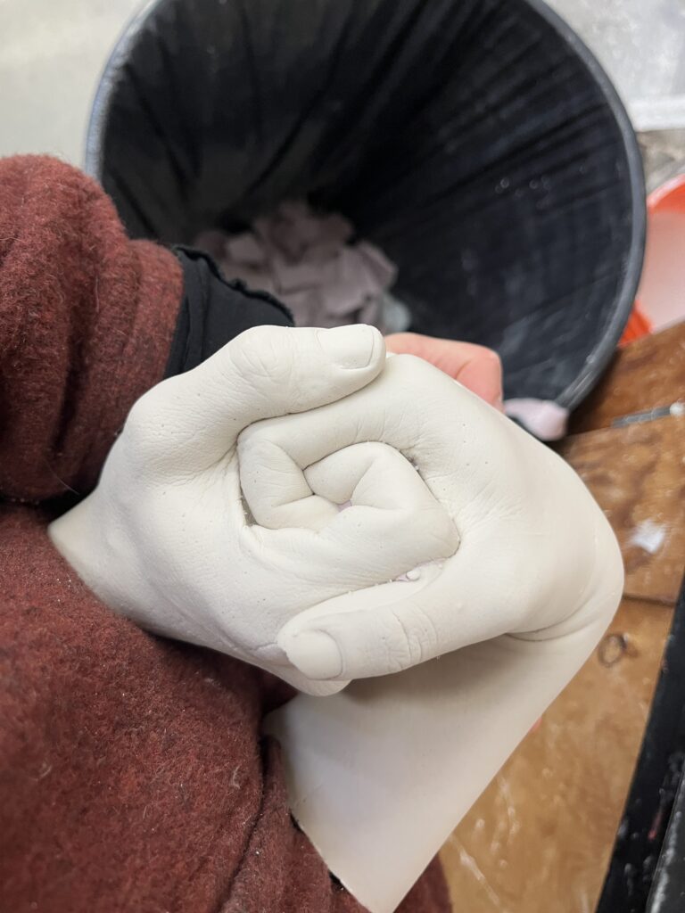
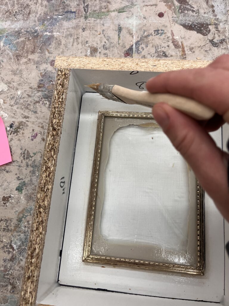
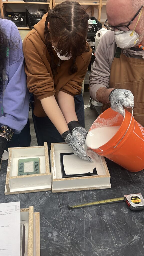
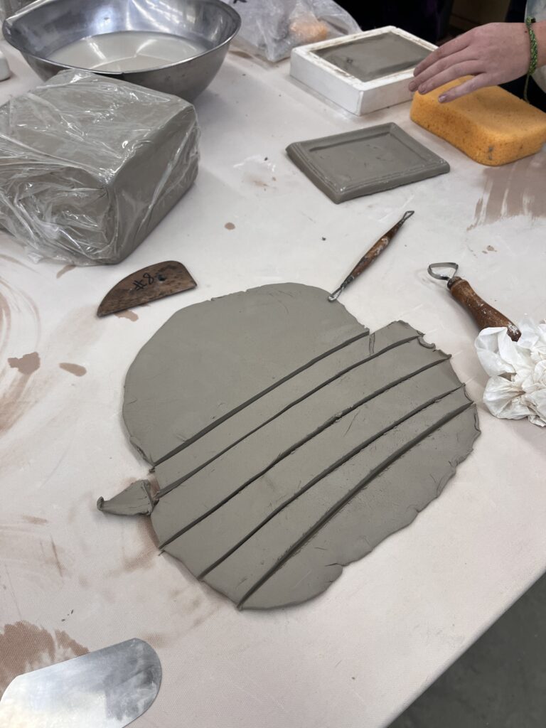
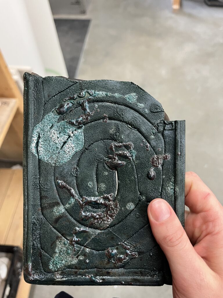
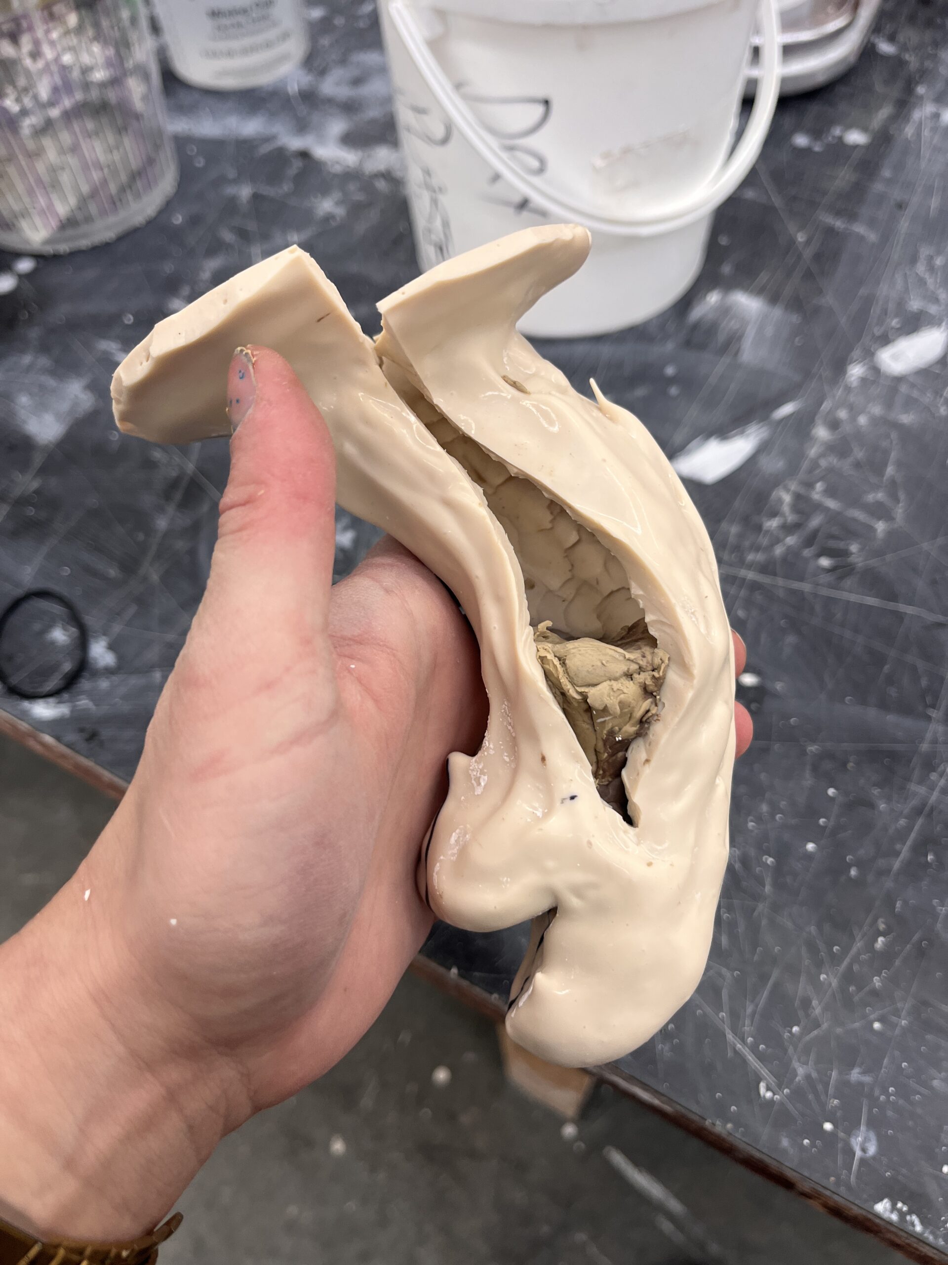
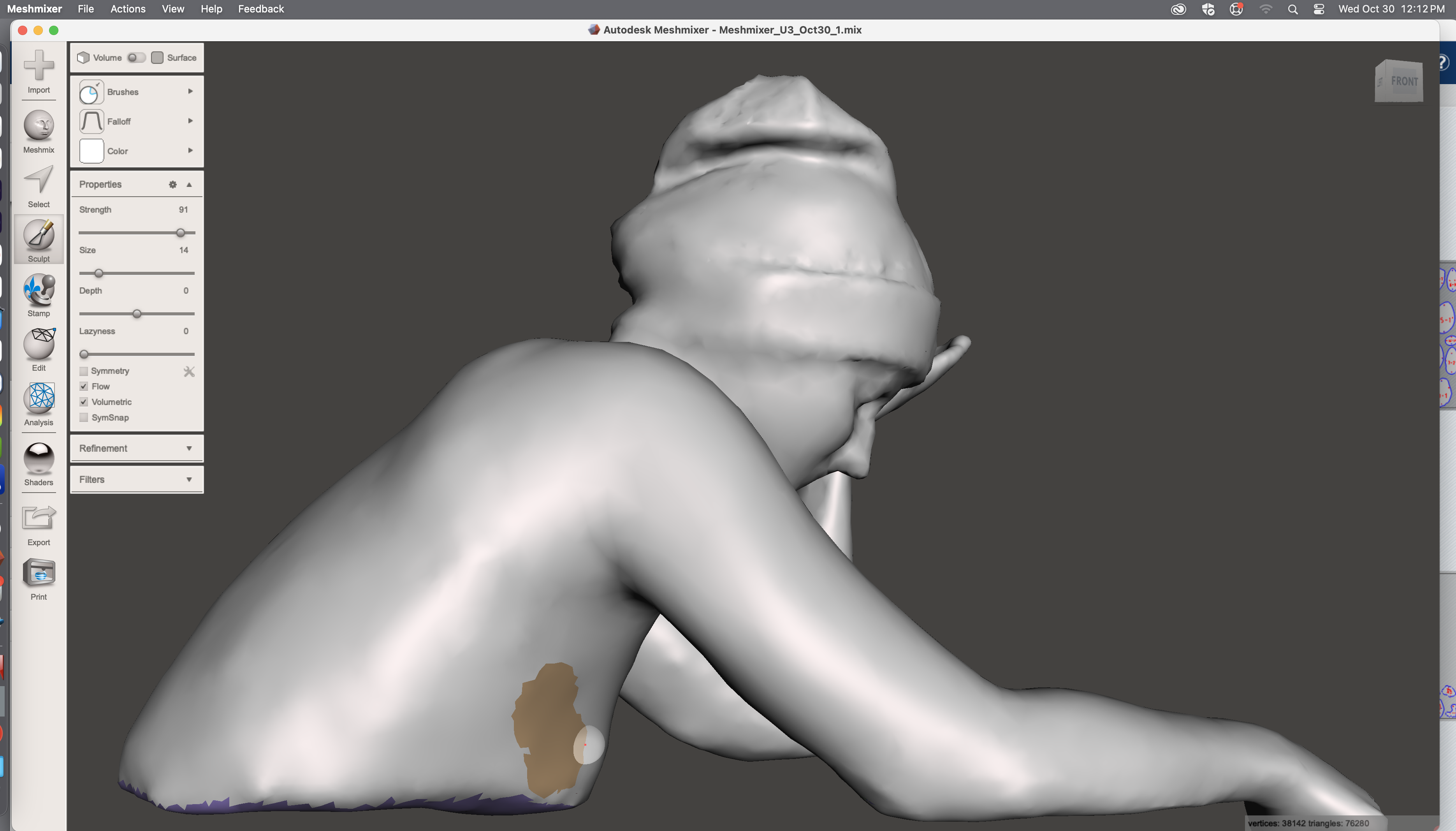
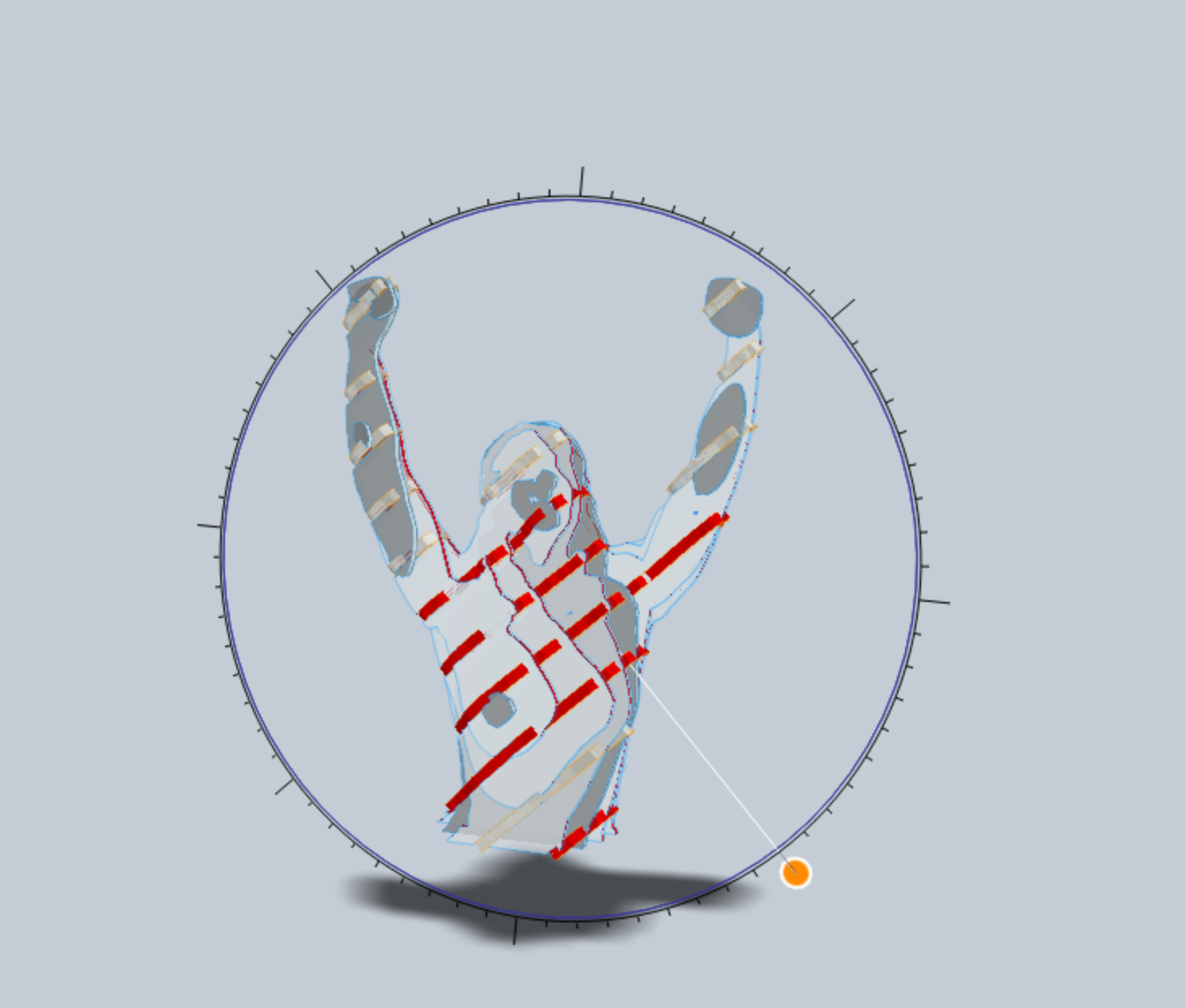
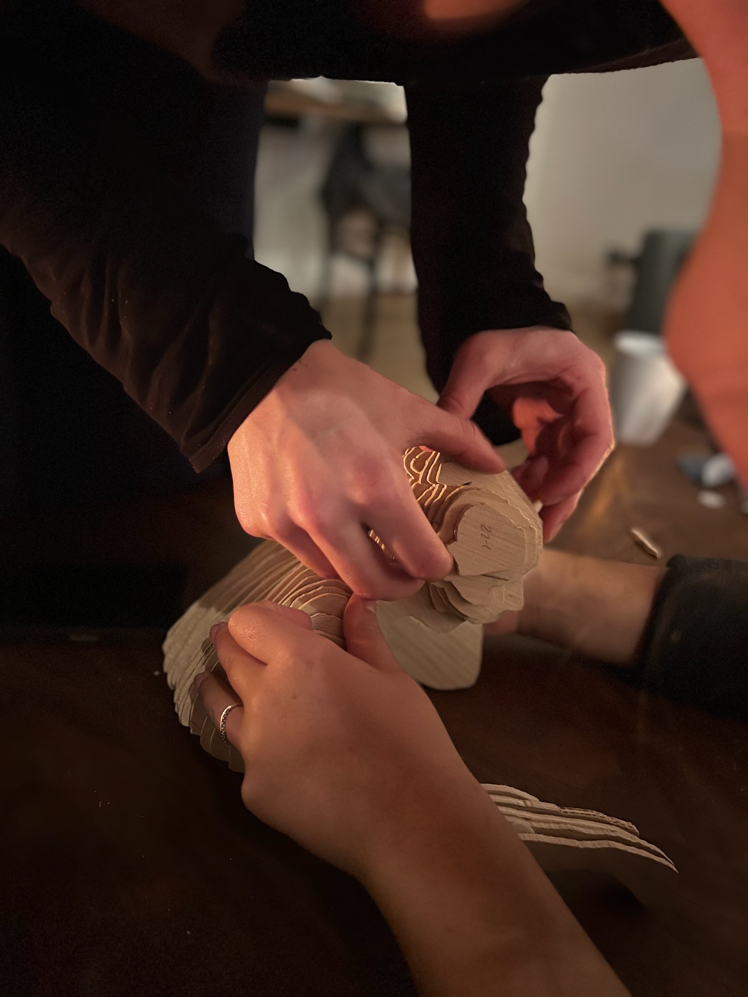
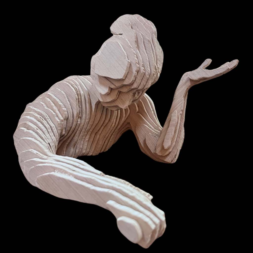
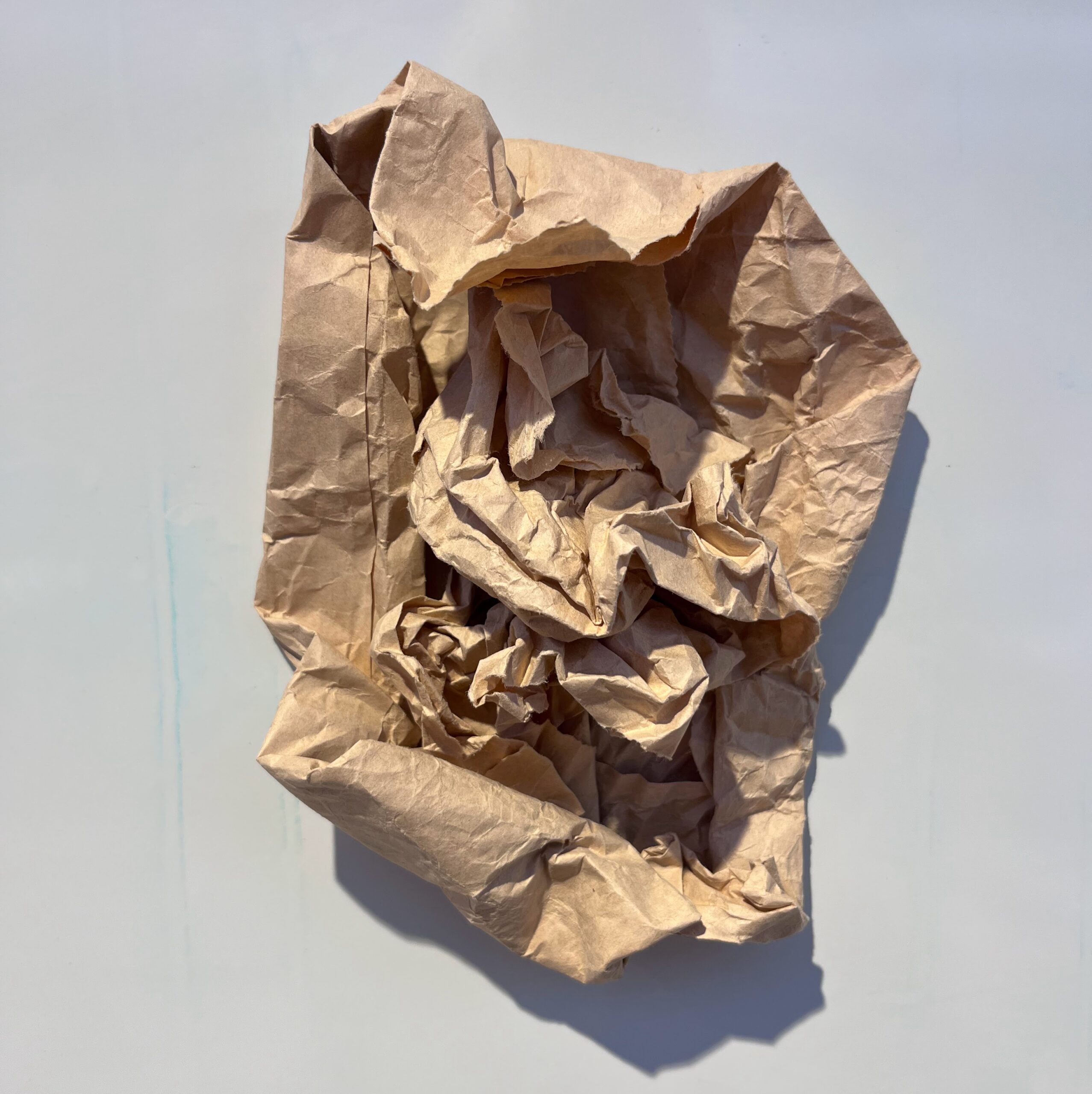
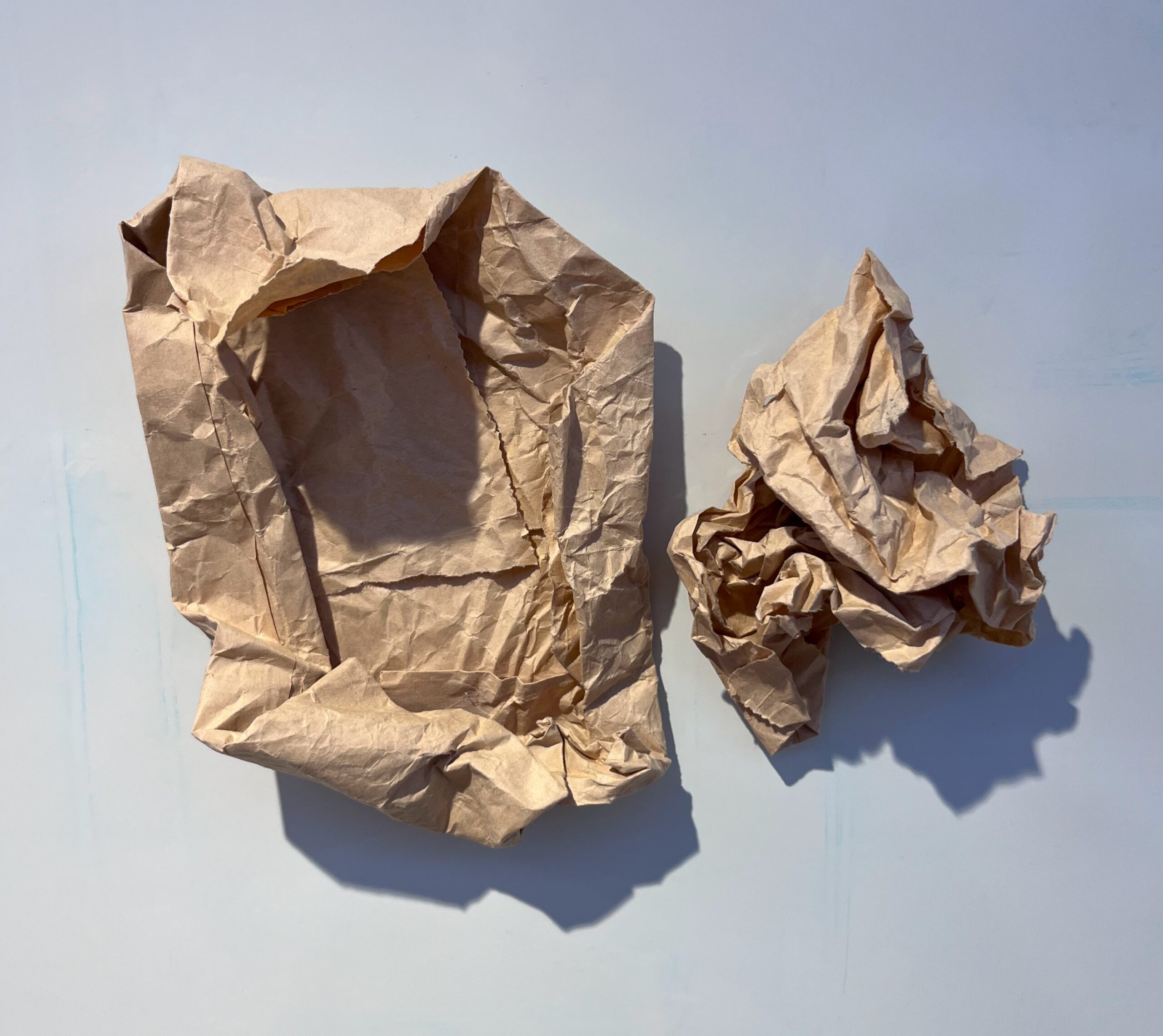
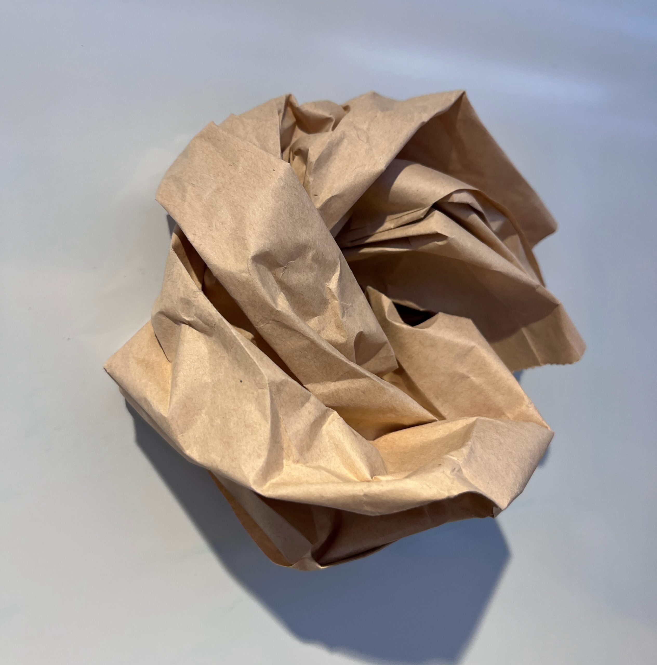
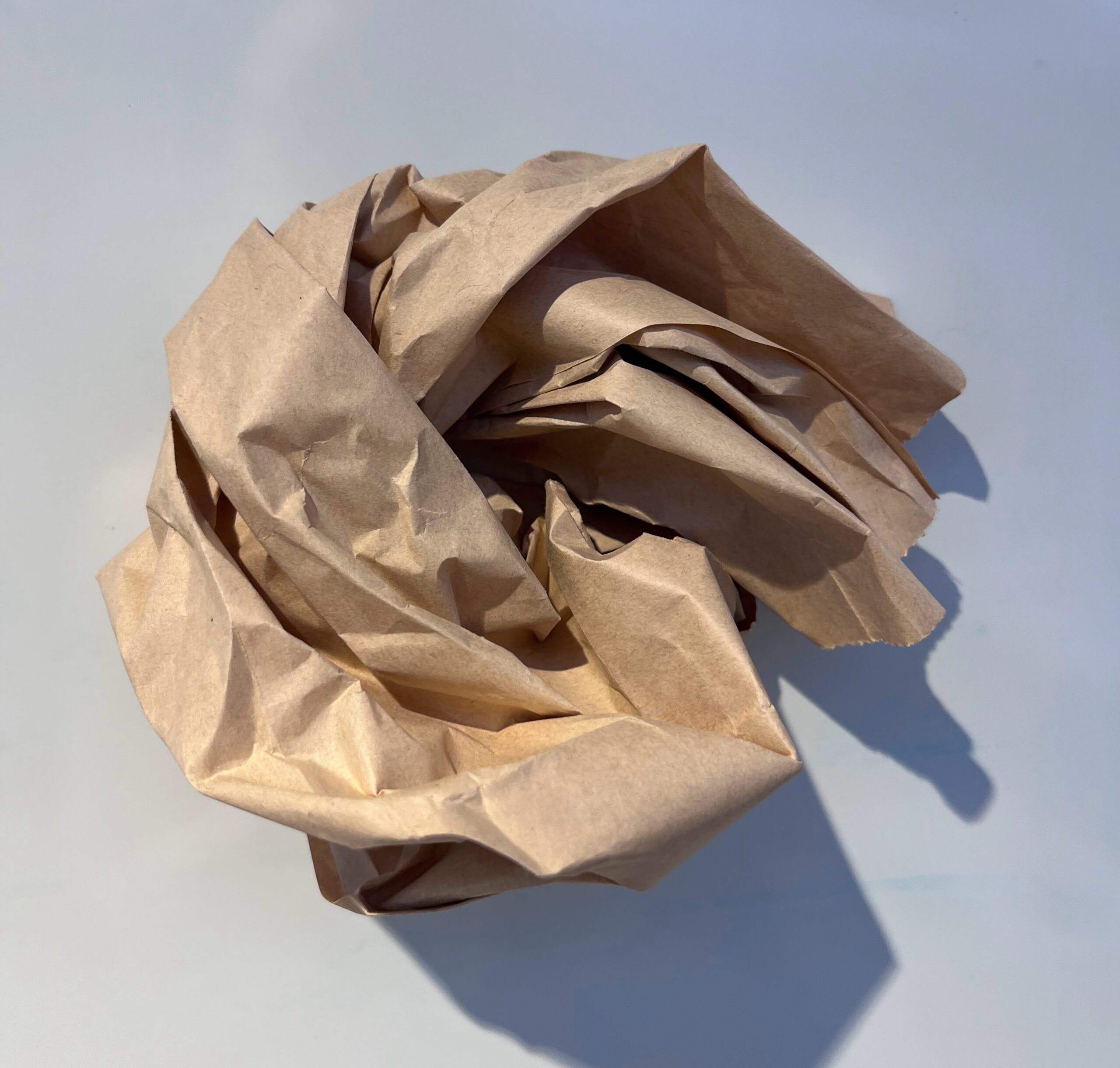
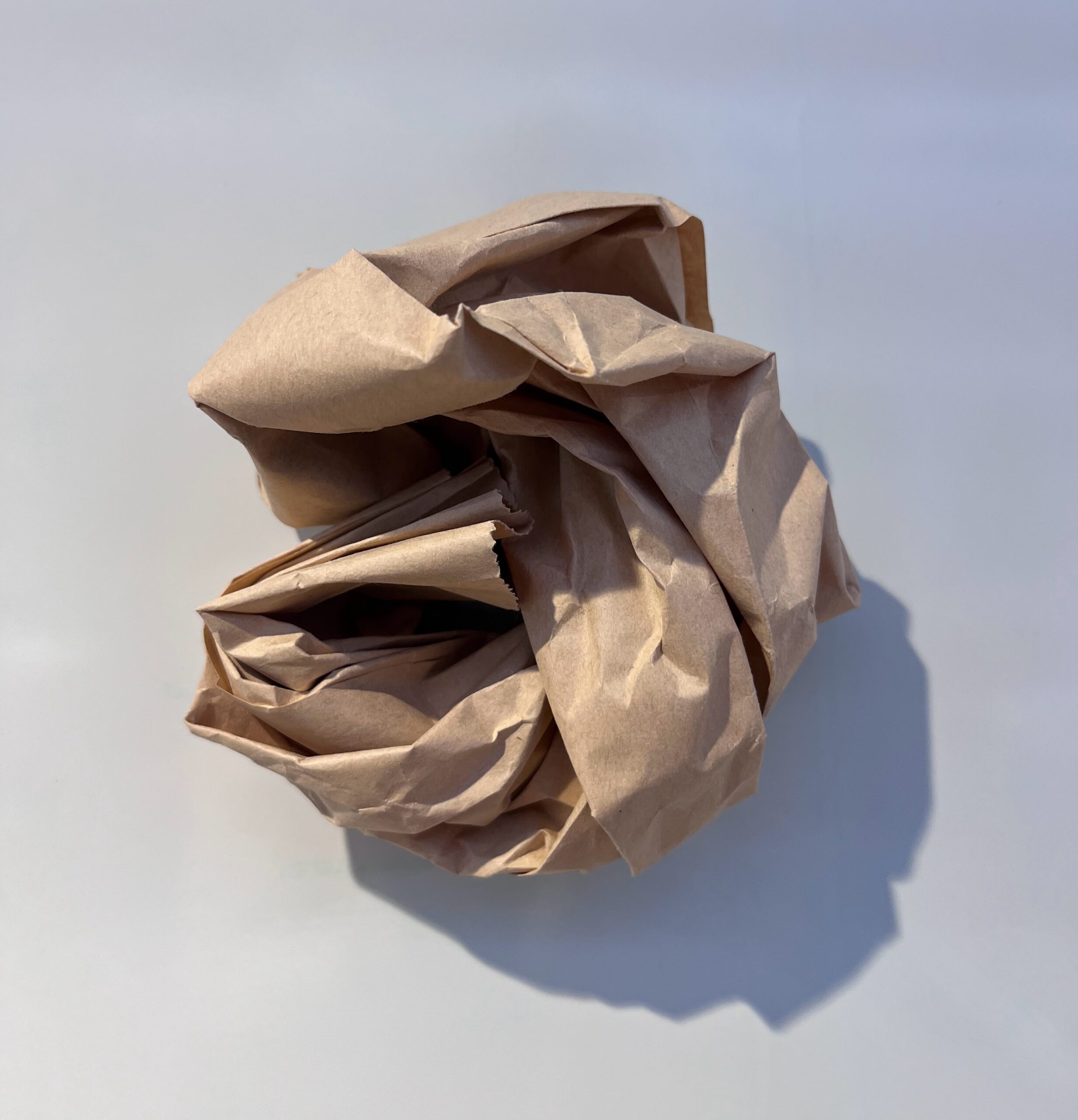
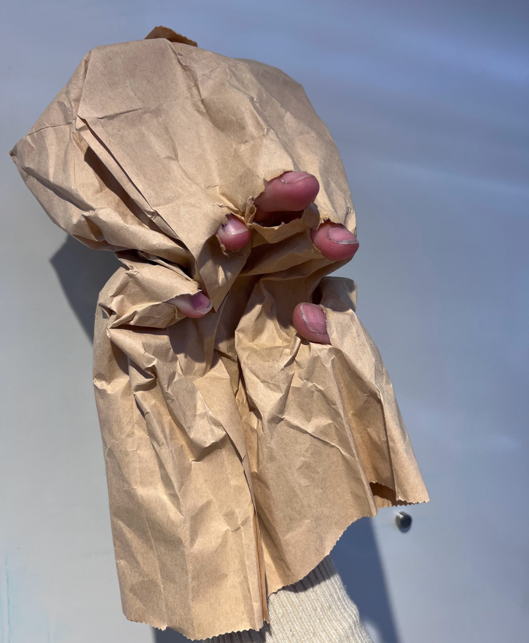
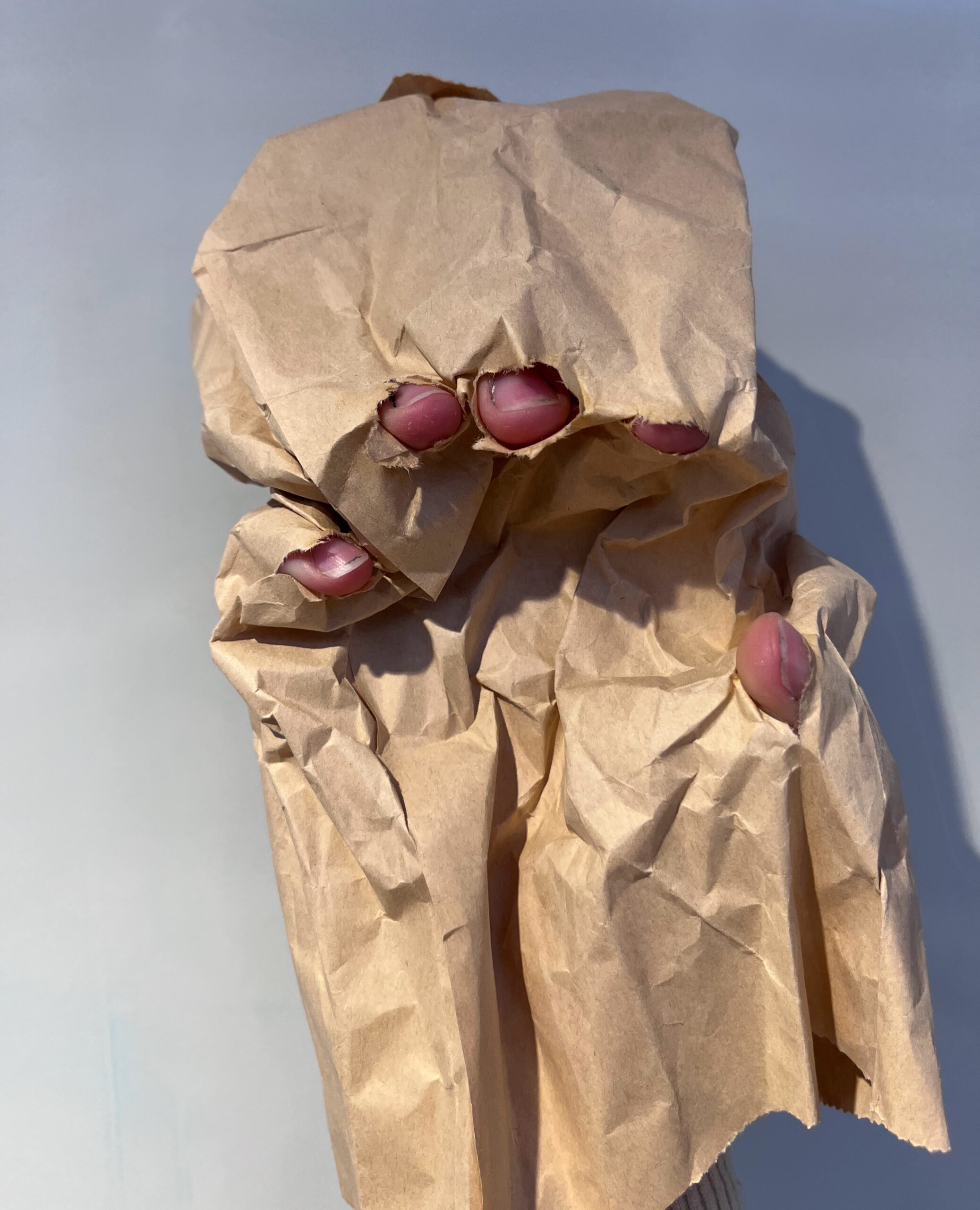
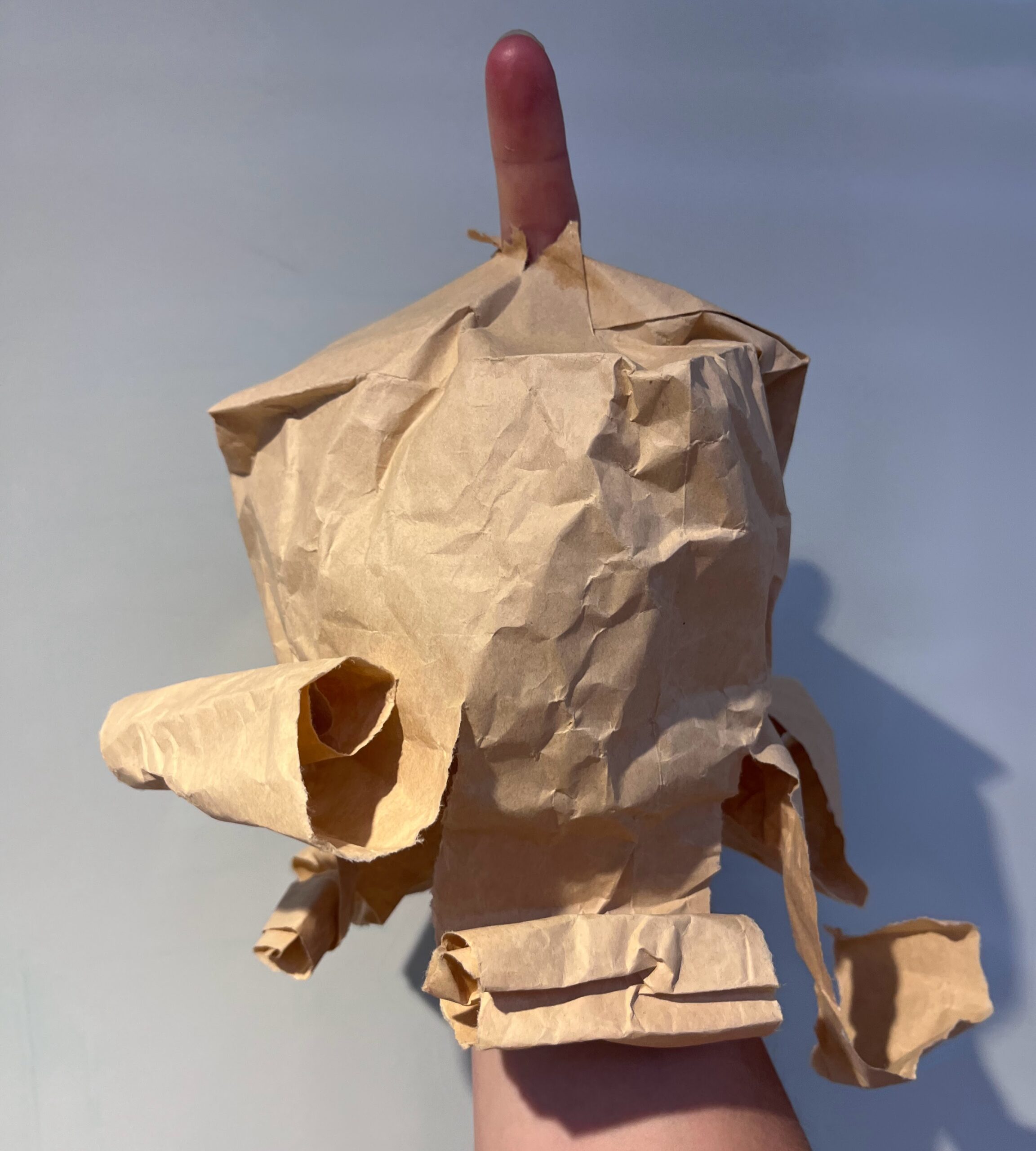
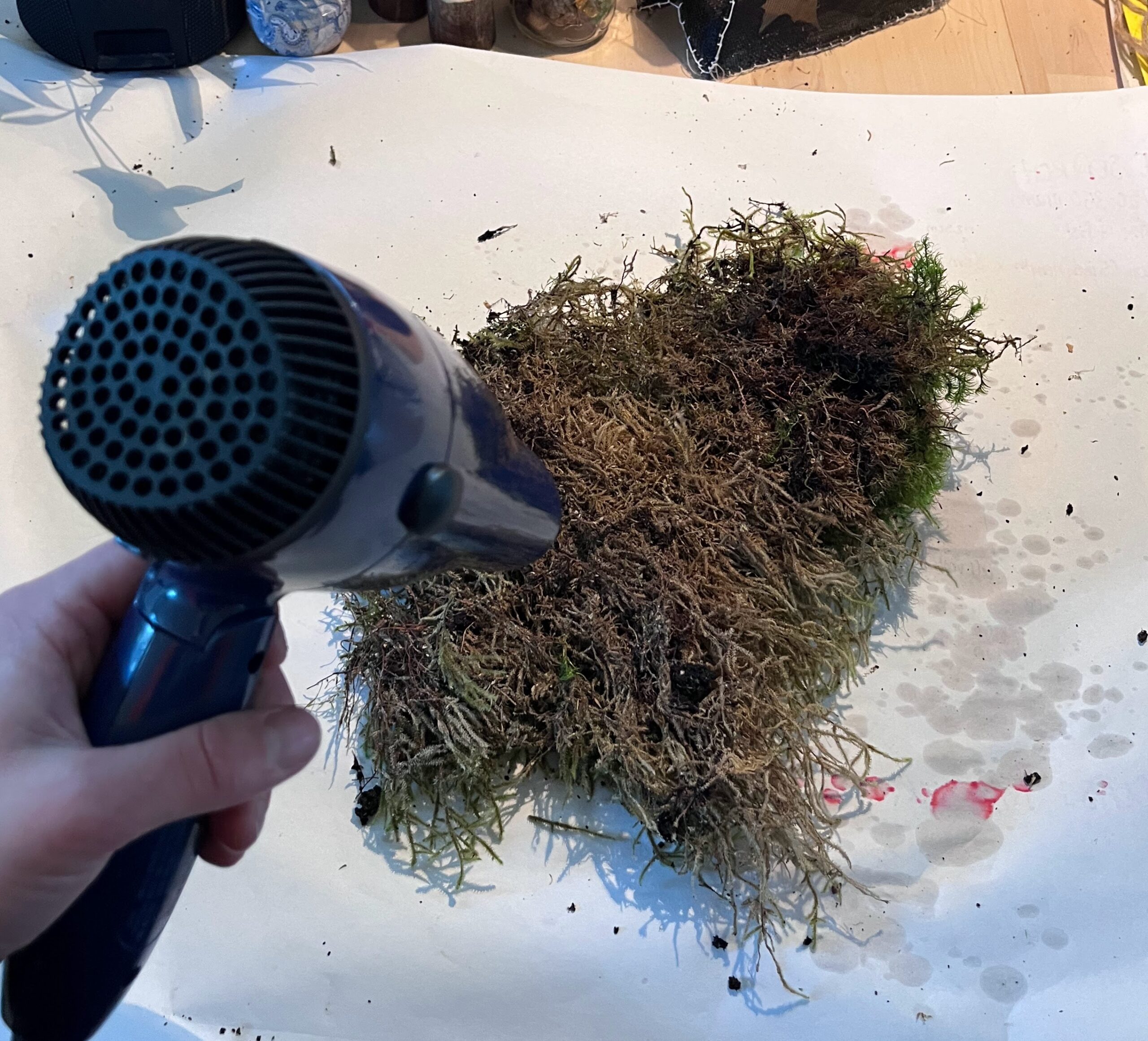
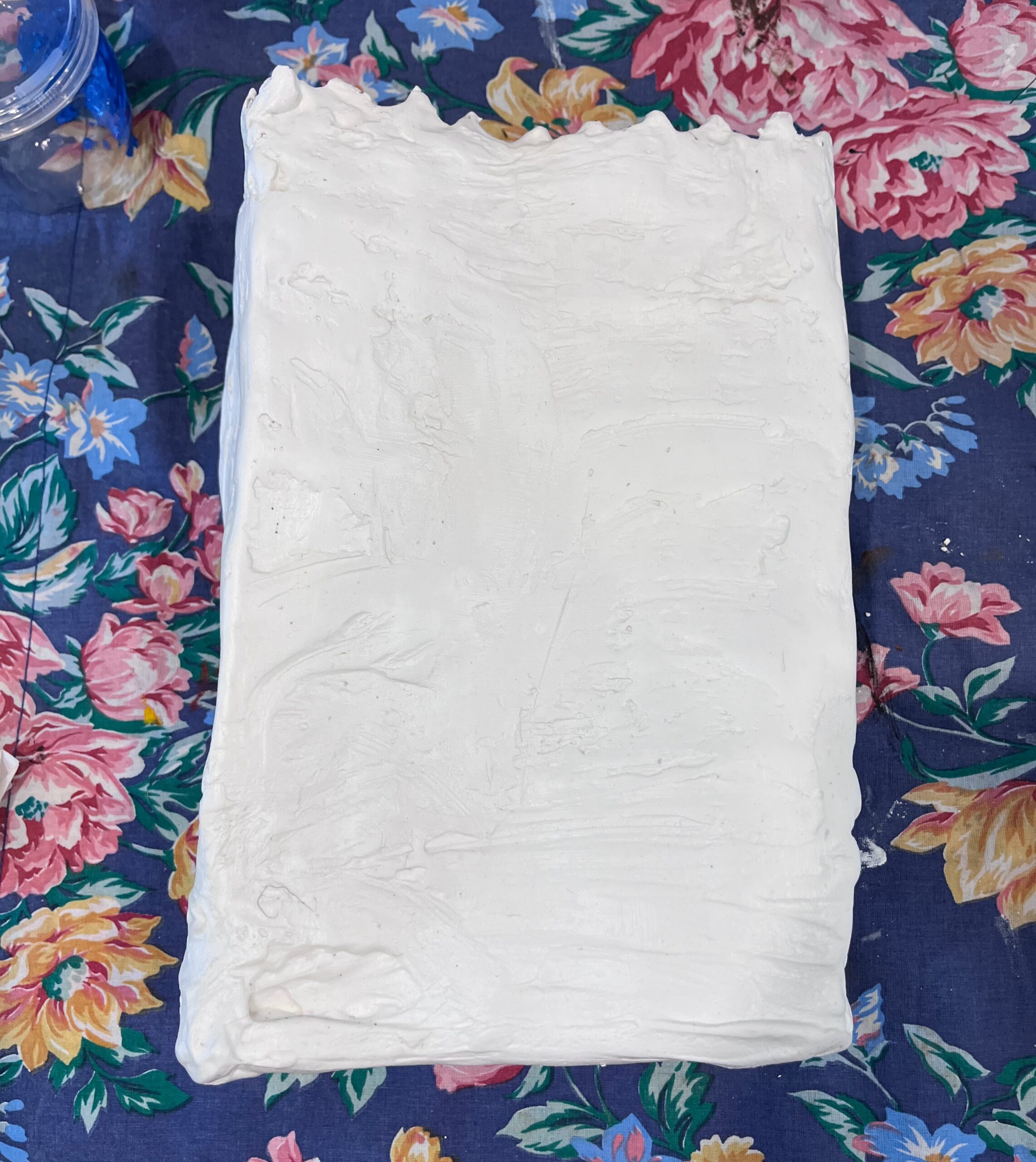
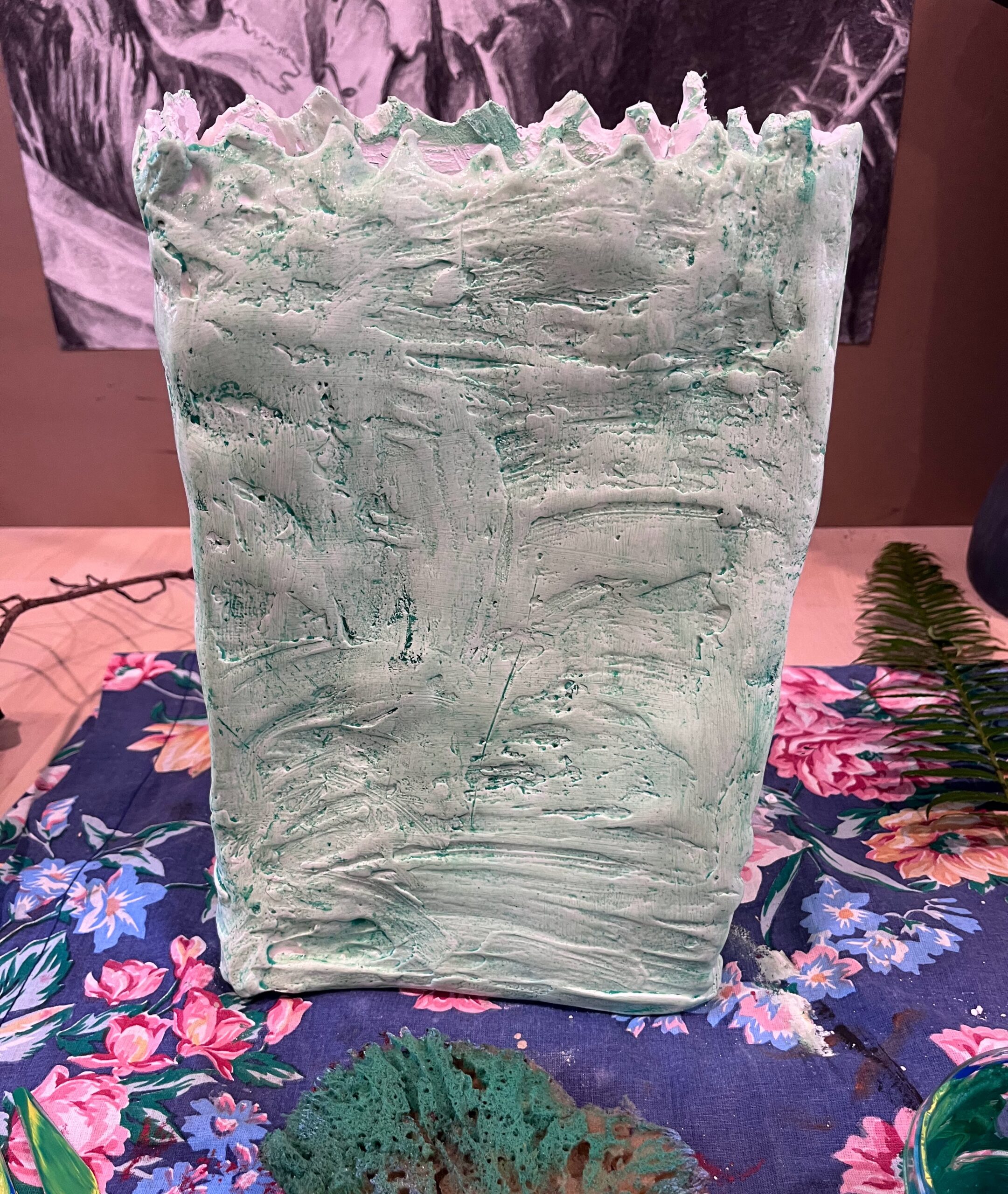
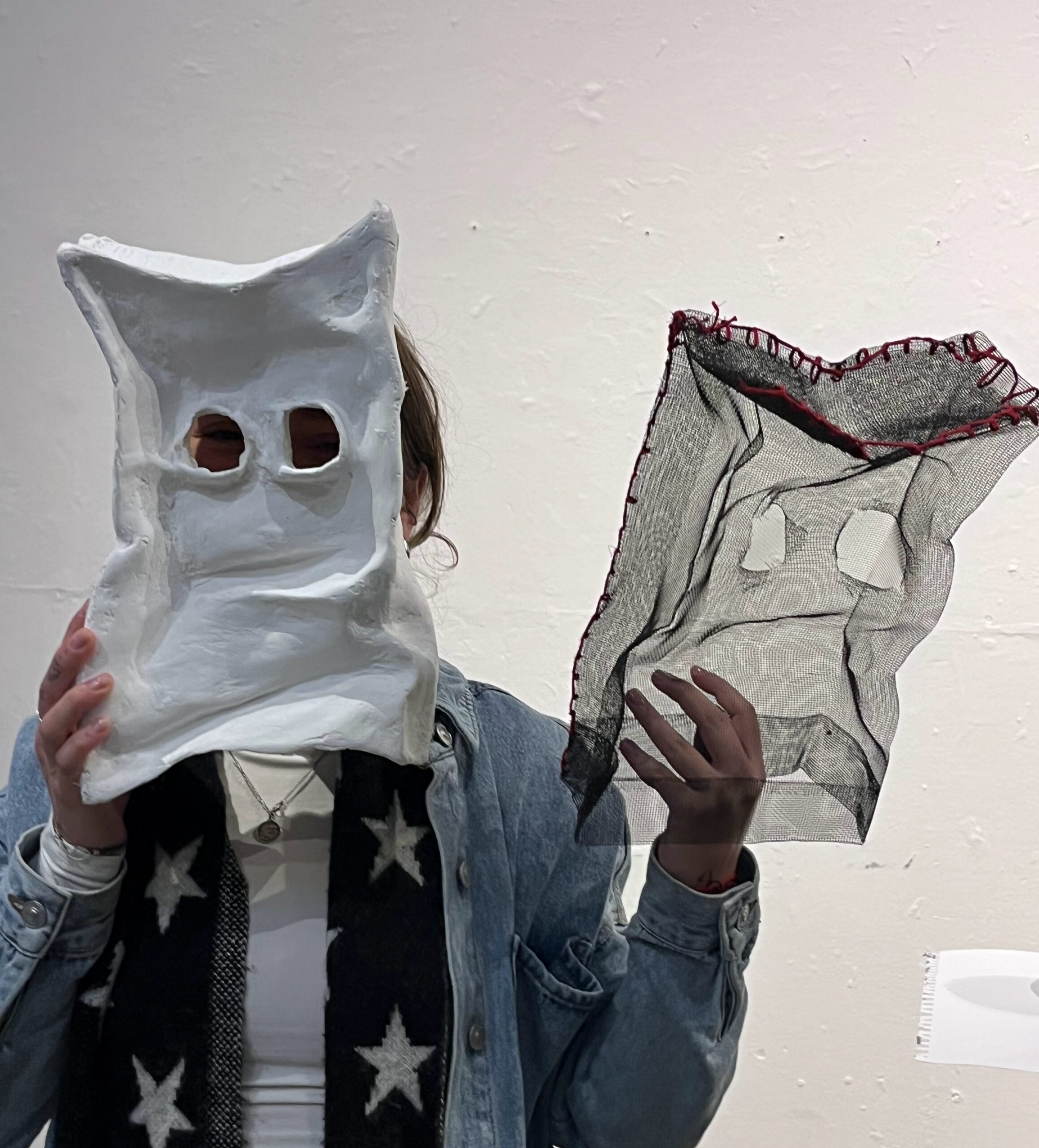
Building form: After considering my discussion with Jeff on how to create form with metal materials, I decided some good old fashioned paper and packing tape and paper mache might be the most realistic. I began building out the form using packing tape an newsprint paper from recyclable drawing sketches to complete the rest of the head.
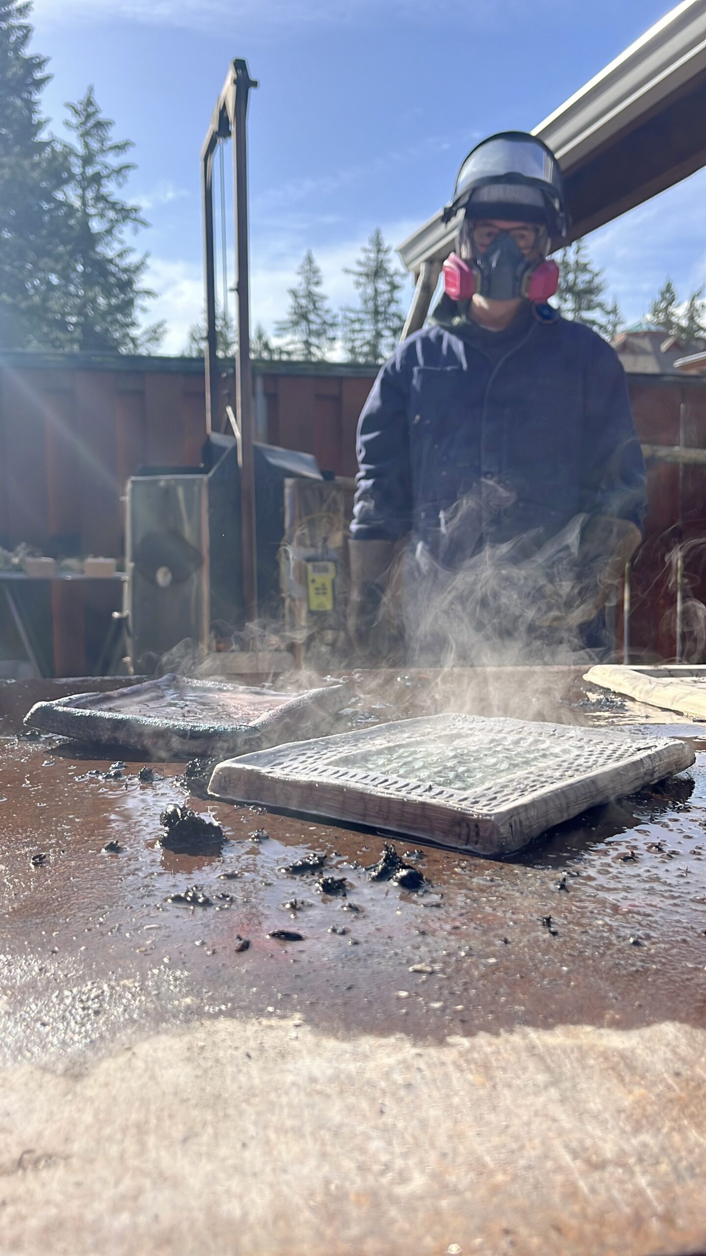
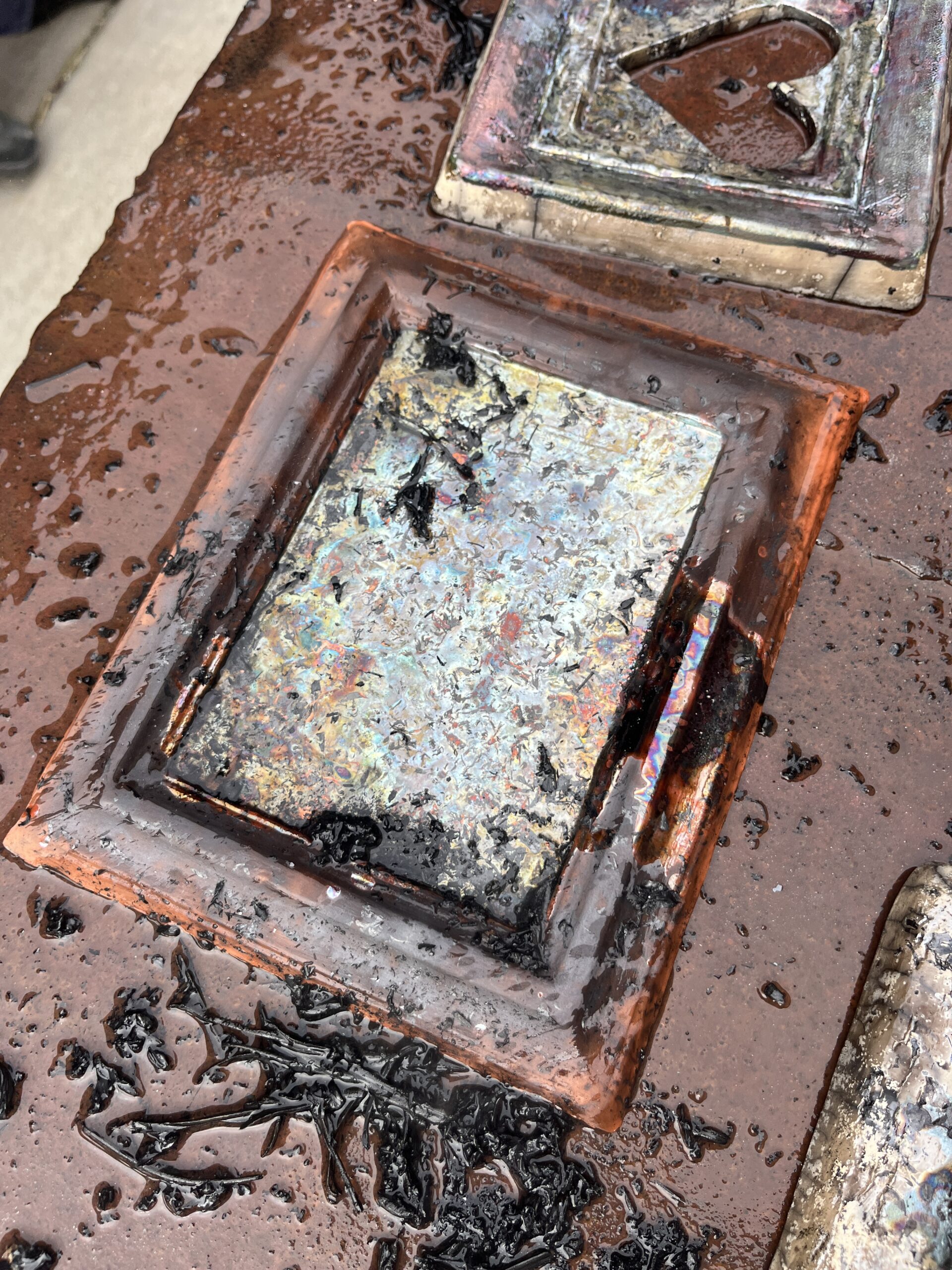
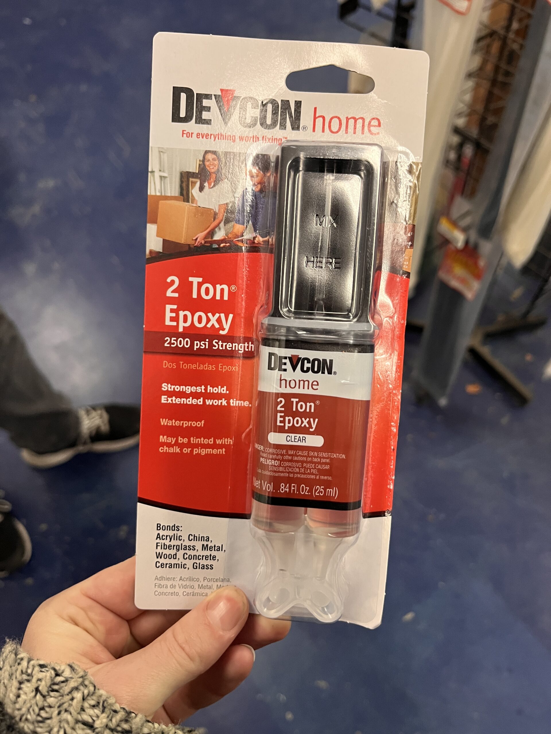
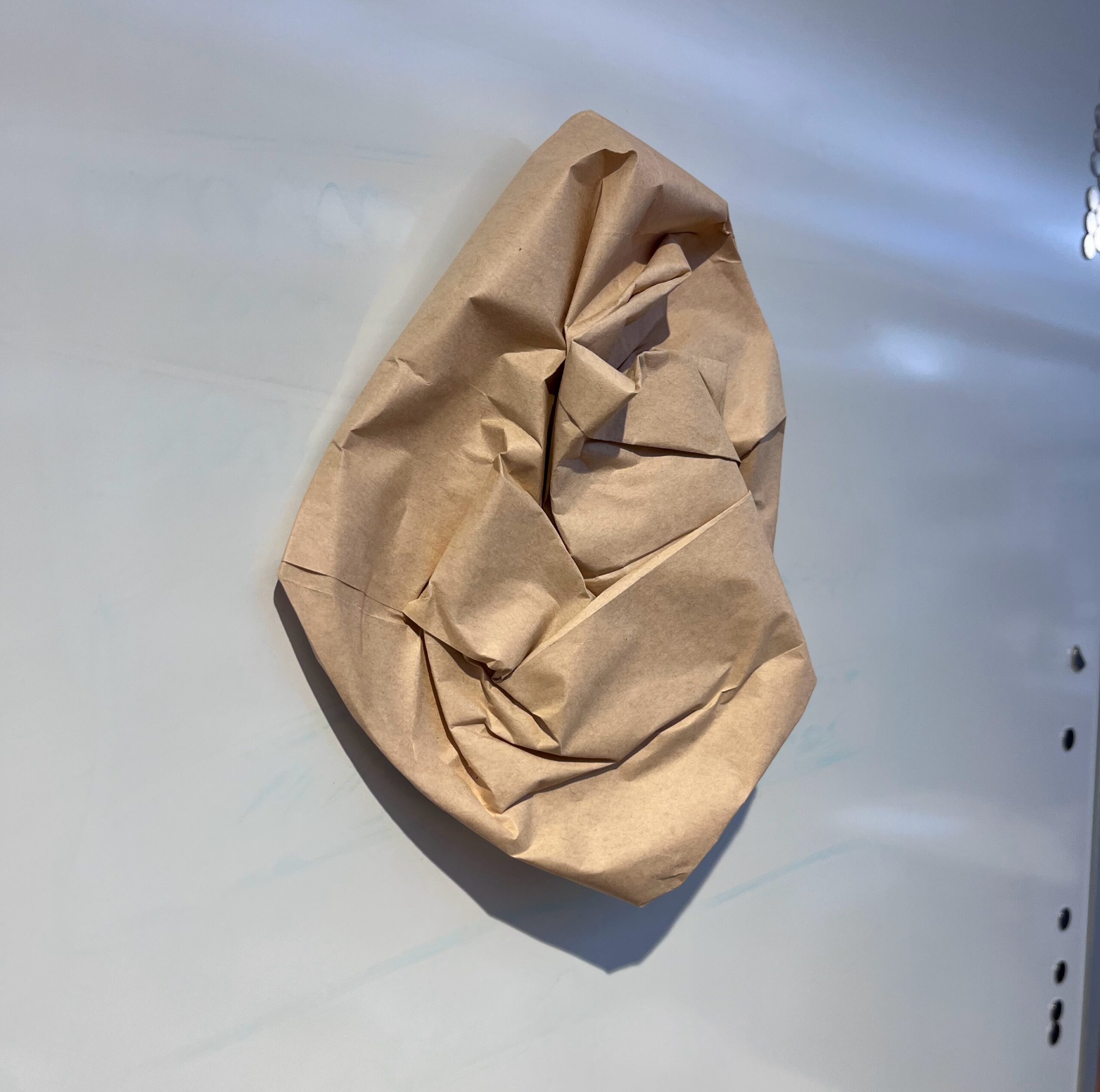
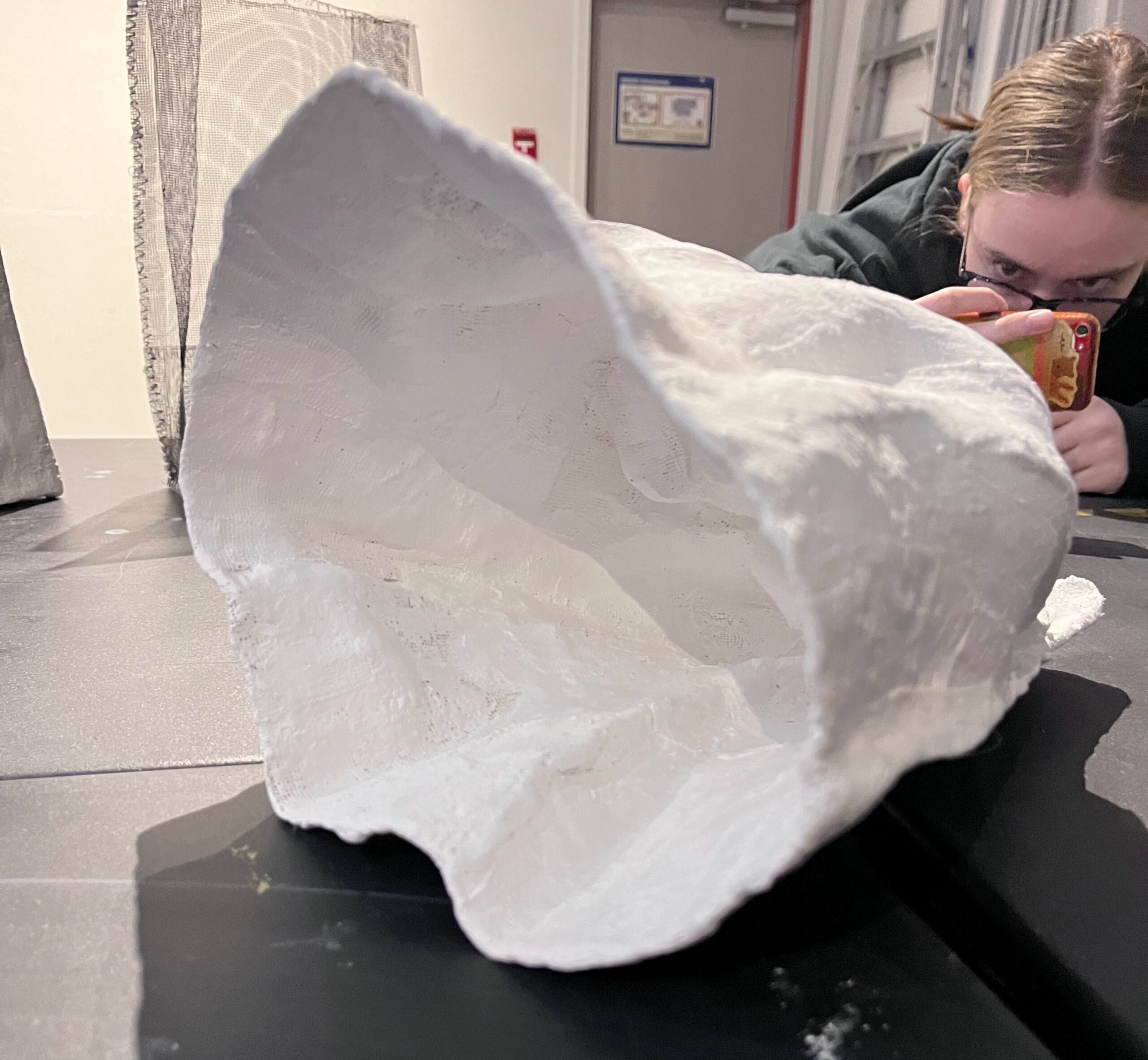
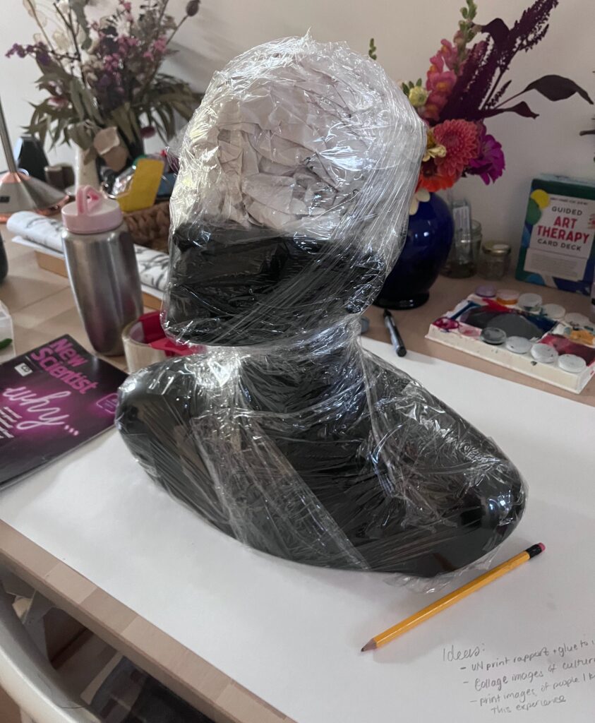
I had the idea that the mache form needed to separate from the mannequin, but I hadn’t worked with paper mache since elementary school so I watched probably 6 of videos on YouTube and asked Perplexity AI how to keep it easy to separate my form from the mannequin. The solution was plastic wrap. I watched other videos on how to make a paper mache clay with drywall joint compound and even adding cement to make it waterproof, but decided I’d keep that in mind for a future project. Plus, I seriously considered the health impacts of using drywall paste with my bare hands and un-ventilated bachelor suite.
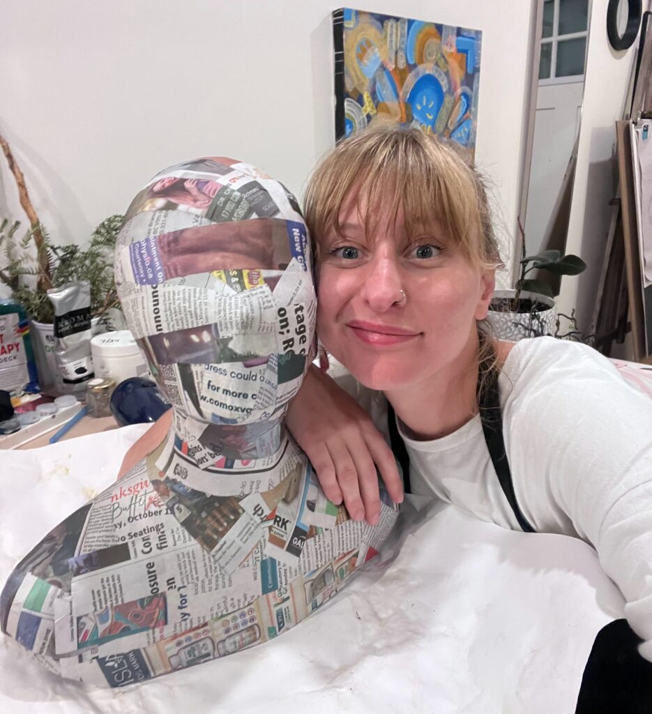
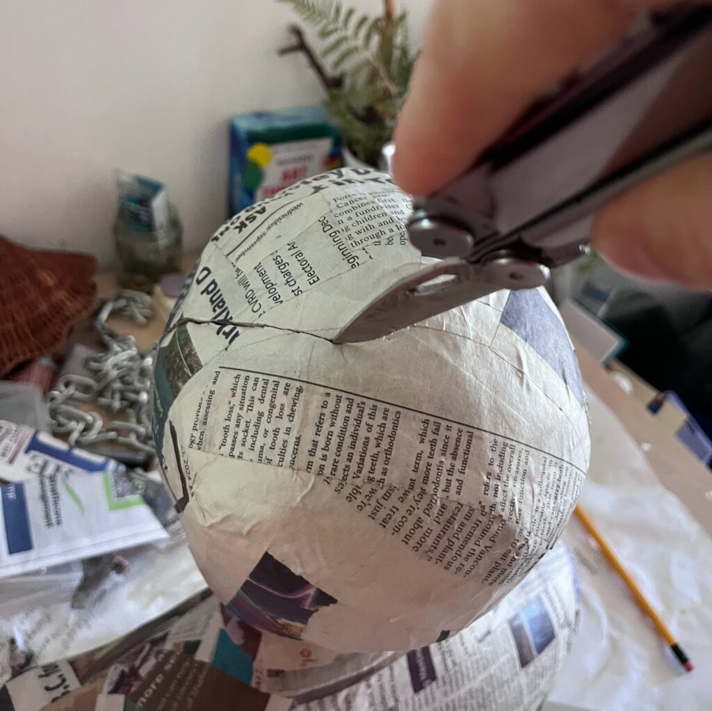
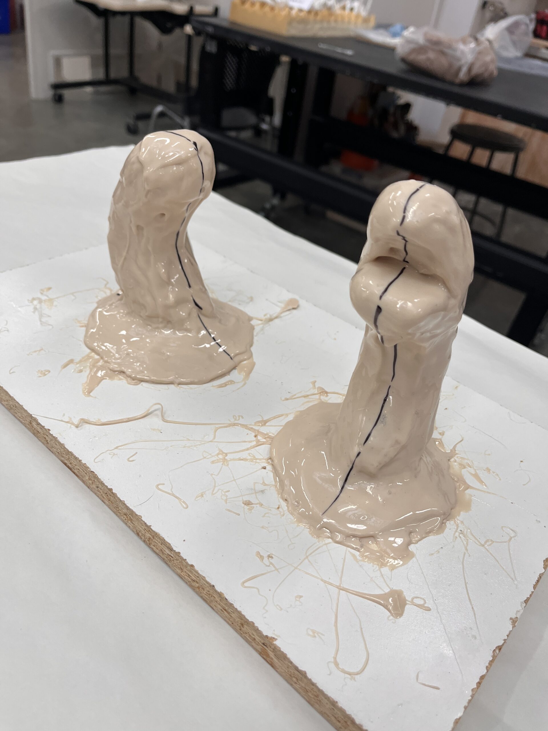
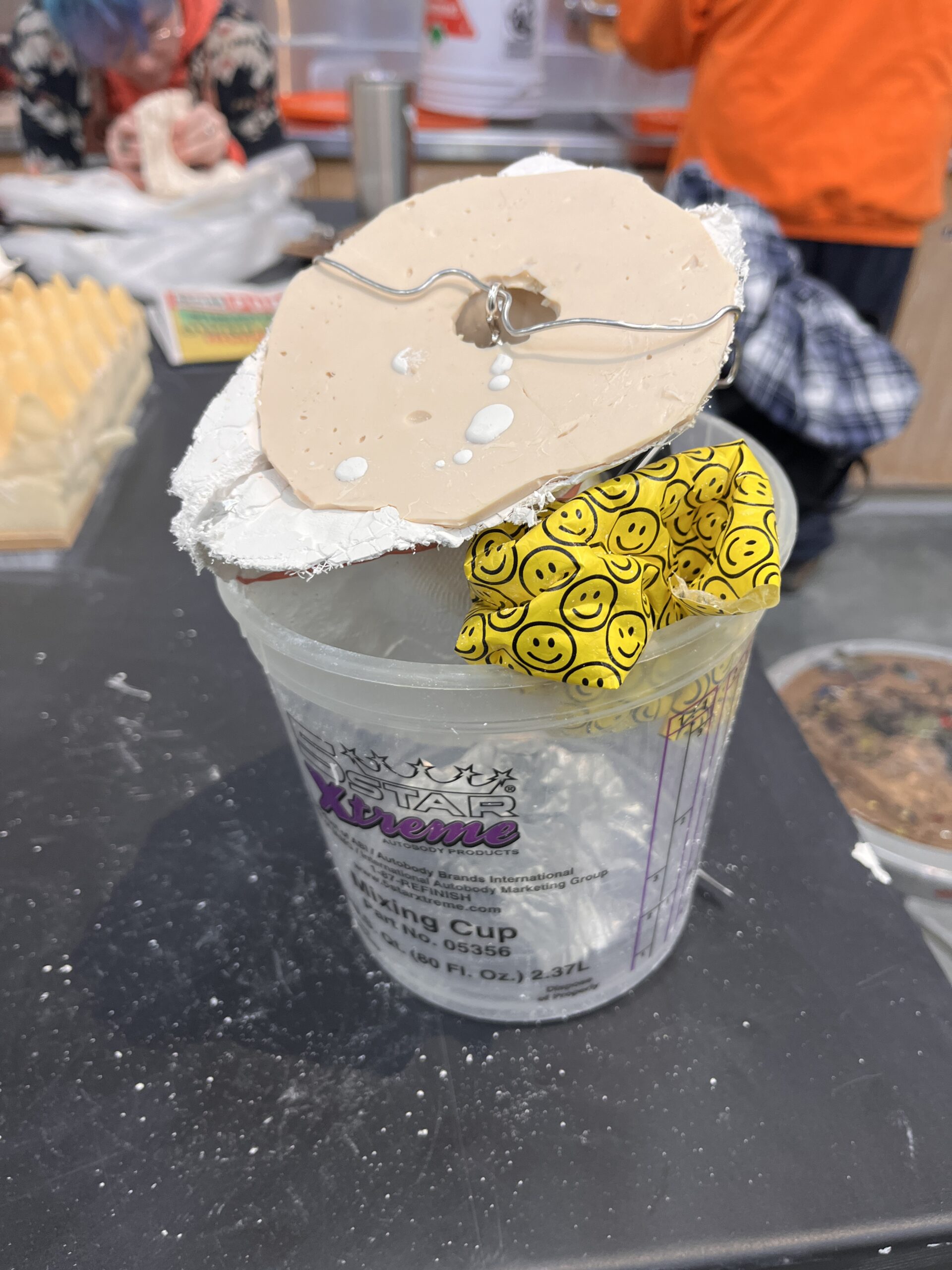
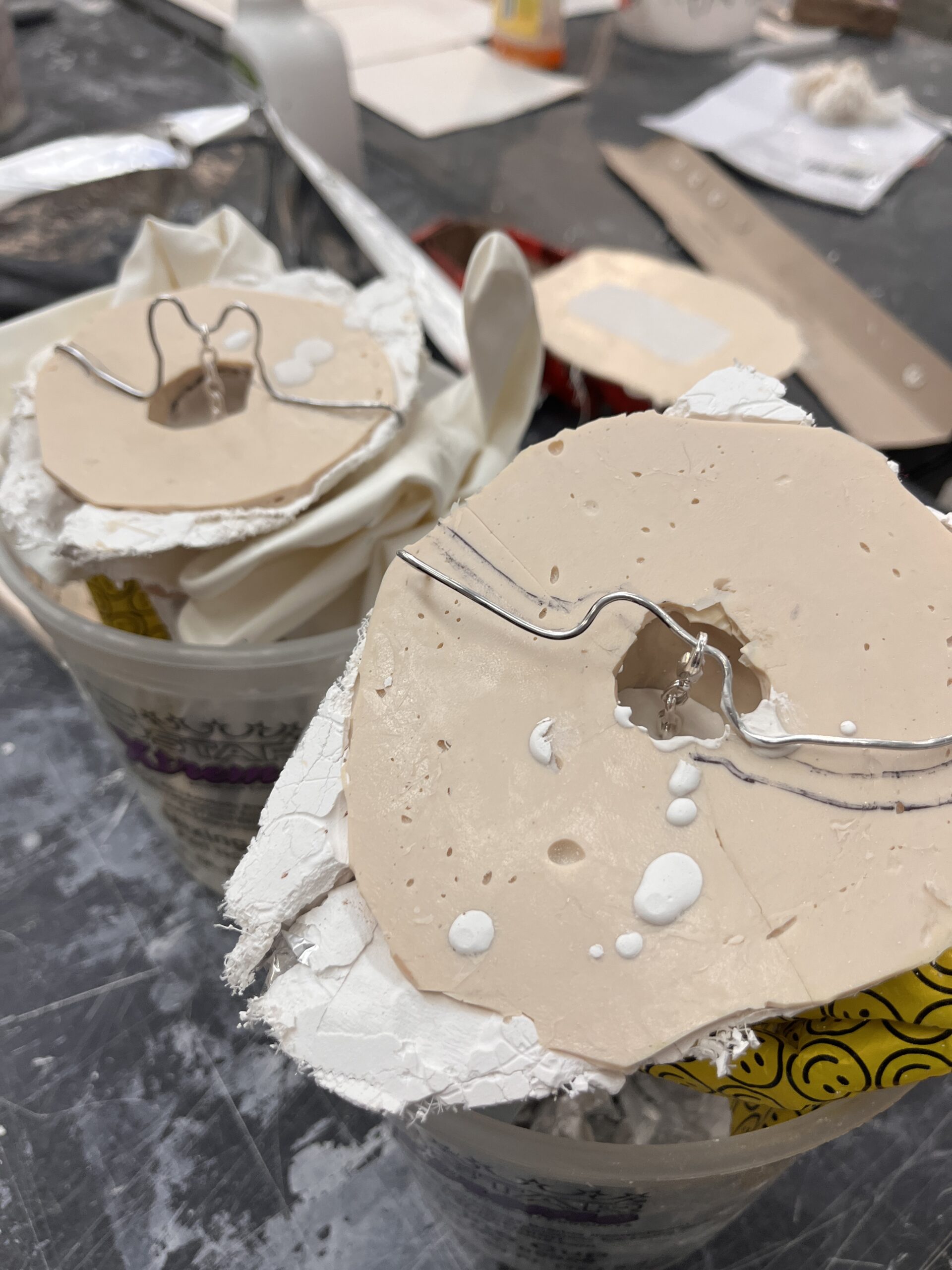
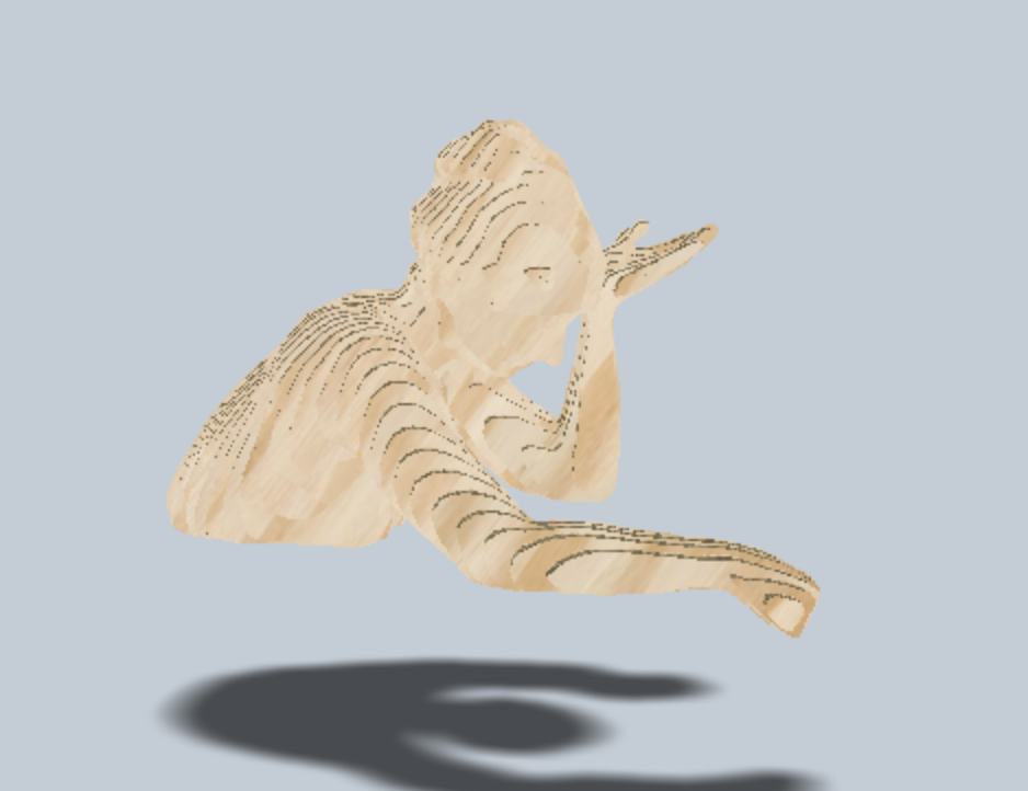
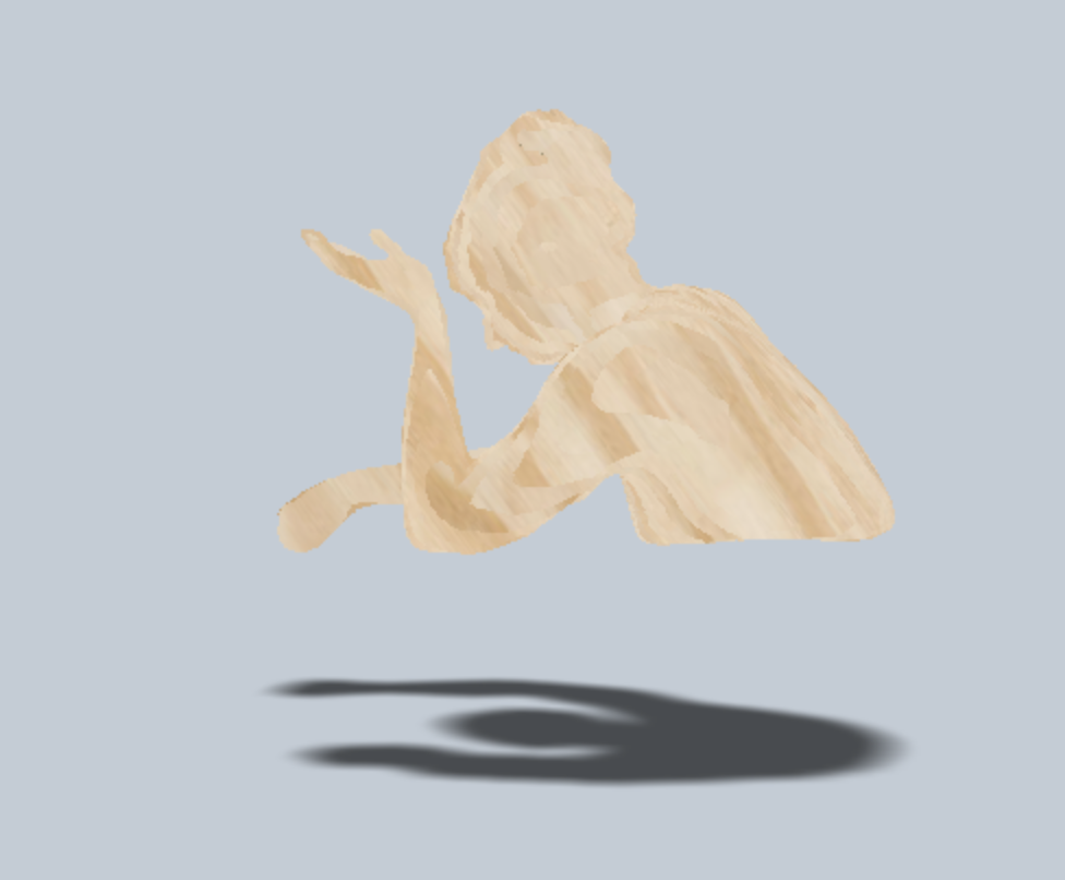
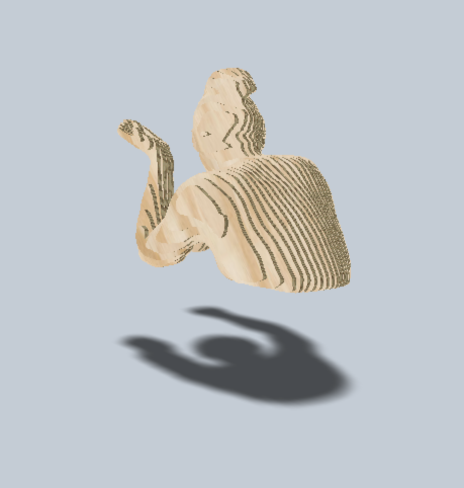
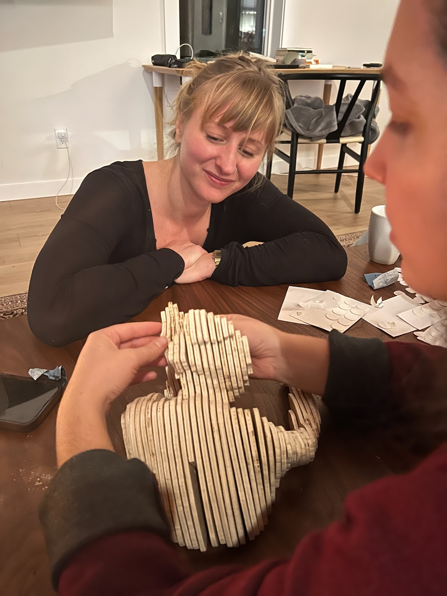
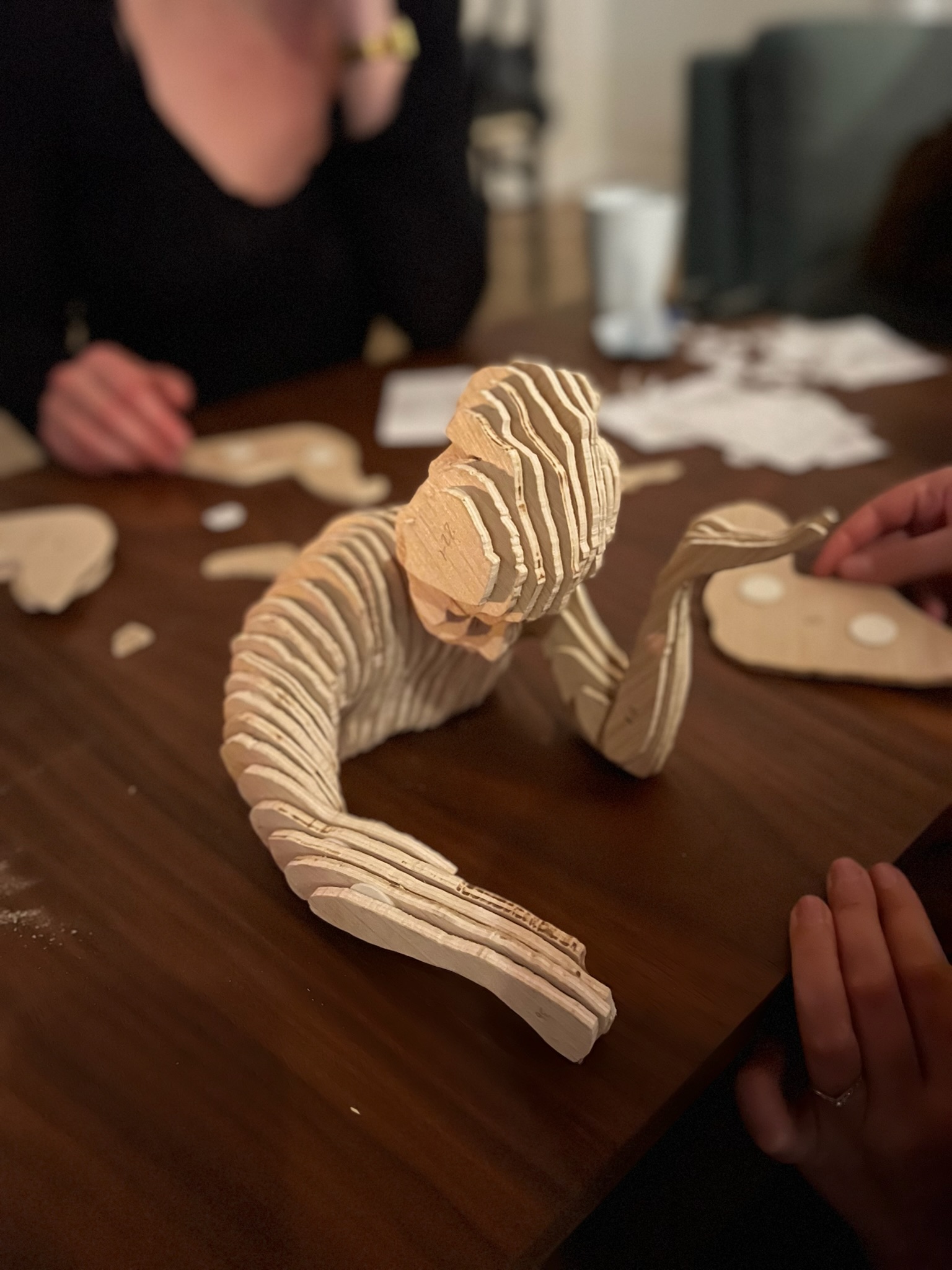
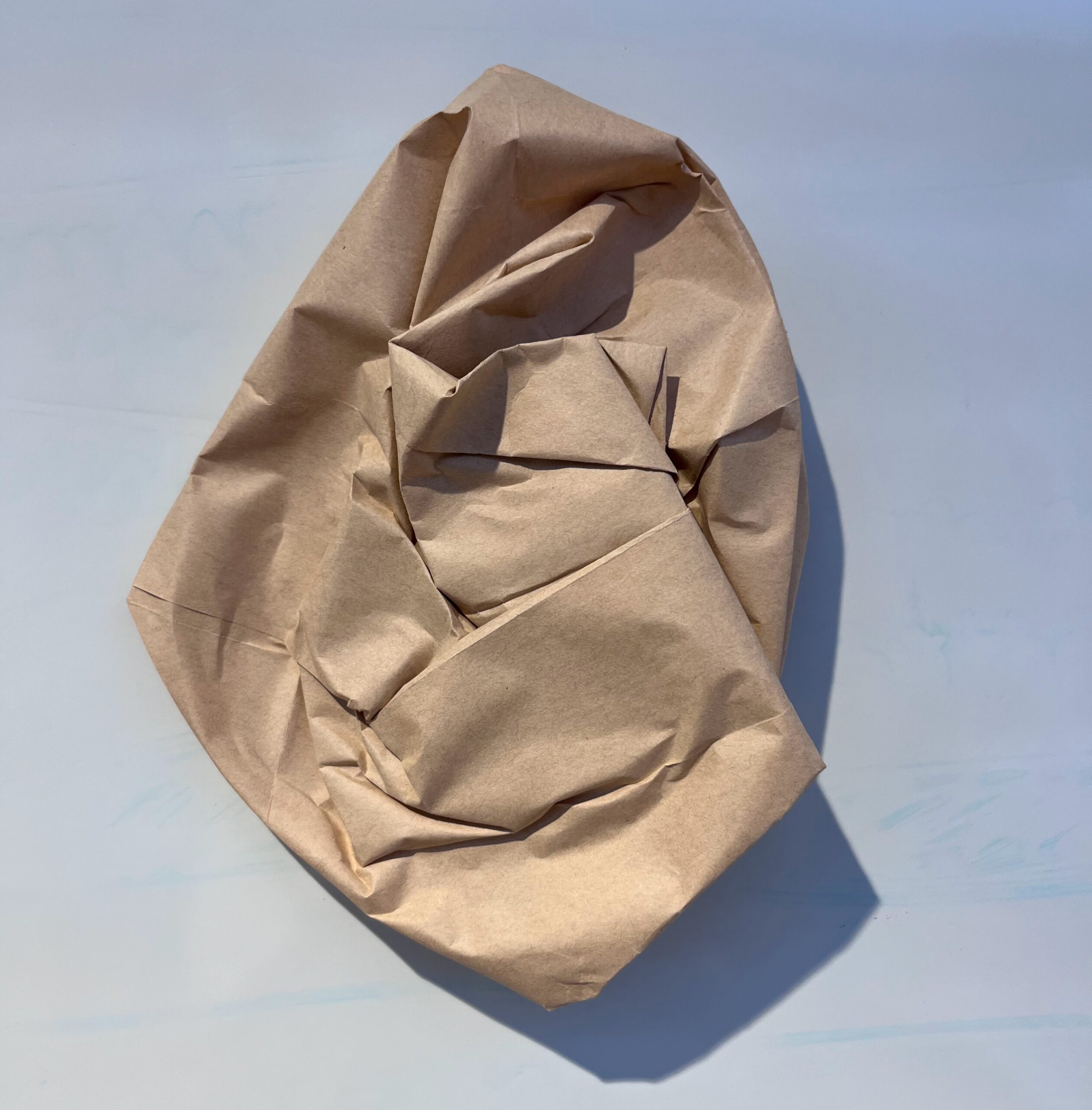
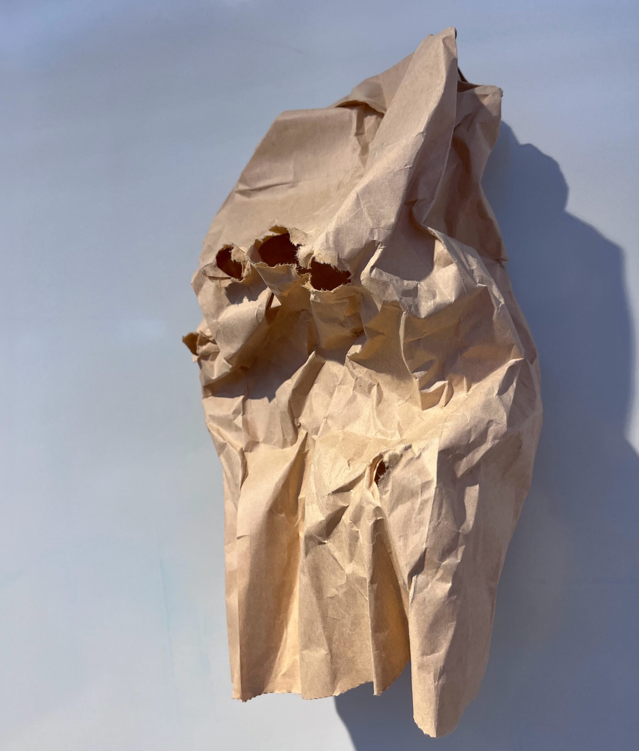
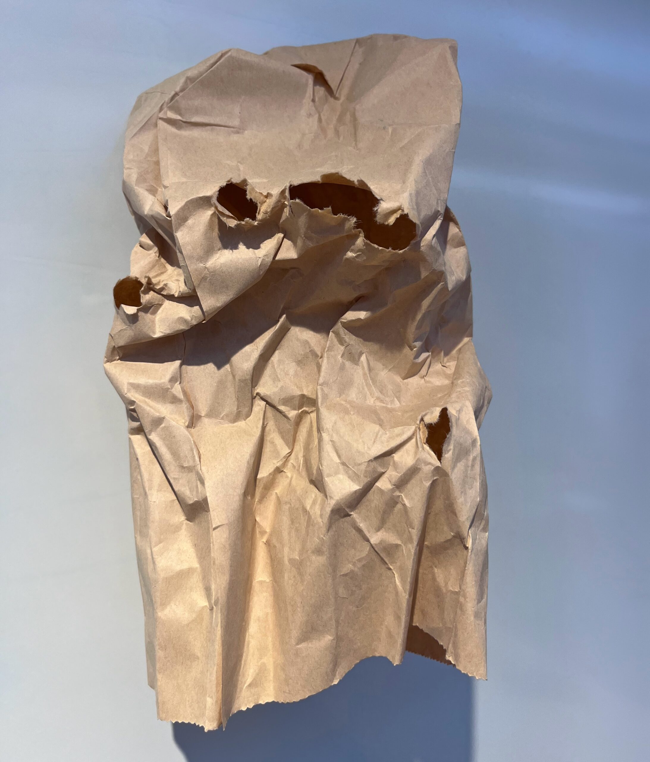
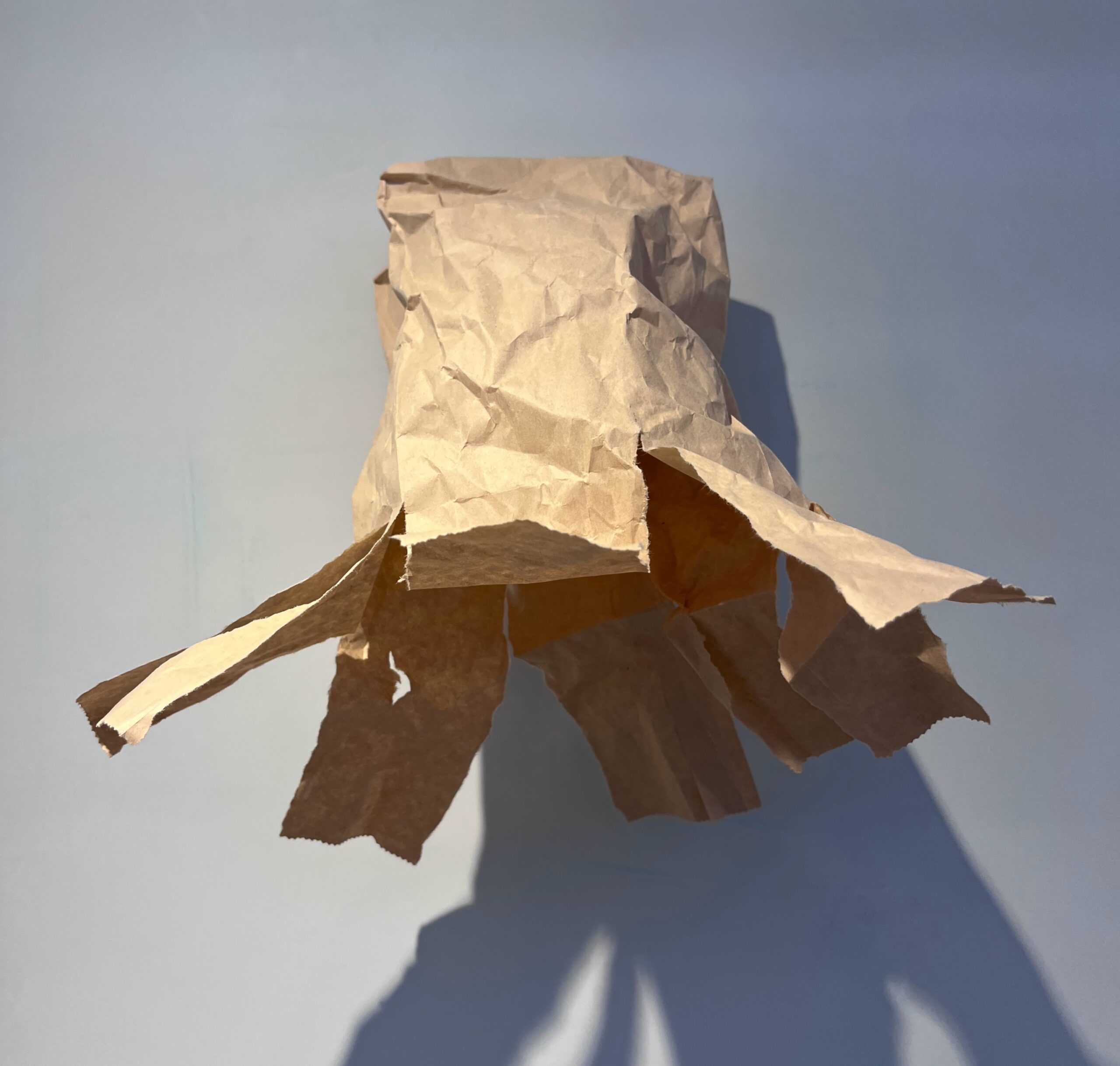
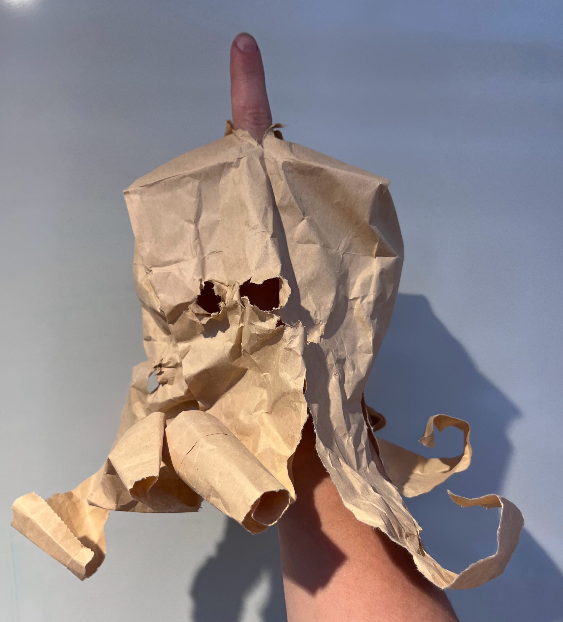
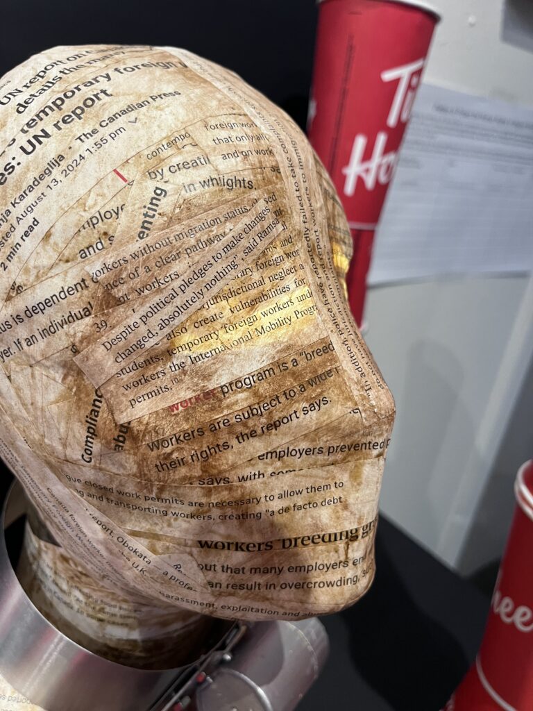
Completion of paper mache: After 5 layers, several podcasts, and my Friday night, I had completed my form. While layering I took notes from ideas that came up. This is when I had the idea of using the UN Special report as the paper mache skin for my structure. I also noticed that using the paper mache strips in certain directions created interesting lines on my form. For example, I could create a collar, hair, and even emphasize the eyes and contours of the face.
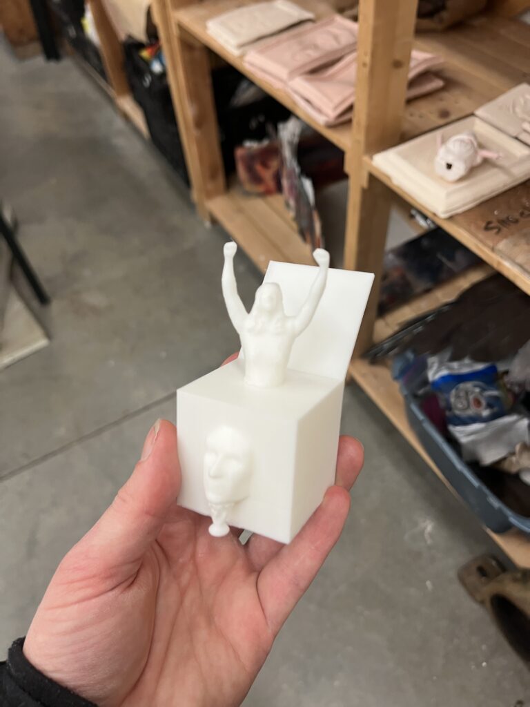
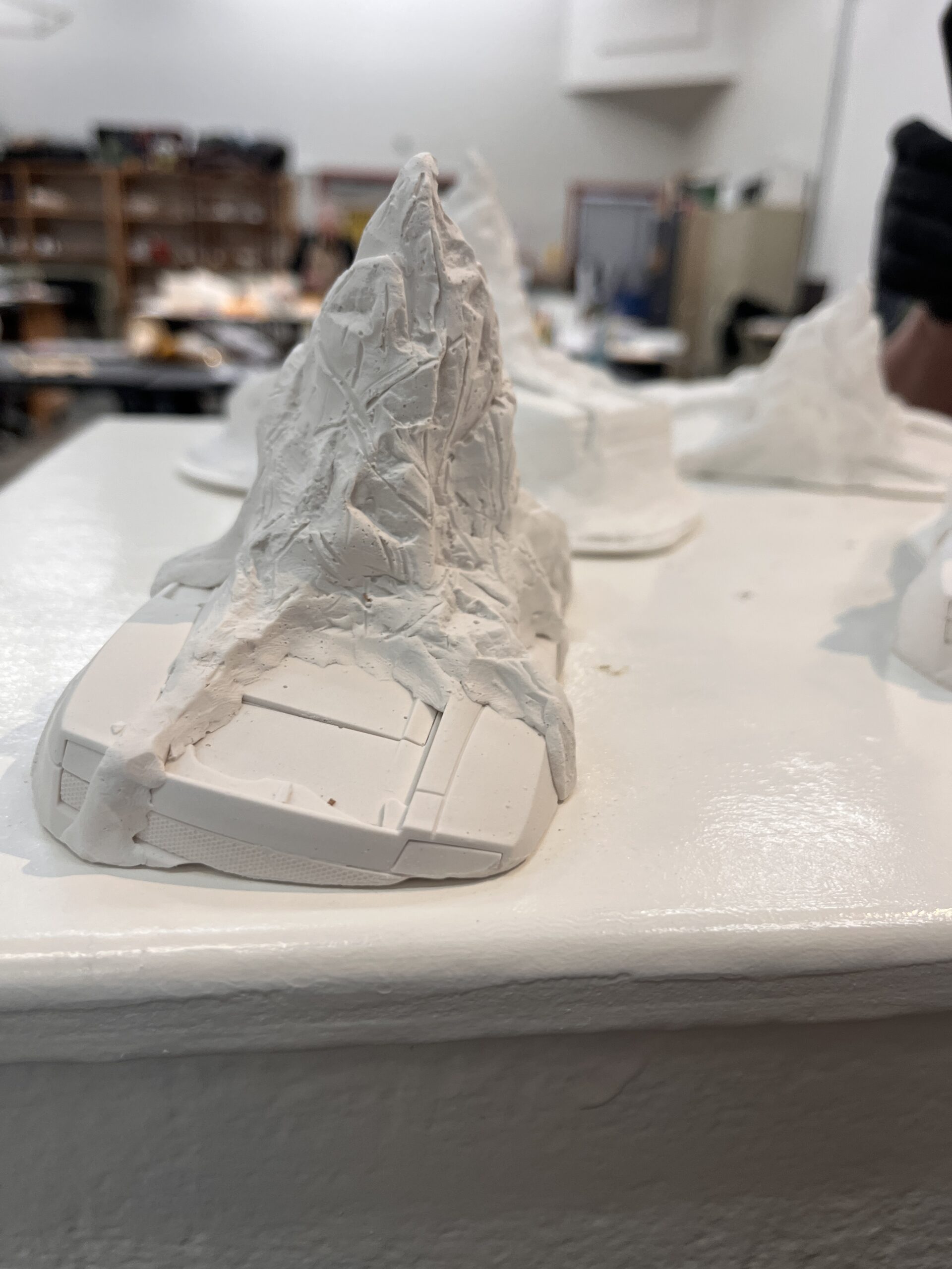
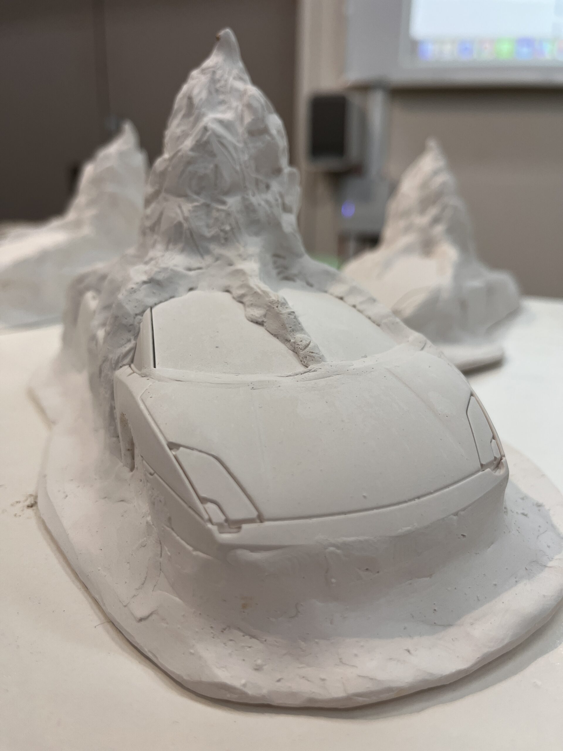
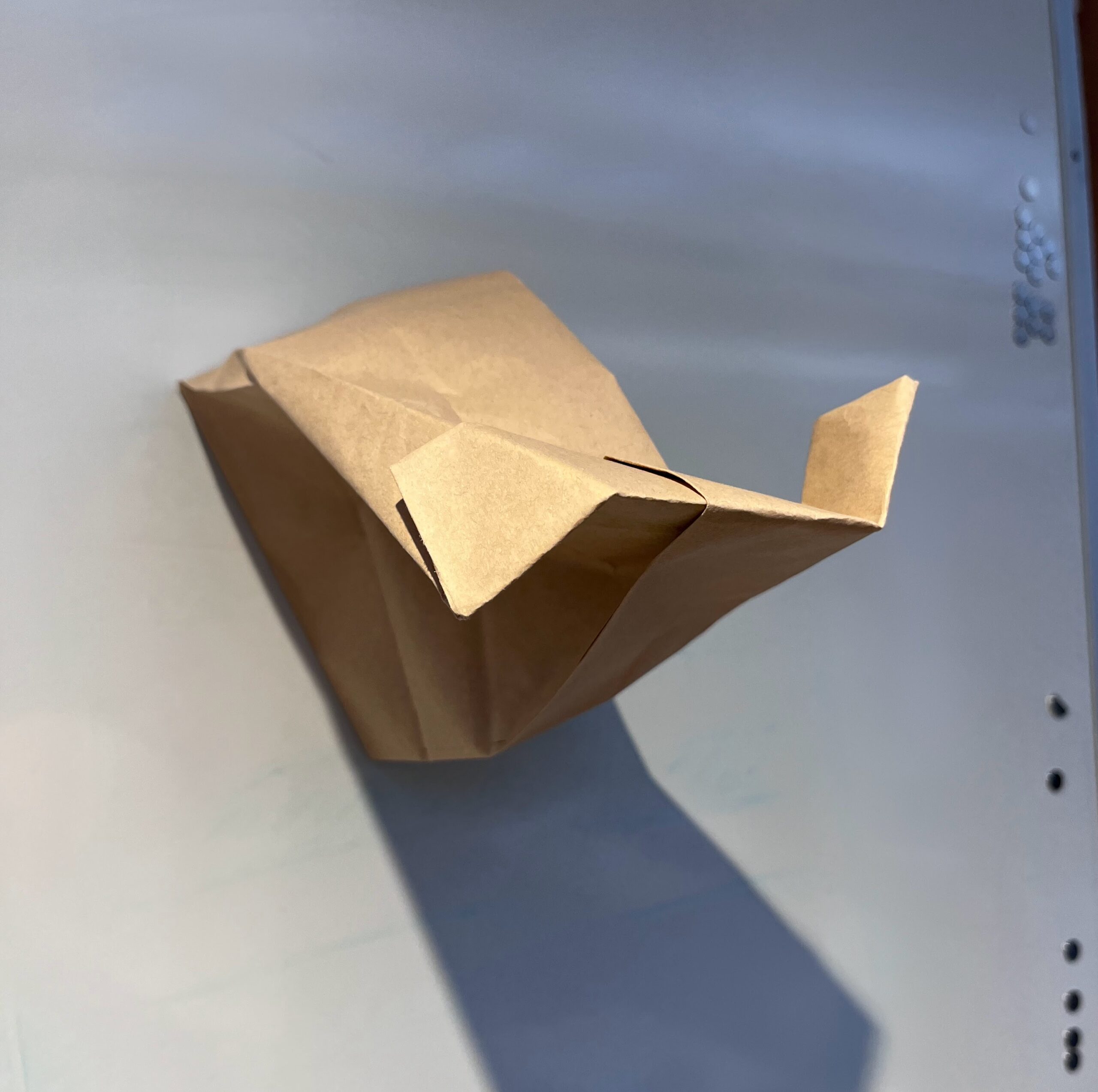
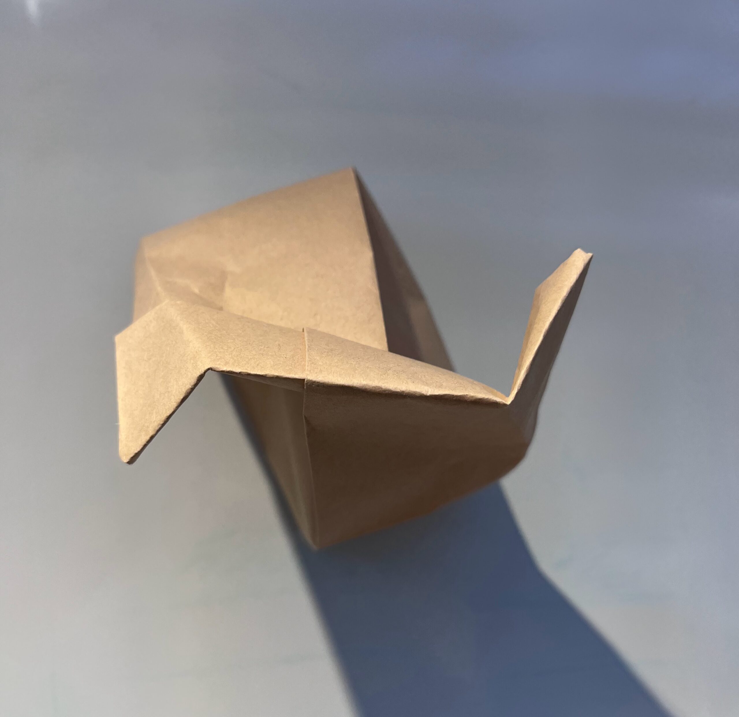
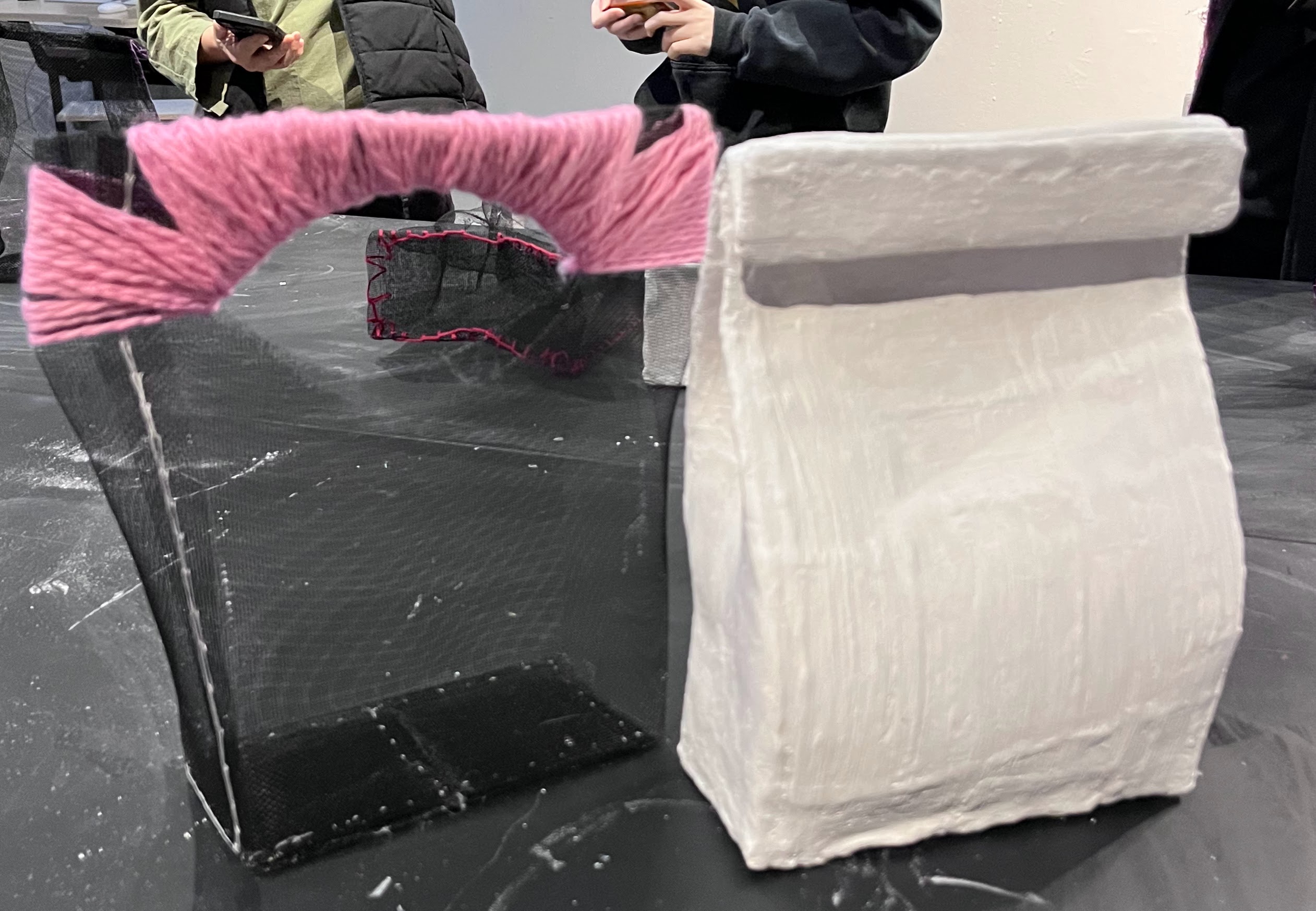
How to incorporate the cup: I wasn’t sure just yet, so I decided to play with the scale: I did some brainstorming here (captured in images above) with the cup on the head, and a super large cup. I was worried the cup on the head might make it look like a hat and look more like fashion than what I was trying to communicate. So, I decided to go with scale. I spoke with Jeff on how to create a larger cup, one that would be larger than the mannequin head, he recommended using a garbage can! At first I thought that was a great idea, I could chain the head by the collar to the garbage can cup and it would be dripping with meaning. But after deeper reflection, I worried about how associating Canada with a garbage bin might be offensive and how I was going to source and paint a garbage bin, after my landlady said I couldn’t use hers. So back to the drawing board.
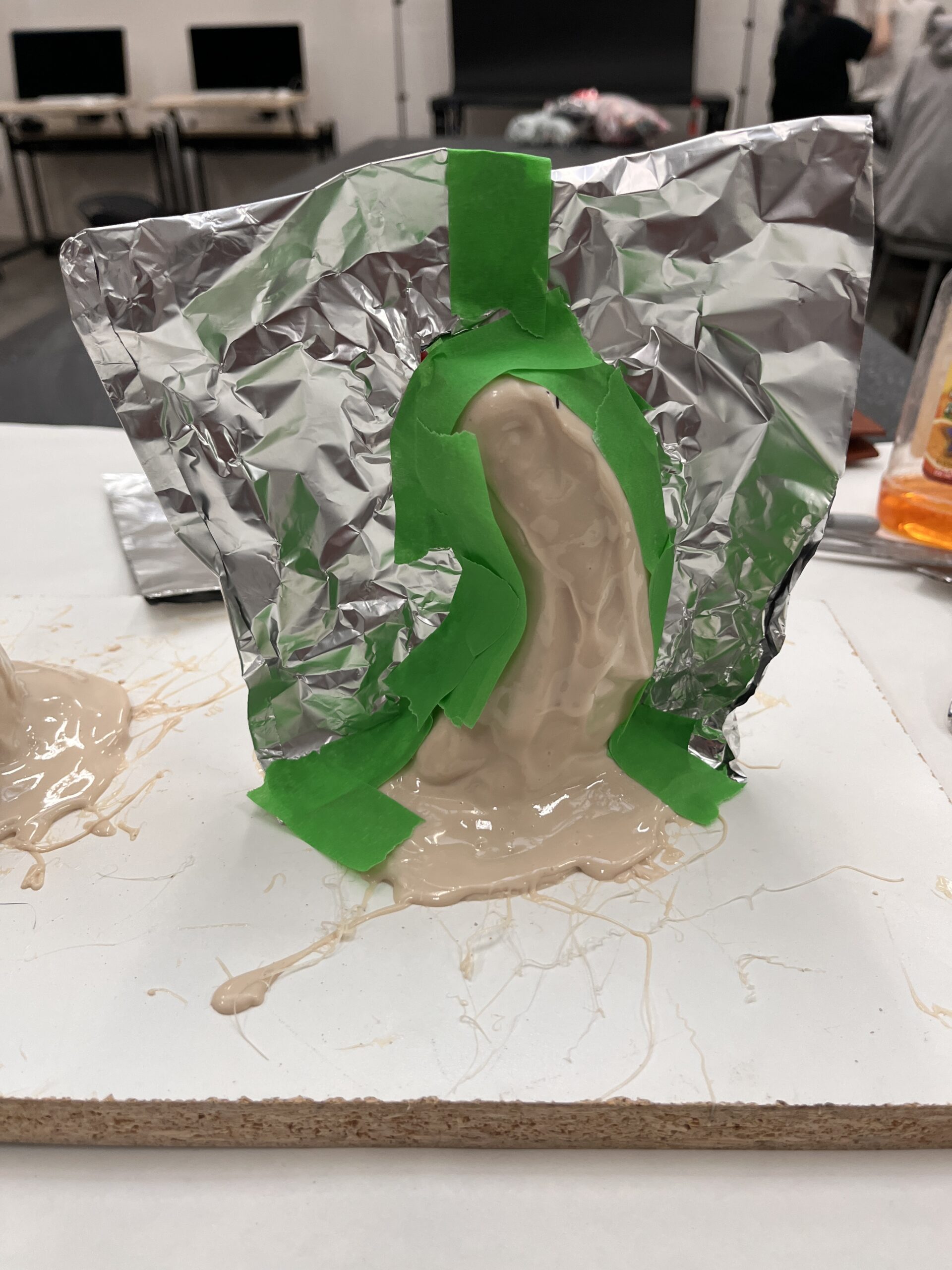
Calling a friend: It was important to me that the work has a social impact, one that inspires people to take action, instead of harming anyone. As I reflected on my project a growing knot occured to me. Was I effectively calling a group of racialized people slaves? How do they feel about that? Is it appropriate that I make this statement as a priveleged white woman? Was I going too far? These felt like important questions to me, so I decided to share my idea with my roommate who is an immigrant from Columbia. It garnered a fantastic conversation and while she said the concept did make her uncomfortable, she felt that she’d learned a lot from our conversation already and encouraged me to go forward with it. I appreciated that feedback but she was only one person, so I decided to reach out to my friend Luis who is more politically active, I knew he’d have a more nuanced perspective on the idea. We spoke the next morning on the phone and I shared my concept idea. I told him about the chains, the collar, the UN report and my most recent idea: a glimmer of hope, and the Tim Hortons cup that started it all. He encouraged me to go forward. He said it was important white people raise these conversations too and that the use of Tim Hortons was perfect since it’s often a huge source of pride to drink and go to Tim Hortons as newly landed immigrants.
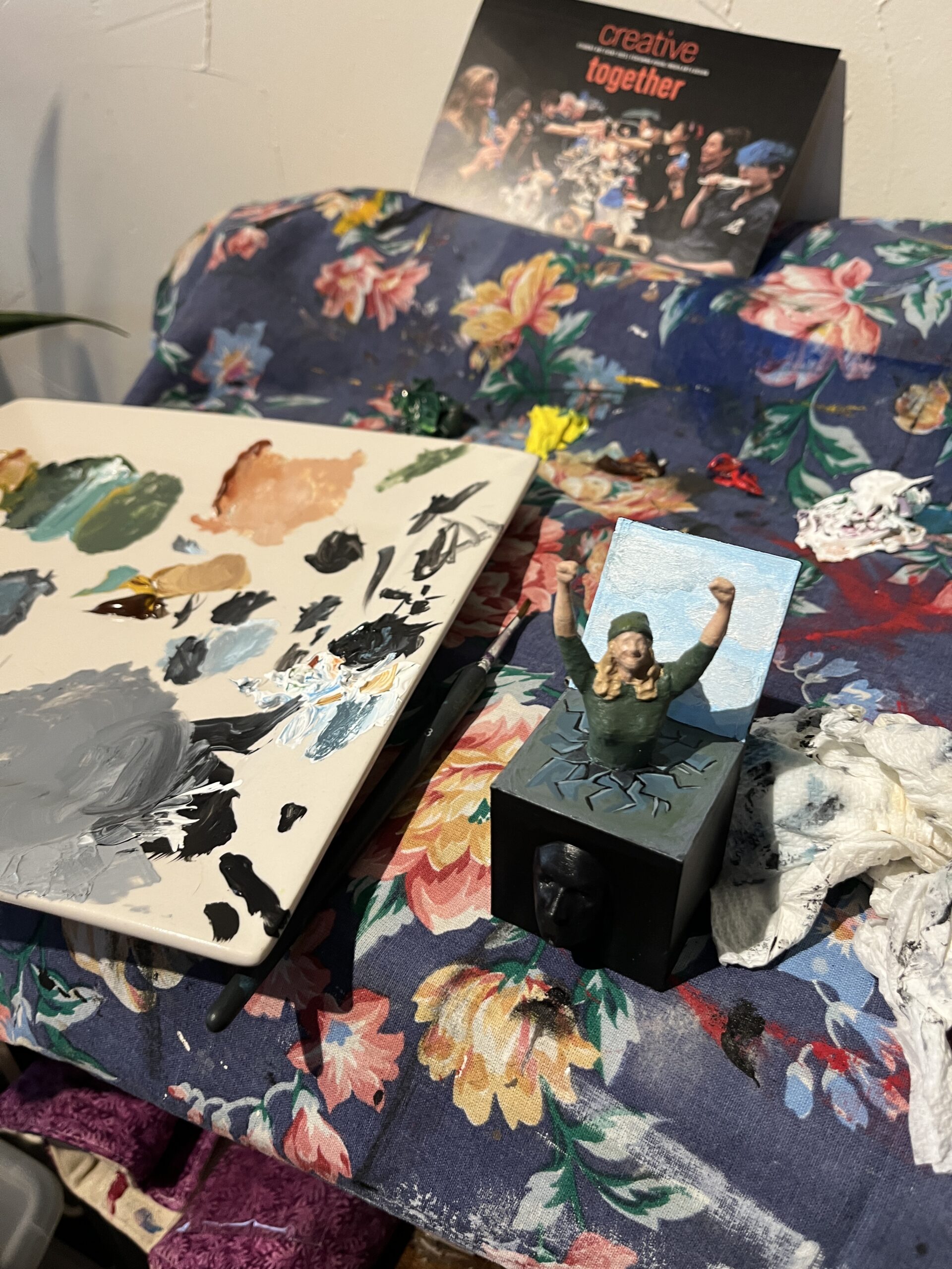
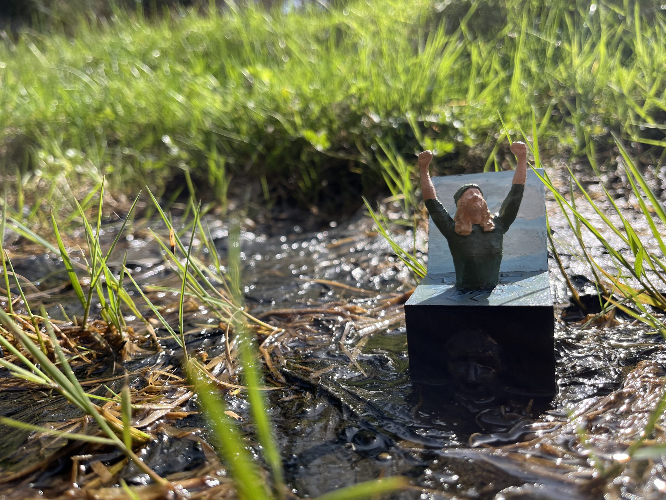
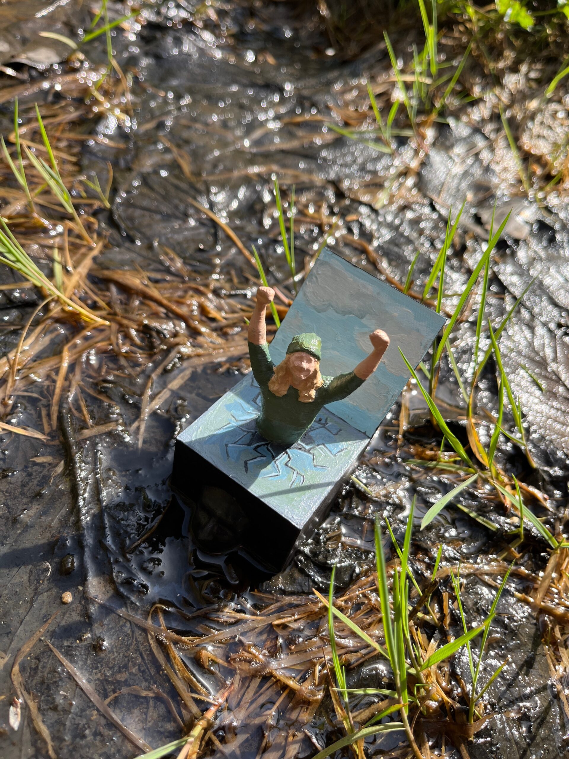
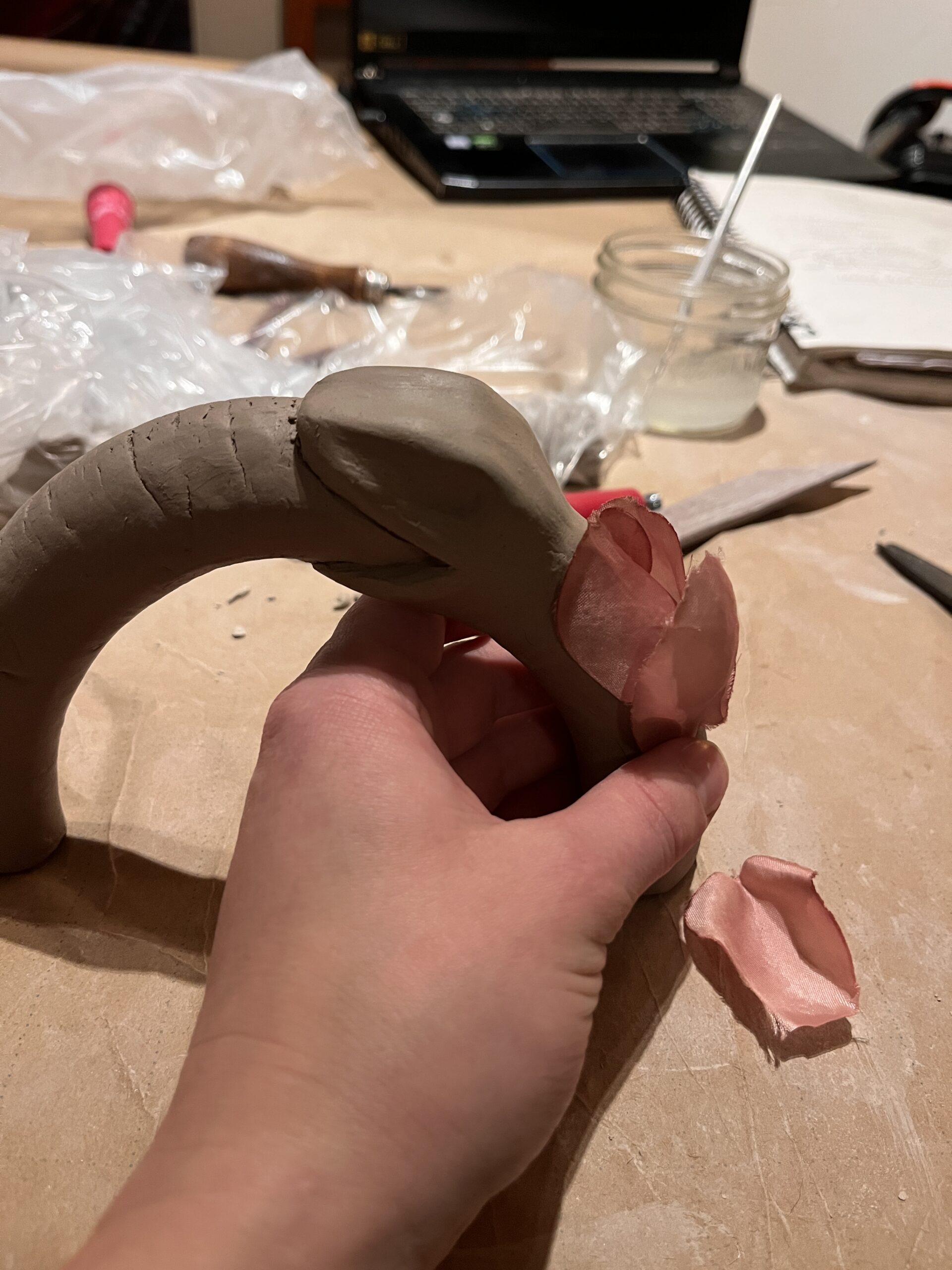
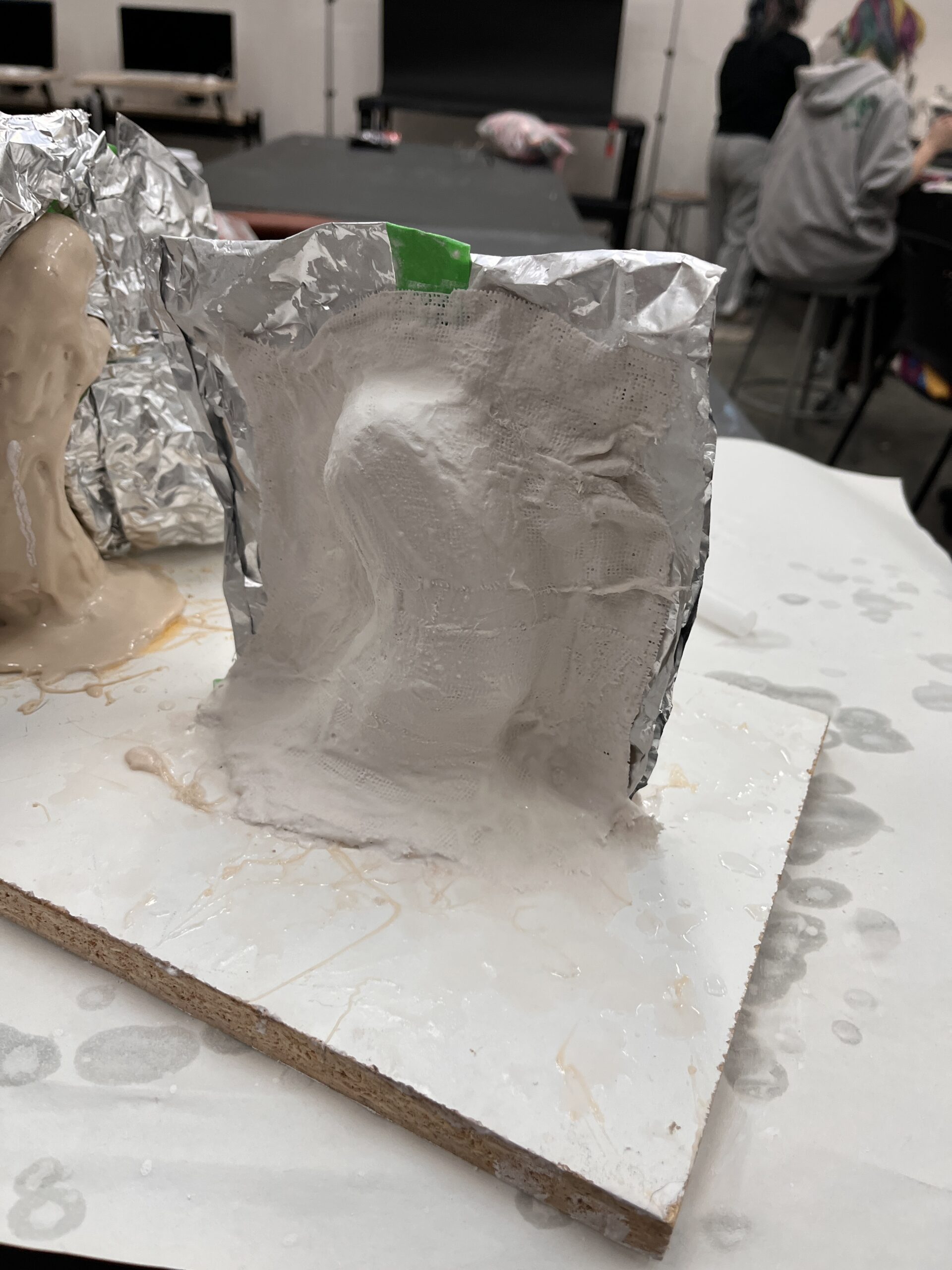
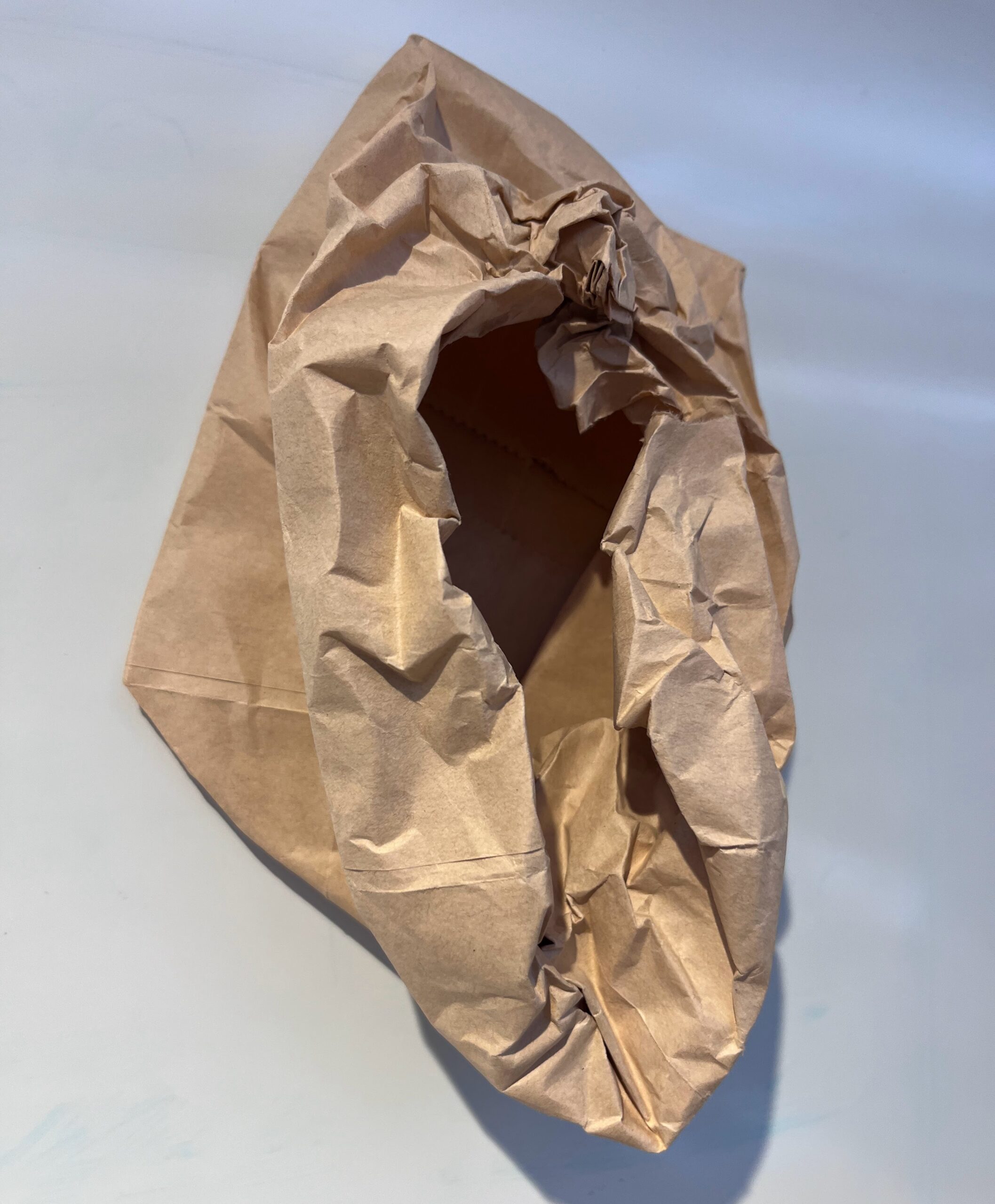
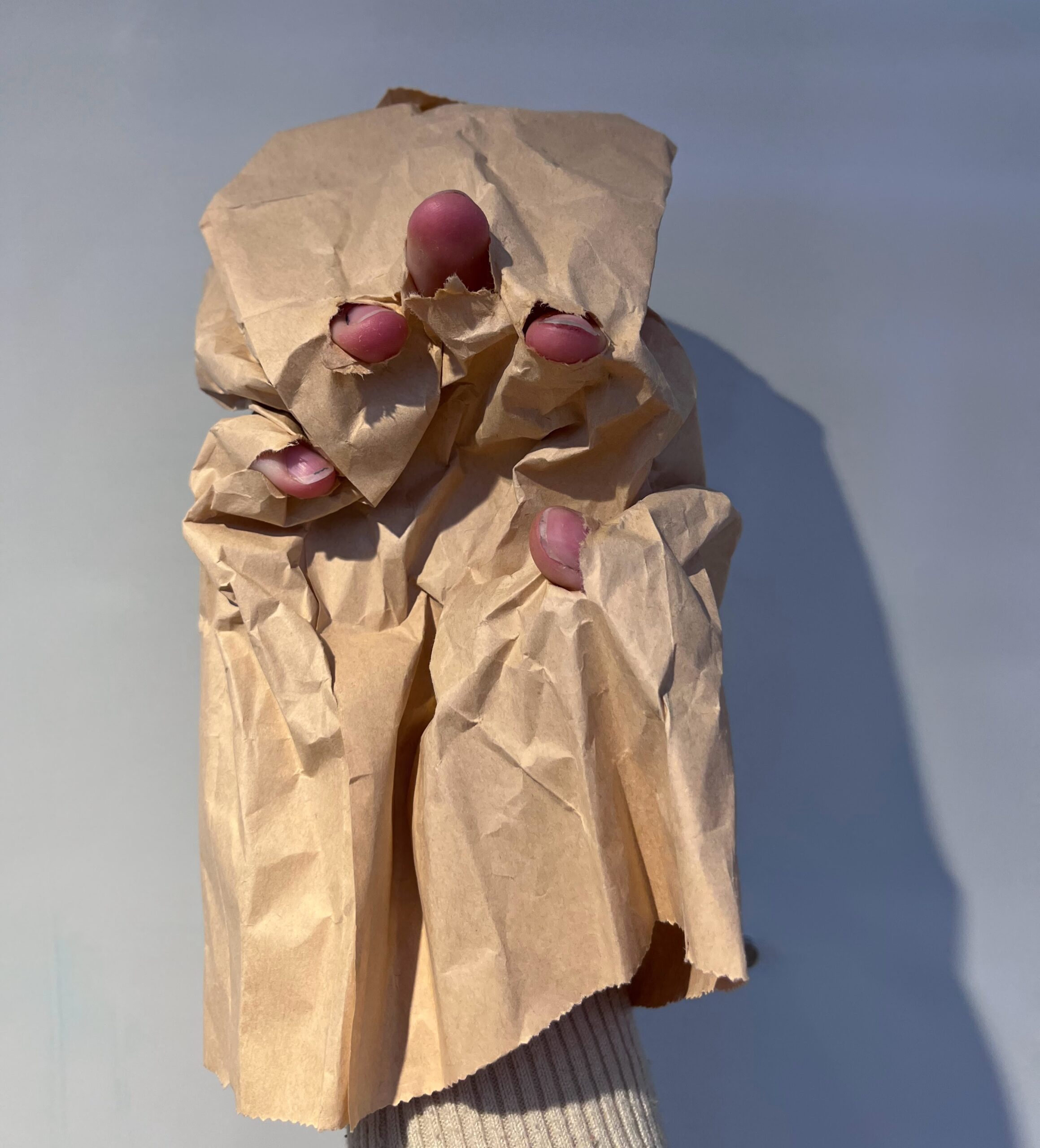
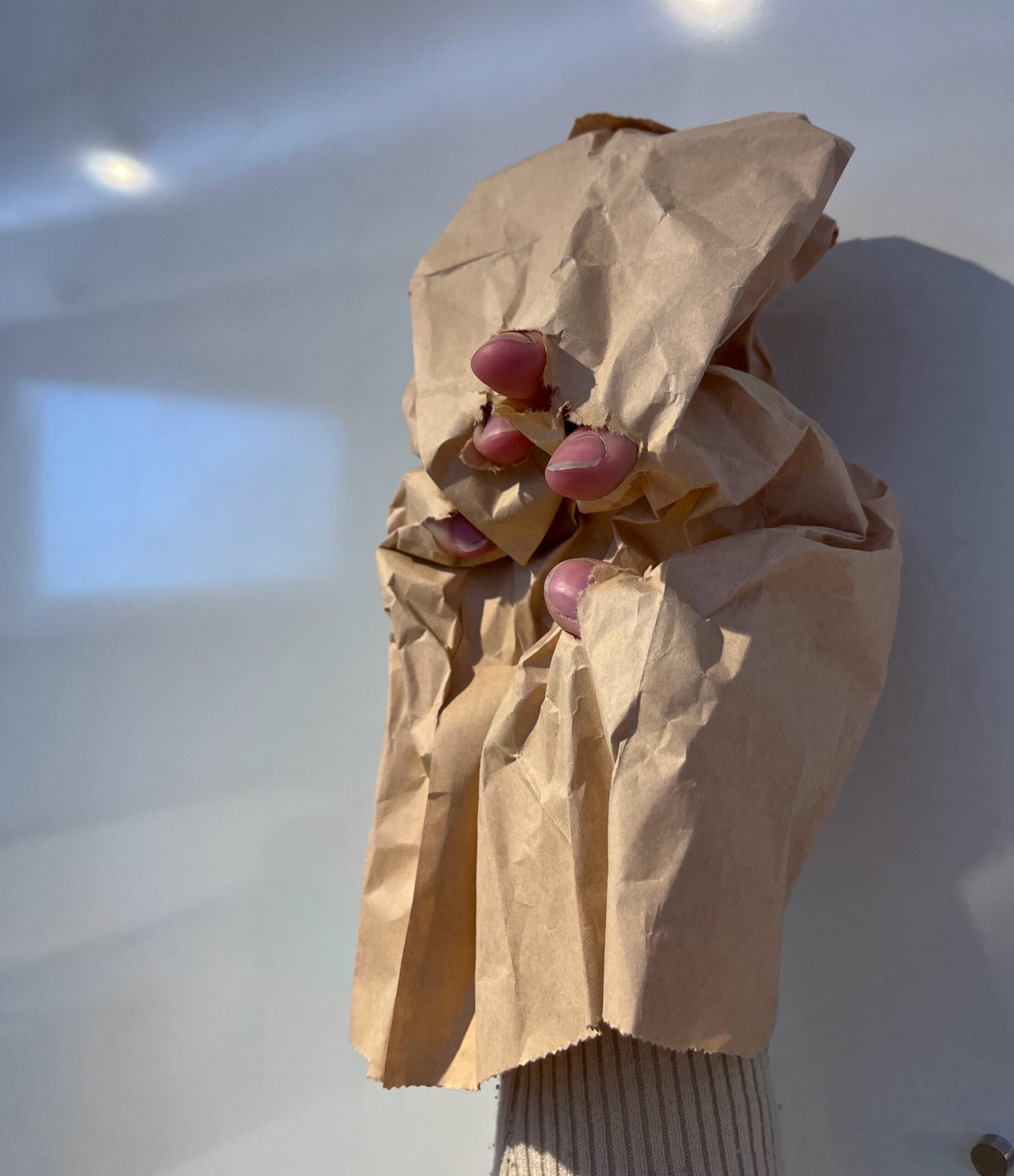
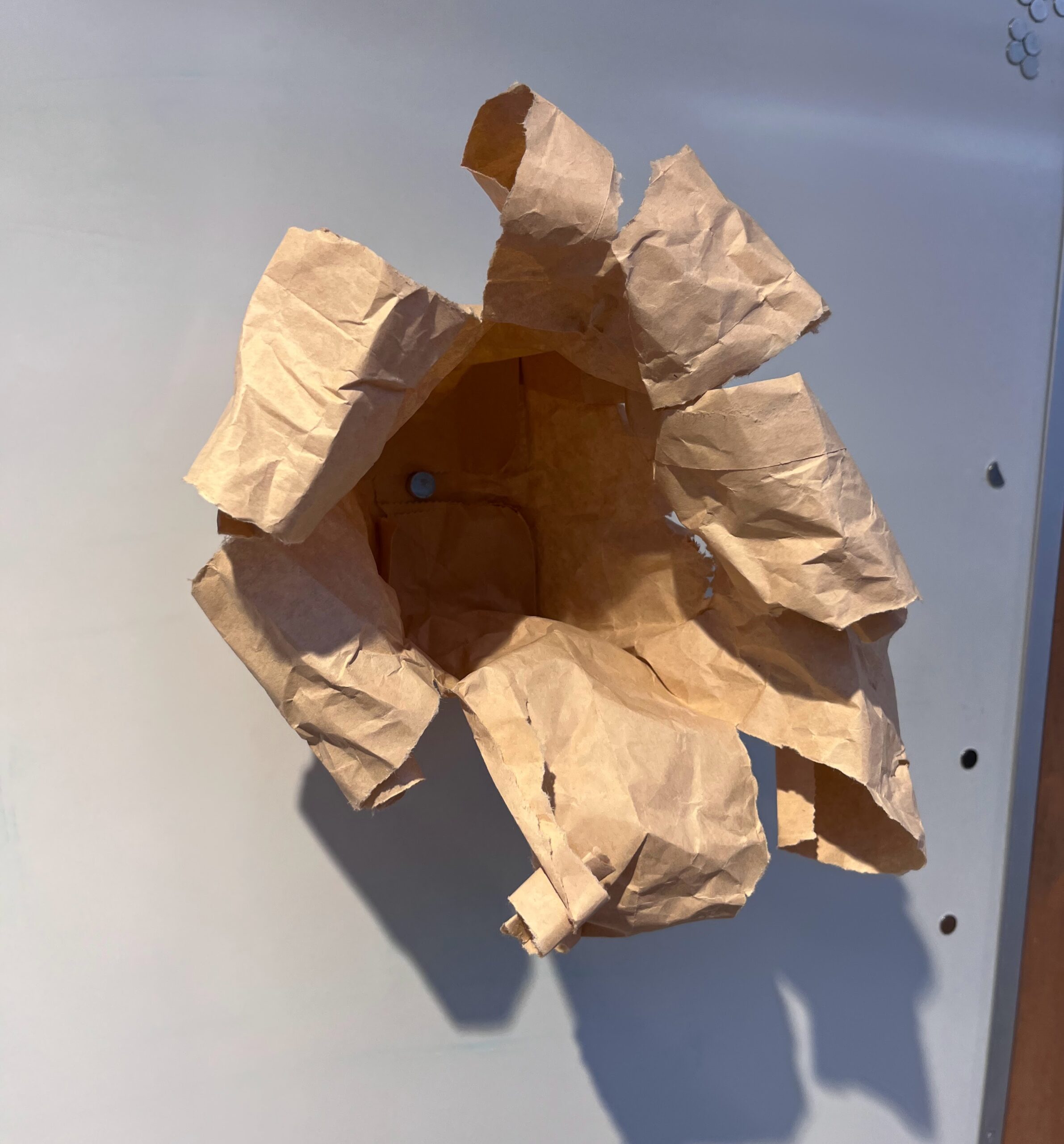
Lobotomy part 1: Part of my considerations also had me wondering was how I could add some lightness to the piece. Even with my friends’ blessings it was still heavy content. I wanted to reflect the hope that immigrants have when choosing to come to Canada. I decided to see if I could quite literally add light to the areas behind the eyes, as a “glimmer of hope”, the light within that keeps people working hard, despite the risks and the abuse. At first I thought I could add this from the back of the head, but then realized that there was too much stuffing and it would be more efficient to go from the front.
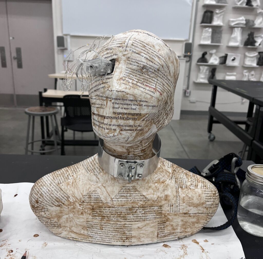
Lobotomy part 2: After cutting open the eyes with a flap, that the 5 layers of paper were too thick to show the light through. So, I’d need to re-paper mache that area with a thiner layer to allow the light to come through. Plus, the lights I ended up buying were not remote operated, so I needed to wait to seal the eye final eye until I could be sure that I could turn on the lights without it running out of battery before the critique.
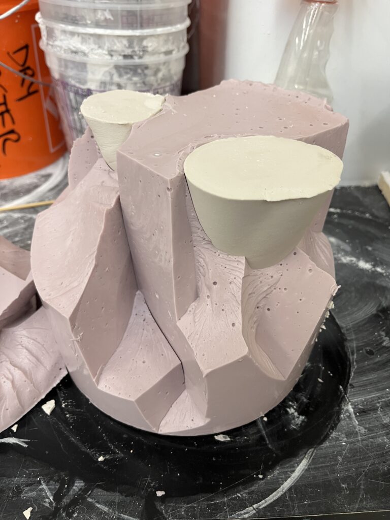
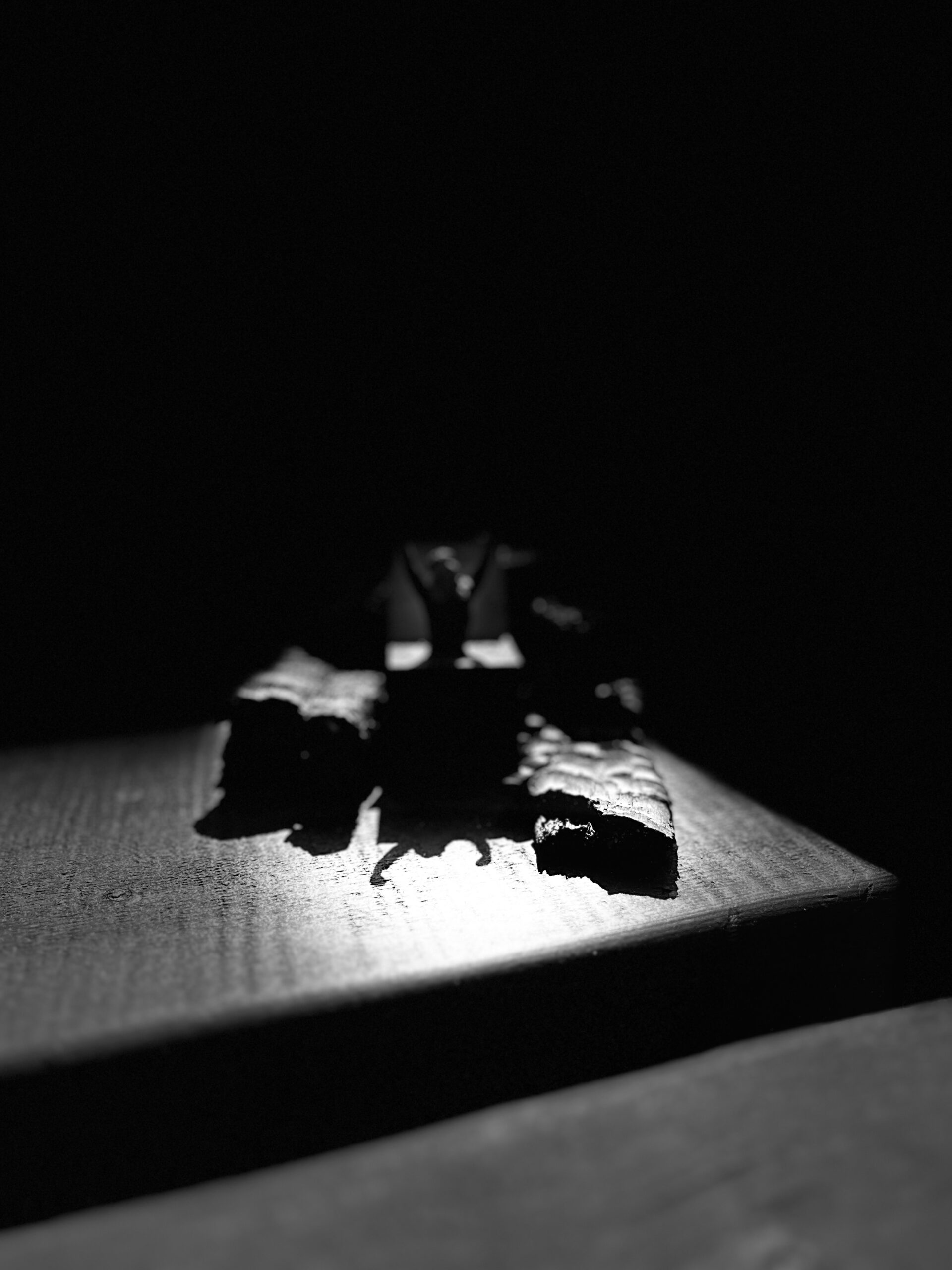
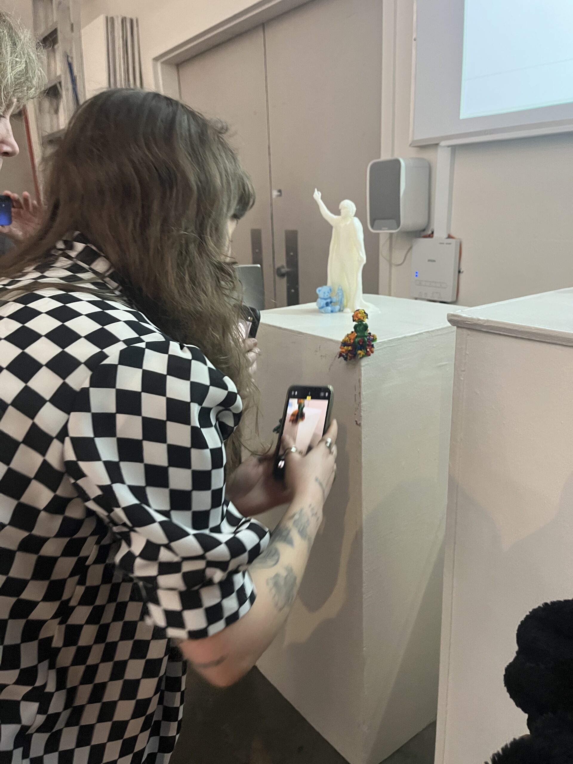
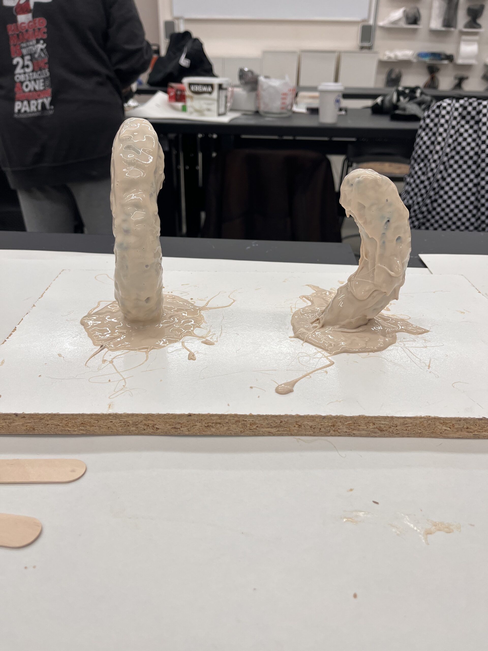
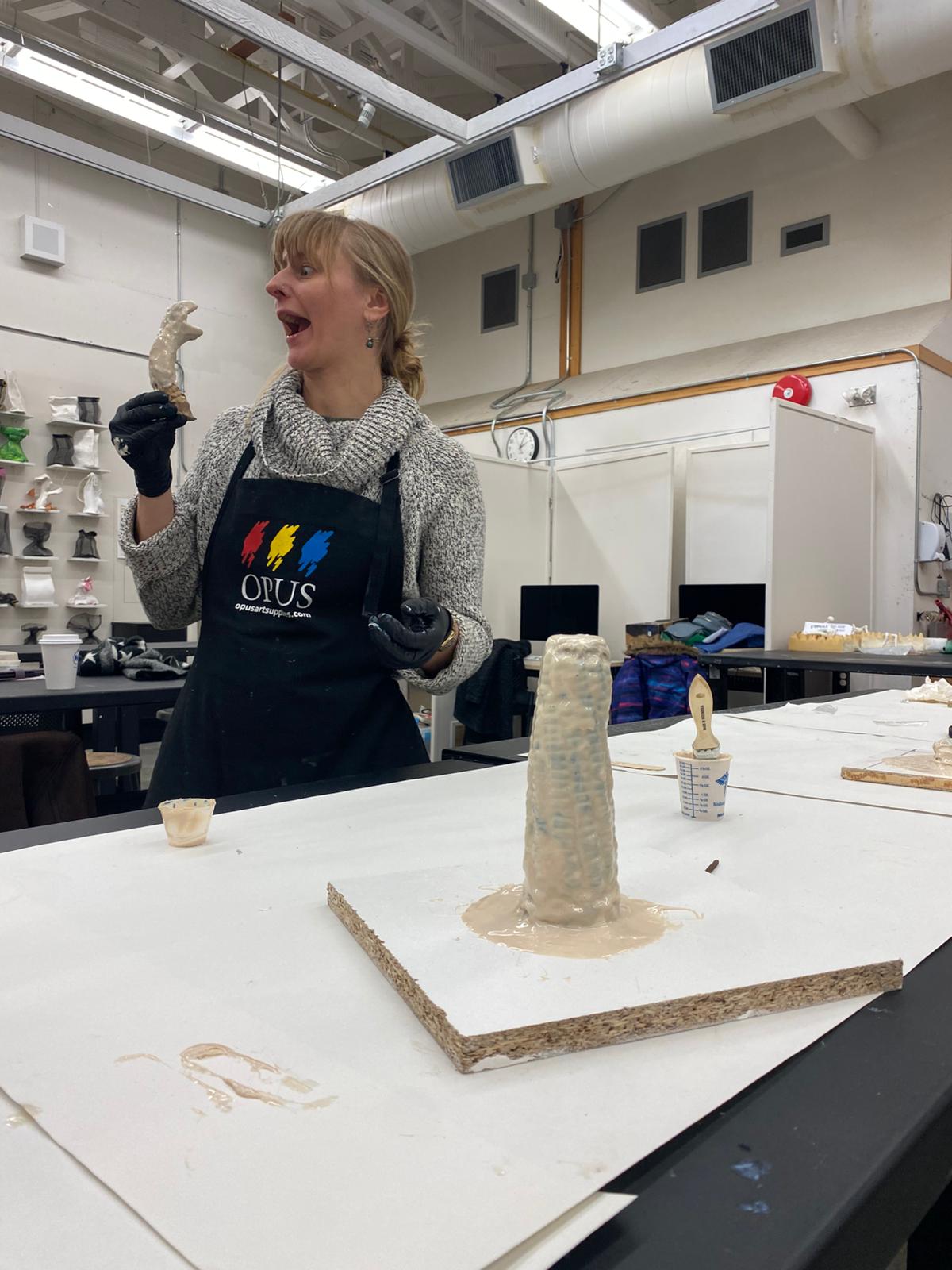
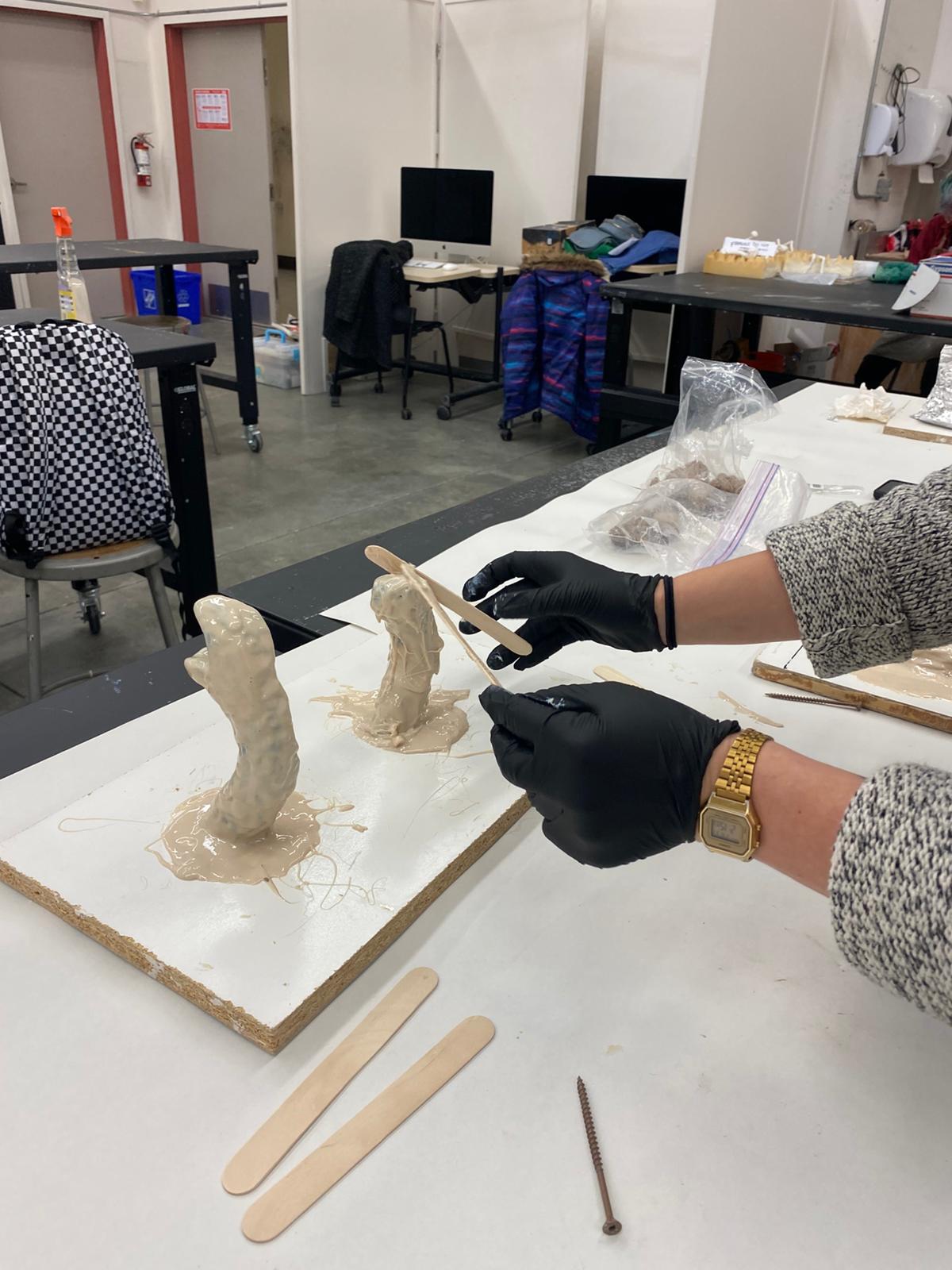
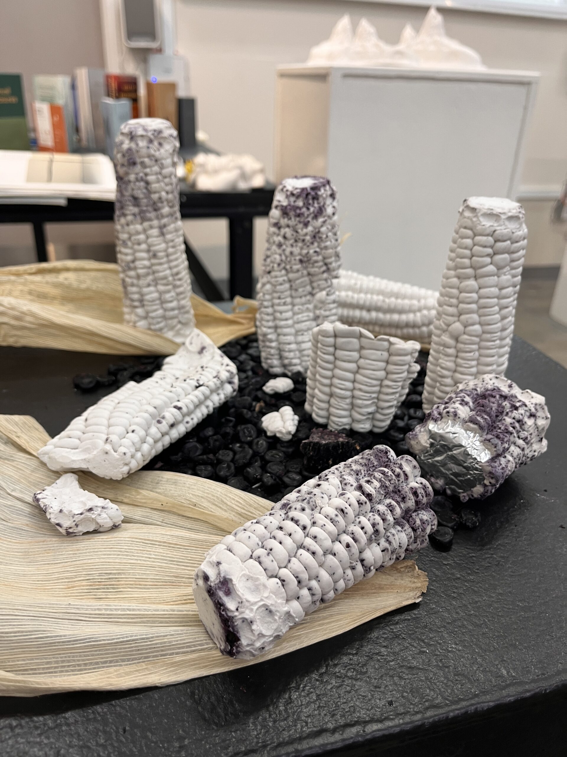
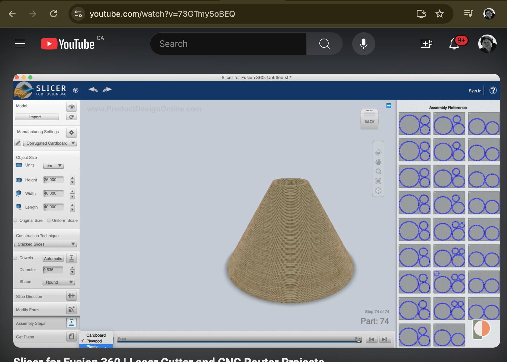
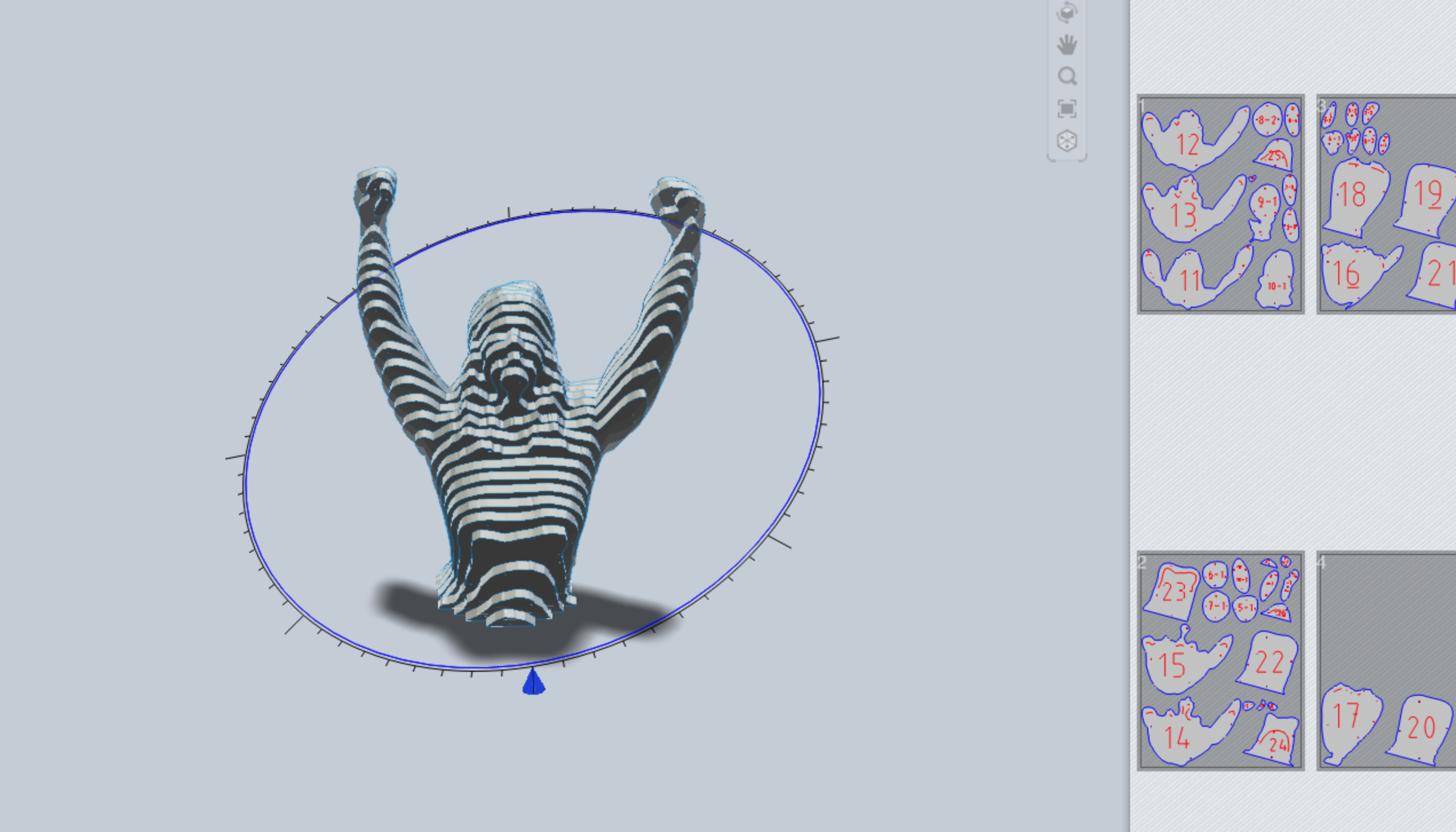
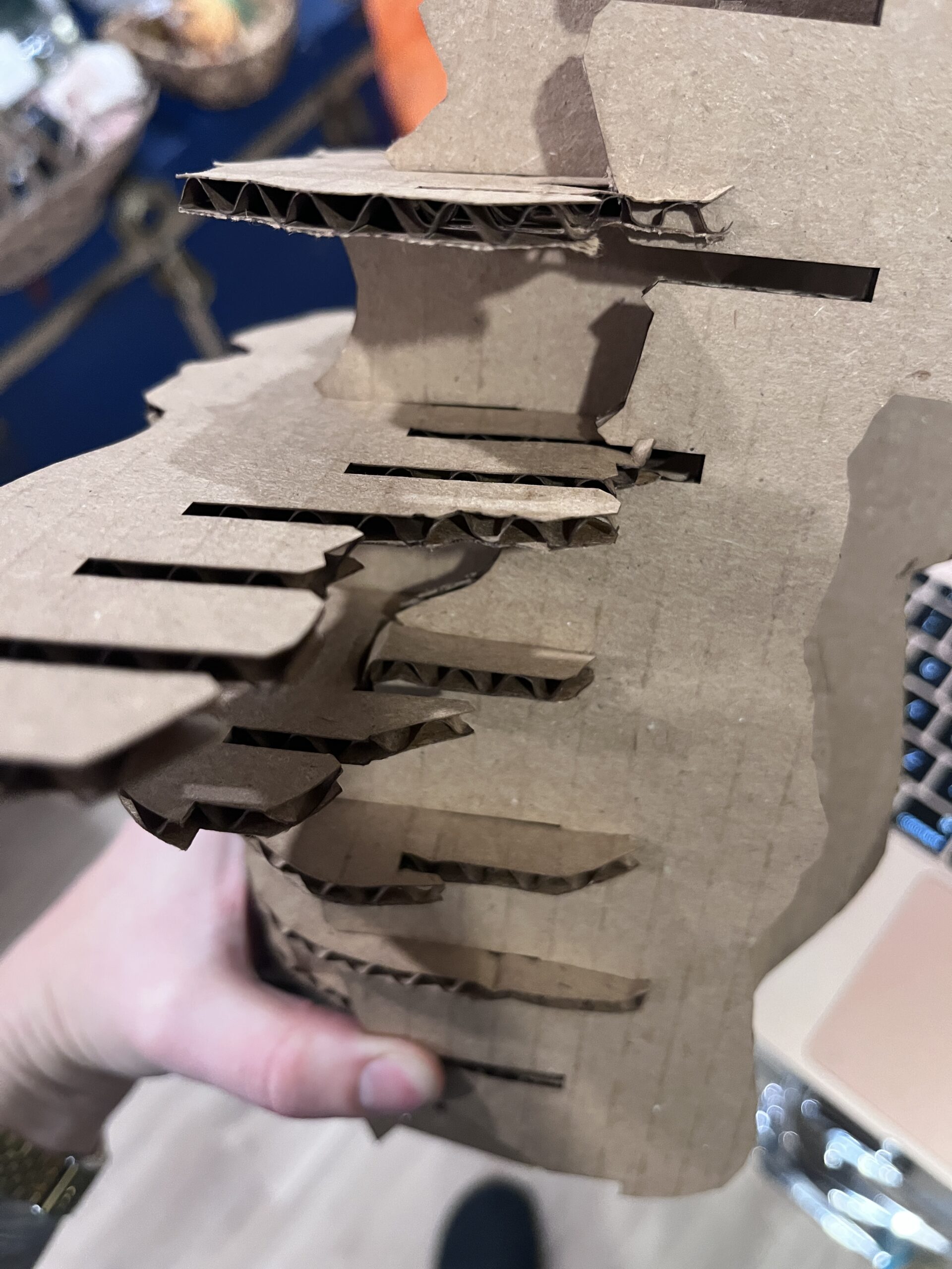
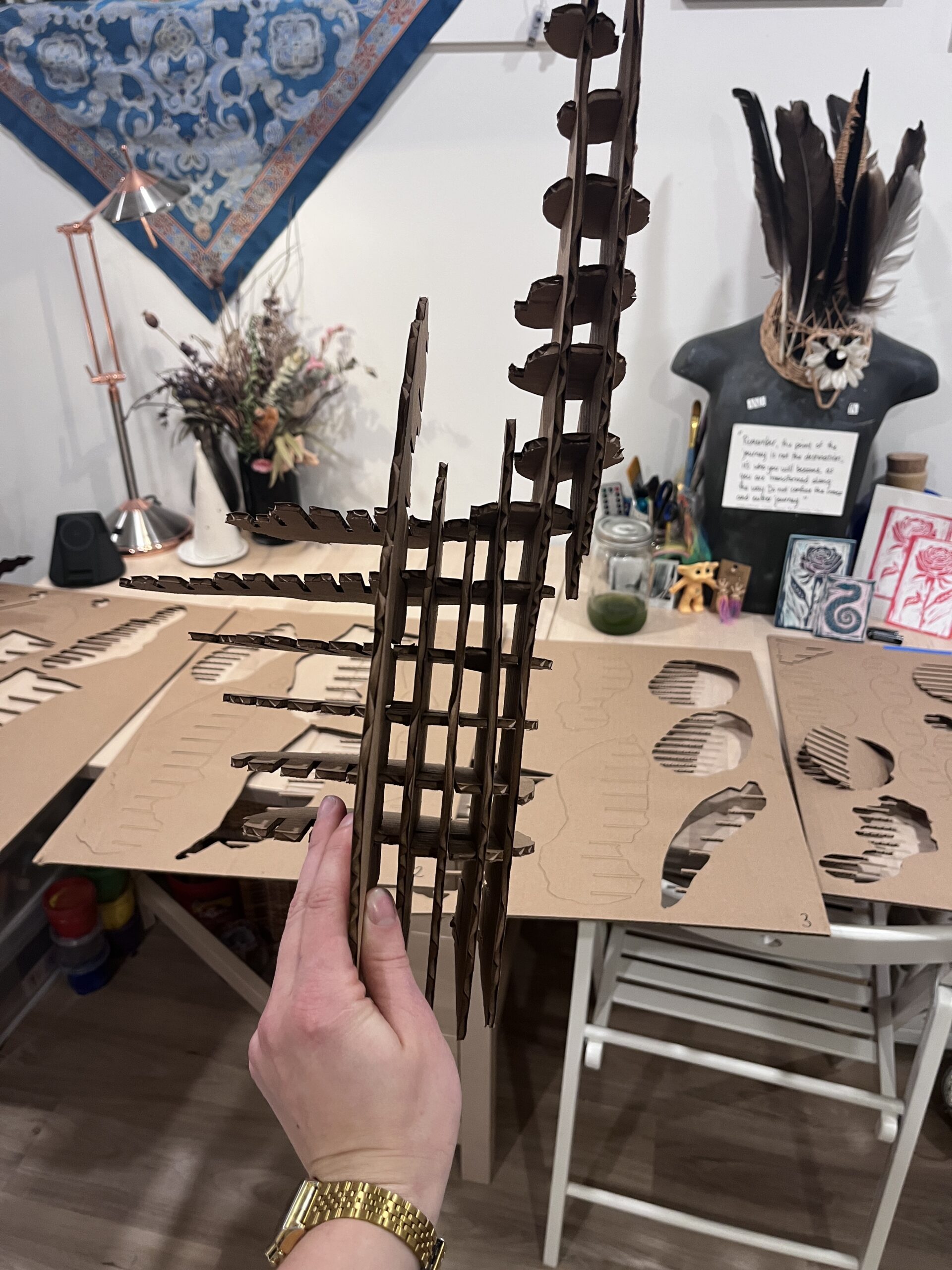
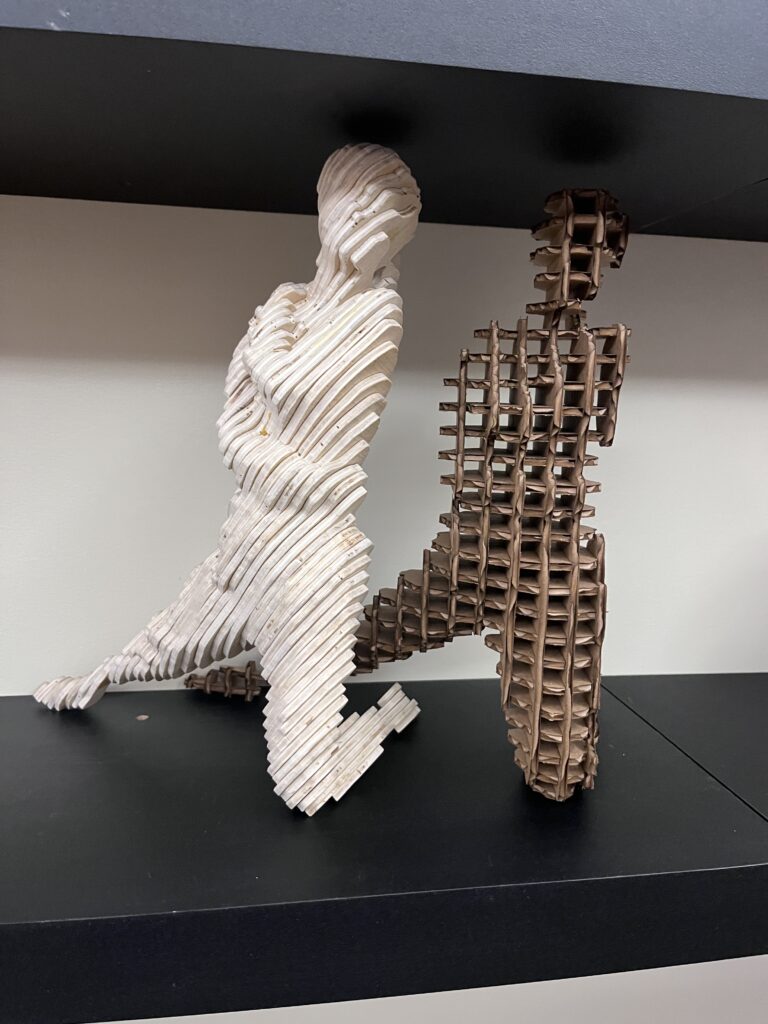
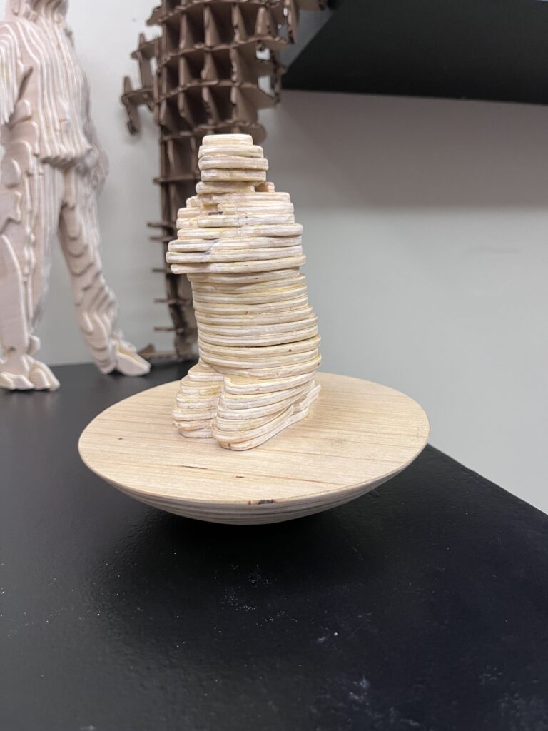
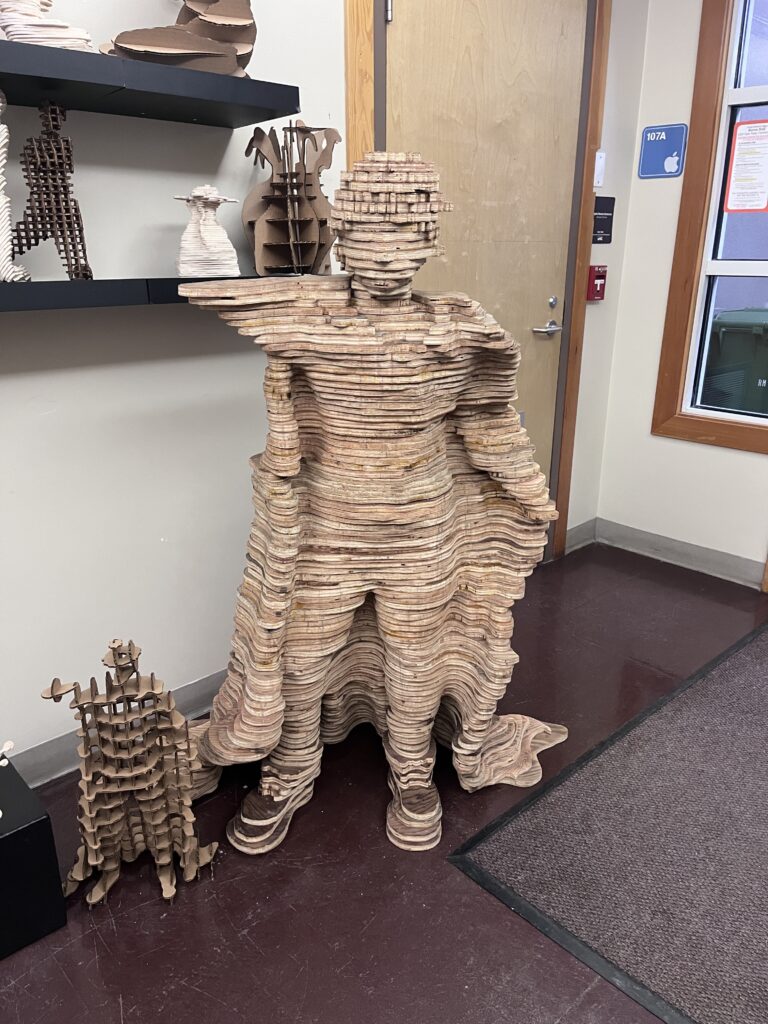
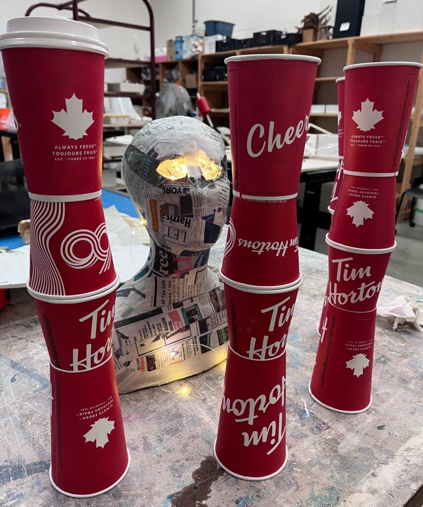
Staging: In the meantime, I could still decide on what to do with cups and how to tie it in. So I played with repetition and stacking, drawing inspiration from Tara Donavan. At this point, I’d been collecting Tim Hortons cups for a while, and I’d even posted on the Comox Valley Neighbours Facebook page to see if anyone had any cups they could donate and one lady had 12! I thought about stacking them like a pyramid, a commentary on capitalism, or like bars – like being inprisioned. And settled on a bit of both, creating bar-like structures with the biggest cups on the top (like the big corporations or the rich).
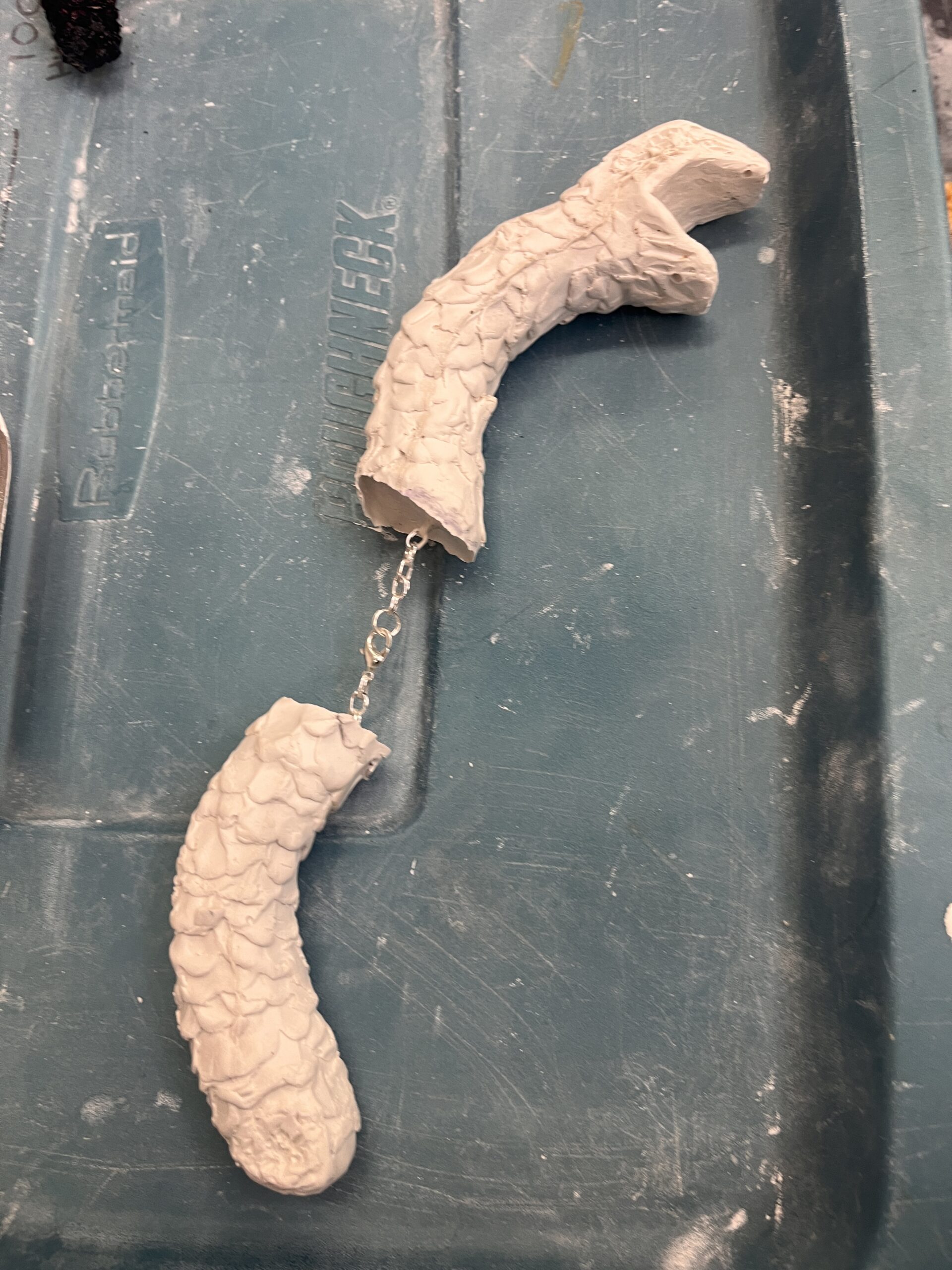
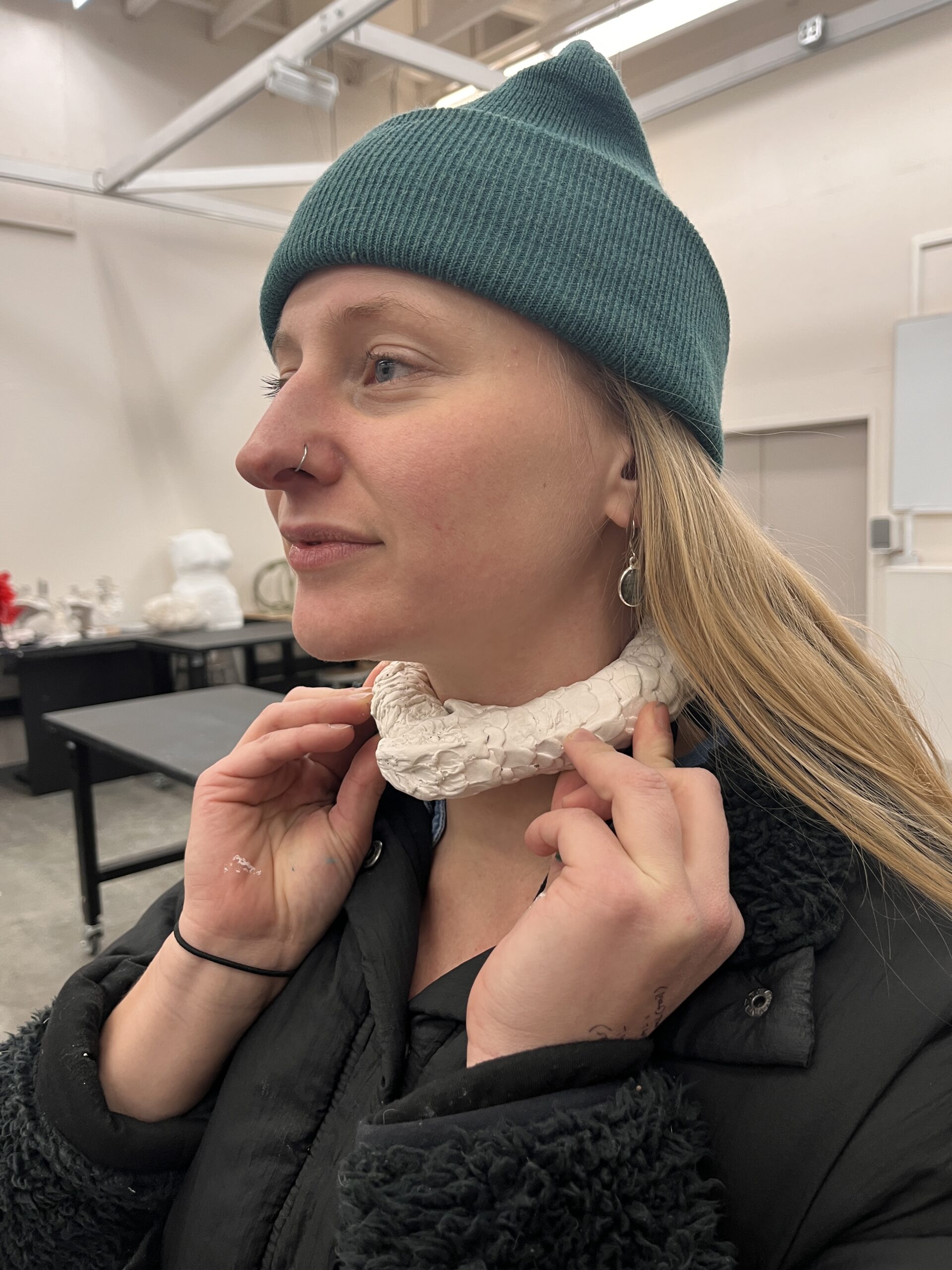
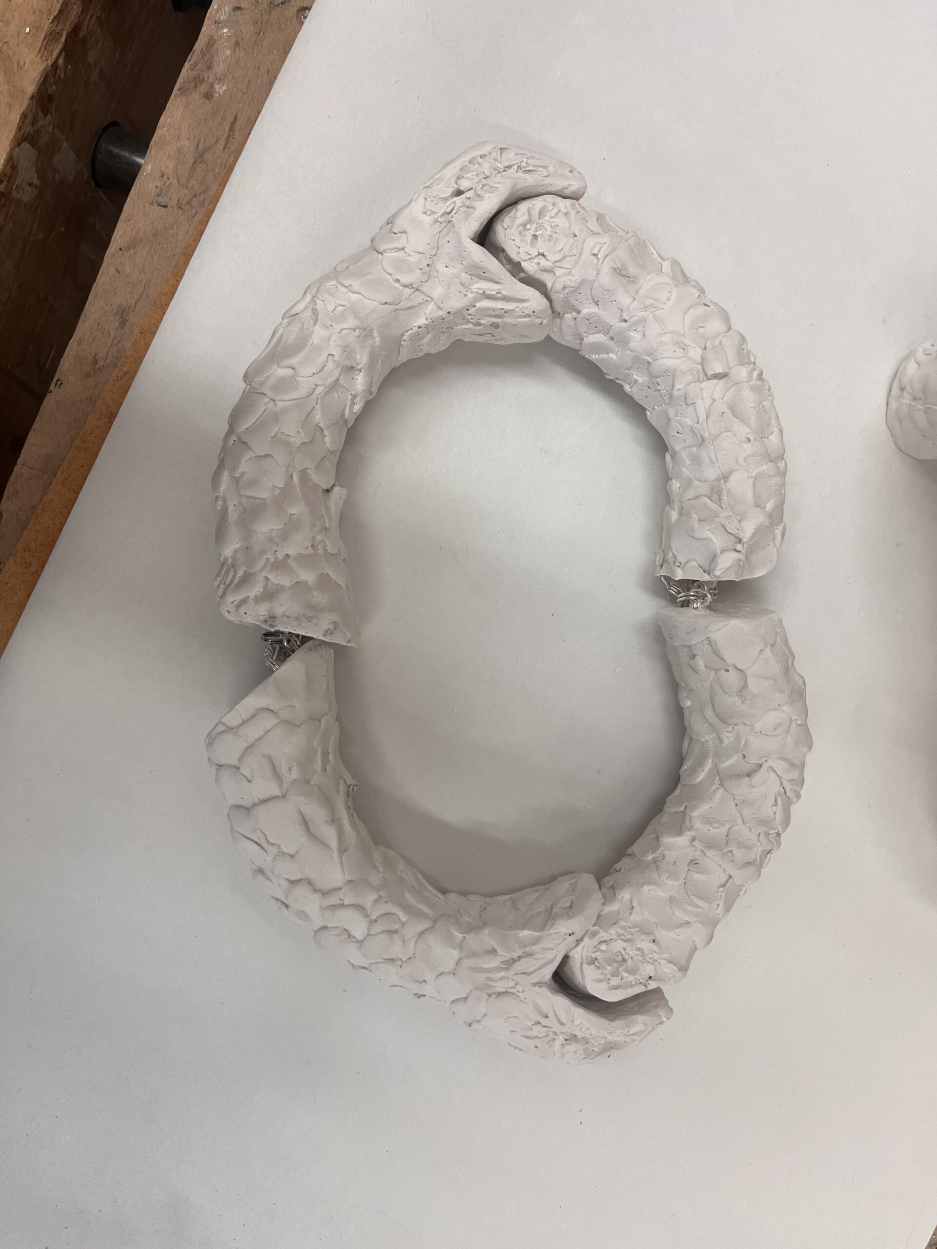
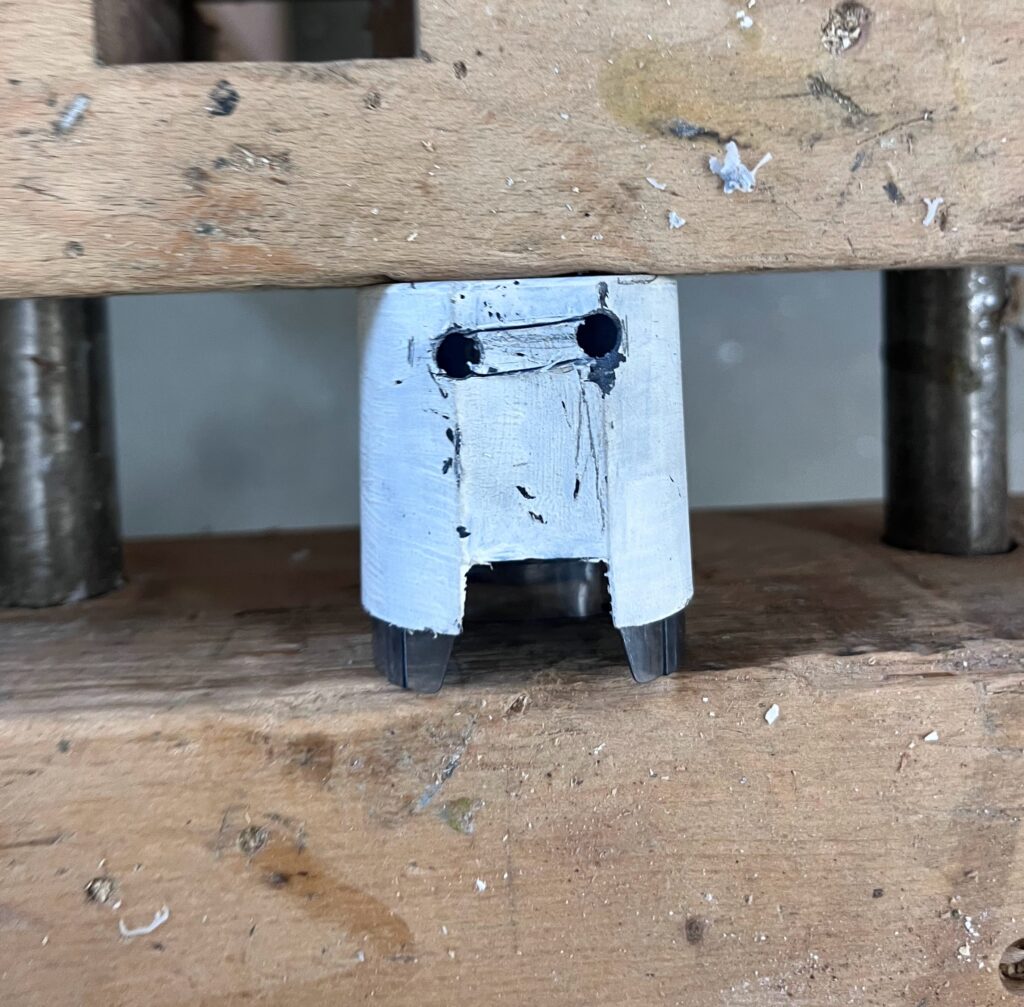
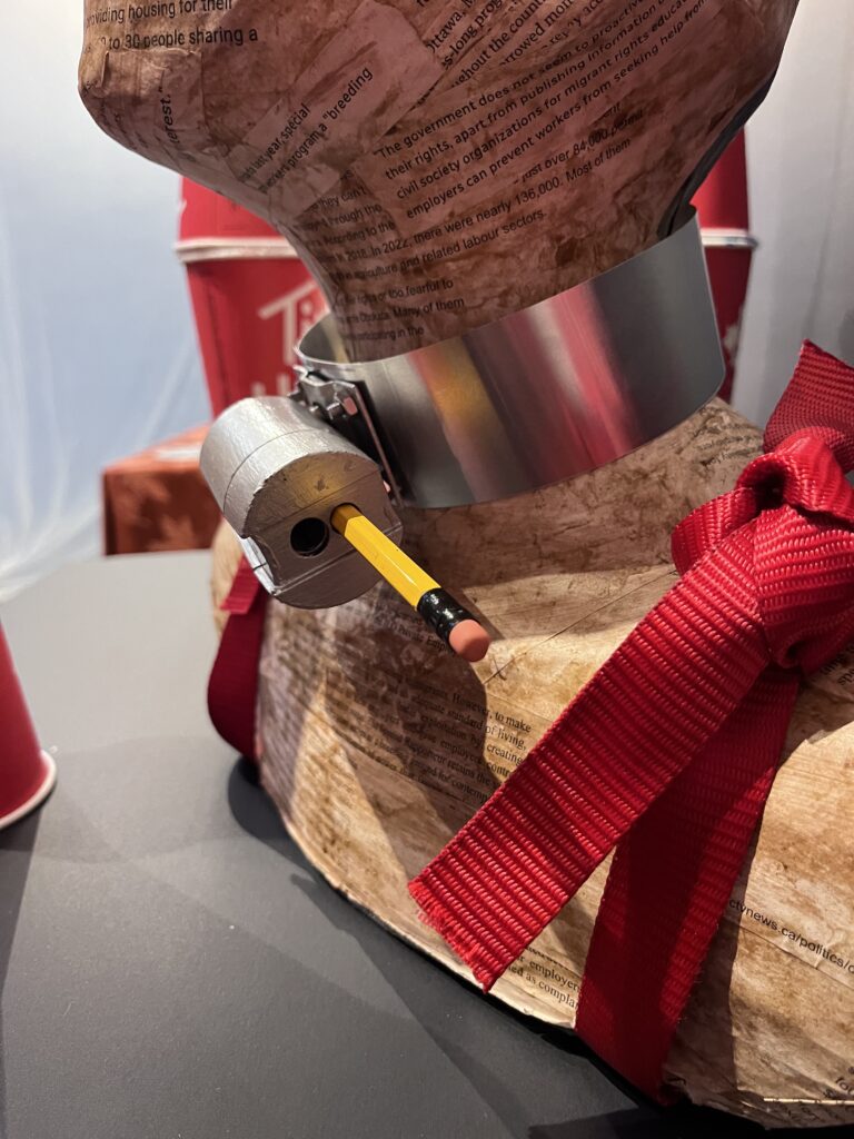
Collar detail: Jeff and I spoke about the collar a while back and I set up a time to work on this. I decided I wanted to have the collar removable, to represent that the collar can be removed, with the right action. used a piece of thin sheet metal, measured it, and drileld wholes in it, used some nuts and bolts, and part of a locker lock. It came together beautifully! Now for perhaps the most important part: the lock and key! I had a pencil case in mind, painted it white as a primer, then we also drilled holes in that and then shaved it into a wide slit so I could attach it to collar.
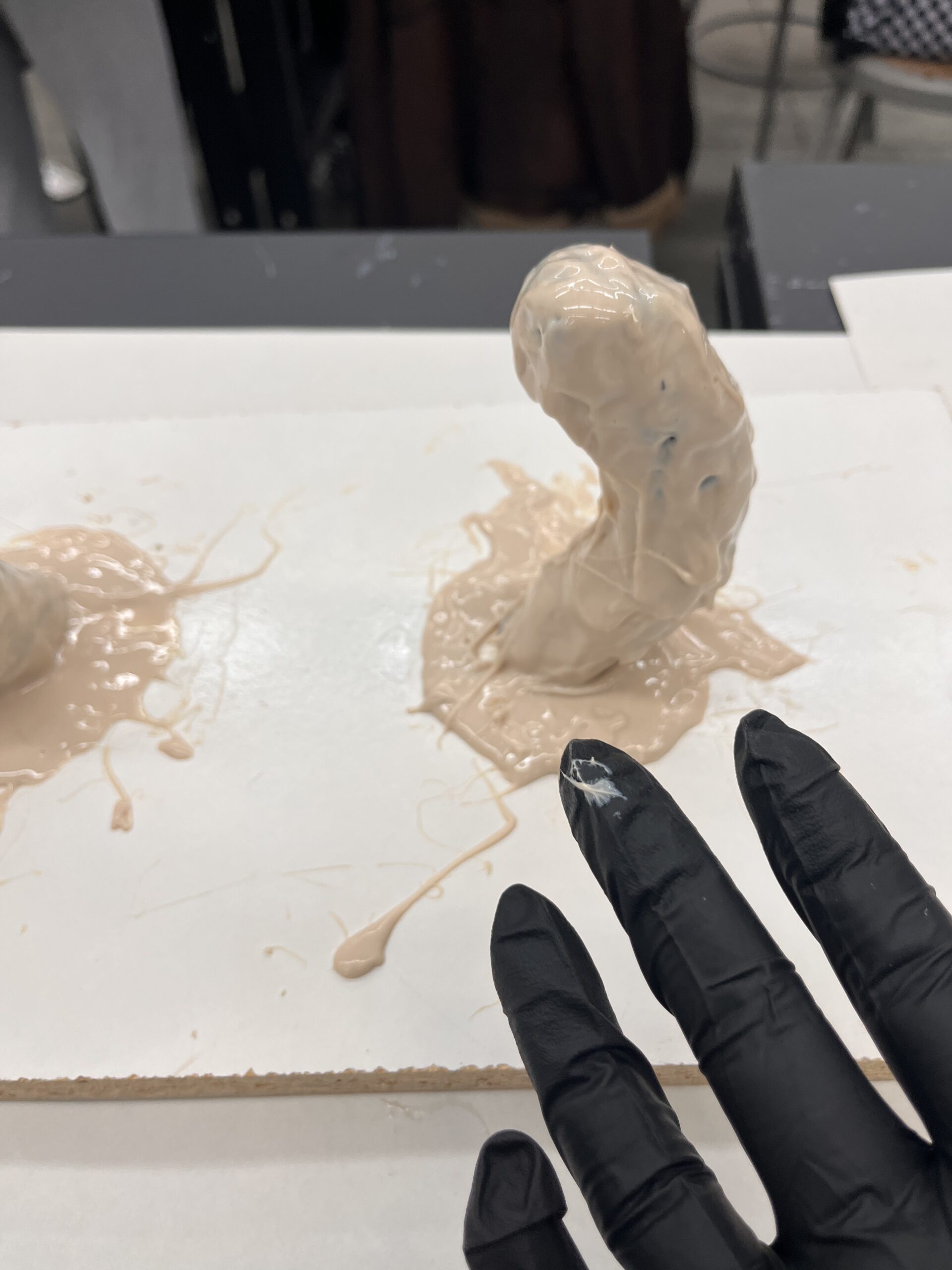
Organic: I figured that the white paper of the UN report would feel a bit off. I wanted it to look more organic, like skin. So, I did some research online to see how I might be able to accomplish that and decided on a coffee wash! I made a fresh batch of paper mache with coffee instead of hot water and got the effect above. It looked a bit un-even, so I tried to add more coffee but it mostly looked translucent. So, I added a brown wash with some acrylic. It still doesn’t have the exact look I was hoping for, but it would have to do. I want to note here that reading, printing, and selecting the words from the UN report and news articles to go on the paper mache brought up a lot of emotions for me. It made me feel sick to read again and again that people were being abused in such ways. Everything in my body tells me its wrong to treat people this way and I need to do something about it.
Petition set up: and that something was through political pressure. That’s my conditioning anyway. From the beginning I wanted to incorporate a petition, so now I had some considerations to make. Was there an existing petition out there I could add to? Should I start a house of commons petition? If so, I’d need 500 petition signatures to have my petition read aloud in the house of commons. Who would read it? What politician would sponsor it? So, I did some research. I couldn’t find a petition that was active that was robust enough. I wanted the petition to enact ALL the recommendations set forth in the UN report, not just one stop-gap solution that doesn’t address the systemic issues. So, I did research on how to set up my own mycommons.ca petition, researched who the minister/critique of citizenship and immigration on a federal level, emailed my local MP and Jenny Kwan, and asked her to be the MP sponsor for my petition. She emailed me back a very thorough letter which inspired some of the wording for my petition. Then I needed 5 people to say they’d support my petition to allow it to be active, so I reached out to 9 people to be safe and submitted my petition in the format the House of Common requires for such things. Petition e-5167 was approved and now I’m just waiting for it to be translated to french and published online! I also made some print versions so I could have something in class in case it wasn’t ready in time.
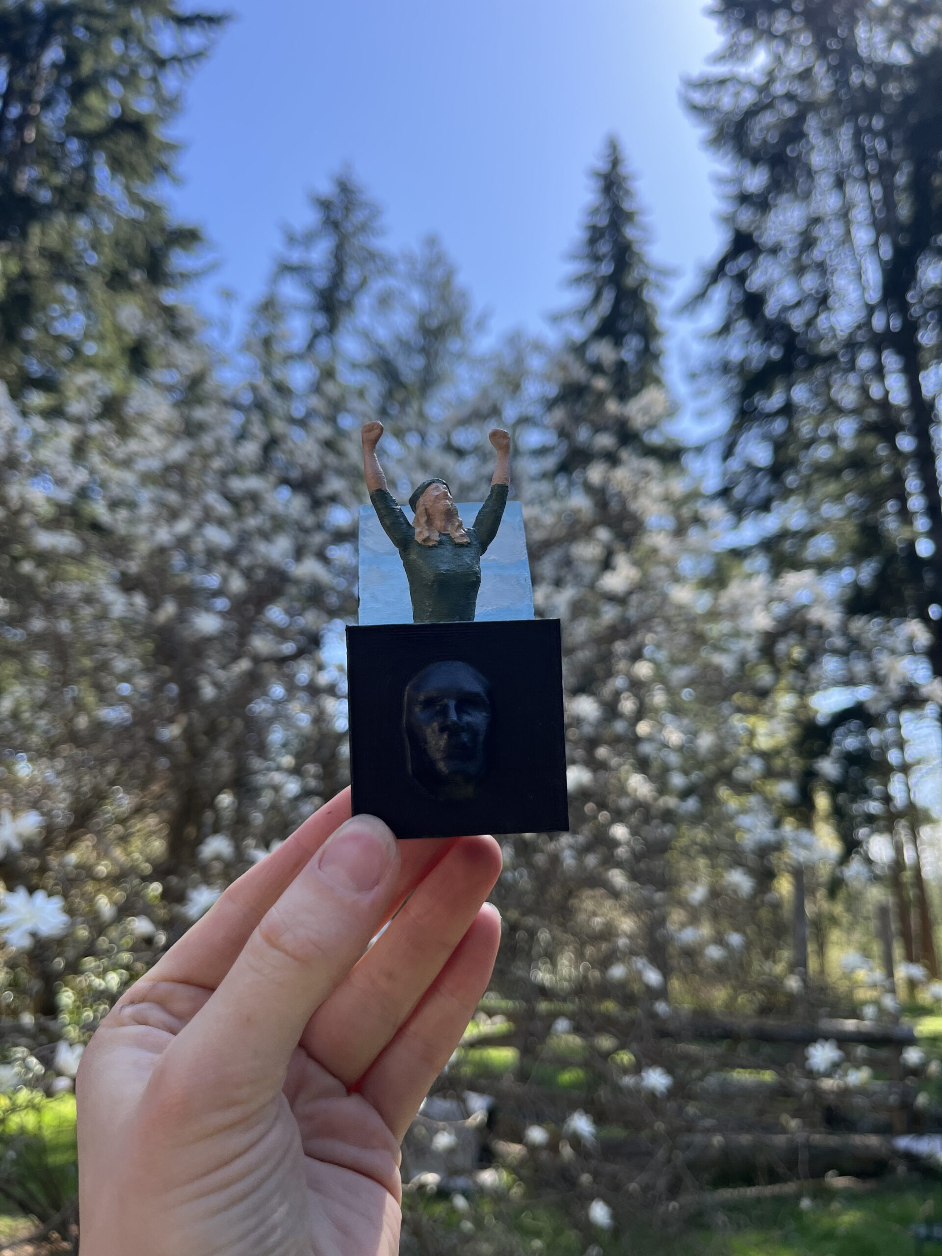
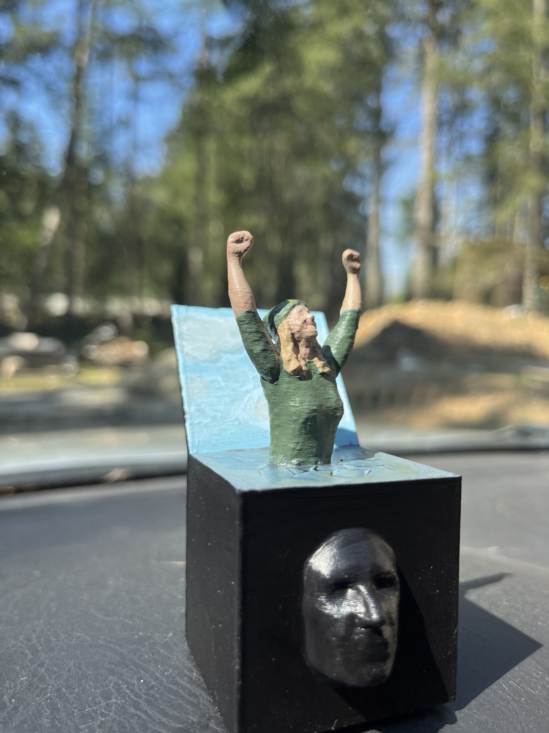
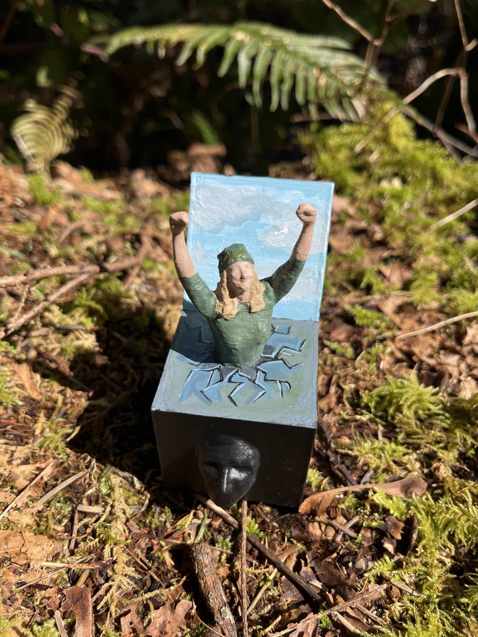
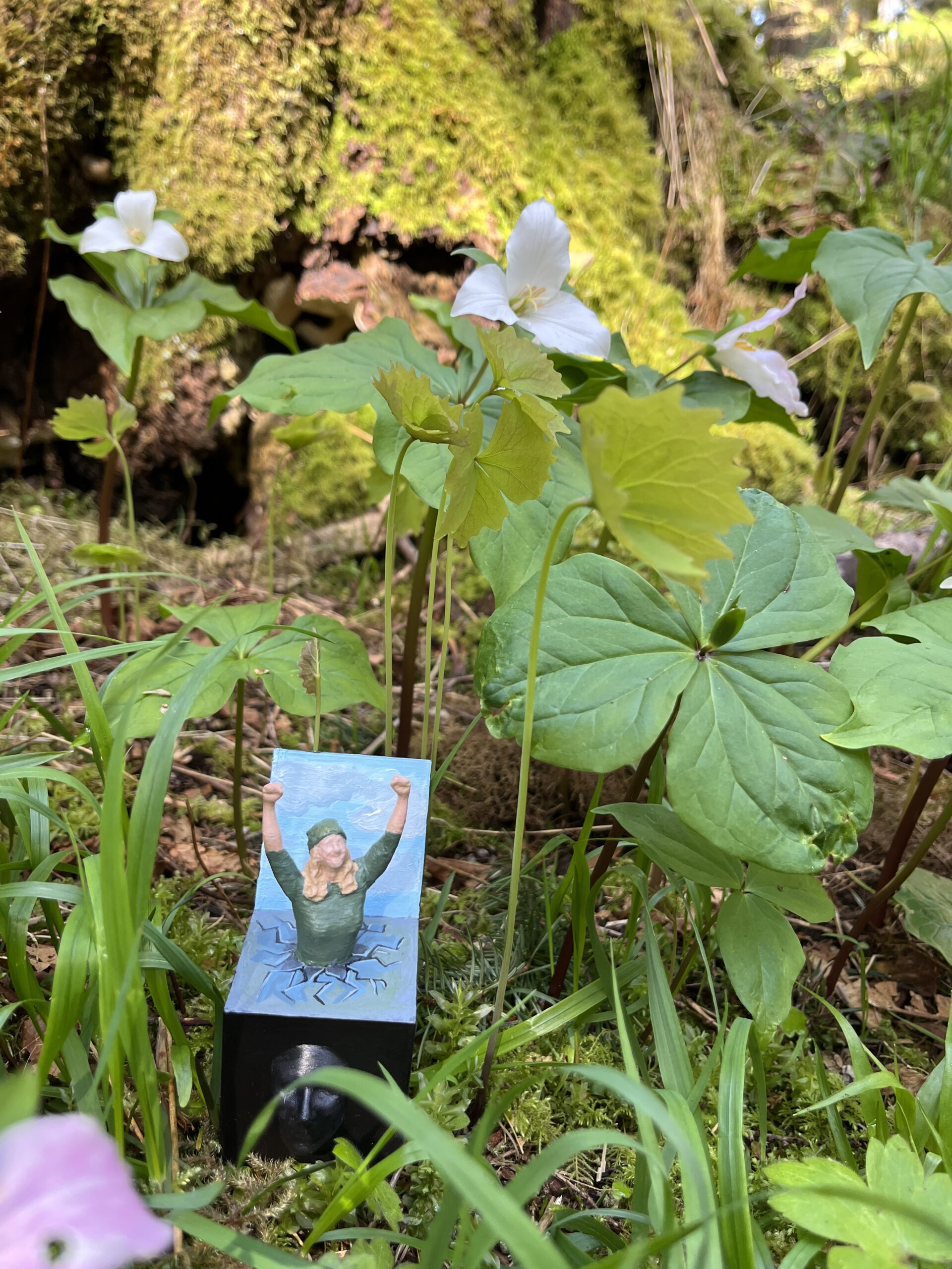
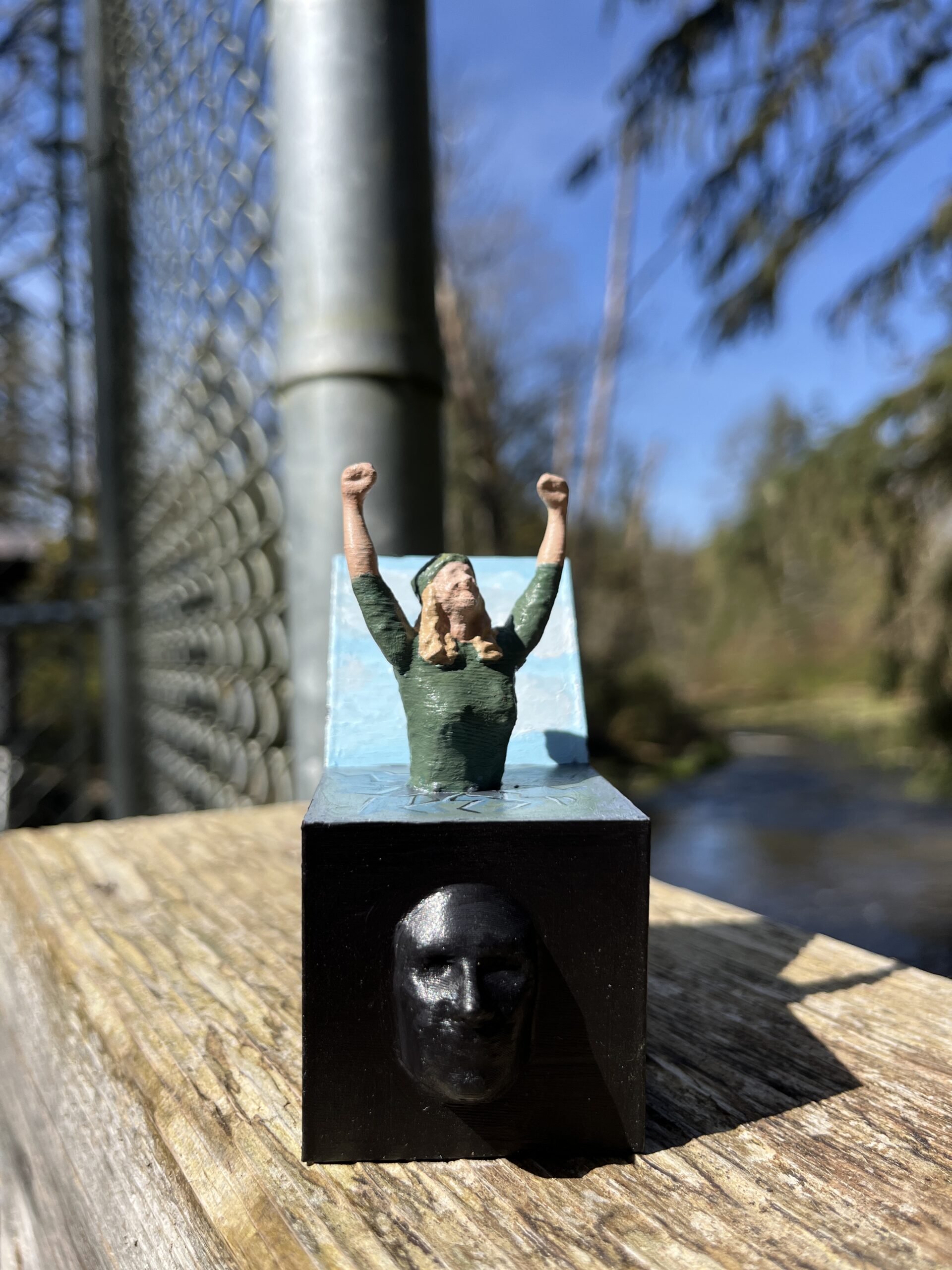
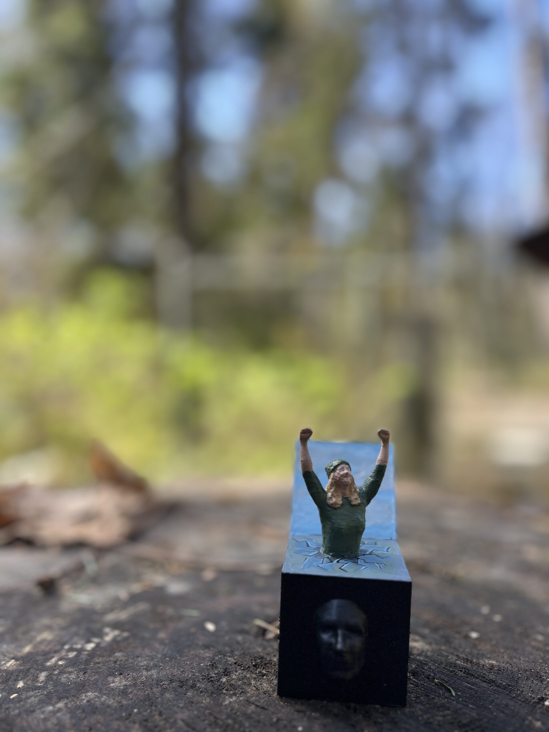
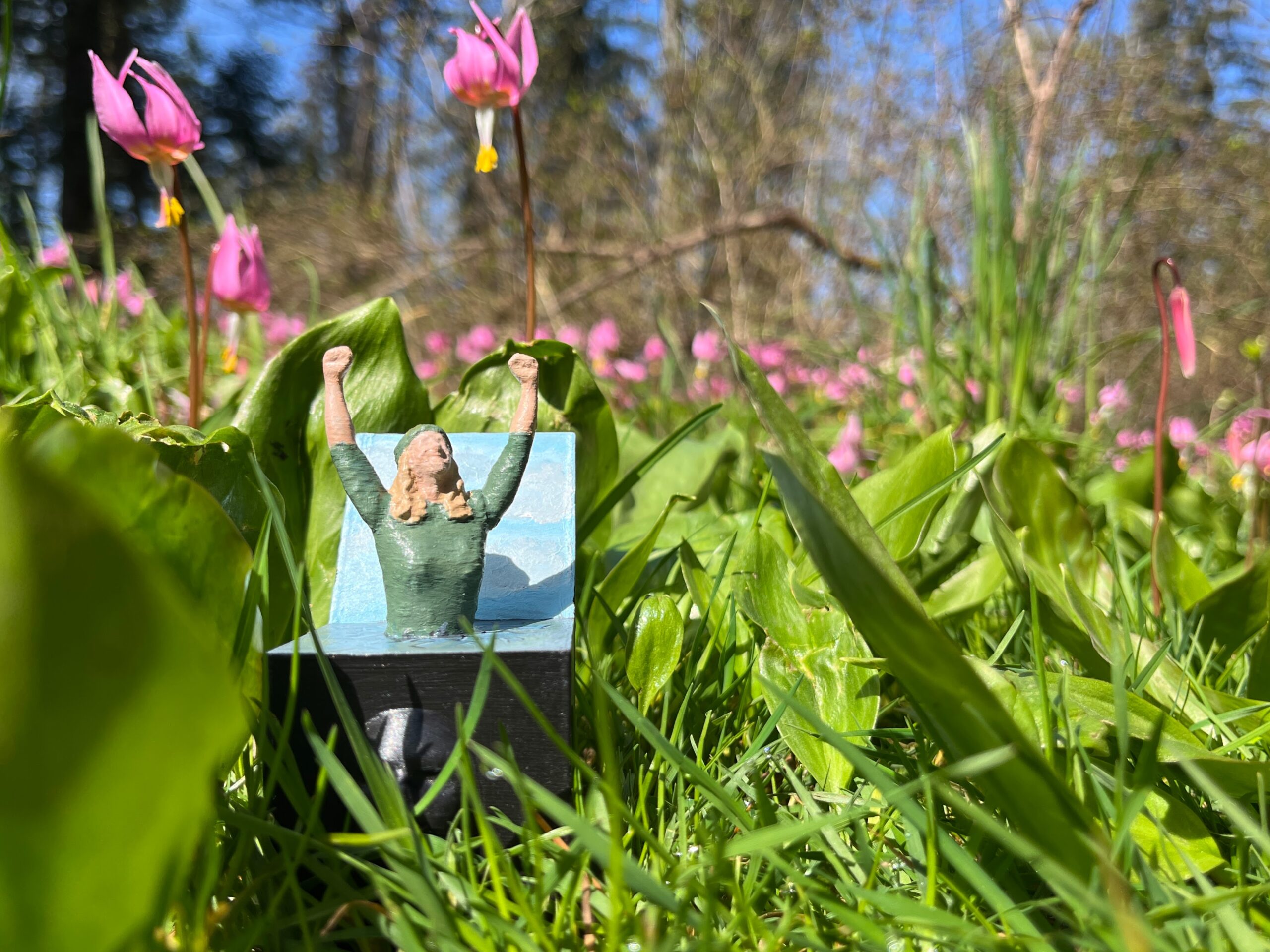
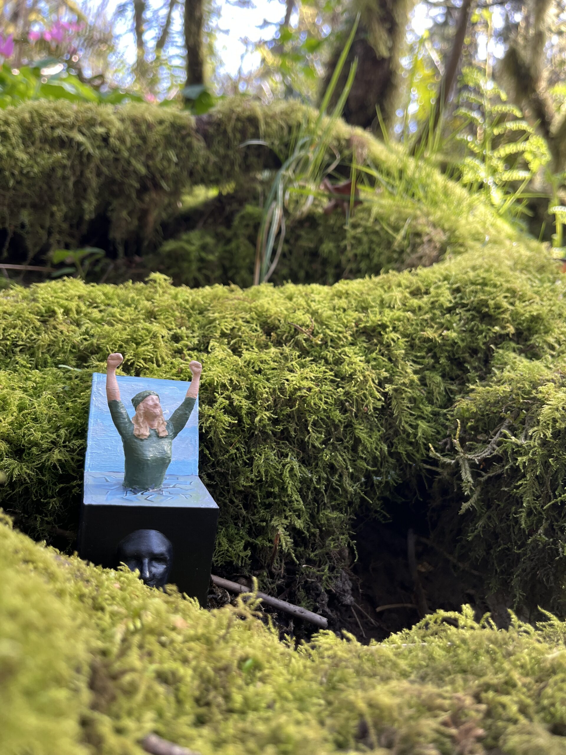
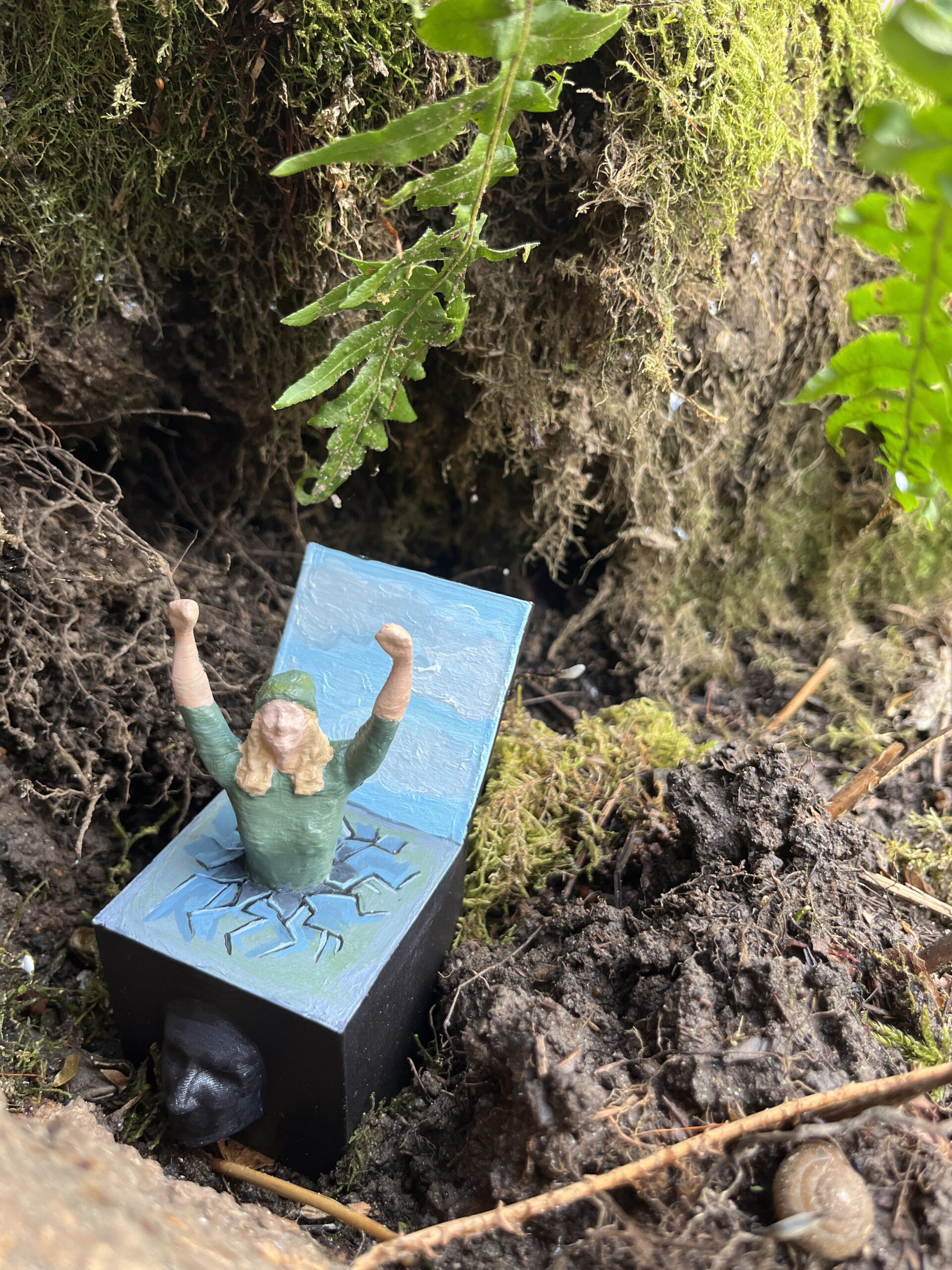
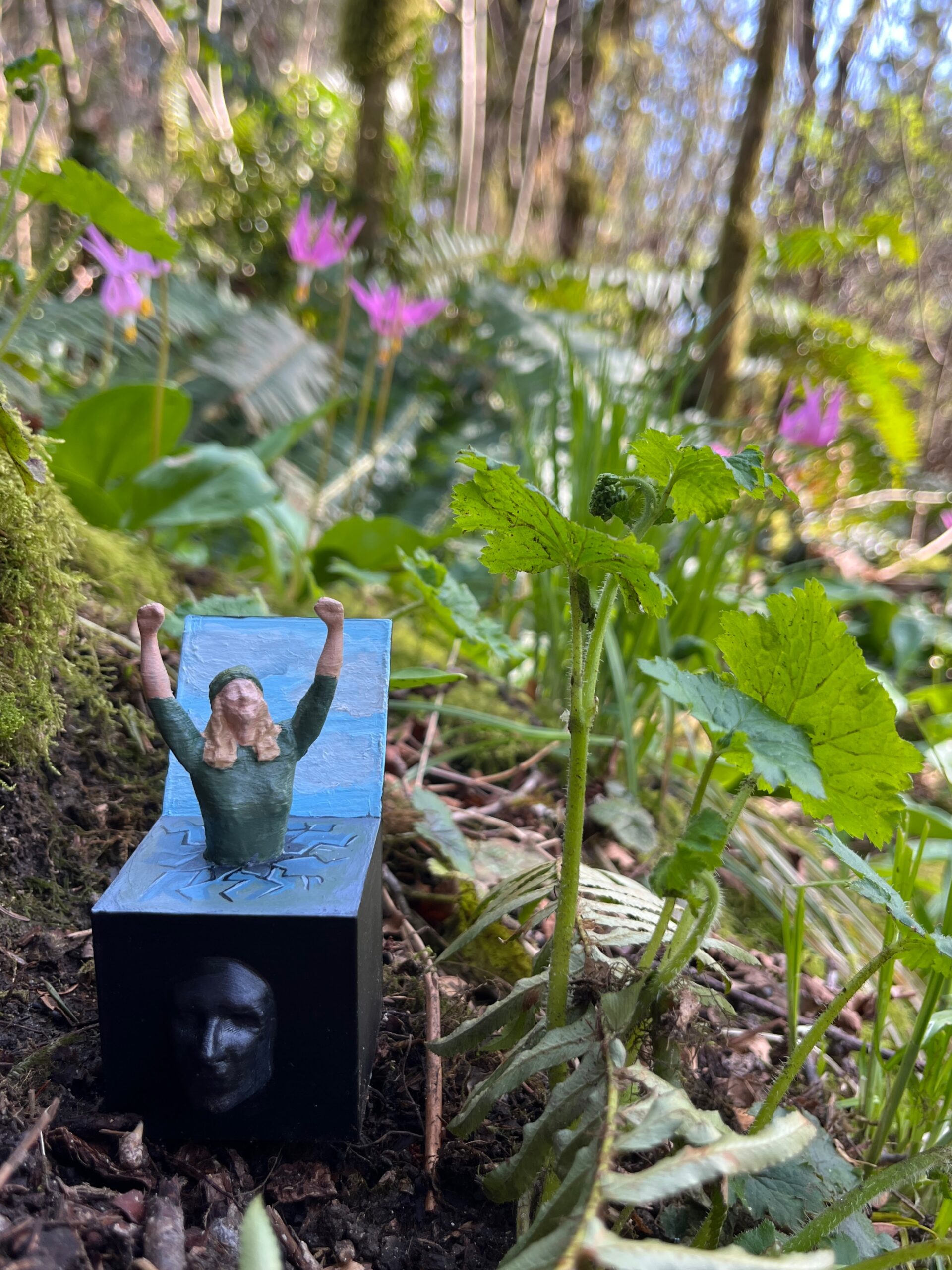
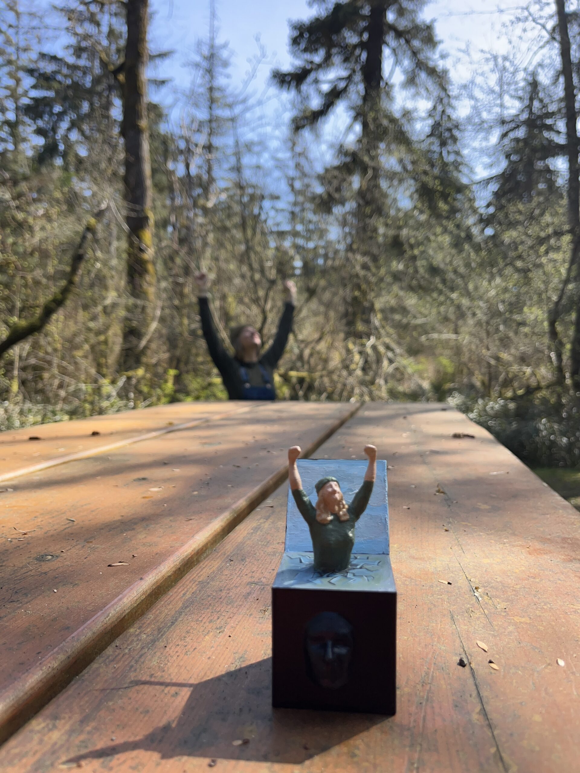
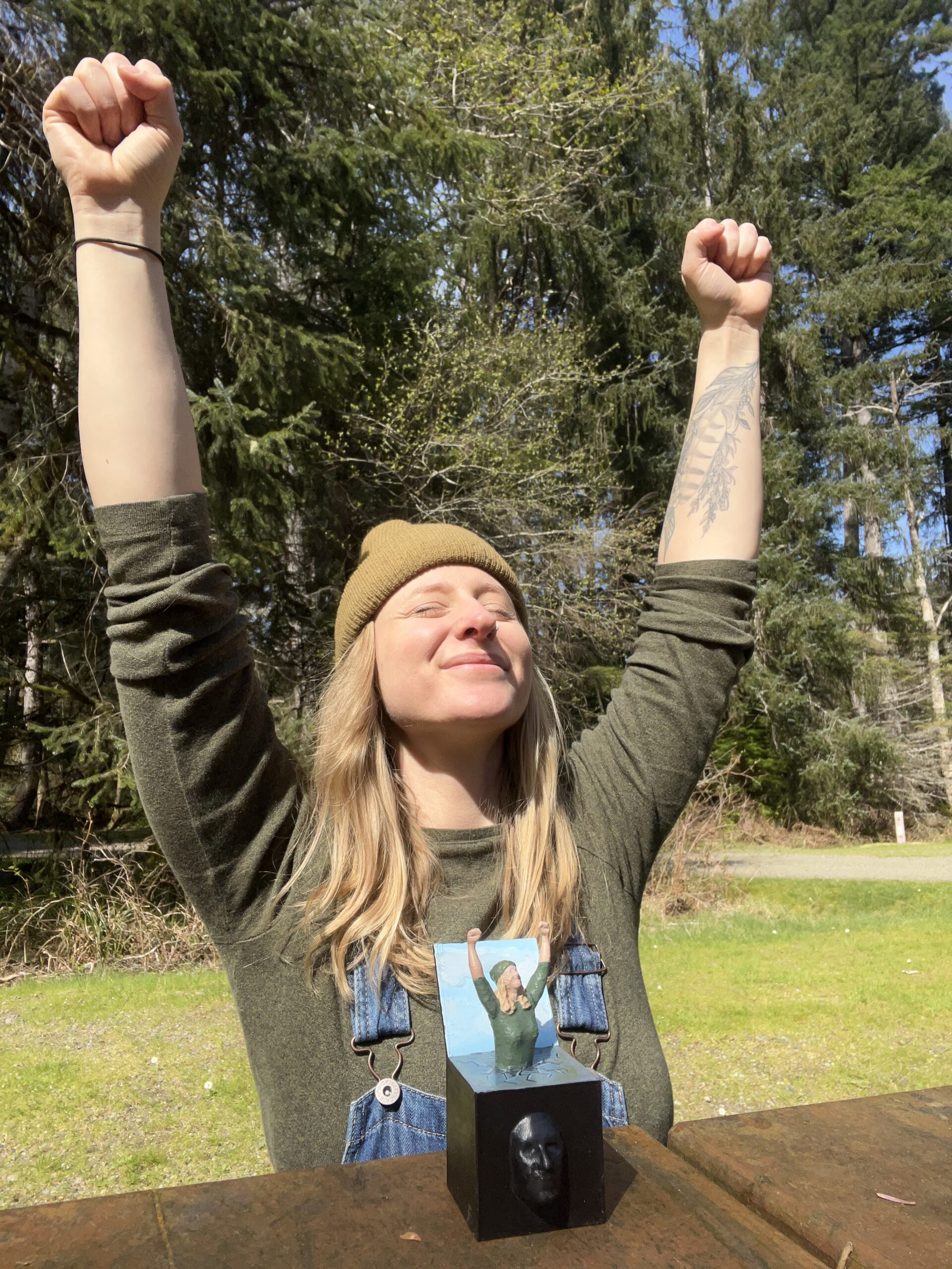
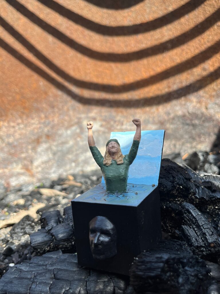
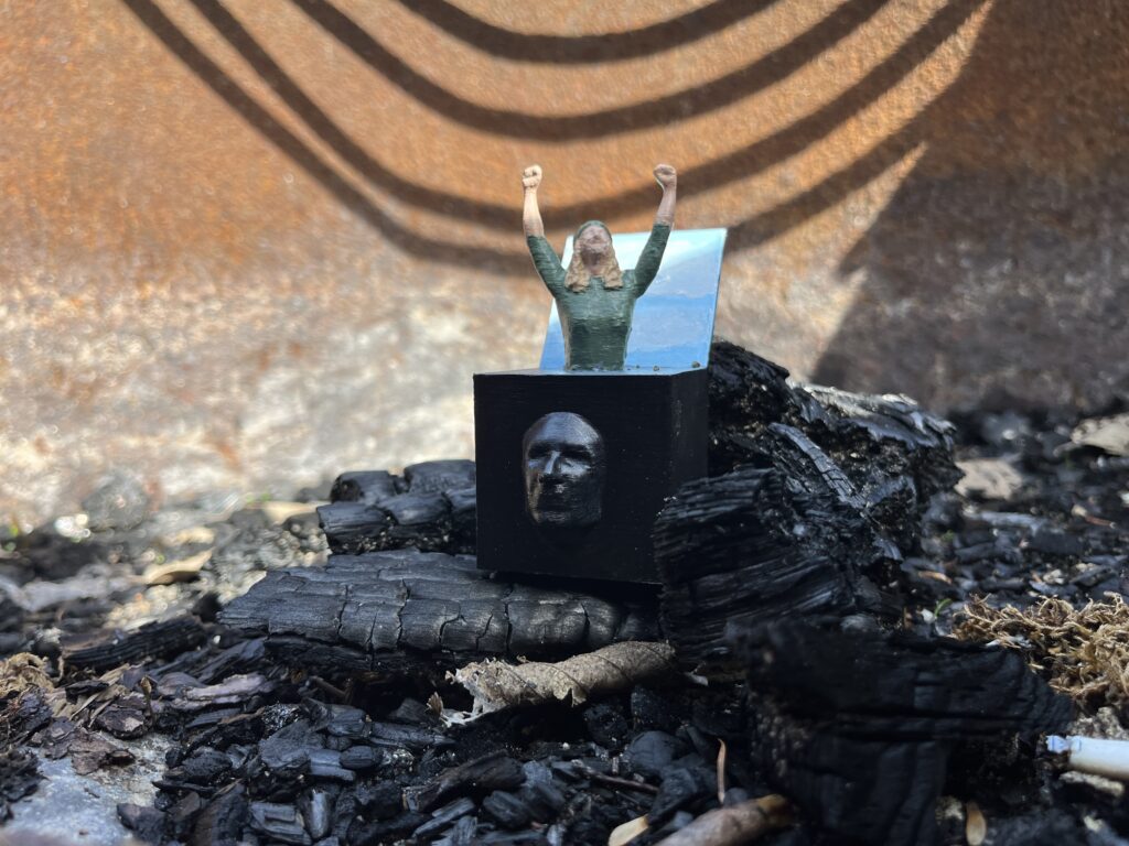
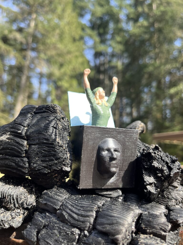
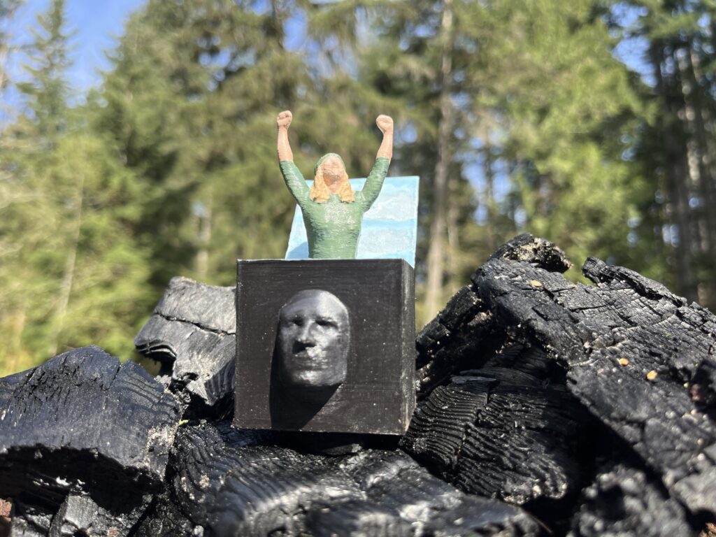
Assemblage final project
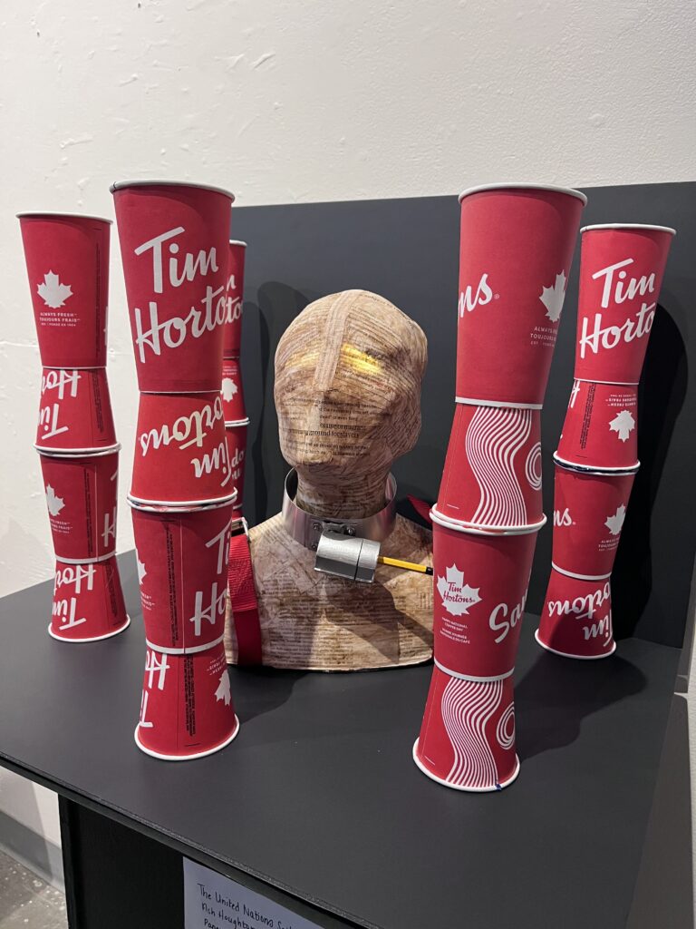
“The United Nations Spilled the Beans”
Intention statement:
The intention of this piece is to draw attention to, and action on Canada’s abuse of migrant workers as outlined in the recent United Nations report on “contemporary forms of slavery, including its causes and consequences”. According to the Report written by Tomoya Obokata, received reports of migrant workers in Canada experiencing physical abuse, wage theft, threats of deportation for asserting their rights, overcrowded and undignified housing, debt bondage, lack of measures to report abuses without risk of losing their status, lack of affordable health care, lack of adequate PPE, and inter-jurisdictional neglect.
I chose to paper mache the UN report to the skin of the model along with subsequent newspaper articles about the report, to create a new opportunity for viewers to “read the news” in a way that may be more enticing and evoke emotion and action. The collar around the neck of the model represents our bondage to big corporations, and those who are abusing human rights.
I chose to use the Tim Hortons cup in this piece because it is an emblem of our nationhood – with its red and white cup and markings of the maple leaf – and a symbol of hope to many who immigrate to Canada to work or live in a country that is fair and free of the human rights abuses. The irony is that these abuses occur here too, and that Tim Hortons is guilty of these abuses. However, unlike in other countries we operate under a functioning democracy that allows residents to speak out against these atrocities and make positive changes.
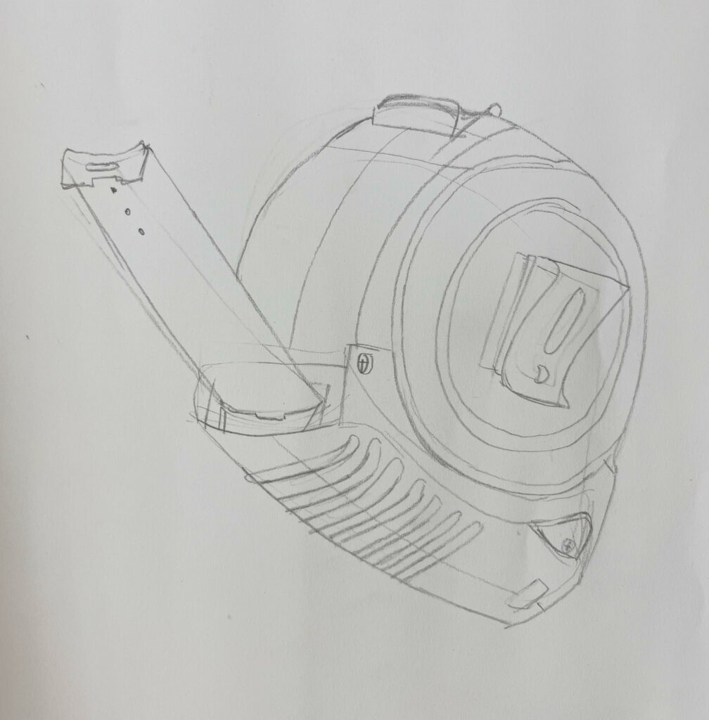
For that reason, attached to the collar, disguised as a lock, is a pencil sharpener with the key to free ourselves from the bondage of the power imbalance that leads to contemporary forms of slavery. The key is a pencil, ready to use on a nearby petition.